I wanted this Galentine’s to feel like a night at a retro cocktail lounge. I pictured ribbed coupes, glossy cherries, deep red lacquer, and a little sign on the door that says The Girls Club. Even if that door is just the one to your kitchen, it’s fun to imagine what your own club would look like for the night.
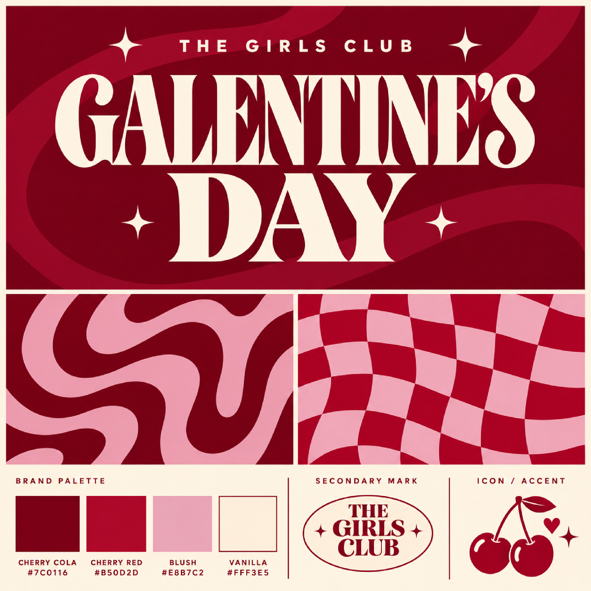
I started with a cherry-and-blush palette, then played with waves, checkerboard, and an emblem I could use on everything from a cocktail menu to a coaster. Some of those ideas looked great on the brand board and needed a little editing once I saw them together. That was the part I enjoyed most.
Give the night a name and a mood
I liked The Girls Club because it sounds like somewhere you’d go. It gave me a way to think about the whole evening. What would the menu look like? What would be printed on the cocktail napkins? What would you order at the bar? “Cocktails & good company” came naturally once I could picture the room.
For your own Galentine’s, think about what you and your friends already enjoy doing together. A group that always ends up ordering fries might have fun with a diner-inspired late-night supper. A standing Sunday brunch could have a name borrowed from the group chat. Once you have a name and a place you can picture, the visual decisions get easier.
Give each colour a job
The cherry photo gave me the mood I was after. I loved the deep reds in the shadows alongside the soft blush. For the finished palette, I brought in a brighter cherry red for the patterns and a warm vanilla for the lettering and illustrations.
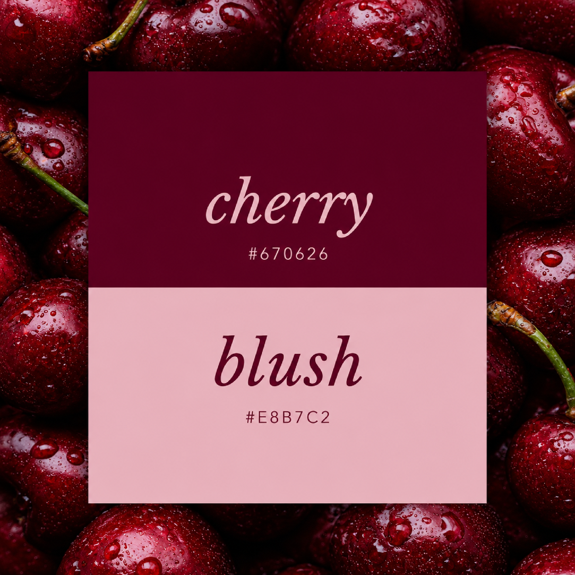
I tried the waves in blush first. The curves looked great, but that much pink changed the mood of the design. I kept the tighter curls and brought back the two reds. That gave me the movement I wanted while getting closer to the dark cocktail-lounge look I’d pictured. Blush found its place in the checkerboard trim, where even a little bit of it stands out.
If you’re building a palette from a photo you love, try assigning each colour a role. Pick the one you’d use across a whole surface, the one you’d use in small amounts, and the one you’d use for lettering. I found that deciding how much blush to use mattered as much as choosing the shade.
Decide where each pattern belongs
The waves and checkerboard were both on the brand sheet, and I wanted to see them together. The combination I liked best was the all-over red waves with a slim strip of checks down one side. I also softened the curves in the checkerboard so it still had a little movement and felt more like a trim.
I’d use that same approach on a drinks menu. The checks could run down one edge, with the drink names set on a plain vanilla background. On the bar, a larger sign could take the tonal waves and a big cream The Girls Club heading. Both pieces would feel like they belong together, even though each uses a different part of the brand board.
Make a small mark you can use on its own
The pair of cherries with a little heart and sparkle is my favourite piece of the branding. I like it in cream on the deep reds and in cherry red on vanilla. It still reads at a small size, which makes it easy to imagine on a coaster or a little card next to the garnishes.
There’s also an oval Girls Club mark on the brand sheet. I’d use that where I want the name to be part of the design, like at the top of a menu. The cherries can go where there’s only room for a small detail. Having both gives you more freedom when you start putting the pieces together.
Bring the look off the page
The cocktail mockup helped me picture the materials together. The shiny red surface, the satin ribbon, and the ribbed glass each catch the light differently. That’s the part I’d borrow for an actual party. I’d set out a dark tray, use the coupes I already have, and put a little bowl of cherries where everyone can reach it. The cherry illustration could sit at the top of the drinks menu, then turn up again as a garnish in the glass.
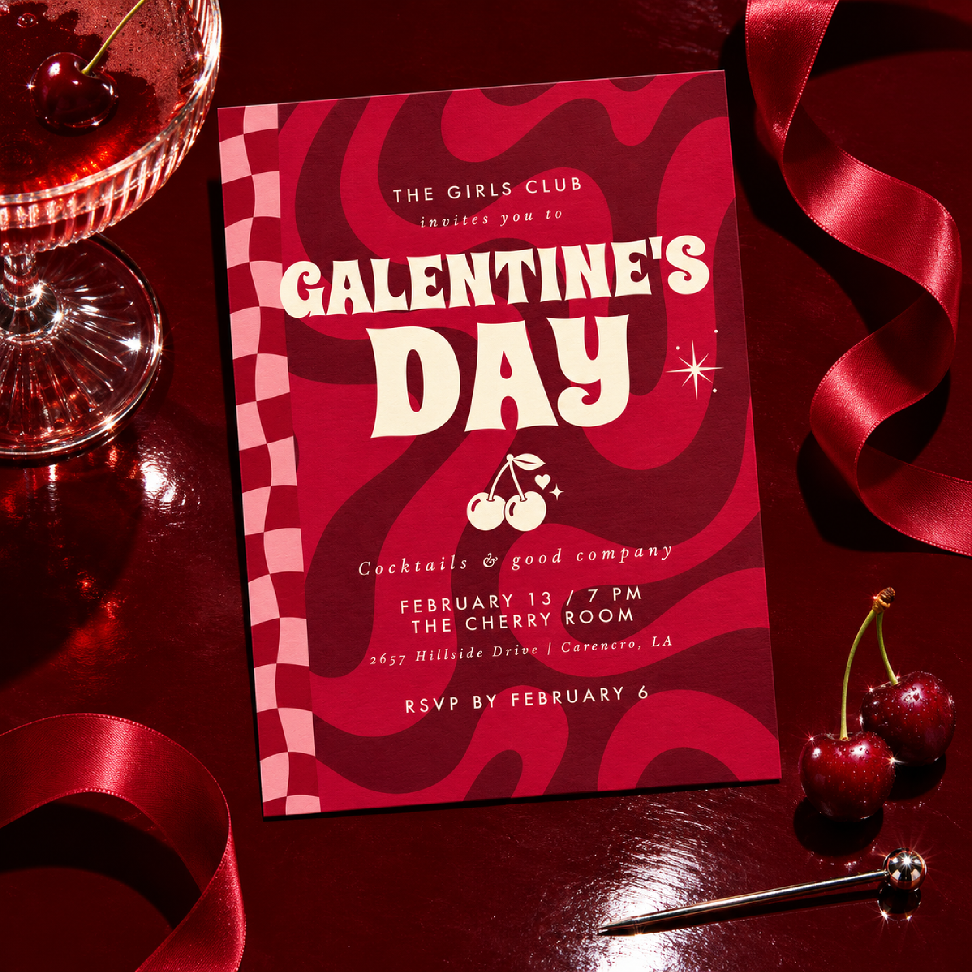
My favourite part of The Girls Club is that I could take the words off and still recognize it. I could put the checkerboard edge on a menu and just the cherries on a coaster, and they’d still feel like they belonged to the same night. I’d start with those two pieces and let the glassware and garnishes carry the rest.
If you’re planning your own Galentine’s, start with something your friends would recognize. It could be the drink you always order together, the name of your group chat, or the colour of the booths at your favourite diner. Give that detail a second appearance somewhere guests will notice it. I like the idea that the next time someone drops a pair of cherries into a coupe, one of my friends might call it another meeting of The Girls Club.