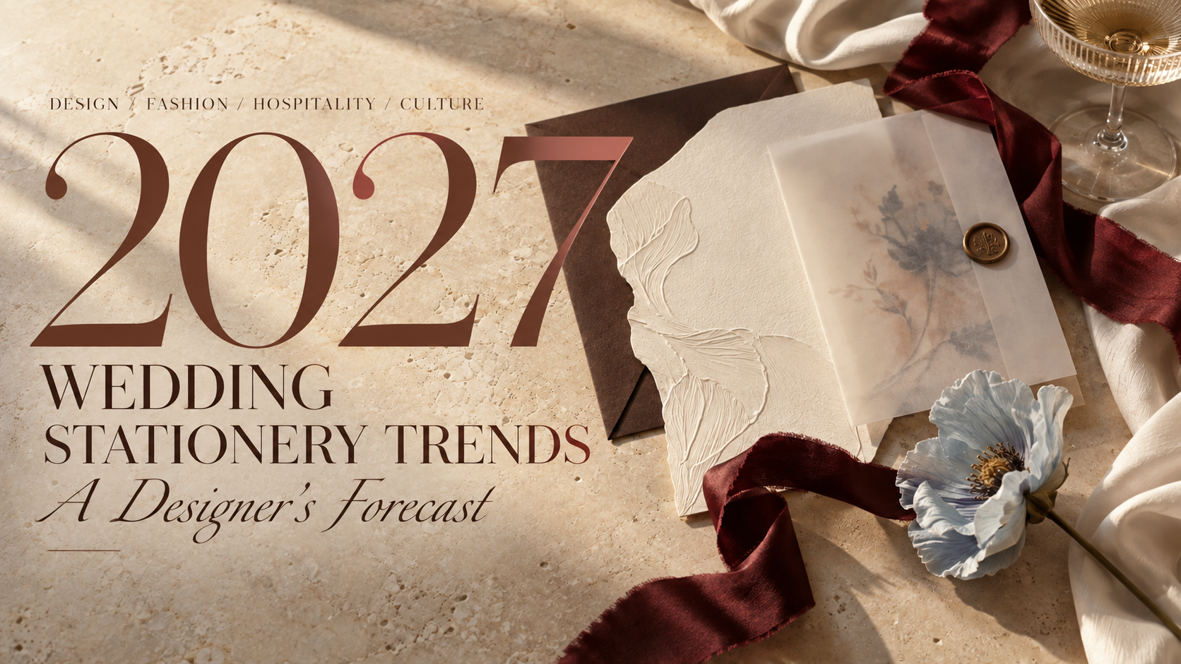
2027 Wedding Stationery Trends: A Designer’s Forecast
Every year, wedding trends arrive with a familiar set of declarations.
This color is in. That flower is out. Minimalism is over. Bows are staying. Something we loved ten years ago has returned with a new name.
But design rarely changes that neatly.
The shifts that eventually reach wedding stationery often begin somewhere else entirely. On fashion runways. Inside restaurants and hotels. In interiors, packaging, editorial design and the objects people choose to surround themselves with.
And right now, across many of those worlds, I keep noticing the same thing.
Perfect is becoming less interesting.
After years of polished minimalism, carefully coordinated palettes and design that could sometimes feel almost interchangeable, things are getting more personal again. More tactile. More layered. More expressive. Sometimes a little stranger.
We're seeing lace, draping and asymmetry return to fashion. Vintage references are being reworked rather than simply reproduced. Interiors are becoming layered with objects, craftsmanship and personal history. Color combinations don't always behave. Handmade details are being celebrated precisely because they aren't perfect.
And I believe those ideas are going to have a very interesting effect on weddings.
So this isn't a list of things every couple should include in 2027.
It's a designer's forecast of the creative movements I believe will influence the most interesting wedding stationery and event design in the year ahead.
01 / Fashion Moves Onto the Paper
Fashion has always influenced weddings, but in 2027 I think stationery will begin borrowing more than its color palette.
It will borrow its construction.
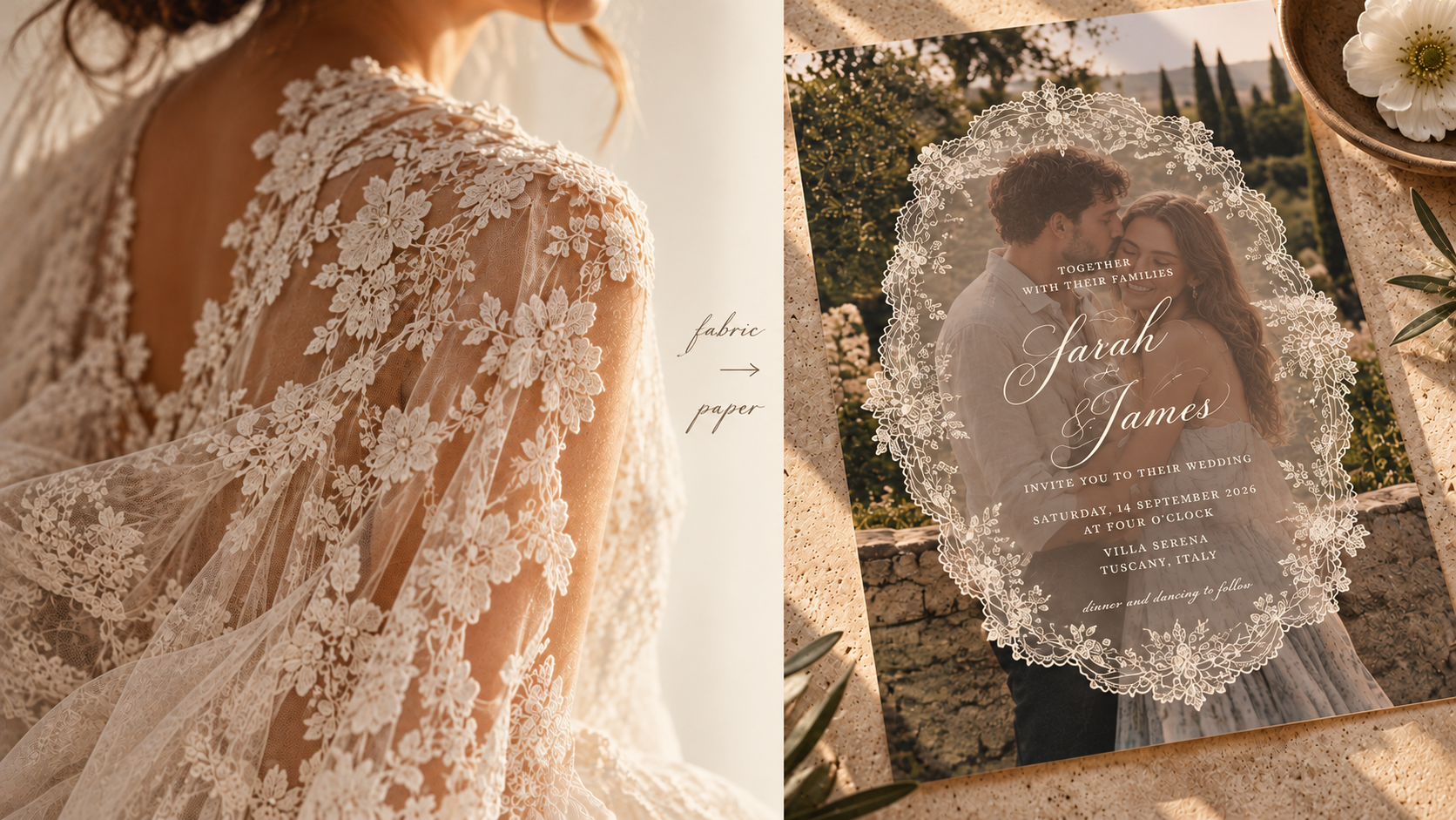
Spring 2027 bridal collections are filled with lace, dramatic draping, asymmetry, sheer layers, sculptural shapes and vintage references interpreted through a modern lens. Even outside traditional bridal, designers are playing with romantic ruffles, slips, unusual tailoring and fabric manipulation.
There is an obvious visual connection between fashion and paper, but the more interesting translation isn't printing a picture of lace onto an invitation.
It's asking what lace does.
It reveals and conceals. It creates an edge. It adds texture. It changes depending on what sits beneath it.
The same can be said of draping, pleating, corsetry and sheer fabric.
Imagine translucent layers revealing typography underneath. An invitation constructed asymmetrically rather than perfectly centered. Embossing inspired by embroidery. A folded menu taking cues from pleating. A scalloped edge referencing lace without literally reproducing it.
Even something as simple as a ribbon becomes more interesting when it feels like part of the construction rather than something tied around the finished piece afterward.
The wedding dress and the invitation don't need to match.
But increasingly, I think they'll feel as though they belong to the same world.
02 / Color Gets More Interesting
I don't think 2027 will belong to one wedding color.
And I'm glad.
What feels more interesting right now is the willingness to put colors beside each other that aren't obvious companions.
Spring 2027 fashion is moving freely between soft pastels and much stronger color, while bridal itself is expanding beyond white into muted pink, blue, cream and gray. Recent collections are even pairing pastels with flashes of cobalt and acid green.
I think weddings will take that permission and run with it.
Not necessarily toward louder palettes, but toward more specific ones.
Powder blue becomes much more interesting beside oxblood than another pale neutral. Butter yellow gains weight beside chocolate brown. Dusty lilac suddenly feels less sweet with an acidic green. Tomato red can make blush feel almost modern.
It's the slightly uncomfortable color that often makes the rest of the palette work.
That doesn't mean neutrals are disappearing. A restrained palette can still be incredibly beautiful.
But I think we'll see fewer palettes designed around the question, Does everything match?
And more designed around:
Does this combination have a point of view?

03 / The Wedding Becomes a Restaurant
One of the biggest influences I see moving into weddings isn't coming from weddings at all.
It's coming from hospitality.
Think about the places people remember.
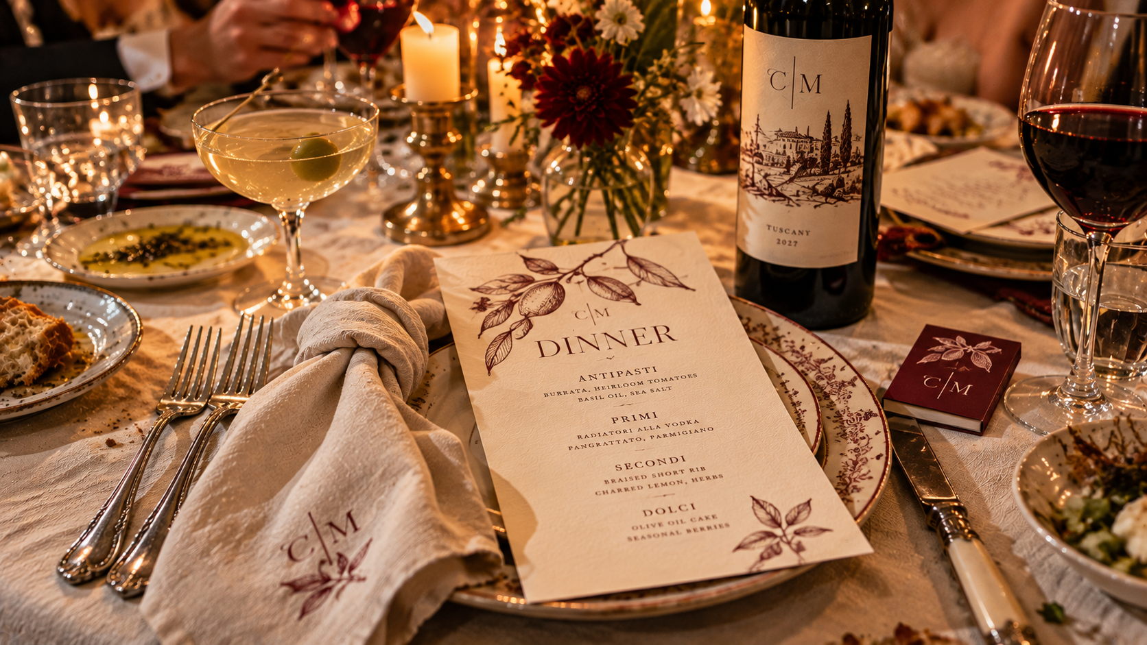
A tiny restaurant with incredible typography on the menu. A hotel bar with its own matchbooks. A café whose napkins, cups and signage somehow make the entire place feel more considered. A wine label you photograph before the bottle is empty because the design is too good to forget.
Hospitality understands something that translates beautifully to weddings:
identity doesn't need to shout to be everywhere.
A wedding reception is already, in many ways, a restaurant that exists for one night.
There is a menu. A bar. A wine selection. Tables. Servers. Food. Music. Lighting. Guests sitting together for hours.
So rather than simply styling the dinner, I think more couples will begin branding the experience of it.
Custom matchbooks. Cocktail napkins. Wine labels. Menus that look as though they came from a favorite neighborhood restaurant. Illustrated food. Tiny bar identities. Coasters. Table numbers inspired by café graphics. Even cheeky little receipts or late-night takeaway packaging.
These details don't have to scream wedding.
In fact, they're often better when they don't.
04 / Illustration Becomes Identity
Custom illustration has become a familiar part of wedding stationery.
But I think we're going to ask more of it.
For years, the default has often been the venue watercolor: beautiful architecture painted above the couple's names.
There will always be a place for that.
But a wedding isn't only a venue.
It's people, places, pets, food, memories, family, travel, inside jokes and tiny details that might mean absolutely nothing to anyone except the two people getting married.
That's where illustration becomes far more interesting.
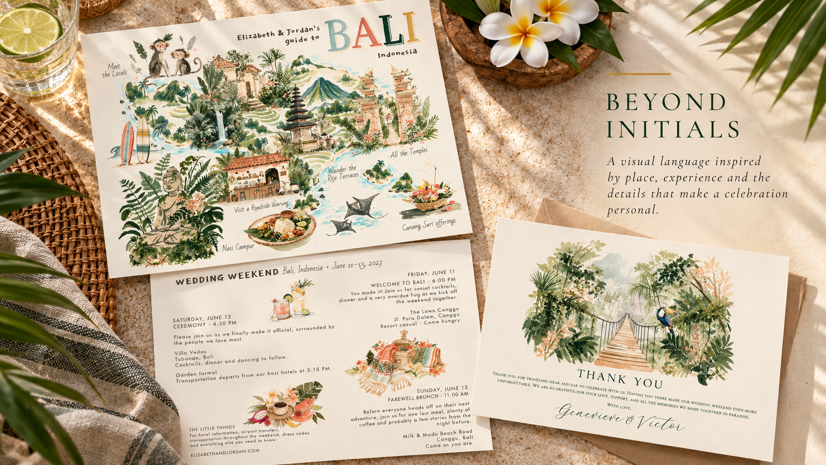
The restaurant from the first date. The dog who owns the house. A grandmother's garden. The skyline where they met. A particular flower. Their favorite cocktail. A terrible rental car from an unforgettable road trip.
One illustration is decoration.
A collection of them becomes a visual language.
Once that library exists, it can travel from invitations to maps, menus, cocktail napkins, websites, welcome gifts, signage and the event itself.
Instead of decorating the wedding with pretty pictures, couples can build an illustrated world that belongs specifically to them.

05 / Meaning Becomes the New Luxury
I don't think the monogram is going anywhere.
But I do think the automatic monogram is becoming less interesting.
Initials are useful. They're personal by definition.
But sometimes there is something far more specific that could represent a couple.
A flower from a family garden. A shell collected from a meaningful beach. A house. A mountain. A bird. A cherry. A martini. A dog in an absurd little bow tie.
Perhaps it's worked into a crest.
Perhaps it replaces the crest entirely.
What interests me is the idea of wedding identities containing symbols that aren't immediately understandable to everyone who sees them.
They don't need to be.
A guest might simply see a beautiful illustration.
The couple sees a story.
As our visual world becomes increasingly easy to replicate, I think that distinction will matter more. A beautiful aesthetic can be copied.
Meaning is harder to copy.
And that may become one of the most valuable forms of luxury in wedding design.
06 / Paper Becomes an Object
We spend an extraordinary amount of our lives touching glass.
Maybe that's part of why tactile design suddenly feels so satisfying.
Wedding stationery is becoming something you don't simply look at.
You open it.
Unfold it.
Untie it.
Turn it over.
Run your fingers across it.
Spring 2027 fashion is similarly fascinated with materiality, from layers of lace and embellishment to sculptural construction and fabric manipulated into unexpected shapes. Interiors are embracing dimensional wall treatments, embroidery, appliqué, passementerie and other tactile craft.
It makes sense that paper would participate in the same movement.
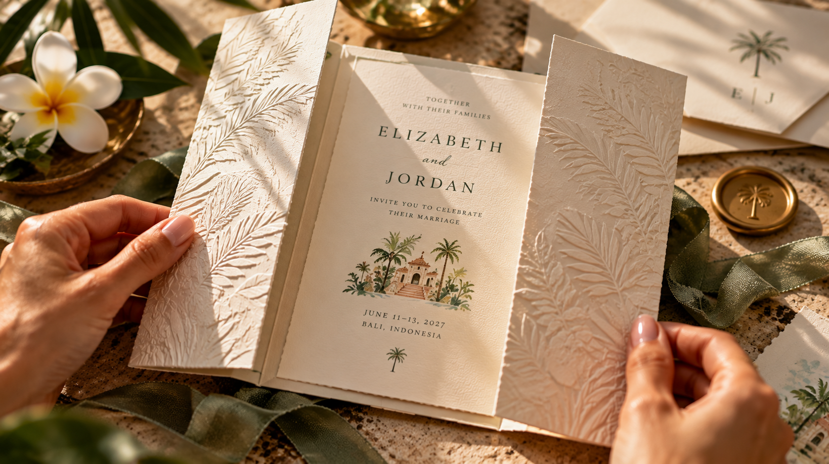
Die-cut shapes. Scallops. Folds. Layers. Translucency. Embossing. Fabric. Ribbon. Charms. Unexpected stocks. Pieces that function almost like tiny objects.
But I don't think more automatically means better.
A twelve-piece invitation suite isn't inherently more luxurious than one beautifully considered card.
Sometimes a single unexpected shape or incredible stock does all the work.
The shift isn't toward complexity.
It's toward physicality.
07 / The Human Hand Shows
There is something almost funny about spending years making digital design more and more perfect, only to arrive at a moment when imperfection suddenly feels luxurious.
But here we are.
Even the Spring 2027 fashion conversation is showing renewed interest in DIY techniques and visible handcraft as a counterpoint to digital precision. Across fashion more broadly, this season is leaning toward human creativity and emotional expression rather than frictionless perfection.
I think wedding stationery will reflect that.
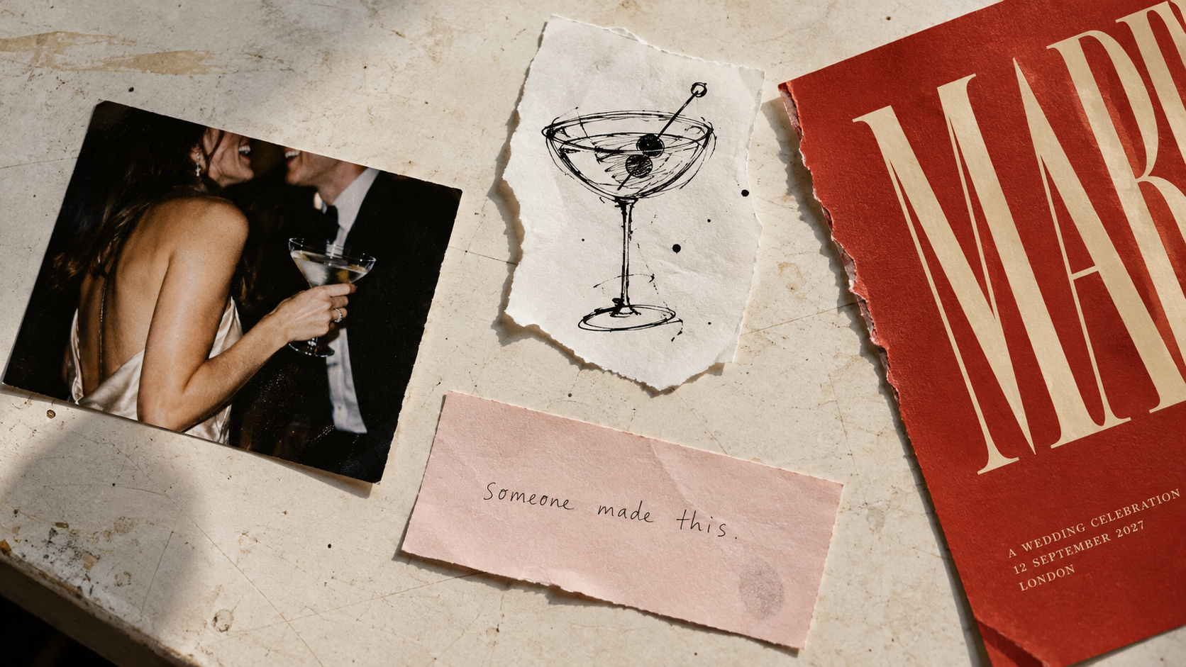
Handwriting that actually looks handwritten.
Loose sketches.
Ink that isn't perfectly consistent.
Vintage typography.
Torn edges.
Naïve illustration.
Scanned flowers.
Collage.
Analogue photography.
Things with evidence of a hand still attached to them.
That doesn't mean design suddenly becomes sloppy.
There is a huge difference between intentional imperfection and simply not finishing something properly.
The work can still be beautifully art-directed and meticulously considered.
It just doesn't need every line straightened and every irregularity removed.
Because increasingly, those irregularities are what tell us: someone made this.
08 / Stationery Escapes the Page
Perhaps the biggest change in wedding stationery is that we're increasingly using the word stationery to describe something that doesn't stay on paper at all.
The invitation establishes a language.
Then that language starts moving.
Onto the menu.
Across the bar.
Around the dance floor.
Onto a stage.
Along a wall.
Through the wayfinding.
Into packaging, textiles, installations and the tiny objects guests interact with throughout the night.
Eventually, the identity becomes part of the environment.
And that shift mirrors what we're seeing elsewhere in design. Interiors are becoming more personal, layered and story-driven rather than uniformly minimal. People aren't simply decorating spaces. They're creating environments that communicate something about who inhabits them.
A wedding can do the same.
This doesn't mean putting the couple's initials on every available surface.
Good event branding can actually be remarkably quiet.
A shape introduced on the invitation might reappear in the architecture of a bar. An illustration becomes a pattern. A color appears unexpectedly in the lighting. Typography from the save-the-date guides guests toward dinner.
Guests may never consciously connect those decisions.
They simply experience a celebration where everything somehow feels as though it belongs together.
I've written much more about this idea in From Invitation to Environment: What Event Branding Actually Means, because I think this is where stationery stops being an accessory to the event and begins helping to shape the event itself.

So, What Will Weddings Look Like in 2027?
Hopefully, not all the same.
That's the part of this forecast I'm most confident about.
The broader design world is moving away from the idea that good taste requires everything to be quiet, neutral and perfectly controlled. Fashion is mixing romance with asymmetry, vintage references with modern construction and softness with much stronger gestures. Interiors are becoming layered, tactile and personal. Craft is increasingly valuable precisely because we can see the hand behind it.
Wedding stationery is uniquely positioned to bring all of those ideas together.
Borrow the lace from the dress, but translate it rather than copy it.
Choose the strange color.
Turn dinner into a tiny restaurant that exists for one night.
Illustrate something nobody else would think to illustrate.
Use a symbol that requires a story.
Make something guests want to touch.
Leave a line imperfect.
Let the invitation escape the envelope and become part of the room.
Or ignore all eight predictions.
Because ultimately, I don't think the most interesting weddings of 2027 will be the ones that followed the most trends.
I think they'll be the ones where you can look around the room and know exactly whose wedding you're at.

The future of wedding design isn't about making everything perfect.
It's about making it personal.
From Invitation to Environment: What Event Branding Actually Means
You choose a color palette.
You design an invitation.
Maybe there's a logo or monogram. A custom illustration. A pattern you love.
Then the event gets closer.
Suddenly you need a welcome sign. A bar menu. A seating display. Table numbers. Maybe graphics for a stage, a dance floor, a photo moment or an entire wall.
And this is usually the point where something interesting happens.
Those pieces can either become a collection of things that happen to be at the same event.
Or they can become an environment.
That second idea is what I mean when I talk about event branding.
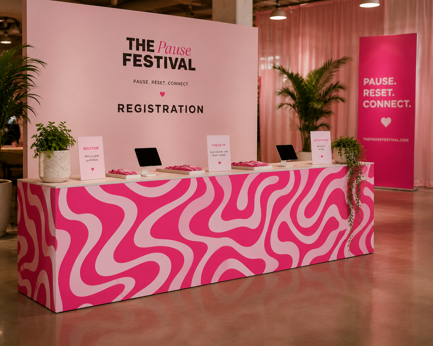
First, What Is Event Branding?
The word branding can make this sound much more corporate than it actually is.
Event branding doesn't necessarily mean putting a logo on everything.
At its simplest, it's the visual language that connects the different parts of an event.
Color is part of it.
Typography is part of it.
Illustration, pattern, photography, materials, shapes and signage can all be part of it too.
But the real goal isn't matching.
It's recognition.
A guest should be able to move from the invitation to the entrance, from the entrance to the bar, and from the bar to the table without every element looking identical, while still feeling as though all of it belongs to the same experience.
It Usually Starts With Something Small
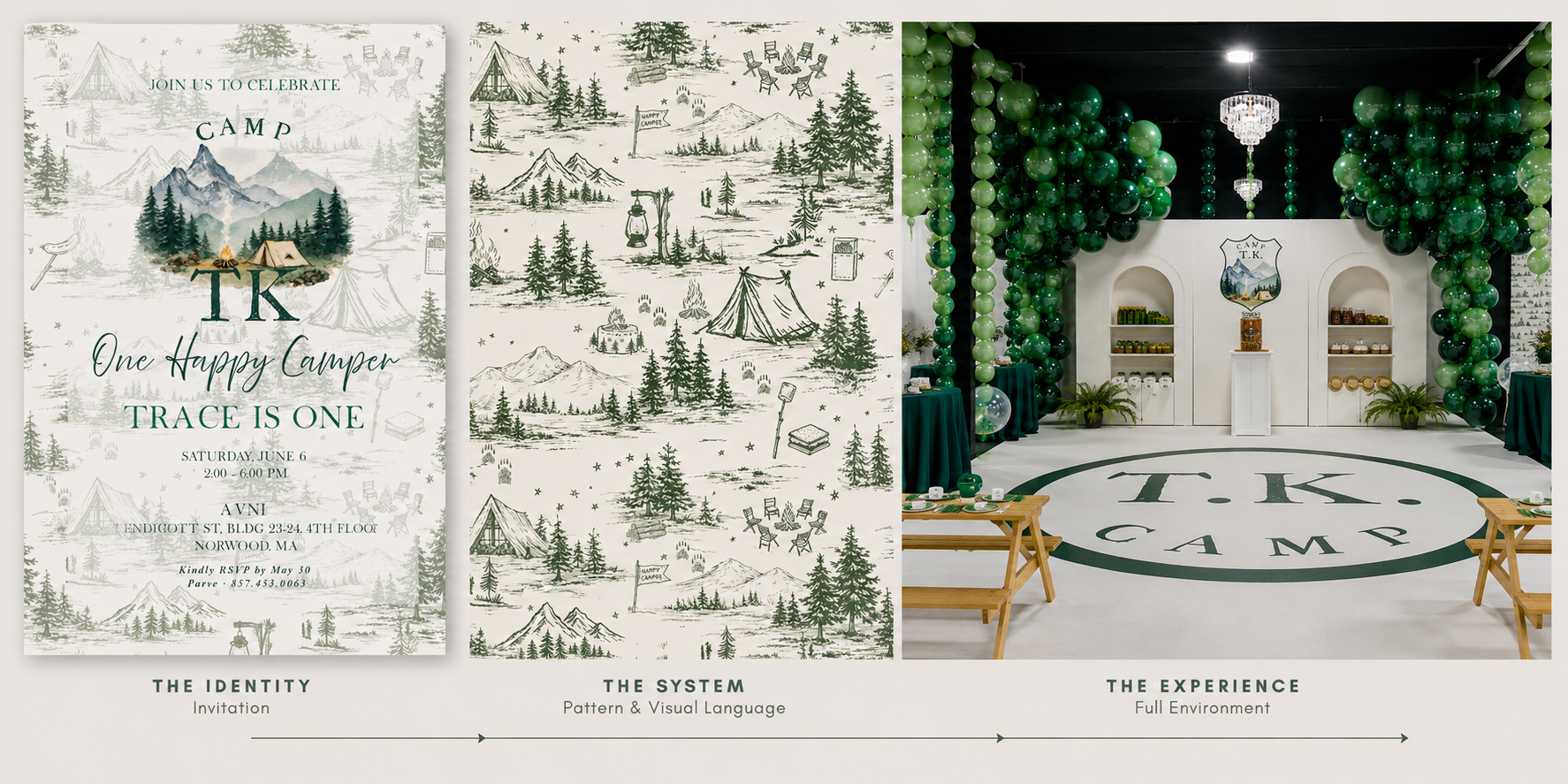
Interestingly, an event identity often begins on one of the smallest pieces we'll create.
An invitation.
A logo.
A monogram.
An illustration.
Maybe even a single unusual color.
At that stage, I'm not necessarily thinking about how many times that element can be repeated.
I'm thinking about what kind of visual world could grow from it.
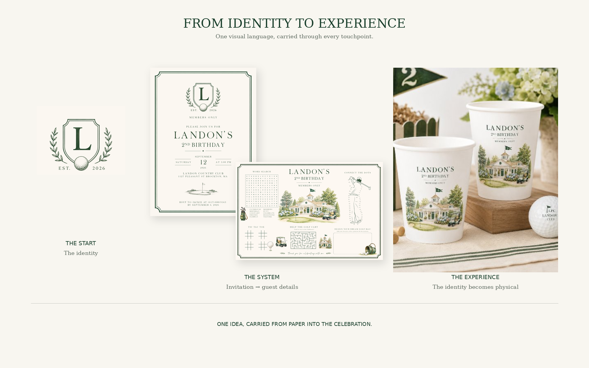
A venue illustration might eventually become an oversized graphic.
A tiny pattern inside an envelope might become a bar wrap.
A monogram could become a subtle detail on menus, cocktail napkins or signage.
A shape from the invitation might influence the shape of a seating display.
The original design becomes a vocabulary.
And once that vocabulary exists, we can start speaking with it in different ways.
Then the Scale Changes
This is where event branding becomes especially fun.
Something designed at five inches suddenly needs to work at five feet.
And simply enlarging it isn't always the answer.
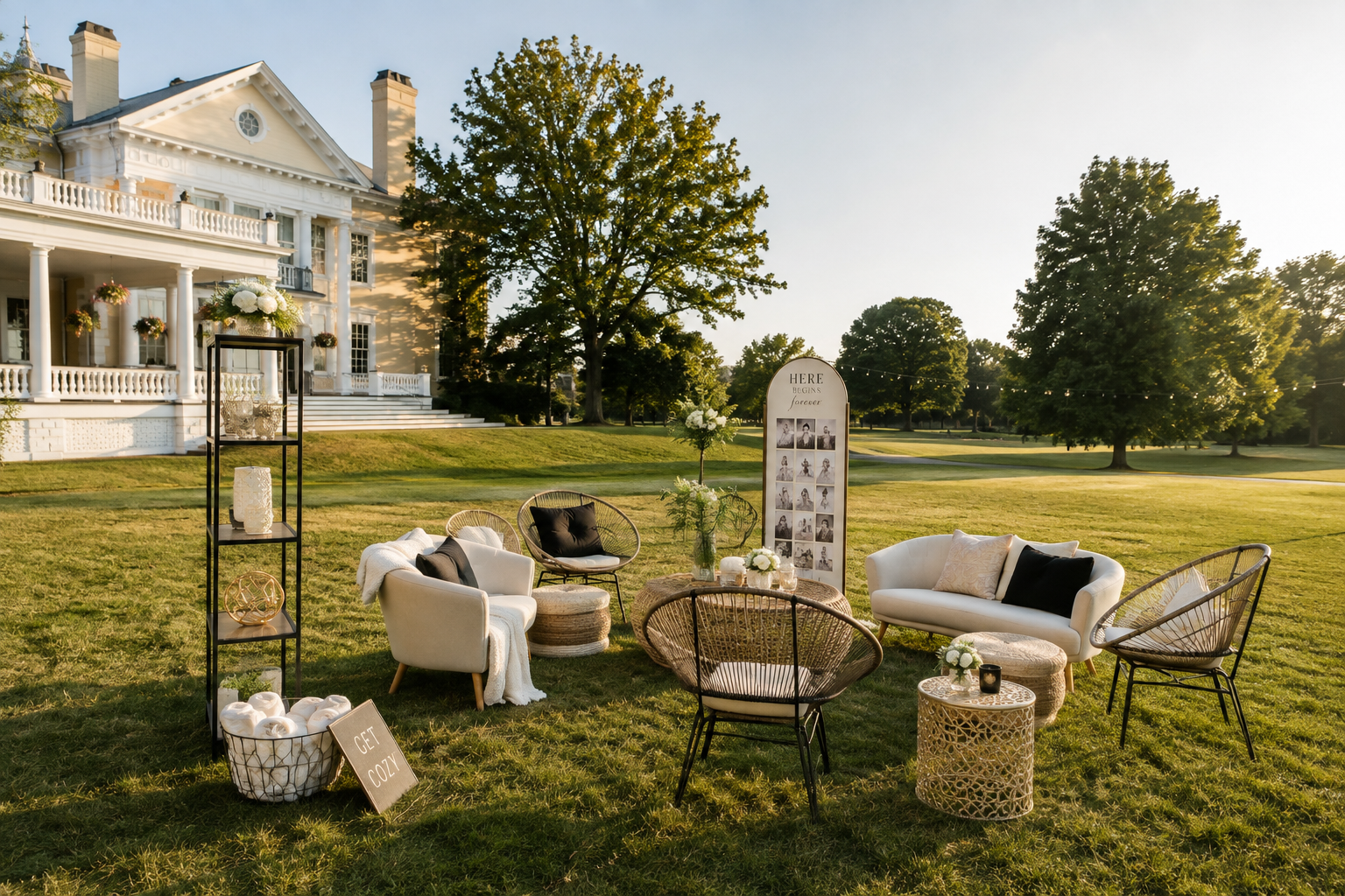
Designing for an environment means thinking differently.
What will someone see from across the room?
What needs to be understood immediately?
What will they experience up close?
What competes with the architecture, florals, lighting and furniture already in the space?
A delicate illustration that works beautifully on an invitation might disappear completely on a twenty-foot wall.
A tiny pattern might become incredible when it's enlarged.
Typography that feels dramatic on paper might need to become much quieter once it's surrounded by flowers, lighting and people.
Scale changes the design.
And good event branding allows it to change.
The Venue Is Part of the Design
One of the biggest differences between designing stationery and designing an environment is that the environment already exists.
There is architecture.
There are walls, windows, flooring, lighting and furniture.
There may be a spectacular view.
There may also be something we'd rather not draw attention to.
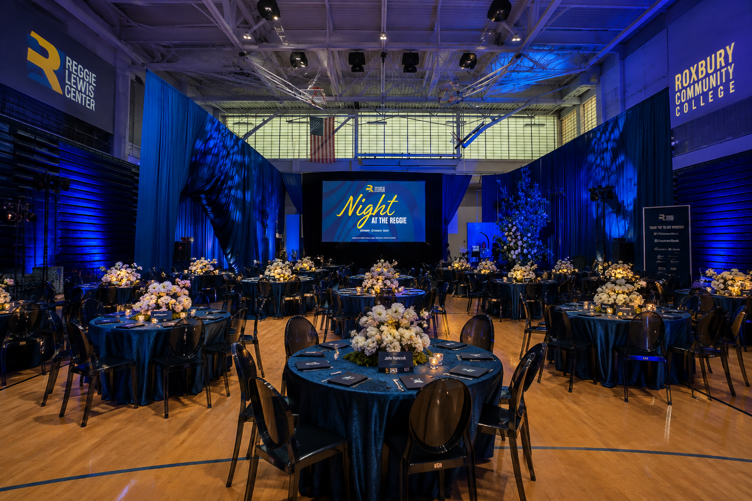
The strongest event graphics don't feel as though they've simply been dropped into a room.
They respond to it.
A historic venue might inspire illustration or typography.
A modern space may call for oversized graphics and cleaner forms.
A destination can introduce local architecture, landscapes, plants, food or cultural details.
Sometimes the environment gives us the identity before we've designed anything at all.
Not Everything Needs the Logo
This might be one of the biggest misconceptions about event branding.
Branding does not mean branding everything.
If the logo appears on the invitation, welcome sign, seating chart, menu, bar, cocktail napkin, dance floor, photo backdrop and favor, eventually it stops feeling intentional.
It starts feeling sponsored.
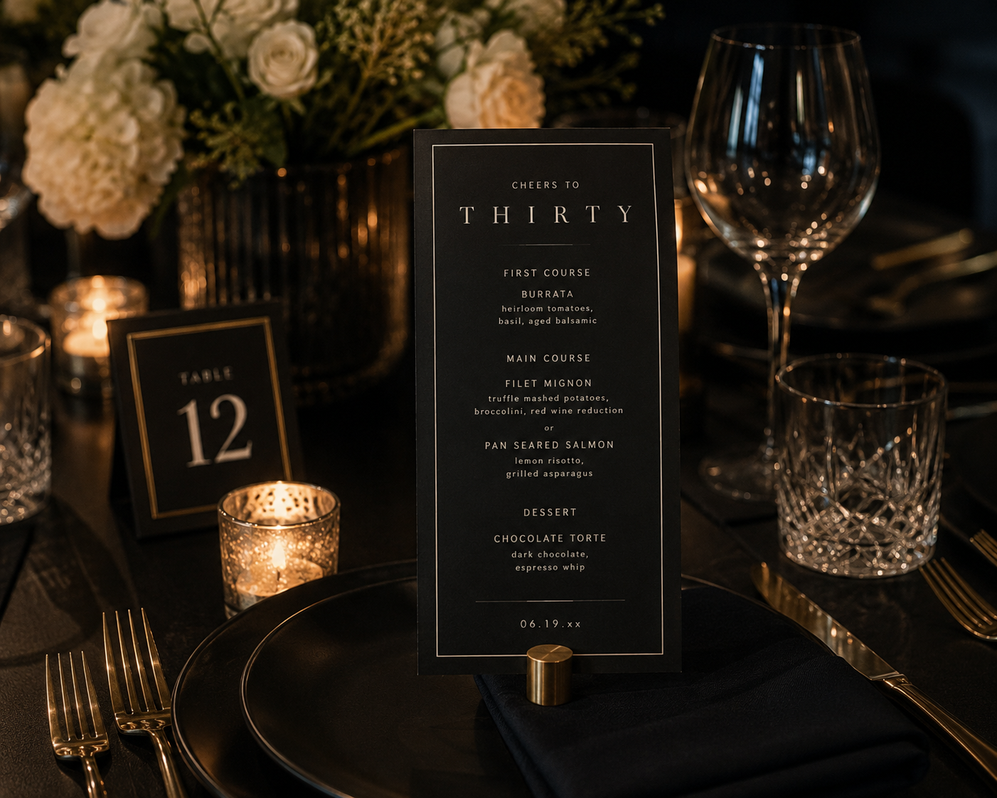
A strong identity gives us more tools than a logo.
We can use a color.
A typeface.
A crop of an illustration.
One tiny icon.
A pattern.
A particular shape.
Sometimes the most sophisticated application of an event identity doesn't contain the event logo at all.
You simply recognize it.
Every Surface Is a Possibility. Not a Requirement.
Once you start thinking environmentally, almost anything can become part of the visual experience.
Bars can be wrapped.
Dance floors can carry graphics.
Walls can become installations.
Menus can become objects.
Seating charts can become interactive displays.
Stages can become enormous pieces of graphic design.
Even functional elements like directional signage can contribute to the visual story.
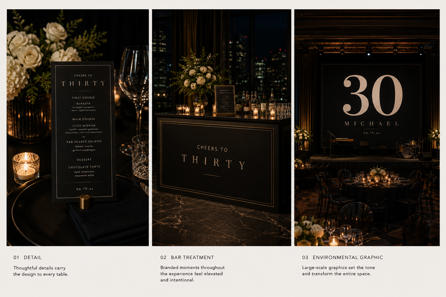
But possibility shouldn't become obligation.
The question isn't, Where else can we put the design?
It's, Where would design actually make this experience better?
Sometimes the answer is an enormous installation.
Sometimes it's a beautifully designed little sign telling someone where to go.
Both matter.
Event Branding Isn't Just Decoration
This is where the word experience becomes important.
Some event graphics are decorative.
Others actually help guests understand the event.
A welcome sign confirms they've arrived.
Directional signage tells them where to go.
A seating display helps them find their place.
A menu tells them what they're about to eat.
A schedule explains what's happening next.
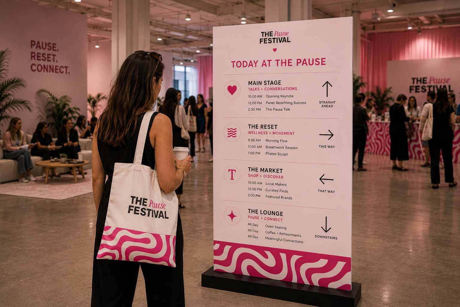
When those functional pieces are thoughtfully designed, they can do two jobs at once.
They make the event easier to navigate.
And they make the environment feel more considered.
That's why I don't really separate function from aesthetics when I'm designing an event.
The best pieces usually do both.
Weddings Aren't the Only Events With Identities
Weddings make event branding easy to understand because there are so many visual touchpoints.
But the same thinking applies far beyond weddings.
A milestone birthday can have its own visual world.
A baby shower can begin with a custom illustration and expand into signage and environmental graphics.
A corporate gathering can feel warm, experiential and human rather than covered in logos.
A hospitality event might borrow from the visual identity of the space itself.
A festival can use graphics to move people through an entire venue while creating moments they want to photograph along the way.

The scale changes.
The audience changes.
The tone changes.
The principle doesn't.
We're creating a visual system flexible enough to move through an experience.
The Details Guests Remember Aren't Always the Biggest Ones
Interestingly, the biggest graphic at an event isn't necessarily the one guests remember.
Sometimes it's the menu they took home.
The funny line they saw at the bar.
Their name beautifully printed on something.
An illustration they recognized from the invitation.
The unexpected little sign that made them laugh.
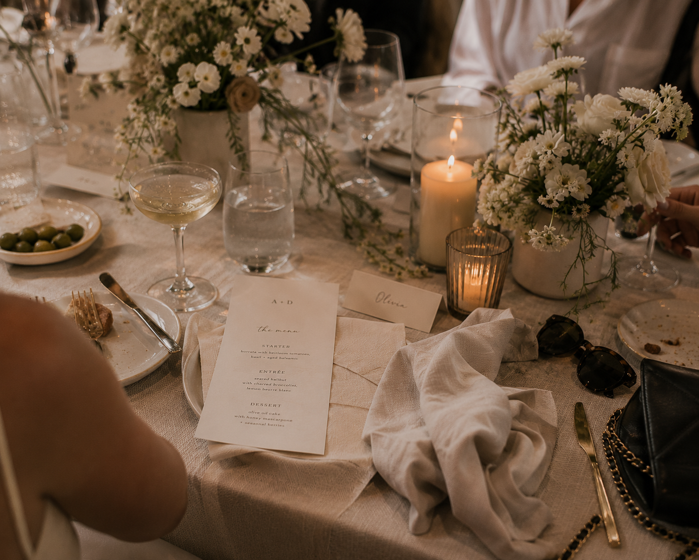
These moments are why I think personality matters so much in event branding.
Perfectly coordinated isn't enough.
The design should belong specifically to this event.
From Invitation to Environment
I think that's ultimately the easiest way to understand event branding.
It isn't about designing more stuff.
It's about taking an idea and allowing it to grow.
An invitation becomes an introduction.
A color becomes an atmosphere.
An illustration becomes part of a room.
Typography becomes wayfinding.
A pattern becomes architecture.
And individual pieces that might otherwise have felt unrelated begin to tell one visual story.
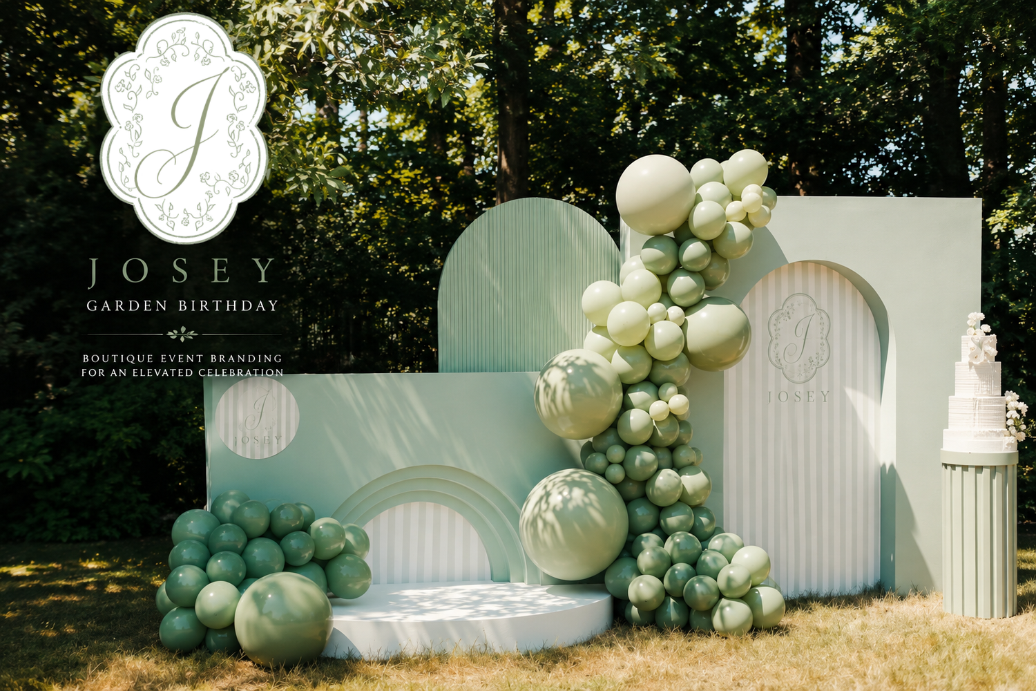
That's when design moves beyond something guests simply look at.
It becomes part of where they are.
And that is where an event identity becomes an environment.
IYHTVDesigns creates custom event branding, illustration, stationery and environmental graphics for weddings, celebrations and experiences, developing visual identities that can move from the smallest printed detail to the spaces guests experience.
Beyond the Invitation: How Wedding Stationery Became Part of the Guest Experience
The Invitation Is Only the Beginning
For a long time, wedding stationery had a fairly straightforward job.
The invitation told guests where and when to arrive. The place card told them where to sit. The menu told them what they were eating. The seating chart helped everyone find their table.
Each piece had a purpose, and it still does.
But somewhere along the way, wedding stationery became something more.
Today's most interesting weddings aren't being designed as a collection of separate things. The invitation, flowers, fashion, cake, signage, tablescape and even the smallest guest details are increasingly connected by a visual language that begins long before the wedding day.
The invitation is no longer the finished product.
It's the introduction.
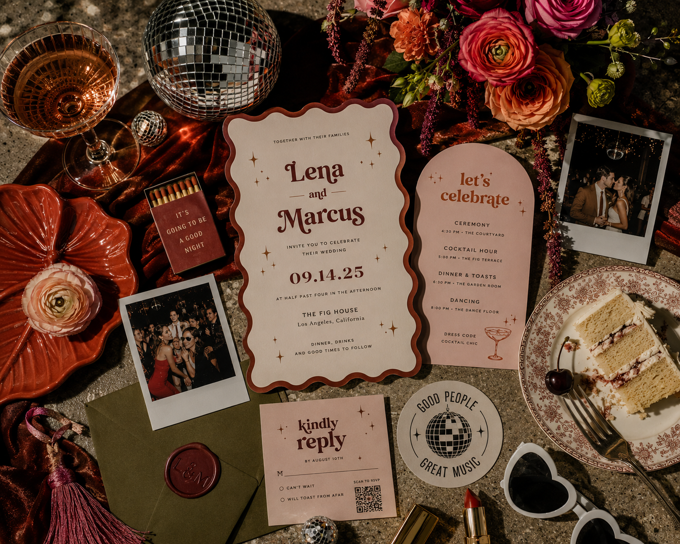
From Stationery Suite to Visual Identity
Traditionally, wedding stationery was often designed as a matching suite.
The invitation had a floral motif, so the RSVP card had the same flowers. Then the menu had the flowers. The place card had the flowers. Eventually, the flowers appeared on everything.
But creating a visual identity is different from making everything match.
A strong wedding identity gives you a collection of visual ingredients to work with: typography, color, illustration, pattern, shape, texture and perhaps a few recurring motifs.
Then those ingredients can be interpreted differently throughout the celebration.
The illustration that dominates an invitation might appear only as a tiny detail on a menu. A pattern hidden inside an envelope might eventually cover an entire bar. A custom crest could appear formally on the invitation and later become something playful on a cocktail napkin.
Nothing has to look identical.
It simply has to feel like it belongs to the same world.
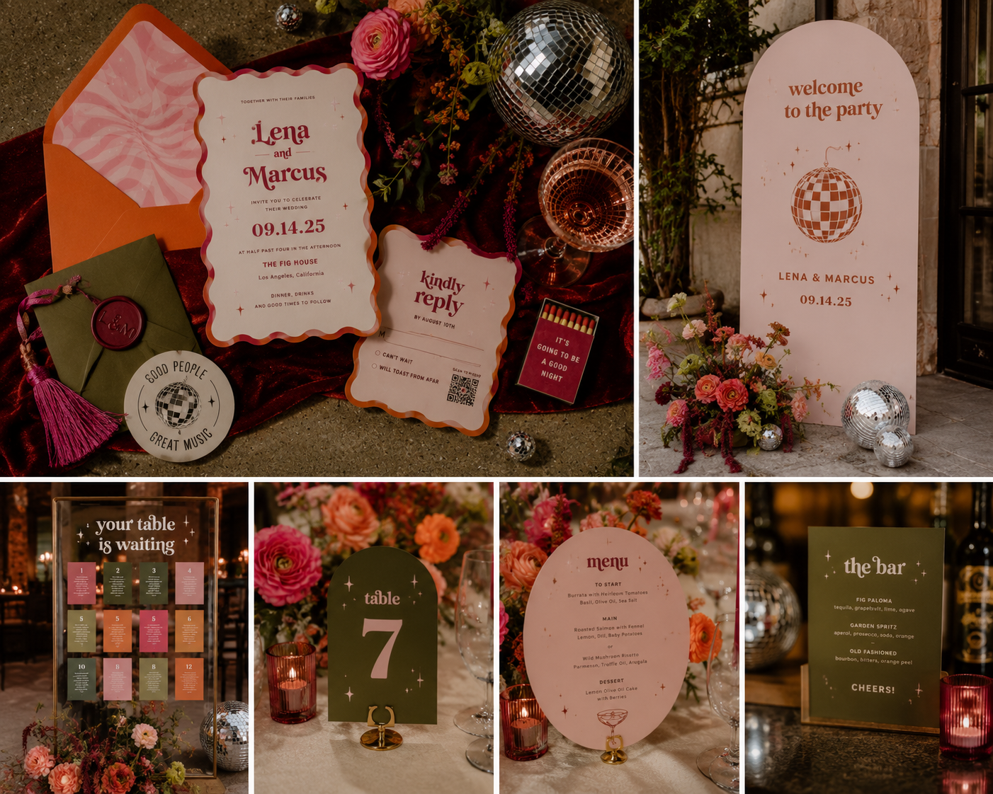
When Paper Became Part of the Room
This is where the meaning of "wedding stationery" starts getting a little blurry.
A seating chart can now be an installation. A bar menu can be printed on a mirror. Escort cards might hang from a wall, sit inside fruit, attach to champagne glasses or become part of a floral display.
Something that began as a five-by-seven-inch invitation can eventually become six feet tall.
And that's an interesting shift.
Stationery isn't necessarily something guests simply read anymore. It's becoming part of the physical environment they're walking through.
A graphic introduced months earlier on an invitation might suddenly appear behind the bar. A color used sparingly in the stationery can dominate a seating installation. Typography becomes signage. Illustration becomes decor.
The graphic identity has escaped the page.

The Table Is Where Guests Actually Touch the Design
Once guests sit down, the experience becomes much more tactile.
They pick up the menu. They find their name. They turn over a place card. They read a little note. They notice the table number sitting among the flowers.
This is where stationery stops being something guests looked at months ago and becomes something they're physically interacting with.
And menus in particular have become much more interesting.
They don't have to be rectangular pieces of cardstock that resemble miniature invitations anymore. They can be circles, records, folded pieces, die-cut shapes or objects integrated directly into the tablescape.
The menu still has a job to do.
It just gets to have a personality while doing it.
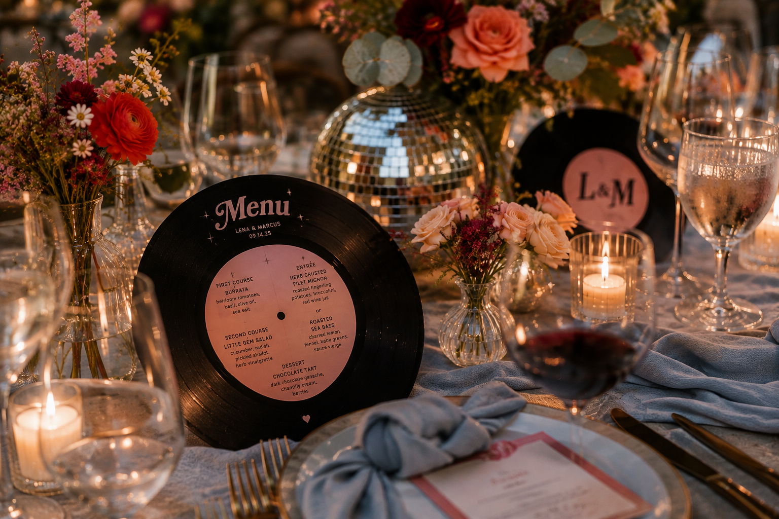
Everything Is Starting to Talk to Everything Else
This might be the part of current wedding design that I find most interesting.
The boundaries between categories are disappearing.
Fashion is influencing cake design. Interior design is influencing tablescapes. Architecture is becoming illustration. Florals are becoming patterns. A vintage object can inspire an entire graphic direction.
One trend I'm particularly fascinated by for 2027 is wedding cakes borrowing details directly from bridal fashion.
Lace becomes piping.
Pearls become confectionery details.
Fabric draping becomes icing.
Bows, ruffles and embroidery move from the dress to the cake.
But there's no reason that conversation has to stop there.
The scallop of a neckline could inspire the edge of a menu. Lace could become a blind embossed detail on an invitation. A bow could become a tiny illustration on a cocktail napkin.
The strongest weddings aren't necessarily built around a "theme."
Sometimes they're built around a collection of ideas that keep talking to one another.
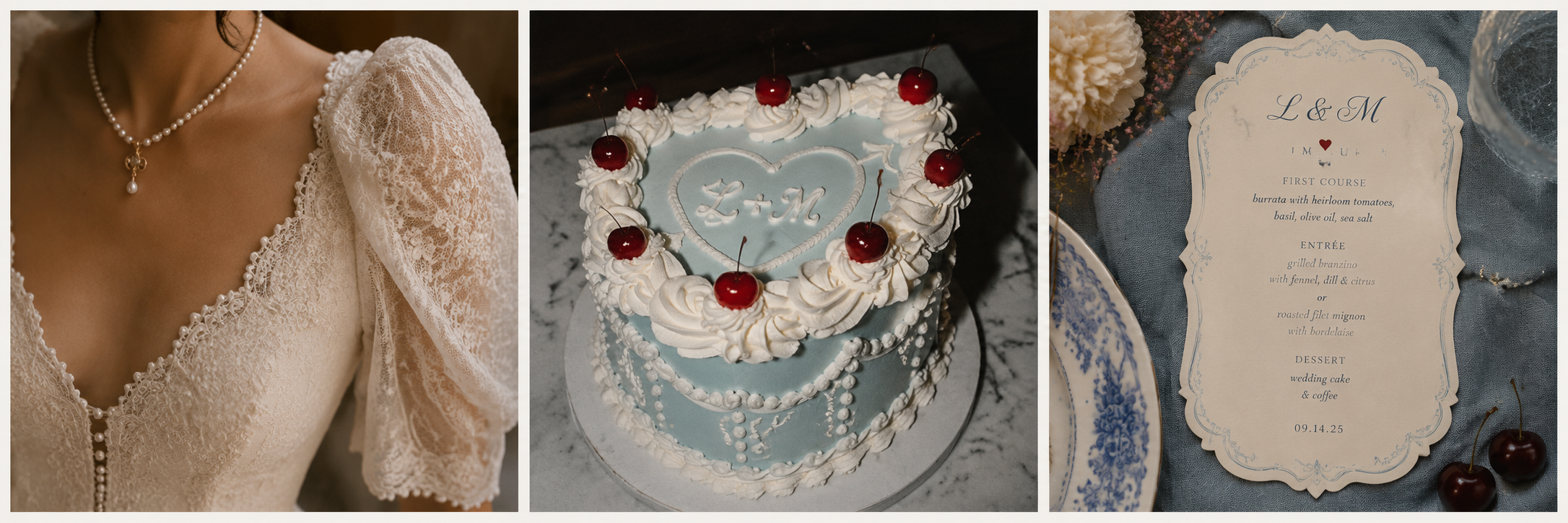
Color Doesn't Have to Behave
Wedding palettes used to feel very prescribed.
Choose three colors. Apply those three colors throughout the wedding. Make sure everything coordinates.
But color becomes much more interesting when different colors are allowed to play different roles.
A palette I recently came across for winter pairs Redwood, Powder Blue and Cloud Dancer.
It's unexpected enough to feel fresh while still making perfect sense for the season.
Cloud Dancer creates the quiet foundation. Powder Blue brings in that icy winter softness. Redwood adds depth and warmth.
But the interesting part isn't simply putting all three colors on an invitation.
Maybe the stationery is predominantly Cloud Dancer.
Powder Blue appears on the cake and bridesmaid dresses.
Redwood comes through in florals, typography, ribbon or tiny details.
The colors don't need equal billing.
They just need to belong to the same conversation.

Personality Is Replacing Perfection
For years, luxury wedding imagery was incredibly polished.
Perfect stationery flat lays. Perfect place settings. Perfectly arranged details photographed before anyone touched them.
Those photographs are still beautiful.
But there's something much more interesting happening alongside them.
A champagne bottle left on the table. Half-eaten cake. Sunglasses abandoned beside a place setting. Photobooth strips scattered among the flowers. A guestbook full of handwriting.
Evidence that people were actually there.
And wedding design is becoming more comfortable with that personality too.
A cheeky phrase on a bar sign. An old telephone used as an audio guestbook. A menu designed like a record. Matchbooks, postcards, illustrations, photographs and tiny inside jokes.
Personalization doesn't necessarily mean putting the couple's initials on everything.
Sometimes it means creating a wedding that couldn't possibly belong to anyone else.
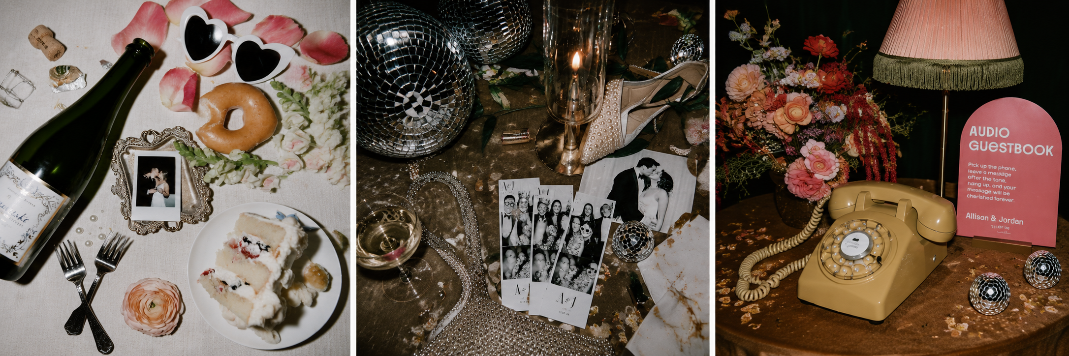
Guests Notice More Than We Think
Most guests aren't going to consciously analyze any of this.
They're probably not going to compliment the consistent typographic hierarchy across the event.
At least I hope they're not.
But they notice how a wedding feels.
They notice something interesting while they're looking for their seat.
They pick up an unusual menu.
They take a picture in front of the seating display.
They leave a message on an old telephone.
They recognize the illustration from the invitation they received months earlier.
They tuck a place card into their purse because it's too pretty to leave behind.
Individually, these are tiny moments.
Together, they're part of the experience.
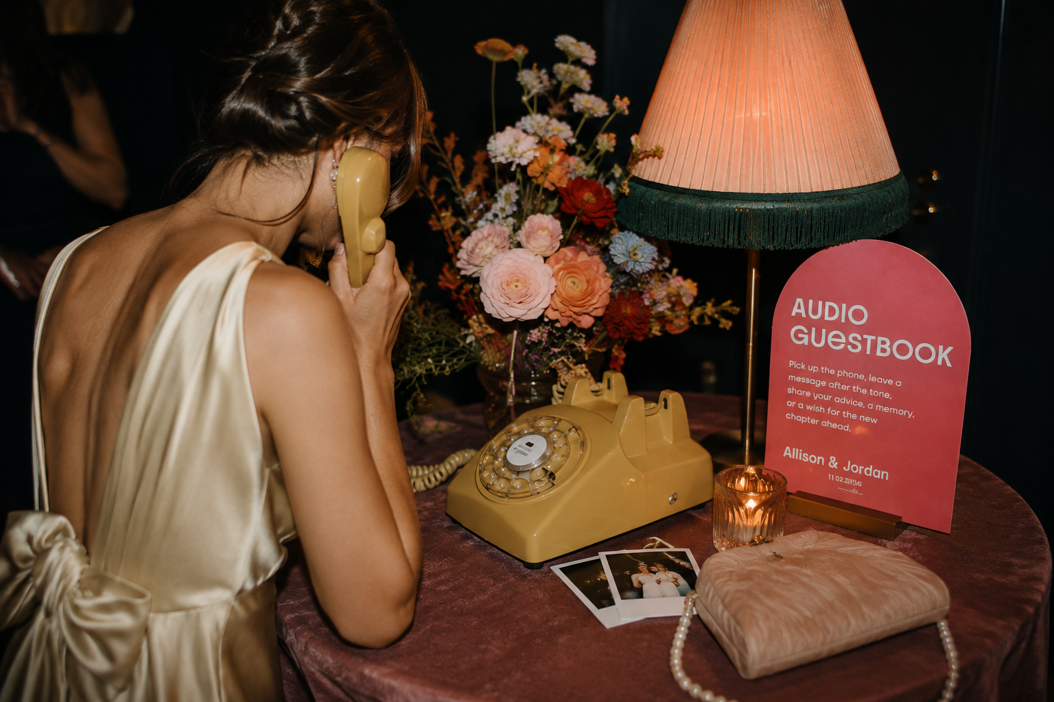
Cohesion Doesn't Mean More
There is one important caveat to all of this.
Just because we can put a custom crest on the invitation, menu, napkin, bar, dance floor, welcome sign, seating chart and favor doesn't mean we should.
Good visual identities need quieter moments.
If the seating installation is dramatic, maybe the place cards are simple.
If the invitation is covered in illustration, perhaps the menu is mostly typography.
If there's a bold pattern behind the bar, the cocktail napkin might need nothing more than one tiny symbol.
The goal isn't to make guests notice how many things were designed.
The goal is to make the entire celebration feel considered.
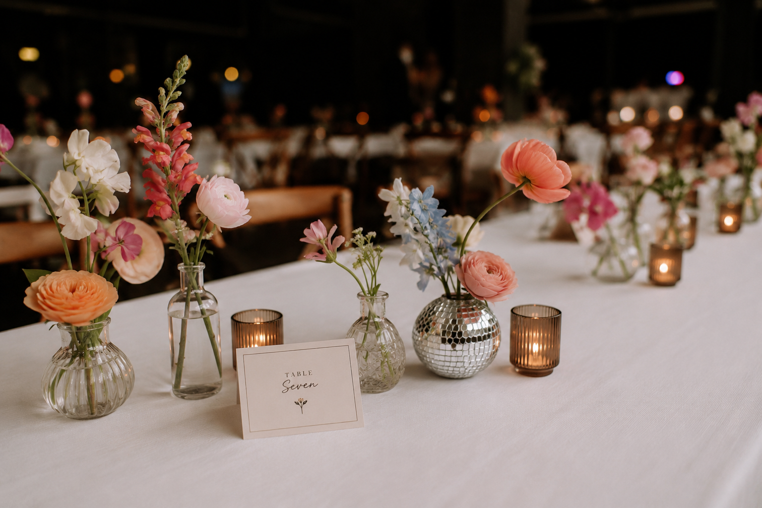
Beyond the Invitation
Maybe "wedding stationery" isn't even a big enough phrase anymore.
Because we're designing things guests read, but we're also designing things they hold, discover, photograph, interact with and sometimes take home.
The invitation still matters.
In many ways, it matters more than ever.
It's simply no longer the entire story.
It's the first glimpse.
A color introduced there can eventually appear on the cake. An illustration can become an installation. A detail from the bride's dress can inspire a menu. A map can help guests experience a destination. A tiny graphic can reappear somewhere completely unexpected.
And slowly, those individual pieces build something much larger.
Not a perfectly matching wedding.
A wedding that feels like it belongs to the people at the center of it.

2026 Wedding Colour Trends: Warm Minimalism Takes Centre Stage
Wedding trends come and go, but every so often a colour palette emerges that feels less like a passing fashion and more like a timeless design philosophy.
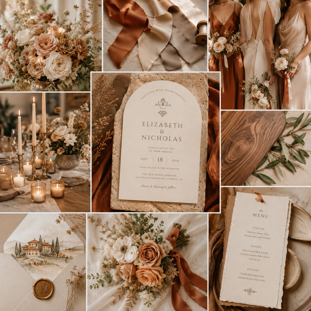
For 2026, one of the most elegant trends embraces exactly that approach: soft ivory, warm neutrals, and rich copper-inspired earth tones. Rather than dramatic contrasts or bold statement colours, couples are gravitating toward palettes that feel calm, refined, and effortlessly sophisticated.
The result is a wedding aesthetic that photographs beautifully, complements nearly every venue, and feels just as appropriate for an intimate garden ceremony as it does for a grand ballroom celebration.
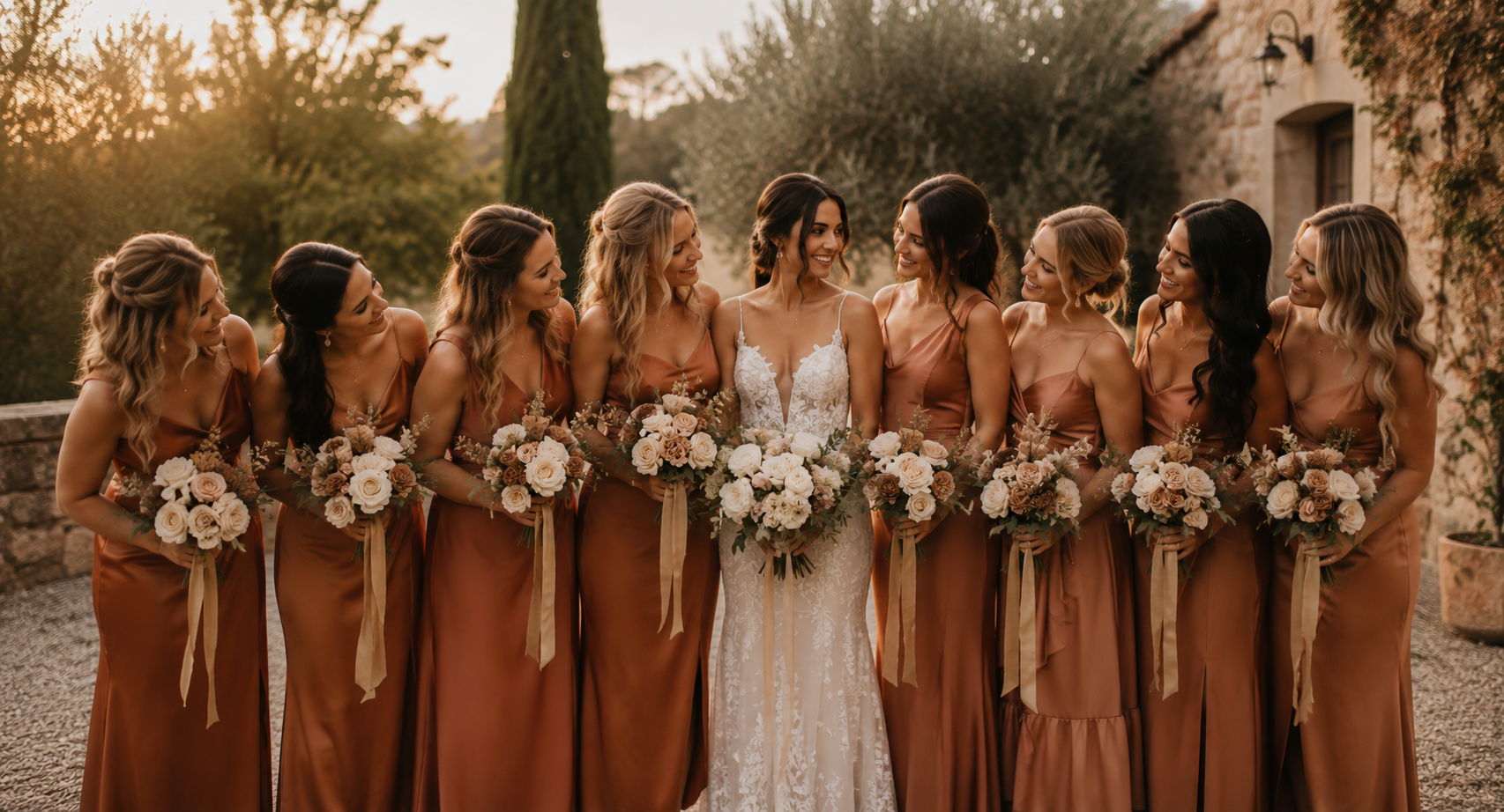
The Colours Defining 2026
One of the standout palettes for Fall 2026 combines three beautifully balanced shades:
Cloud Dancer
A soft, creamy ivory that replaces stark white with something gentler and more inviting.
Hazelnut
A warm neutral beige that brings depth and softness while remaining wonderfully versatile.
Matte Copper
A rich earthy copper that introduces warmth, elegance, and a subtle hint of autumn without feeling overly seasonal.
Together, these colours create an aesthetic that feels fresh, modern, organic, and luxurious all at once.
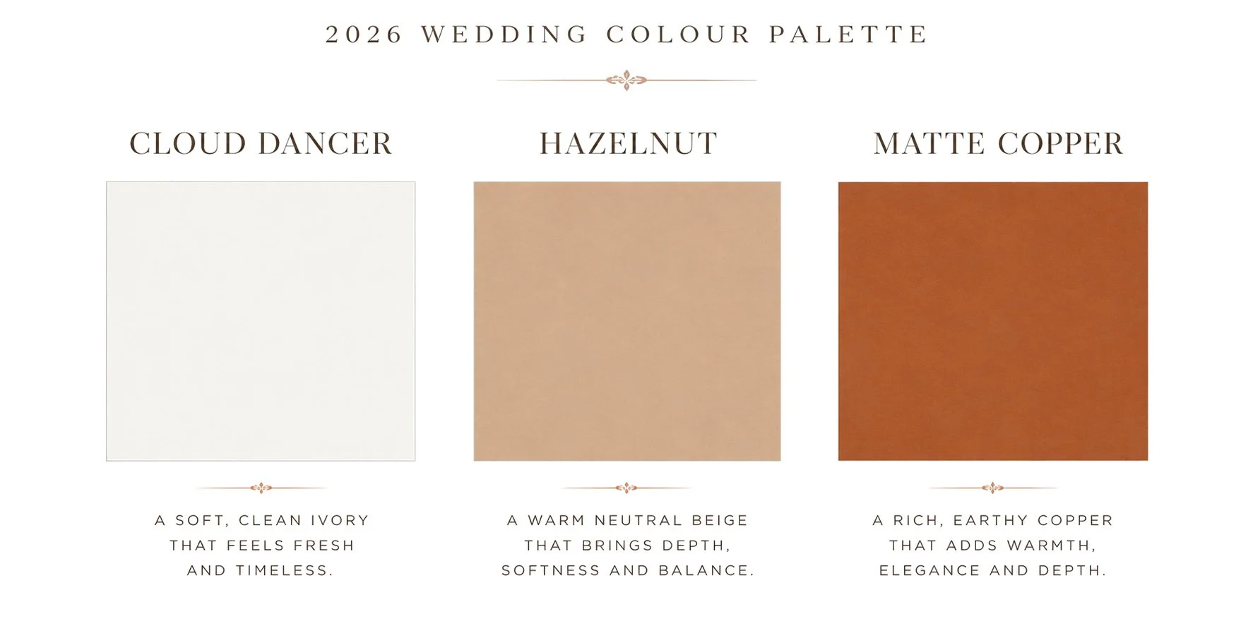
Warm. Minimal. Earthy.
Soft ivory establishes a clean, luminous foundation, while warm hazelnut neutrals and rich matte copper introduce depth, warmth, and understated sophistication. Inspired by natural textures and timeless materials, this palette balances modern simplicity with effortless elegance, creating a refined aesthetic that feels both contemporary and enduring.
Why Warm Neutral Weddings Feel So Timeless
One of the reasons this palette is becoming so popular is because it isn't built around chasing trends.
Instead, it draws inspiration from natural materials and colours that have always existed around us.
Think linen tablecloths.
Natural stone.
Handmade ceramics.
Champagne silk ribbon.
Warm candlelight.
Aged brass.
Soft white florals.
Wood grain.
These elements create an atmosphere that feels welcoming rather than overly styled.
Years from now, wedding photographs featuring these tones are likely to feel every bit as elegant as they do today.
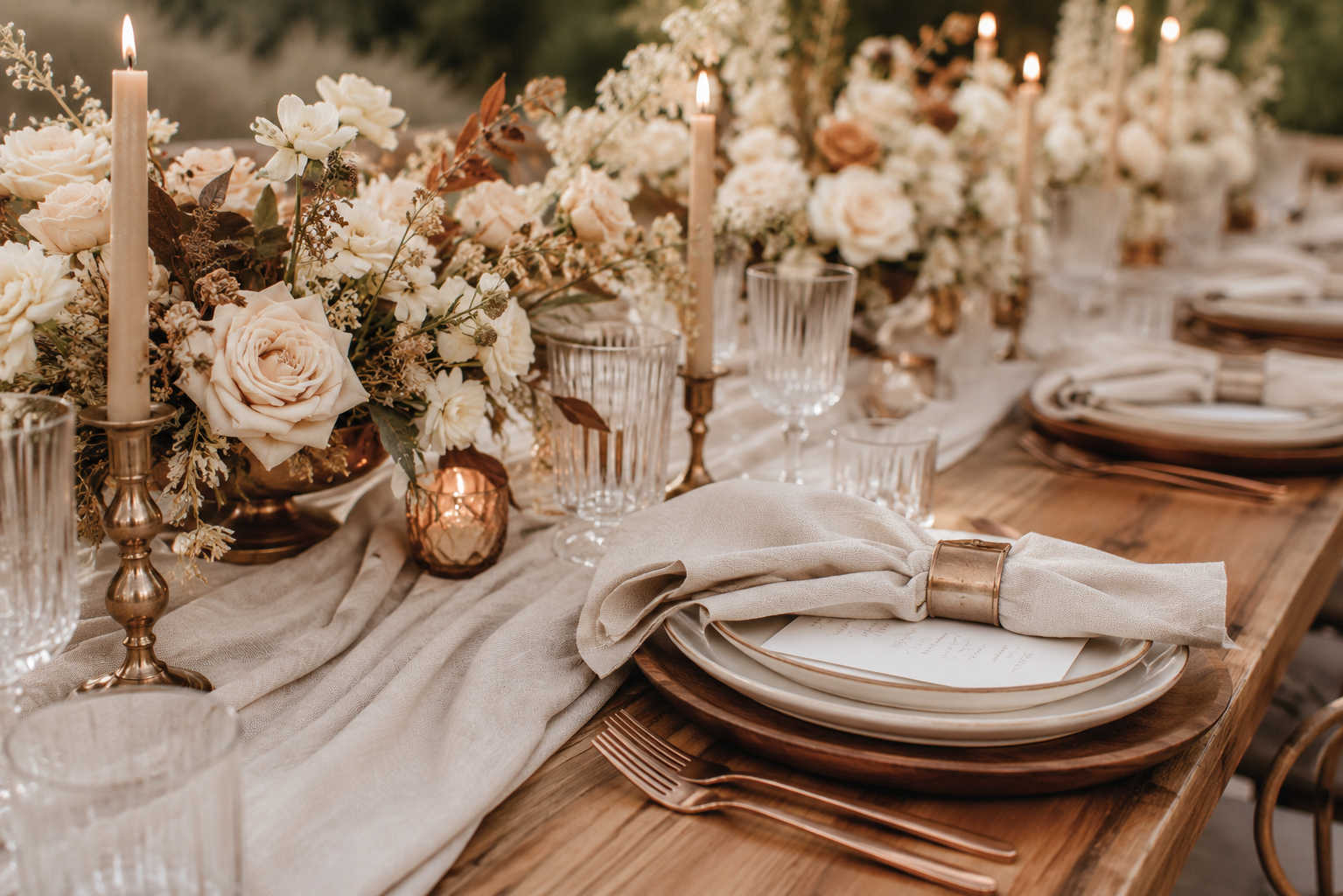
Why This Colour Palette Photographs So Beautifully
As both a designer and photographer, one of my favourite things about this palette is how incredibly well it photographs.
Warm neutrals reflect natural light more softly than bright whites while avoiding the harsh contrast that darker palettes can sometimes create.
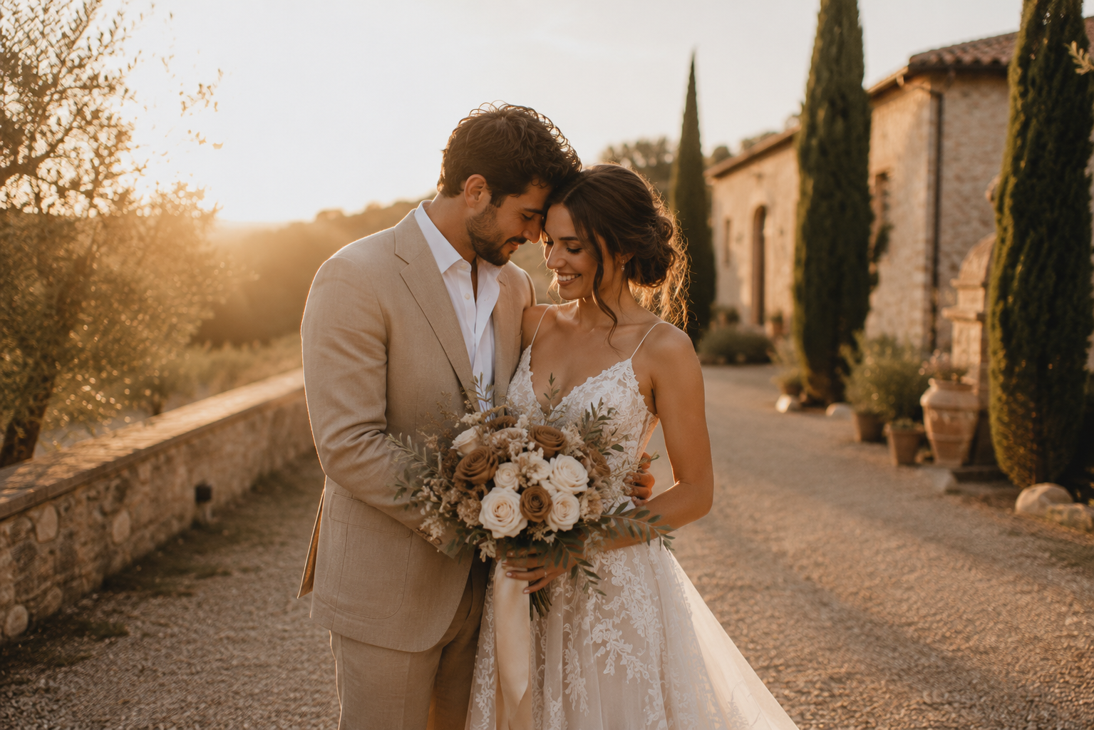
They also complement virtually every skin tone and work beautifully during golden hour, where warm sunlight enhances the copper and beige tones instead of competing with them.
Whether your wedding is held in a vineyard, a mountain lodge, a coastal venue, or an elegant ballroom, these colours adapt effortlessly to the surrounding environment.
That versatility is one of the reasons warm minimalism continues to gain popularity with modern couples.
Bringing the Trend Into Your Wedding Stationery
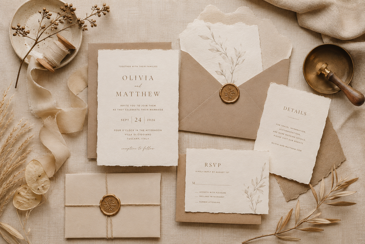
While flowers and bridesmaid dresses often receive the most attention, your wedding stationery is one of the very first opportunities to establish your wedding's overall aesthetic.
Invitations introduce guests to the style of your celebration long before they arrive.
Choosing a palette built around warm ivory, natural neutrals, and copper-inspired accents immediately communicates elegance without feeling overly formal.
Minimal typography, generous white space, and thoughtful details allow these colours to shine without overwhelming the design.
The result is stationery that feels elevated, luxurious, and wonderfully timeless.
A Design That Naturally Fits the 2026 Trend
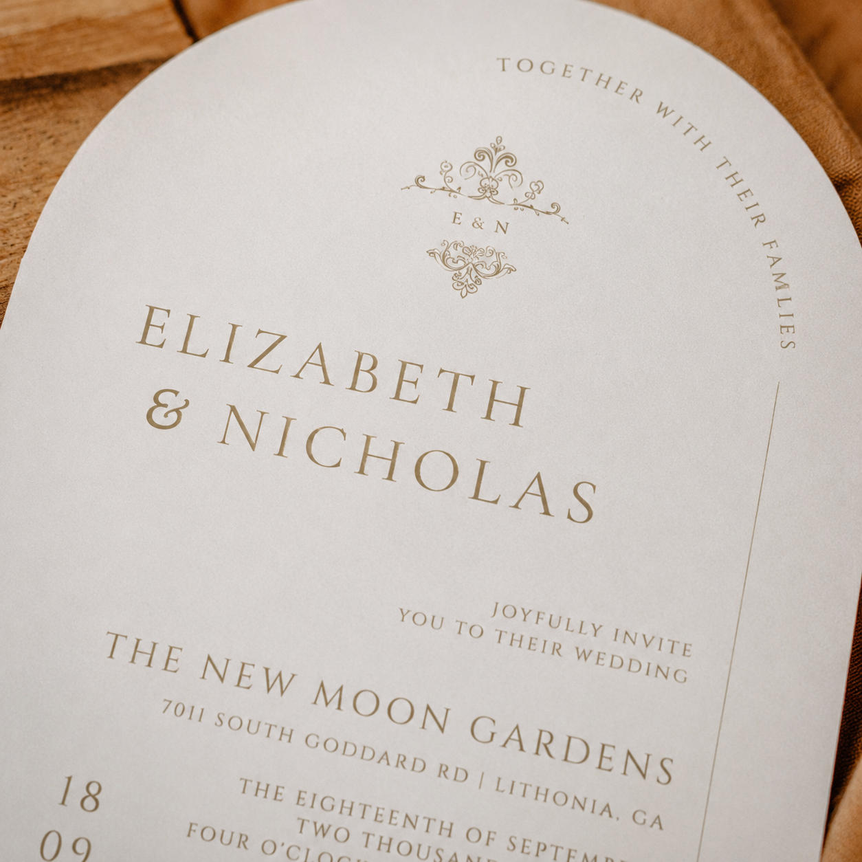
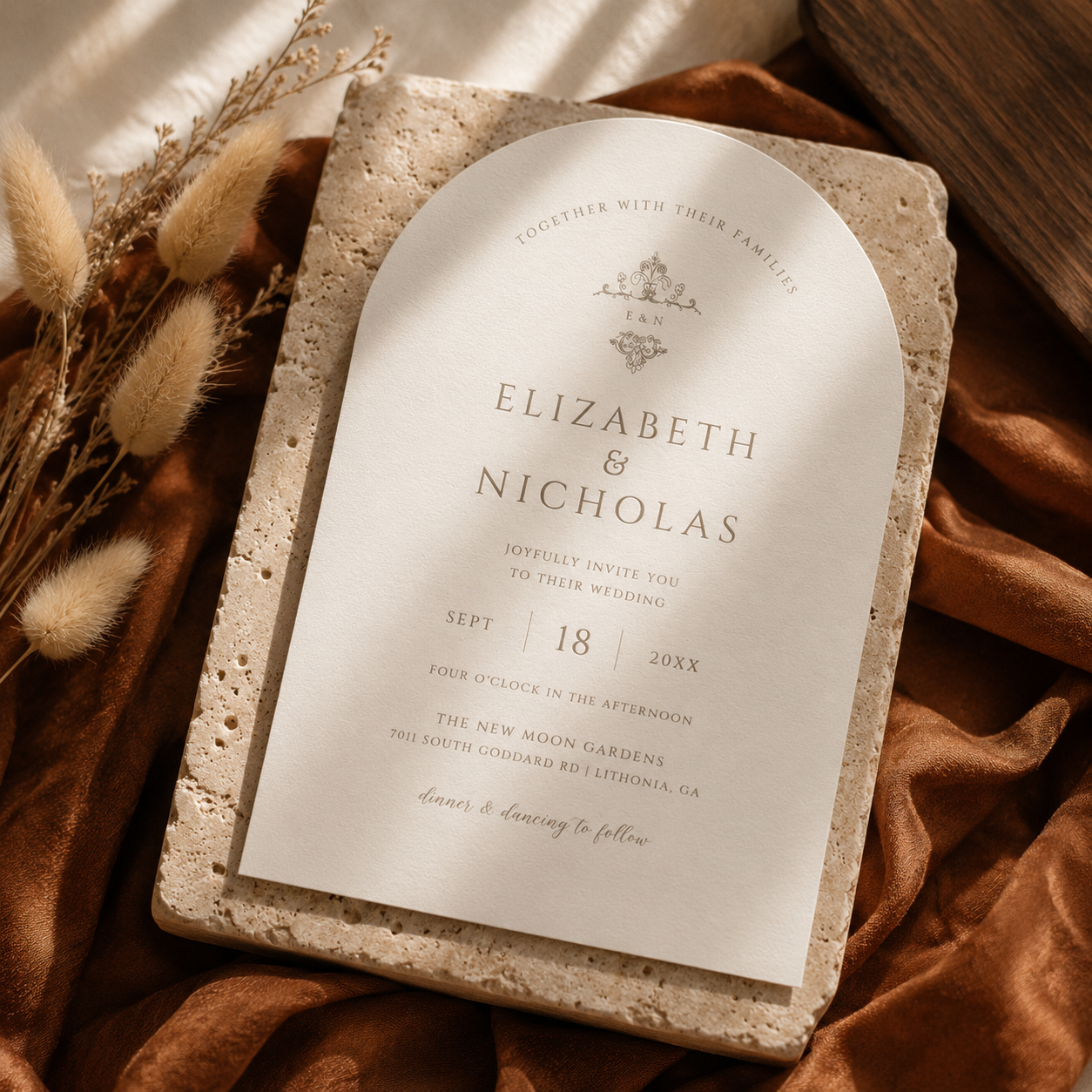
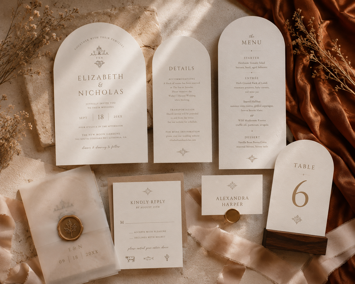
One of my favourite examples of this aesthetic is my Vintage Monogram Wedding Invitation Collection.
Although this design wasn't originally created specifically for the 2026 colour forecasts, it naturally embodies many of the same characteristics that are now defining this year's most elegant weddings.
The soft ivory background echoes the gentle warmth of Cloud Dancer.
The understated typography and neutral detailing reflect the softness of Hazelnut.
When styled with warm linens, natural wood, and copper-toned fabrics, the invitation effortlessly embraces the richness of Matte Copper while maintaining a clean, editorial appearance.
It's a wonderful reminder that truly timeless design often aligns with future trends because it is built upon enduring principles rather than temporary fashions.

Pairing Ideas for a Warm Minimalist Wedding
One of the greatest strengths of this palette is how easily it coordinates with other wedding details.
Some beautiful pairings include:
White garden roses
Toffee roses
Champagne orchids
Natural greenery
Travertine place settings
Walnut wood chargers
Ivory taper candles
Champagne silk ribbon
Handmade paper
Warm brass candle holders
Copper-toned table accents
Bridesmaid dresses in cinnamon, caramel, mocha, or terracotta
Each layer adds warmth without competing for attention, creating a celebration that feels cohesive from beginning to end.
Beyond Autumn
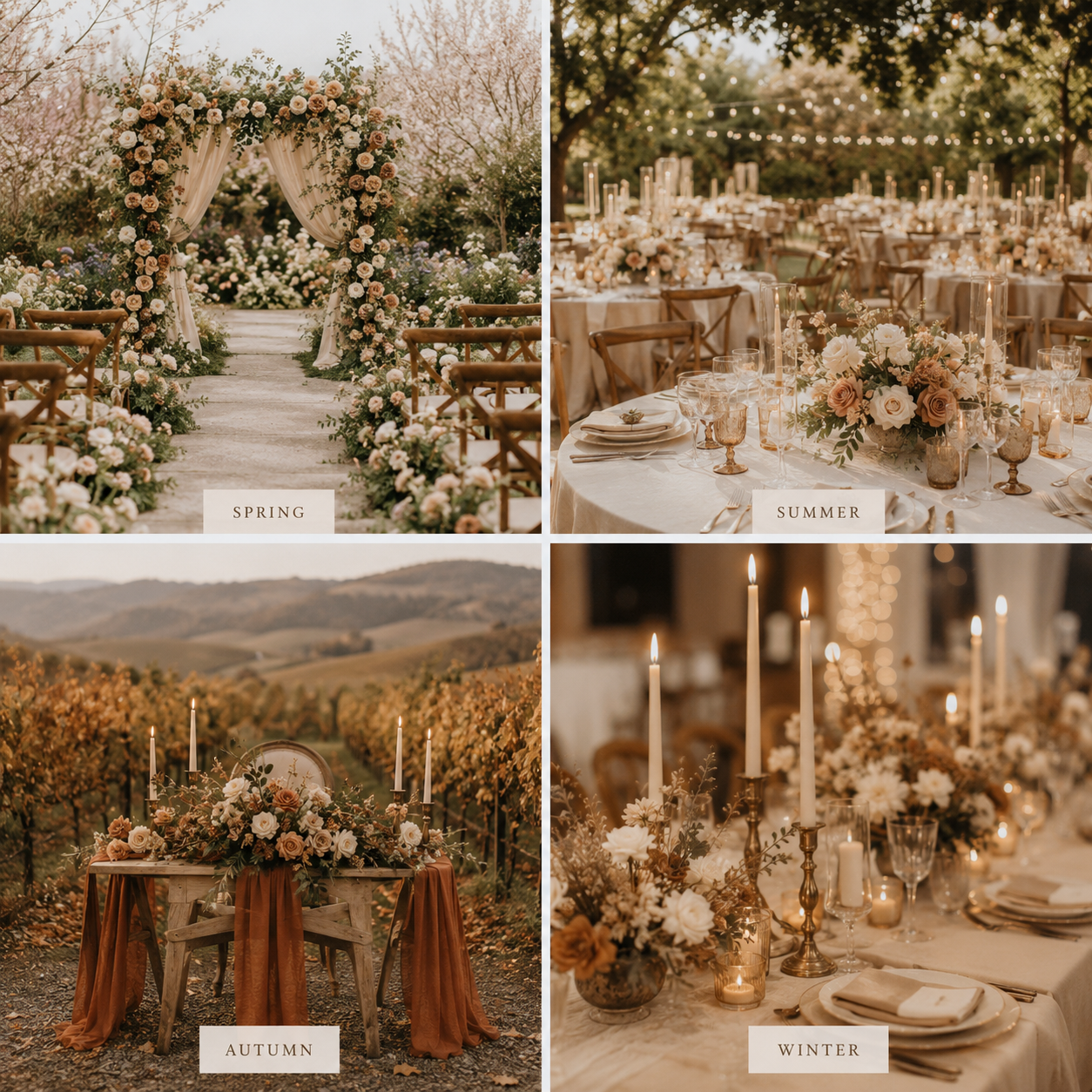
Although these colours are often associated with autumn weddings, their versatility extends far beyond a single season.
During spring, they pair beautifully with fresh white florals and soft greenery.
In summer, they feel airy and elegant against outdoor garden venues.
For autumn, they naturally complement changing leaves and candlelit receptions.
Even winter celebrations benefit from the warmth these earthy neutrals bring to cooler surroundings.
Rather than feeling tied to a specific month, this palette adapts effortlessly throughout the year.
Designing for Trends Without Chasing Them
Wedding trends can provide wonderful inspiration, but the most meaningful designs are those that still feel authentic years after the celebration has ended.
Rather than following every passing colour forecast, I always strive to create stationery that balances current inspiration with timeless design principles.
When those two worlds overlap, as they do with this beautiful warm minimalist palette, the result is something that feels both current and enduring.
That's exactly the kind of wedding design I love creating.
Planning a Warm Minimalist Wedding?
If you're dreaming of a wedding filled with soft neutrals, natural textures, and understated elegance, this colour palette offers the perfect starting point.
Whether you're planning a vineyard celebration, an intimate garden ceremony, or a sophisticated destination wedding, warm minimalist stationery creates a timeless first impression that guests will remember long after the day has ended.
Browse the Vintage Monogram Wedding Collection to see how this elegant palette can carry through your invitations, save the dates, menus, signage, and day-of stationery for a beautifully cohesive celebration.
THE RISE OF AI-GENERATED DESIGN
THE RISE OF AI-GENERATED DESIGN
And Why Intentional Design Still Matters
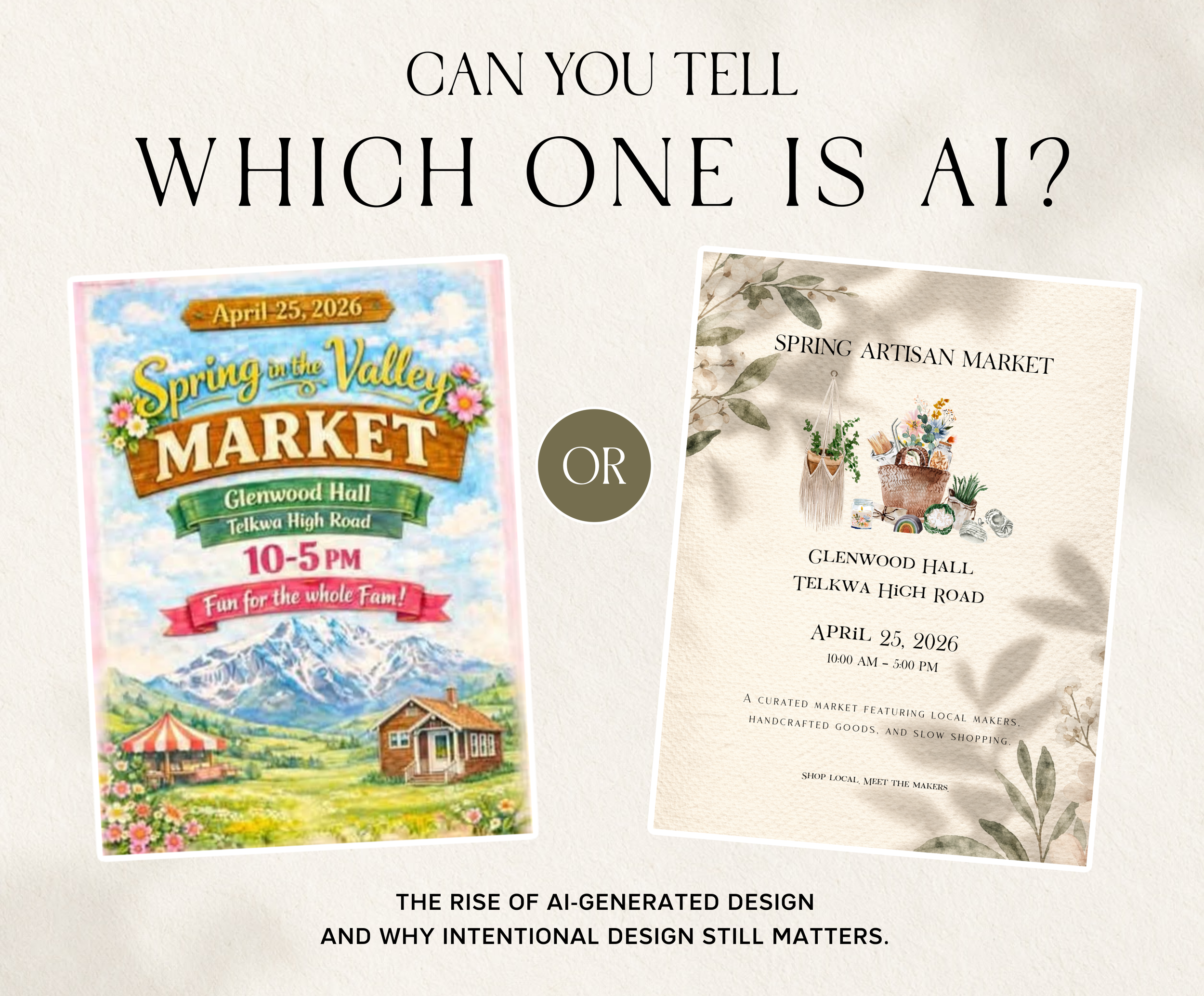
Can you tell which one was designed?
It's an interesting question.
Not because one was created with artificial intelligence and the other wasn't, but because most people instinctively know which one feels more intentional.
Over the past year, social media has become flooded with AI-generated event posters, advertisements, logos, menus, and promotional graphics. If you've spent any time scrolling lately, you've probably noticed the trend. They all seem to share the same visual language: dramatic lighting, decorative typography, oversaturated colours, and every available inch filled with something designed to demand attention.
Ironically, the more AI-generated designs I see, the more they begin to look exactly alike.
Recently I've even noticed something else happening. Designers, tattoo artists, musicians, event organizers, and everyday consumers have started pushing back.
I've seen people openly saying they won't attend events promoted with AI-generated flyers. Others joke that we're living through an "AI flyer pandemic." While those posts are often tongue-in-cheek, they reveal something deeper.
People are craving authenticity again. Not perfection. Not expensive branding. Just something that feels intentional.
Whether you agree with those sentiments or not, I think they point toward something much more interesting.
People aren't rejecting technology.
They're responding to a lack of intention.
And those aren't the same thing.
The Conversation Isn't Really About AI
Before anyone sharpens their pitchforks... No, I don't think AI is the enemy. I understand using it to brainstorm ideas. Organize thoughts. Write rough copy. Explore concepts.
But here's the important distinction.
Please don't mistake the first draft for the finished product.
Think of AI as one tool in a toolbox. It isn't a creative director.
For many, AI has become an incredibly valuable creative assistant. And that's exactly what it is: an assistant. Not a replacement for creative direction, taste, or design.
There's an important distinction between using AI as a tool and asking it to do your creative thinking for you.
Design is a series of decisions.
Take the two posters above.
One immediately grabs your attention with bright colours, decorative banners, multiple typefaces, mountains, flowers, a cabin, a carnival tent, and layer upon layer of visual effects competing for your attention.
The other is considerably quieter.
They're connected in a way you might not expect. The poster on the right wasn't created in a vacuum. It was a redesign after one of the event vendors sent me the AI-generated version on the left and asked if I could create something that felt more intentional.
That experience isn't unique. In fact, it's happened several times this year.
Good design isn't about adding more.
It's about knowing what to leave out.
It's understanding hierarchy, proportion, rhythm, balance, contrast, and restraint. It's deciding what your audience should notice first, second, and third.
Those decisions aren't made by software.
They're made by people.
But faster isn't always better.
I completely understand why so many small businesses are embracing AI. Running a business is expensive. Hiring a designer isn't always realistic, especially when you're just starting out. Sometimes you simply need to get something posted quickly.
I genuinely understand that.
But branding has always been about more than simply filling a blank page.
Every flyer, menu, advertisement, website, or social media post communicates something about your business before anyone reads a single word. When your marketing feels rushed or generic, that becomes part of your brand, whether you intended it or not.
First impressions have always mattered.
AI hasn't changed that.
Here's What Fascinates Me Most
The easier it becomes to generate average-looking graphics, the more valuable thoughtful design becomes.
At first, many people assumed AI would replace designers.
In many ways, I think the opposite is happening.
When everyone has access to the same prompts, the same aesthetics, and the same shortcuts, creativity is no longer about who has the technology.
It's about who has the judgment to use it well.
That's why I don't think AI has made designers less valuable.
I think it's made good designers more valuable.
Because when anyone can create something, the people who know how to create the right thing become even more important.
That's something no prompt can replicate.
Taste.
Restraint.
Experience.
Storytelling.
Those qualities have always separated good designers from everyone else, and if anything, I believe they're becoming even more valuable.
The artisan market wasn't an isolated project.
It's become a pattern.
This year alone, I've been contacted several times by businesses asking me to redesign AI-generated advertisements.
Not because the software failed.
It actually did exactly what they asked.
It produced a flyer.
What it didn't produce was their flyer.
It didn't understand who they were, who they were trying to reach, or how they wanted people to feel when they walked through the door.
Those are conversations.
Those are decisions.
That's design.
The Future Isn't AI or Designers
I don't believe we're choosing between artificial intelligence and human creativity.
The future belongs to people who understand how to use both.
AI is not going away any time soon.
But AI doesn't replace creativity.
AI is remarkably good at accelerating ideas.
Humans are remarkably good at deciding which ideas deserve to exist.
That's a partnership, not a competition.
Technology will continue to evolve, just as it always has. Designers have adapted through desktop publishing, digital photography, Canva, smartphones, and countless other innovations.
AI is simply the next chapter.
But no matter how advanced the tools become, one thing remains true.
People don't connect with software.
They connect with intention.
They remember thoughtful experiences.
They notice craftsmanship.
They trust brands that feel authentic.
The businesses that stand out won't necessarily be the ones using the newest tools.
They'll be the ones using those tools with intention.
Technology changes.
Good design principles don't.
Typography still matters.
Hierarchy still matters.
Brand identity still matters.
Storytelling still matters.
Human creativity still matters.
Because at the end of the day...
As AI makes it easier than ever to create something, it also makes it easier than ever to recognize when someone truly designed it.
Perhaps that's the greatest irony of all.
AI can generate a graphic.
Only people can tell a story worth remembering.
25 Personalized Party Details That Guests Will Actually Remember
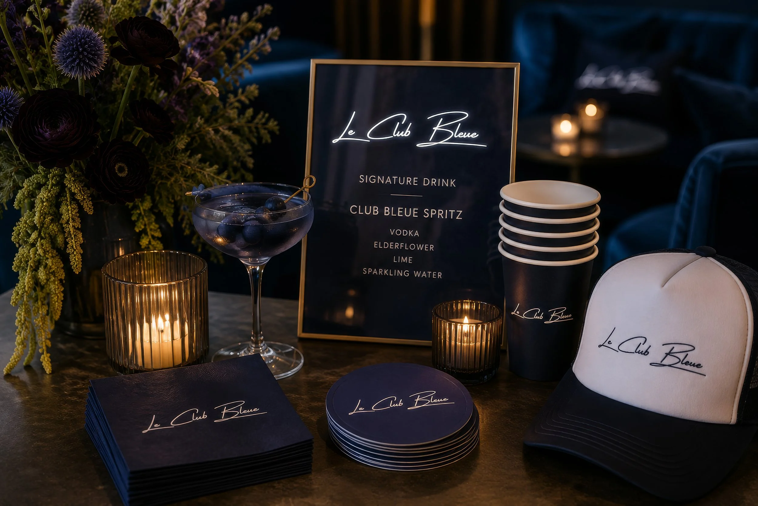
When people think back on a truly memorable celebration, they rarely remember the color of the tablecloth or whether the flowers were peonies or ranunculus.
Instead, they remember how the evening felt.
The welcome they received as they walked in. The signature cocktail they ordered twice. The little details they noticed throughout the night. The personalized touches that made the celebration feel as though it had been created just for that moment and those people.
Those are the details that transform a beautiful party into an unforgettable experience.
Whether you're planning a milestone birthday, bridal shower, baby shower, destination wedding, corporate event, anniversary dinner, or retirement celebration, these are the personalized details that guests genuinely notice and remember.
1. An Invitation That Builds Anticipation
Long before anyone walks through the door, your invitation begins telling the story.
It gives guests their first glimpse of the celebration you've imagined. The colors, typography, illustrations, and overall aesthetic quietly communicate what they can expect.
A thoughtfully designed invitation doesn't simply share the date.
It creates excitement.
2. A Welcome Sign That Sets the Tone
The welcome sign is often the very first thing guests see.
It's the transition between everyday life and the celebration you've carefully planned.
Whether it's elegant, playful, editorial, or full of personality, it instantly tells guests they've arrived somewhere special.
3. A Signature Cocktail Worth Talking About
People always remember a great signature drink.
But what makes it memorable isn't just the recipe.
It's the beautifully framed cocktail sign sitting beside the bar.
A clever drink name.
A simple illustration.
A little personality.
Suddenly ordering a drink becomes part of the experience.
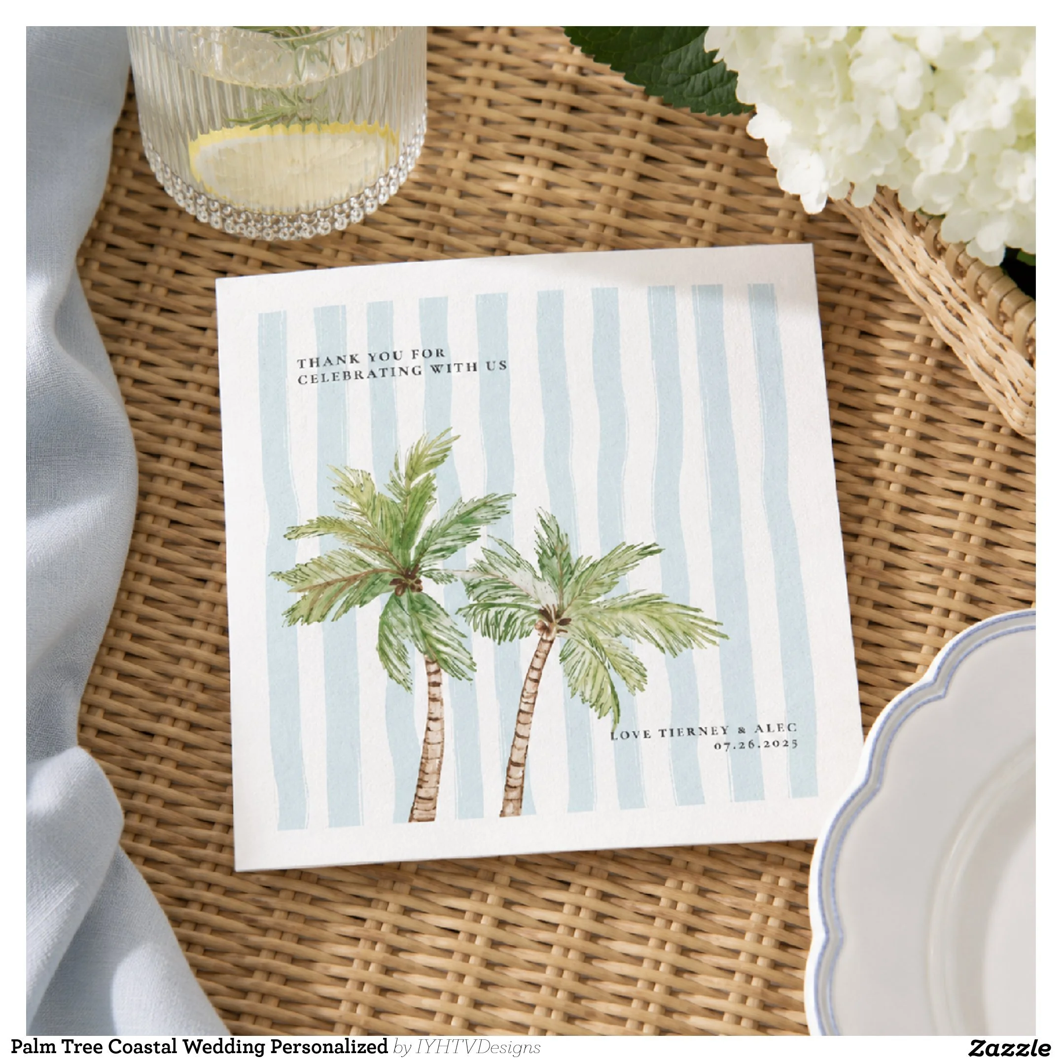
4. Cocktail Napkins Everyone Photographs
Cocktail napkins are one of those tiny details that somehow end up in dozens of photos.
They're in every cheers shot.
Every charcuterie board.
Every cocktail held during golden hour.
It's a small investment that quietly appears throughout the entire event.
5. Personalized Drinkware
Whether you're serving champagne, cocktails, coffee, or sparkling water, customized cups and glasses instantly make everything feel intentional.
Instead of generic drinkware, guests feel like they're enjoying something created specifically for this occasion.
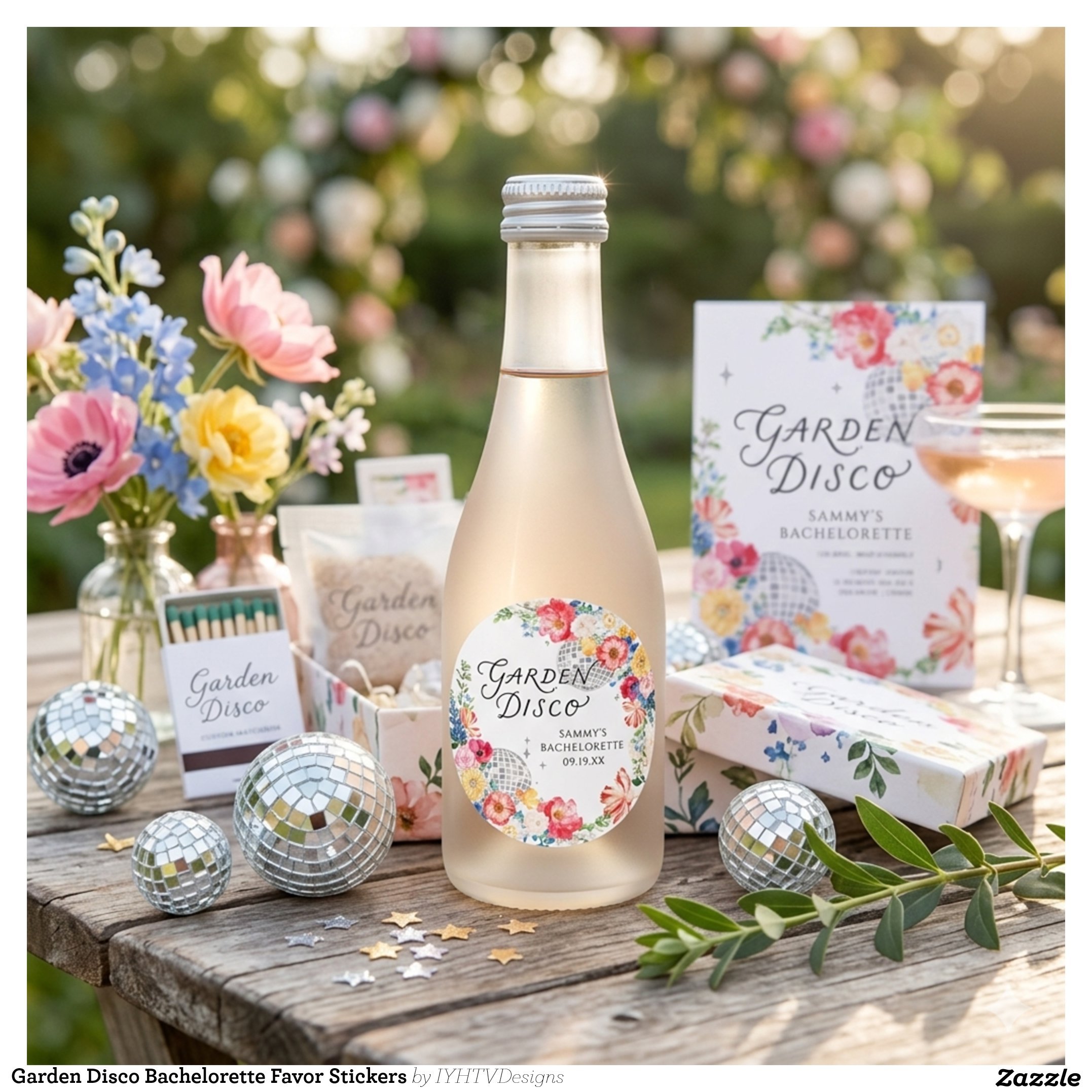
6. Champagne Bottles That Feel Like Keepsakes
Mini champagne bottles, wine labels, or custom beverage labels do something wonderful.
People don't just drink them.
They photograph them.
Many guests even take them home.
It's one of those details that continues reminding people of your celebration long after the party ends.
7. Menus That Become Part of the Décor
Beautiful menus do far more than explain what's being served.
They become another design element on every place setting.
Layered beneath a napkin or tucked beneath cutlery, they add texture, elegance, and another opportunity to carry your event branding throughout the space.
8. Place Cards That Feel Personal
There's something surprisingly meaningful about seeing your own name beautifully displayed at a table.
It tells every guest:
"We planned this with you in mind."
That tiny moment creates an immediate sense of belonging.
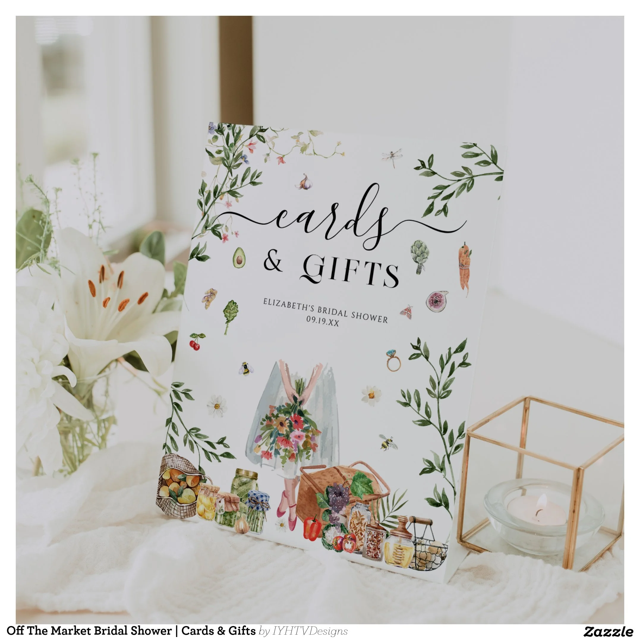
9. Thoughtful Table Signs
Guest book instructions.
Dessert menus.
Memory tables.
Activity signs.
These little pieces quietly guide guests through your celebration while continuing the visual story you've created.
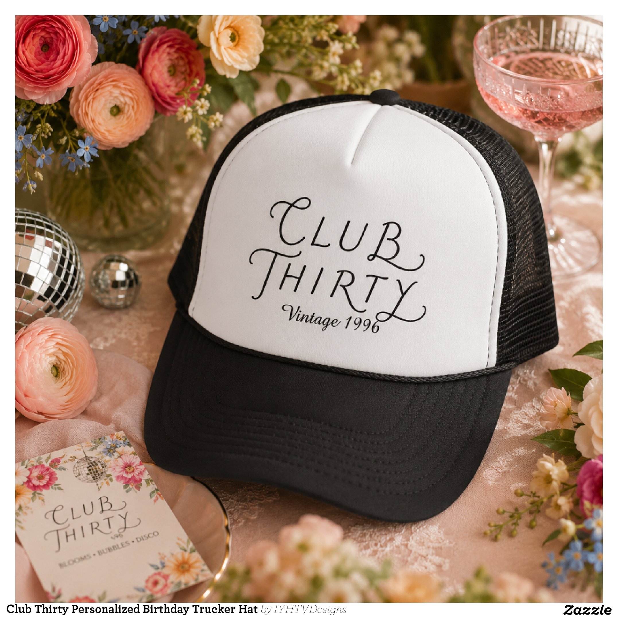
10. Party Hats That Guests Actually Wear
Not every party hat deserves to be worn.
But a beautifully designed trucker hat or embroidered cap?
That's different.
It becomes part of the celebration and often part of someone's wardrobe afterward.
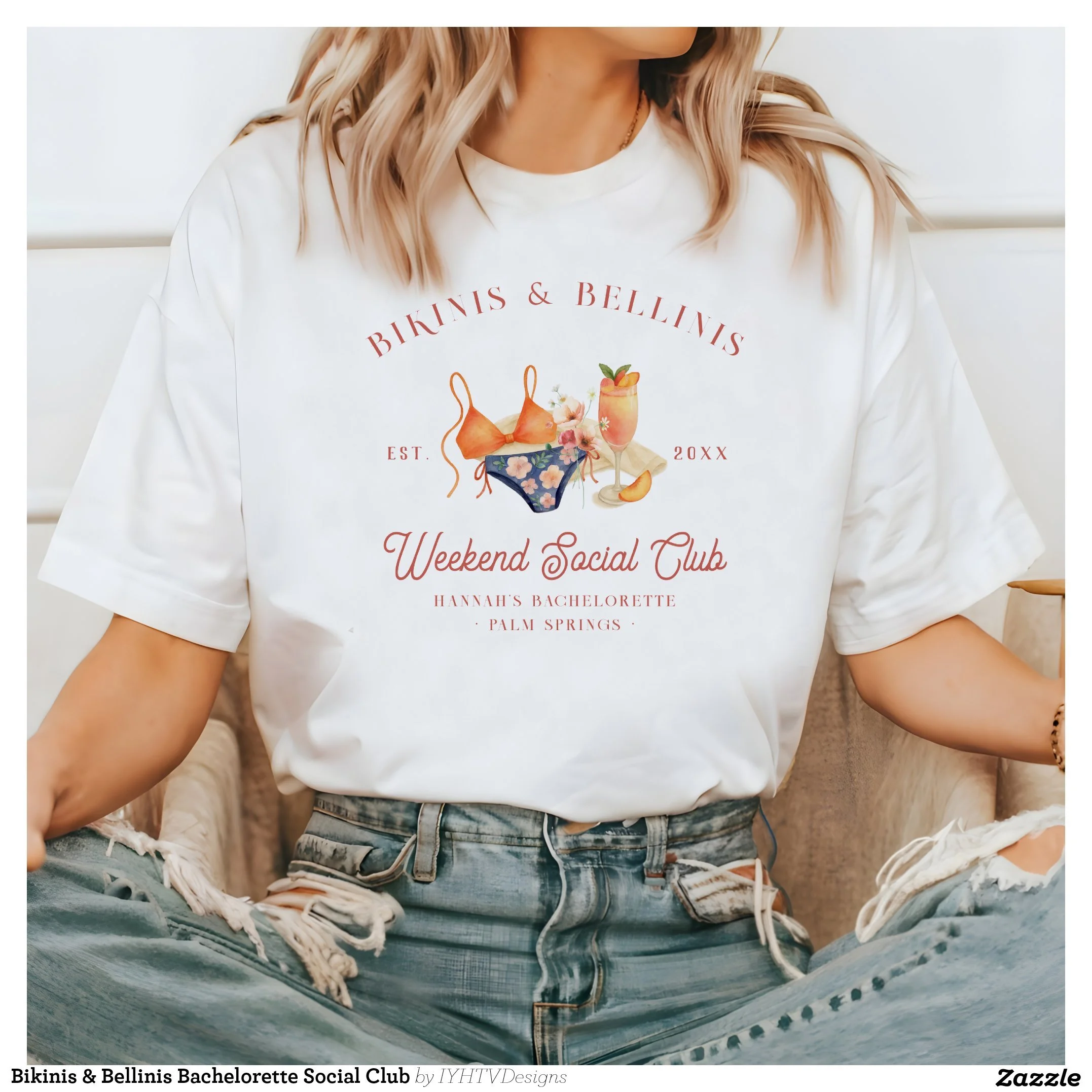
11. T-Shirts That Feel Like Merchandise
The best event apparel doesn't look like event apparel.
Instead, it feels like something you'd happily buy in a boutique.
Whether it's for a birthday weekend, bachelorette, reunion, or company retreat, thoughtful apparel becomes part of the memories—and often shows up in photos for years afterward.
12. Tote Bags Guests Continue Using
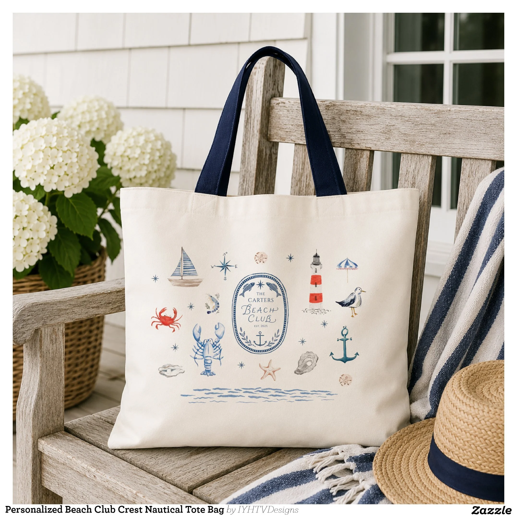
Few favors get more use than a great tote bag.
It's practical.
It's beautiful.
And every trip to the grocery store or farmers market becomes a little reminder of a wonderful day.
13. Favor Tags That Finish the Story
Even the smallest favor feels elevated when it's beautifully presented.
A simple personalized tag tied with ribbon instantly transforms an ordinary gift into something guests feel excited to receive.
14. Coordinated Labels
Water bottles.
Candles.
Mini bottles.
Party favors.
Adding coordinated labels throughout an event creates a subtle consistency guests often notice without realizing why everything feels so polished.
15. Matchbooks With Personality
There's something nostalgic about custom matchbooks.
Even guests who never strike a match tend to tuck them into a purse or pocket because they simply look too good to leave behind.
16. Candles That Double as Favors
Candles create atmosphere during the celebration.
Later, every time someone lights one at home, they're reminded of the evening they took it from.
That's the kind of favor people genuinely keep.
17. Buttons, Pins & Small Collectibles
These little extras are surprisingly fun.
They encourage conversation, appear in photos, and give guests another small piece of the event to take home.
18. Beautiful Guest Books
A guest book shouldn't feel like an obligation.
It should feel like another thoughtfully designed piece of the celebration.
Years later, it's often one of the first things people reach for when remembering the day.
19. Thank You Cards That Complete the Experience
The celebration doesn't truly end when everyone goes home.
A thoughtful thank you card is the final chapter.
It reminds guests how much their presence meant and leaves one last lasting impression.
20. Personalized Gifts for Your VIPs
Parents.
Wedding party.
Hosts.
Corporate teams.
Friends who helped pull everything together.
A personalized gift says thank you in a way that's both meaningful and memorable.
21. Small Moments Worth Photographing
Sometimes the most shared photo from an event isn't the cake.
It's the cocktail.
The beautifully wrapped favor.
The custom hat.
The invitation lying beside a glass of champagne.
When you thoughtfully personalize the little details, you naturally create moments people want to photograph.
22. A Cohesive Color Story
Not every personalized detail needs to match perfectly.
But carrying the same colors, typography, and style throughout an event creates a feeling guests immediately recognize.
Everything simply belongs together.
23. One Signature Design Throughout the Celebration
One illustration.
One monogram.
One logo.
One floral frame.
One pattern.
Repeating a single visual element across invitations, signage, favors, apparel, and décor creates an event identity that feels polished without trying too hard.
24. Details That Become Keepsakes
The best personalized items don't end up in the trash.
They become coffee mugs.
Tote bags.
Holiday ornaments.
Journals.
Candles.
Hats.
Little reminders of a day that mattered.
25. Celebrations That Feel Like You
The most memorable events aren't the ones with the biggest budgets.
They're the ones that feel personal.
The colors remind guests of your favorite place.
The signature drink has a story behind it.
The illustrations reflect your personality.
The favors are things you'd actually use yourself.
When every detail feels intentional, guests leave feeling like they experienced something unique—not something copied from Pinterest.
And in the end, that's what people remember.
Final Thoughts
Beautiful celebrations aren't built from one grand gesture.
They're built from dozens of thoughtful little moments layered together.
The invitation that made people smile when they opened the envelope.
The signature cocktail they ordered twice.
The personalized napkin that ended up in every photo.
The tote bag they still use months later.
The candle they lit at home and immediately thought of your party.
Those are the details that quietly tell a story.
Because the most unforgettable celebrations aren't remembered for what they cost.
They're remembered for how they made people feel.
Looking for personalized invitations, party décor, favors, keepsakes, and coordinating event details? Browse my curated Zazzle collections to find designs created to help every celebration feel thoughtful, cohesive, and uniquely yours.
Unexpected Bachelorette Destinations That Feel Luxurious Without Vegas Prices
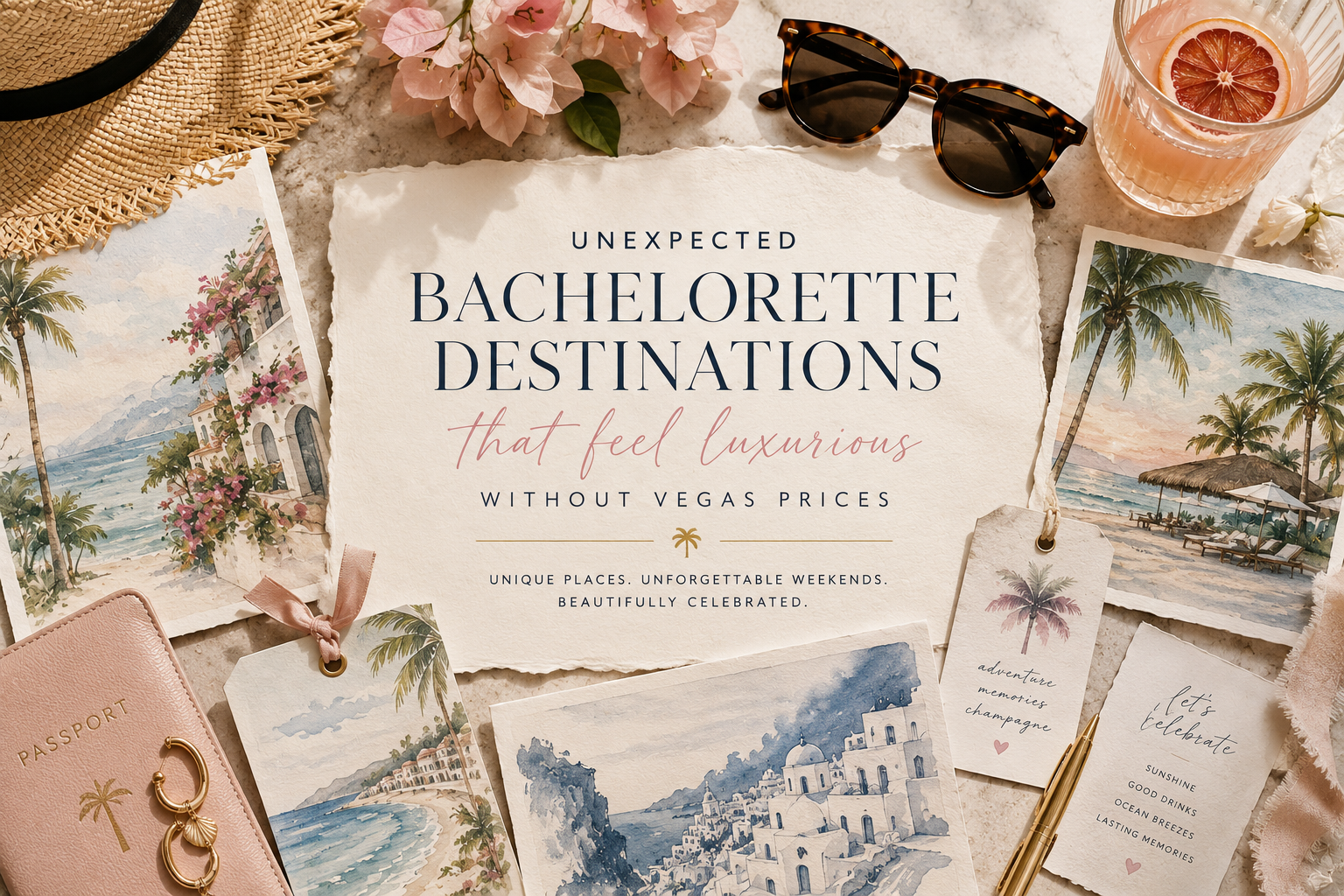
Not every bride wants crowded clubs, matching cowboy hats, and packed itineraries anymore. More groups are leaning toward destinations that feel immersive, beautiful, and experience-driven instead of chaotic.
There’s definitely been a shift happening in the bachelorette world lately.
For years, it felt like every trip revolved around the same handful of destinations: Vegas, Nashville, Scottsdale, Miami. Loud itineraries. Packed schedules. Matching outfits everywhere. The same TikTok recommendations recycled over and over again.
But lately, more brides are leaning toward something different.
More intentional. More beautiful. More experience-driven.
The kinds of places where the weekend feels less like a checklist and more like stepping into a storybook with your closest friends.
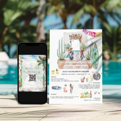
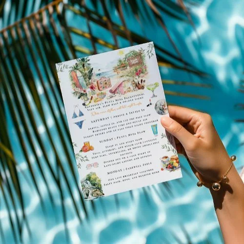
As someone who designs destination-inspired bachelorette invitations and weekend stationery, I’ve loved seeing this shift toward places that feel immersive, personal, and visually unforgettable. Many of these locations naturally inspire the entire aesthetic of the weekend itself, from the invitation suite to the welcome bags, itineraries, menus, and recovery brunch details.
Before Choosing a Destination, Consider:
Does your group want nightlife or relaxation?
Will everyone rent a car?
Is the destination walkable?
Are flights affordable from multiple cities?
Does the weather work for your wedding timeline?
Are you prioritizing aesthetics, activities, or convenience?
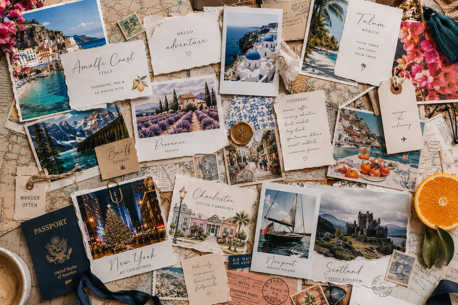
One of the biggest differences between a good destination weekend and a truly memorable one is cohesion. Small details like custom itineraries, welcome bags, illustrated maps, drink menus, and recovery brunch details help the trip feel intentional from beginning to end.
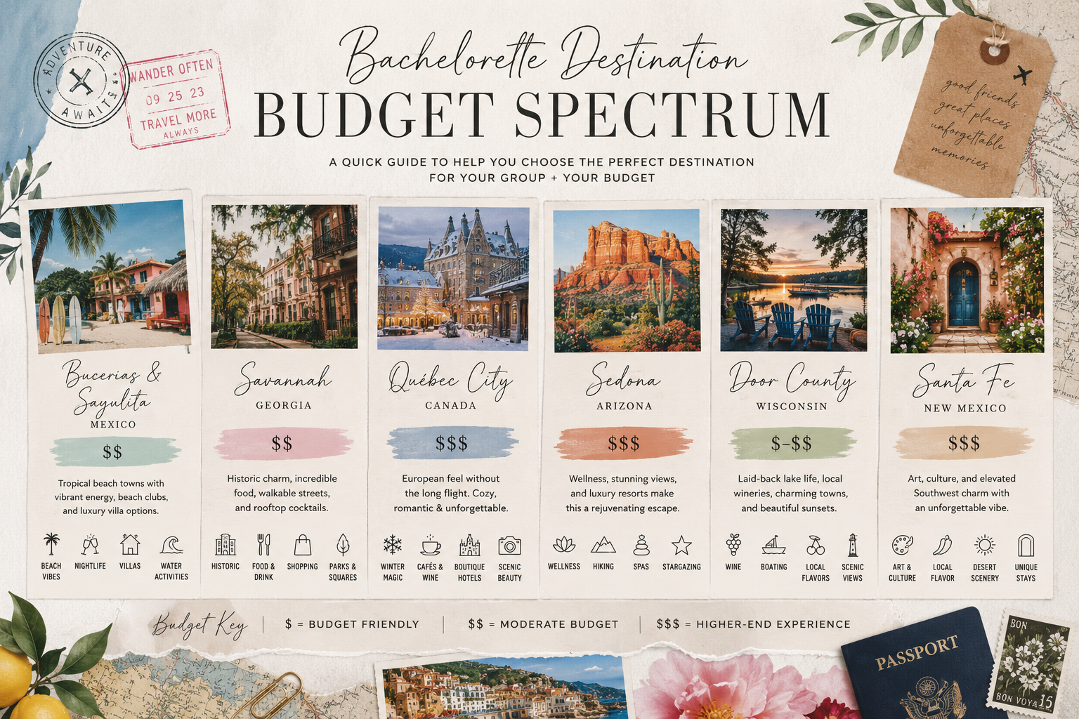
More bachelorette groups are leaning toward destinations that feel immersive, aesthetic, and experience-driven instead. Places where the weekend feels less chaotic and more intentional, whether that means beach clubs in Mexico, cozy winter cafés in Québec City, desert spa days in Sedona, or waterfront wine nights in Door County. If you’re looking for destination ideas that feel memorable without automatically defaulting to Vegas or Nashville, these are some of the most beautiful and underrated bachelorette destinations I’ve been loving lately.
1. Bucerías & Sayulita, Mexico
There’s a reason this area keeps quietly showing up in luxury travel conversations.
Bucerías has a softer, slower coastal charm while nearby Sayulita brings the colorful energy, beach clubs, surf culture, and nightlife. Together, they create a really balanced bachelorette weekend that feels both relaxing and vibrant.
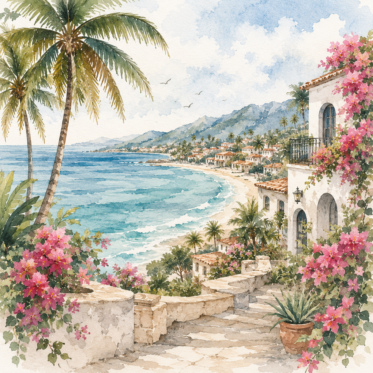
What I love most visually about this destination is how naturally inspiring it is for stationery and event branding. The colors, bougainvillea, beach textures, palms, architecture, and ocean scenery translate beautifully into watercolor invitation suites and destination details.
Think:
beachside welcome dinners
boutique villa stays
fresh seafood and cocktails
catamaran days
matching tote bags and luggage tags
sunset dinners under string lights
It’s the kind of destination that already feels aesthetic before you even decorate.
Best For
Brides who want a tropical destination that still feels laid-back, colorful, and genuinely immersive instead of overly commercialized.
Ideal Group Size
6–12 people works especially well here since many groups rent boutique villas or small beachfront hotels together.
Best Time to Visit
November through April for sunny weather and lower humidity.
Weekend Highlights
sunset catamaran cruises
beach clubs in Sayulita
taco nights and rooftop cocktails
surfing or paddleboarding
boutique shopping and local artisan markets
Overall Vibe
Colorful coastal Mexico with a mix of boho beach energy and elevated tropical luxury.
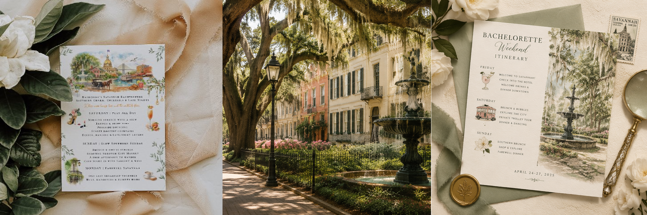
2. Savannah, Georgia
Savannah feels like a southern garden party wrapped in historic architecture.
It has this romantic, cinematic quality that works beautifully for brides who want something elegant but still fun and walkable.
Cobblestone streets, old mansions, hidden courtyards, rooftop cocktails, vintage bars, and Spanish moss hanging over everything. The entire city already feels styled.
This destination especially works well for brides leaning toward:
old money aesthetics
garden editorial vibes
vintage-inspired fashion
softer, feminine color palettes
elevated dinner parties instead of clubbing
Savannah also lends itself beautifully to custom illustrated invitations because the architecture and atmosphere are so visually recognizable.
Best For
Groups wanting a destination that feels elegant and walkable with a mix of nightlife, historic charm, and beautiful scenery.
Best Time to Visit
March–April and October–November when the weather is comfortable and the city feels especially vibrant.
Weekend Highlights
rooftop cocktail bars
riverfront dinners
historic mansion stays
ghost tours
boutique shopping along Broughton Street
garden-style brunches under the Spanish moss
Budget Feel
Often more affordable than destinations like Charleston or Napa while still feeling upscale.
Overall Vibe
Southern garden party meets old-world editorial romance.
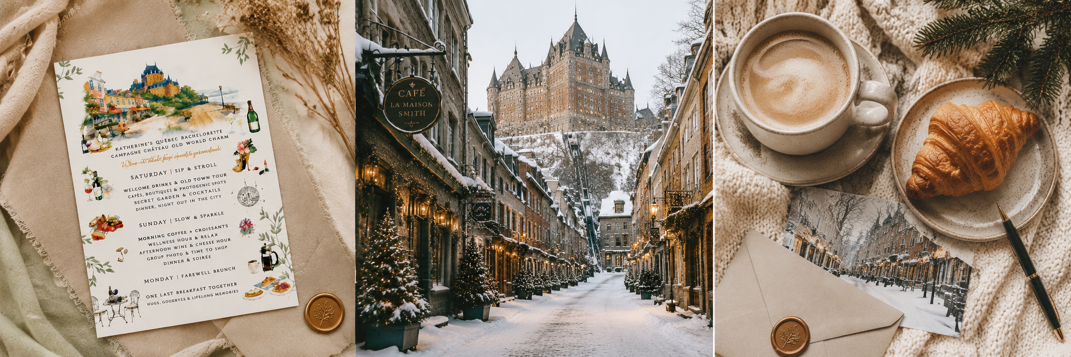
3. Québec City, Canada
If you want European energy without crossing the Atlantic, Québec City is honestly one of the most underrated bachelorette destinations.
The stone streets, cafés, boutique hotels, château-style architecture, and cozy restaurants make it feel incredibly immersive and romantic, especially in fall and winter.
This destination works particularly well for smaller, more intimate groups that want:
wine bars
pastry shops
spa weekends
beautiful boutique hotels
slower luxury travel
winter market aesthetics
The invitation possibilities for this destination are gorgeous too. Soft watercolor architecture, snowy rooftops, café scenes, handwritten itineraries, and old-world details all feel incredibly cohesive here.
Best For
Smaller groups wanting a cozy, European-inspired bachelorette weekend without flying overseas.
Best Time to Visit
December for magical winter atmosphere and holiday markets
September–October for fall colors and café weather
Weekend Highlights
château-style hotels
wine bars and pastry cafés
spa afternoons
old town walking tours
cozy late-night dinners
snowy rooftop cocktails in winter
Important Planning Note
Most activities are walkable within Old Québec, which makes the trip feel much more relaxed logistically.
Overall Vibe
European winter romance with a cozy luxury feel.
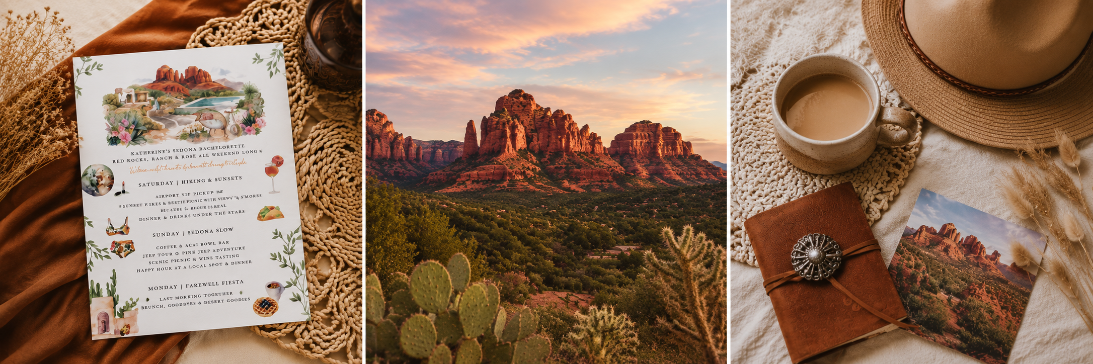
4. Sedona, Arizona
Sedona feels completely different from the typical “party city” bachelorette.
It’s more grounded, earthy, wellness-oriented, and visually dramatic in the best possible way.
Instead of casinos and crowded clubs, think:
desert resorts
spa days
jeep tours
hiking
luxury Airbnb stays
candlelit dinners under the mountains
The desert color palette alone makes this destination incredibly beautiful for stationery design. Terracotta tones, warm neutrals, sunset-inspired palettes, cactus illustrations, and textured watercolor washes work perfectly here.
This destination especially appeals to brides who want the weekend to feel restorative and luxurious rather than chaotic.
Best For
Brides wanting a slower, wellness-focused weekend with beautiful scenery and luxury resort energy.
Best Time to Visit
Spring and fall are ideal since summer temperatures can get extremely hot.
Weekend Highlights
spa days
jeep tours
sunrise hikes
sound baths
wine tastings
stargazing dinners
luxury Airbnb stays with desert views
Good to Know
Many groups split time between adventure activities during the day and slower wellness experiences in the evenings.
Overall Vibe
Earthy desert luxury with wellness retreat energy.
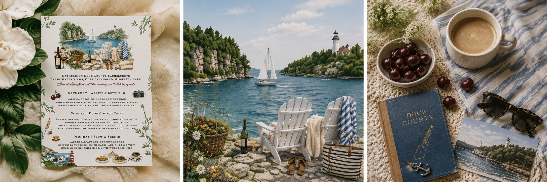
5. Door County, Wisconsin
This one surprises people.
Door County has this charming lakeside summer atmosphere that feels straight out of a Nancy Meyers movie.
Think:
coastal cottages
wine tasting
boating days
cherry orchards
waterfront brunches
cozy downtown shops
It’s relaxed in a way that feels genuinely refreshing for groups wanting connection over nonstop nightlife.
Visually, this destination pairs beautifully with softer watercolor palettes and coastal-inspired stationery.
Best For
Groups wanting a cozy lakeside weekend focused more on connection, food, wine, and relaxed summer activities.
Best Time to Visit
June through early fall for boating weather, outdoor dining, and cherry season.
Weekend Highlights
waterfront brunches
wine tasting
boat rentals
lighthouse stops
cherry picking
local cafés and bakeries
cozy lakeside bonfires
Budget Feel
One of the more affordable options for groups wanting a charming destination without major resort pricing.
Overall Vibe
Midwest coastal cottage-core with peaceful summer energy.
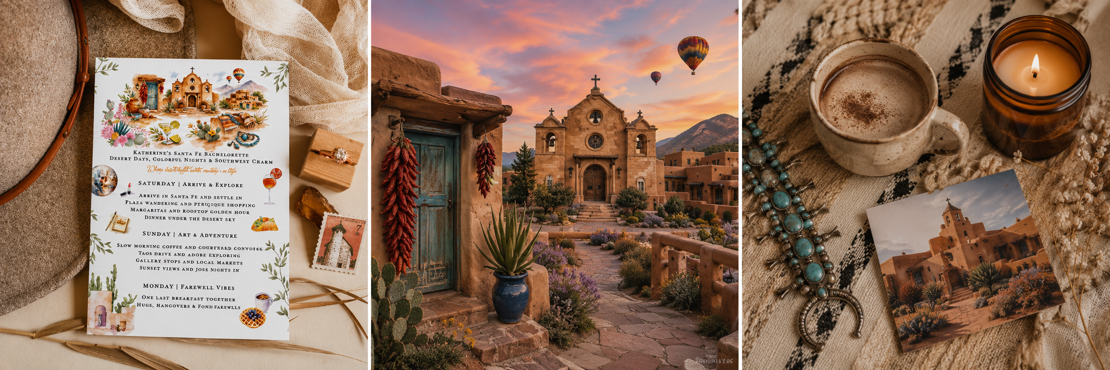
6. Santa Fe, New Mexico
Santa Fe feels artistic, soulful, and deeply atmospheric.
The adobe architecture, desert landscapes, art galleries, woven textures, and warm earthy palettes create such a strong visual identity for an entire weekend.
This destination works beautifully for brides wanting:
elevated dinners
art-focused experiences
boutique hotels
southwestern luxury
slower-paced itineraries
unique photography moments
It’s also one of the strongest destinations visually for custom illustrated invitations because the architecture and color palette are so recognizable.
Best For
Brides who love art, design, architecture, and slower luxury experiences over traditional nightlife.
Best Time to Visit
September–October is especially beautiful with cooler temperatures and golden desert light.
Weekend Highlights
adobe-style boutique hotels
local art galleries
rooftop dining
southwestern spas
artisan markets
desert hiking
margarita trails and sunset dinners
Good to Know
Santa Fe works especially well for smaller groups that appreciate design, food, and atmosphere-focused travel.
Overall Vibe
Artistic desert escape with rich textures, earthy luxury, and old-world southwest charm.
Why These Destinations Work So Well for Bachelorette Weekends
What makes these destinations stand out isn’t just that they’re beautiful.
It’s that they feel immersive.
The best bachelorette weekends now are starting to feel less like generic party packages and more like curated travel experiences with a visual identity behind them.
That’s why details like:
custom invitations
illustrated itineraries
welcome bags
destination maps
themed drink menus
recovery brunch signage
personalized luggage tags
suddenly feel much more meaningful.
They help the entire weekend feel cohesive and memorable from the very beginning.
And honestly, that’s my favorite part of designing for destination celebrations. Every city has its own atmosphere, color palette, energy, and storytelling potential.
The invitation becomes less about announcing a trip and more about setting the tone for the entire experience.
Final Thoughts
I don’t think the future of bachelorette travel is about doing the loudest or most expensive trip anymore.
People are craving places that feel personal, aesthetic, immersive, and memorable.
The kinds of weekends where everyone leaves saying:
“That genuinely felt special.”
And personally, I love seeing more brides choose destinations that actually reflect their personalities instead of simply following whatever city is trending online that year.
Because those are always the celebrations that end up feeling the most unforgettable.
If you’re currently planning a destination bachelorette weekend, I hope this gave you a little inspiration to think beyond the usual party cities and create something that genuinely feels like your group.
Wedding Crests, Reimagined: Turning Your Love Story Into Art
For years, wedding crests followed a fairly traditional formula: symmetrical monograms, ornate flourishes, formal shields, and classic botanical borders. Elegant? Absolutely. But for many modern couples, they no longer feel deeply personal.
Today’s weddings are less about tradition for tradition’s sake and more about storytelling. Couples are weaving together cultures, countries, favorite destinations, meaningful memories, shared passions, and the little details that define their relationship. And that shift is inspiring a new kind of wedding crest entirely.
Instead of a formal emblem rooted in family lineage, modern wedding crests are becoming illustrated love stories.
More Than a Monogram
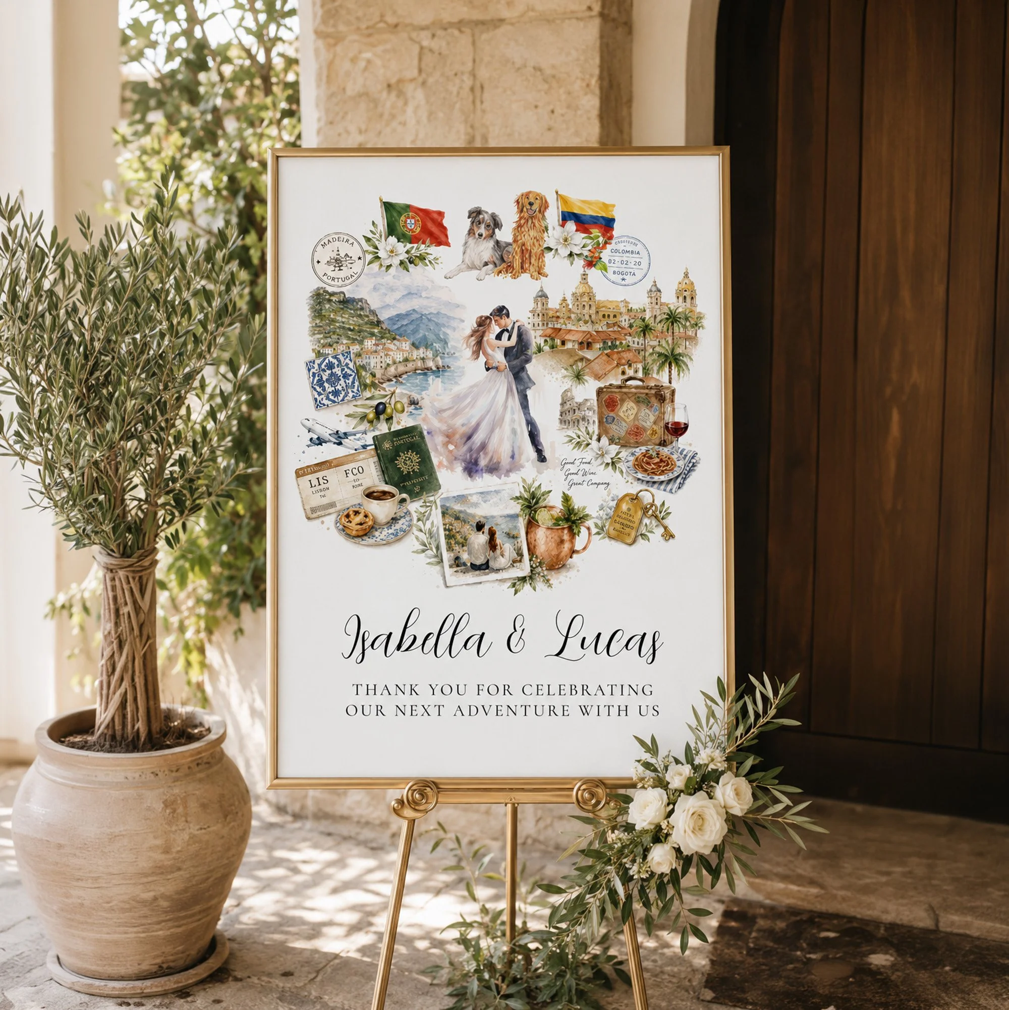
A storybook-style wedding crest blends watercolor illustration, travel-inspired details, meaningful symbols, and personal elements into one cohesive artistic composition. The result feels romantic, elevated, emotional, and uniquely yours.
Rather than relying solely on initials or ornate crests, these modern designs can include:
Heritage flags and cultural references
Favorite travel destinations
Meaningful architecture or landscapes
Signature cocktails or favorite foods
Pets
Passport stamps and vintage travel elements
Florals tied to family history or wedding locations
Favorite activities or hobbies
Coastal scenes, city skylines, or mountain landscapes
Hotel keys, postcards, luggage tags, or maps
Every element becomes part of the story.
Why Couples Are Moving Away From Traditional Crests
Traditional wedding branding still has its place, but many couples are looking for something that feels softer, more emotional, and more reflective of who they actually are together.
A watercolor story crest feels:
More personal
More artistic
More narrative-driven
More modern while still timeless
Better suited for multicultural or destination weddings
Less rigid and formal
More emotionally connected to shared experiences
It becomes less about creating a “logo” and more about creating an heirloom piece of art.
The Beauty of a Shared Story
One of the most meaningful aspects of these illustrated crests is how they visually combine two lives into one shared journey.
A couple might include:
Portuguese tiles and olive branches to honor family roots
Colombian architecture and florals reflecting another side of their story
Travel references from places they visited together
Their dog who has been part of every adventure
A favorite espresso drink from mornings abroad
A hotel key from the place they got engaged
A passport stamp from the trip that changed everything
Individually, they are simple objects.
Together, they become a portrait of a relationship.
A Crest That Works Beyond the Wedding Day
One of the reasons these designs are becoming so popular is their versatility. Unlike traditional wedding branding that sometimes feels tied to a single event, storybook wedding crests often become lasting keepsakes.
They can be incorporated into:
Wedding welcome signs
Invitations
Menus
Cocktail napkins
Matchboxes
Seating charts
Wedding websites
Dance floor wraps
Thank you cards
Guest books
Anniversary gifts
Framed home artwork
Long after the wedding day, the artwork still feels meaningful.
The Rise of the Storybook Wedding Aesthetic
There has been a noticeable shift toward softer, painterly wedding aesthetics that feel romantic without being overly formal. Couples are gravitating toward:
Hand-painted watercolor details
Illustrated destination elements
Editorial-inspired layouts
Organic asymmetry
Layered storytelling
Vintage travel influences
European summer aesthetics
Quiet luxury styling
The modern wedding crest naturally fits into this movement because it combines art, emotion, travel, and personalization into one cohesive visual identity.
Designing a Crest That Feels Timeless
The key to creating a beautiful illustrated wedding crest is restraint. The strongest designs are carefully curated rather than overcrowded.
A few meaningful elements almost always feel more elevated than trying to include everything at once.
The goal is not to create a scrapbook.
It is to create a romantic visual narrative.
The best storybook wedding crests balance:
Meaningful symbolism
Negative space
Cohesive color palettes
Consistent illustration style
Elegant typography
Soft composition flow
When done thoughtfully, the result feels artistic, refined, and deeply personal.
Your Love Story, Illustrated
At its heart, this style of wedding crest is really about preserving a feeling.
The places that shaped you.
The cultures that brought you together.
The adventures you shared.
The details no one else would understand at first glance.
It transforms a wedding detail into something much more lasting:
a piece of art that tells your story.
Thoughtful Father’s Day Gift Ideas That Actually Feel Personal
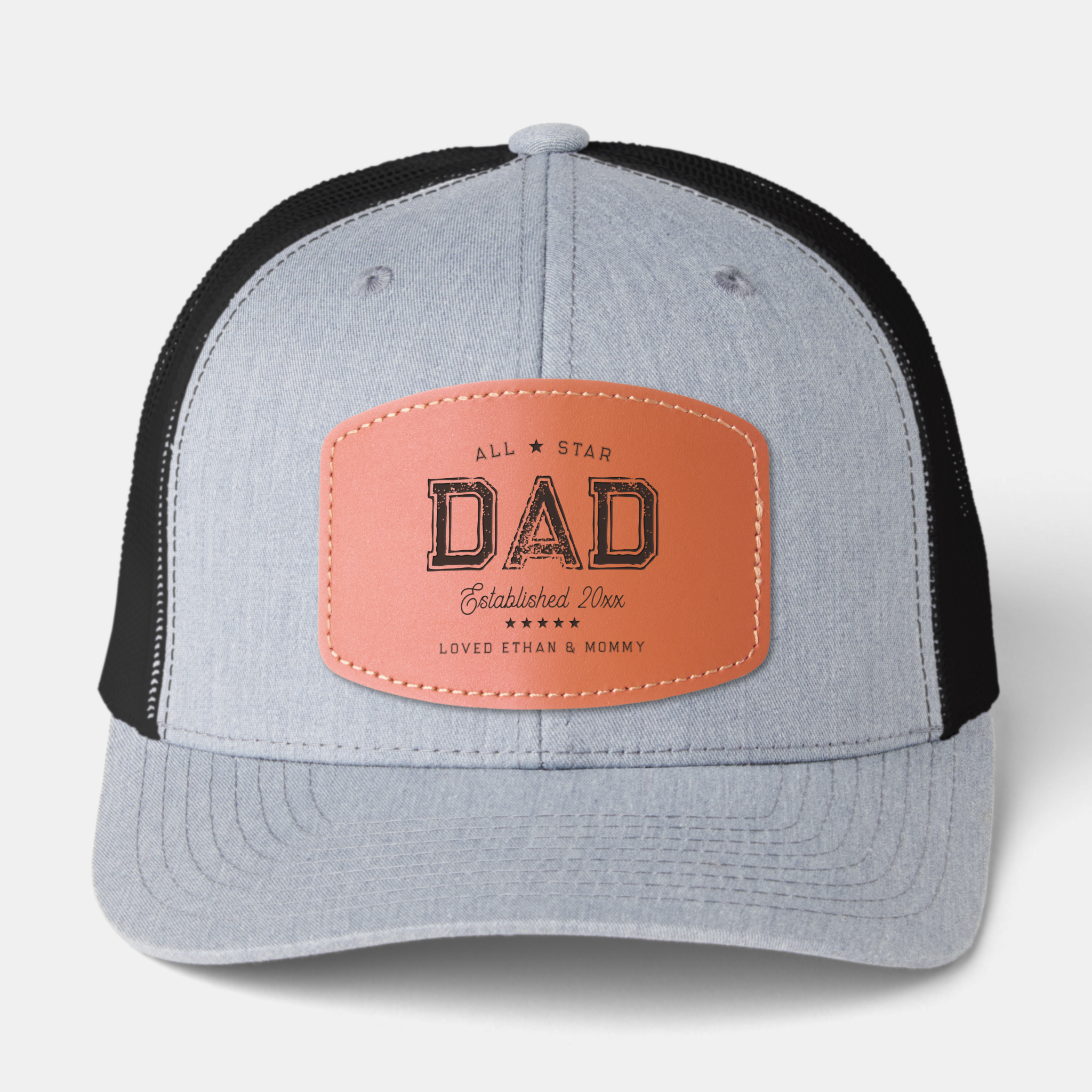
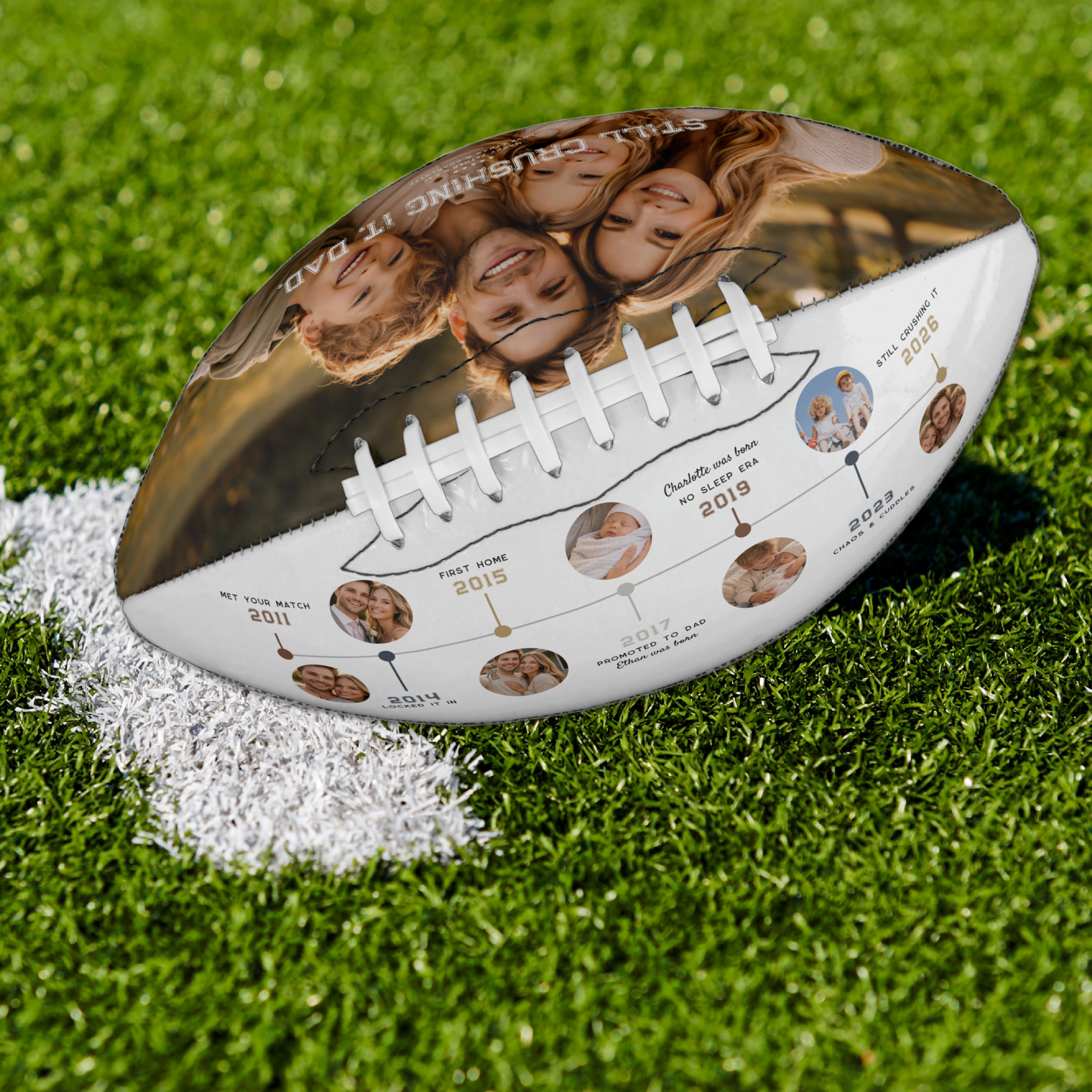
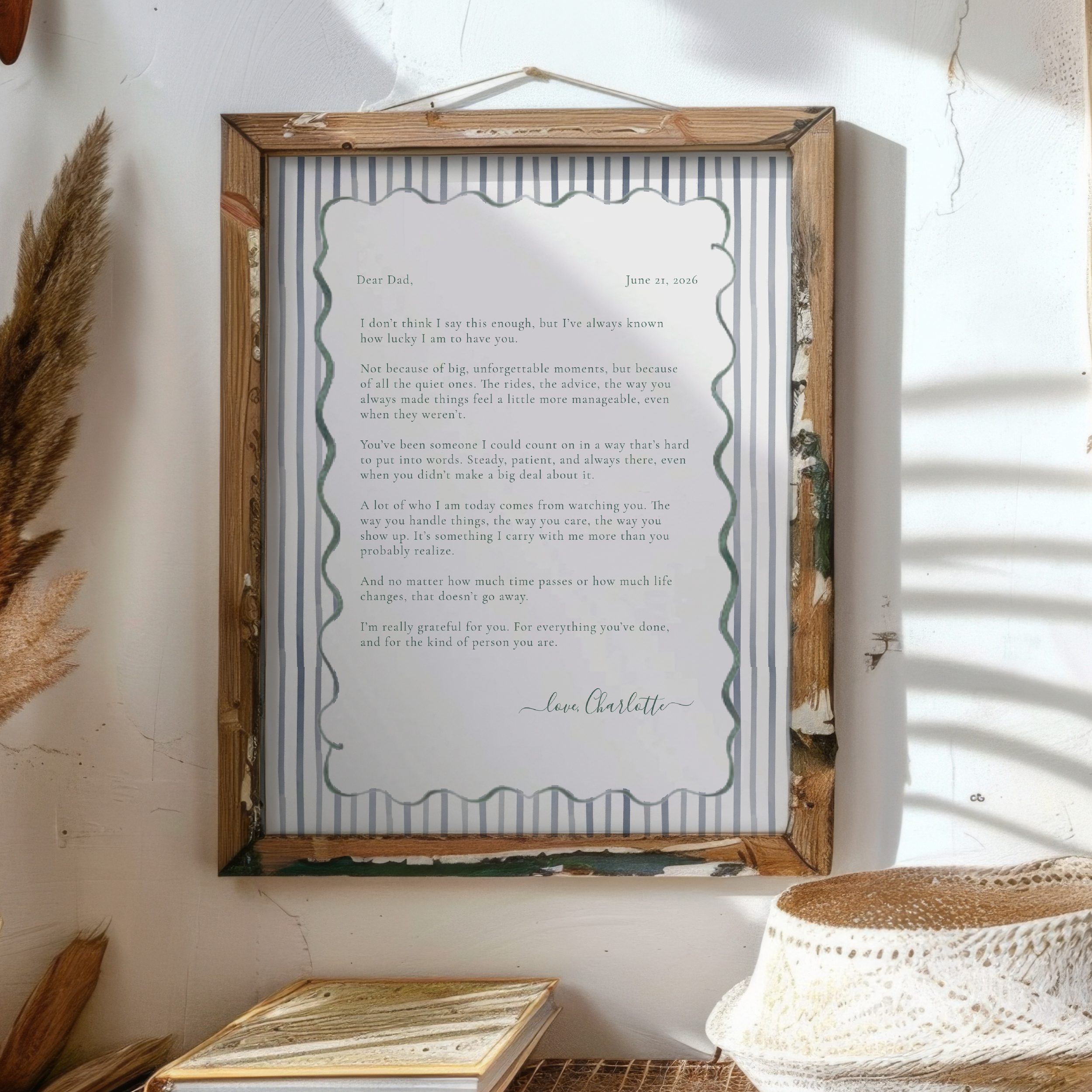
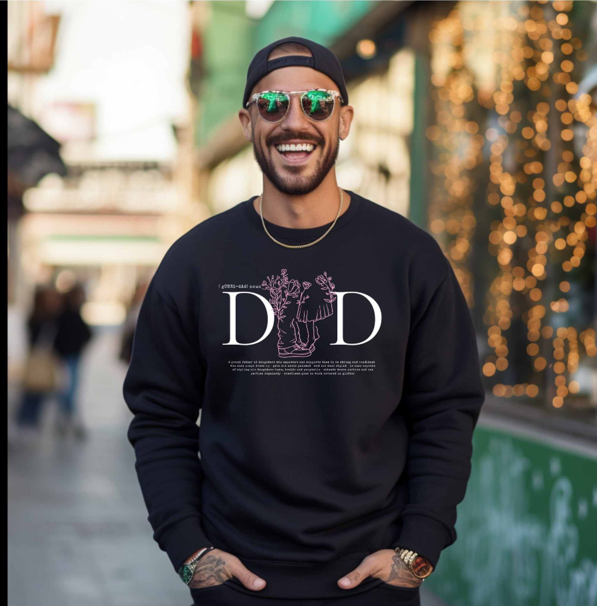
Finding a Father’s Day gift sounds easy… until you’re staring at the same generic options year after year.
If you’re trying to find something that feels meaningful (not just another “#1 Dad” mug), the best gifts are the ones that feel personal, intentional, and actually tied to your memories together.
Here are some Father’s Day gift ideas that go beyond the usual and feel like something he’ll actually keep.
1. Personalized Photo Gifts That Tell a Story
There’s something different about a gift that includes real memories.
Instead of a single photo, look for designs that let you include multiple moments. Think:
Photo collage cards
Custom keepsake prints
Memory-based designs with space for a message
These work especially well for dads who don’t usually ask for anything but appreciate sentimental details more than they let on.
👉 Tip: A clean layout with a simple message often feels more elevated than overly busy designs.
2. Custom Cards He’ll Actually Keep
Most Father’s Day cards get read once and tossed.
But a well-designed, personalized card can turn into something he keeps on his desk, shelf, or tucked away.
Look for:
Unique shapes or layouts
Designs that feel more like a keepsake than a greeting card
Space for a longer message on the back
A thoughtful message paired with a custom design instantly makes even a simple gift feel more meaningful.
3. Hobby-Inspired Gifts That Feel Specific
The best gifts feel like they were chosen just for him.
Instead of going broad, lean into what he actually enjoys:
Travel-inspired designs for dads who love exploring
Designs tied to inside jokes or shared memories
Even small items feel more intentional when they reflect his personality.
4. Minimalist Everyday Items with a Personal Touch
Not every gift has to be overly sentimental.
Some of the best Father’s Day gifts are things he’ll use every day, just with a personalized upgrade:
Clean, modern mugs with subtle customization
Simple designs with initials or meaningful dates
Understated styles that don’t feel overly themed
These tend to work especially well for dads who prefer practical over emotional.
5. Memory-Based Gifts That Go Beyond the Day
If you want something that stands out, focus on gifts that capture a moment.
Ideas that work well:
“Then & Now” photo designs
Gifts that highlight milestones or shared experiences
These are the kinds of pieces that feel less like a holiday item and more like something worth holding onto.
Where to Find Unique Father’s Day Gifts
If you’re looking for customizable options that don’t feel mass-produced, platforms like Zazzle offer a wide range of designs that can be personalized with your own photos, messages, and details.
At IYHTVDesigns we focus on clean, thoughtful layouts that balance design and meaning, so the final product feels intentional rather than generic.
Final Thoughts
The best Father’s Day gifts aren’t about how much you spend.
They’re about choosing something that feels like him.
Whether it’s a photo-based keepsake, a simple personalized item, or something tied to a shared memory, the goal is the same:
Something that doesn’t just get used…
but actually gets kept.
Last-Minute Mother’s Day Gifts That Still Feel Thoughtful
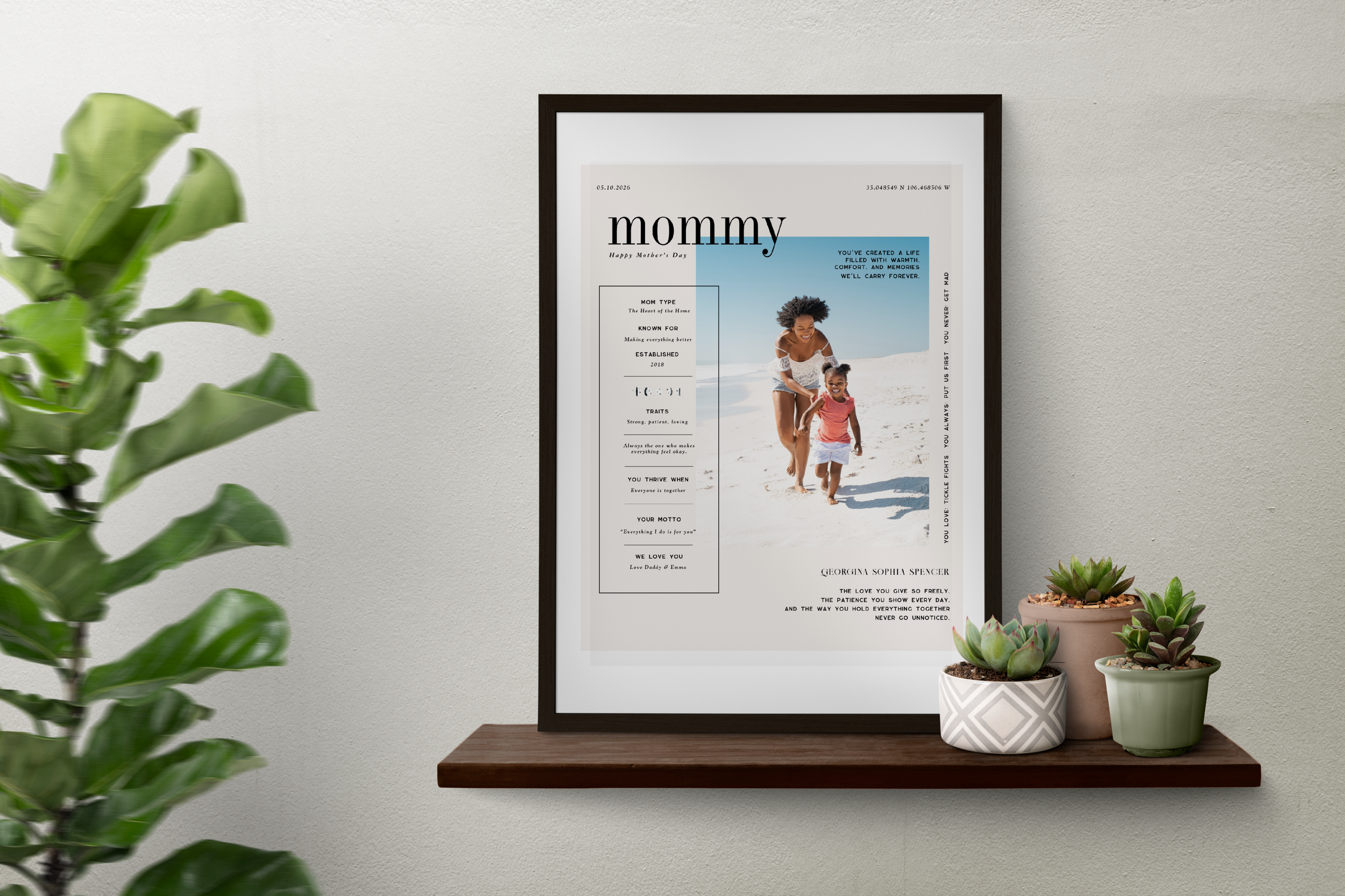
Mother’s Day has a way of sneaking up on you.
One minute you have time, and the next you’re realizing shipping deadlines have passed and everything suddenly feels rushed. It’s easy to fall back on something quick and generic… but that never feels quite right either.
The good news is, meaningful doesn’t have to mean complicated. There are still ways to give something personal and thoughtful, even if you’re a little short on time.
1. Personalized Photo Gifts (That You Can Get Instantly)
One of the easiest ways to create a meaningful gift quickly is by using something you already have… your photos.
Instead of ordering something that may or may not arrive in time, you can customize a design and have it ready the same day. It feels intentional, personal, and far from last-minute.
I’ve been especially loving designs that combine a photo with a few meaningful details. Things like when she became a mom, little traits that describe her, or a short message that actually says what you’re thinking.
👉 You can see and customize this design here.
This one is available as a printable option, which means you can download it and have something ready right away. Frame it, wrap it, or even pair it with a handwritten note… it instantly feels like a complete gift.
2. A Photo Card That Feels Like a Keepsake
Sometimes a card ends up being the most meaningful part of the gift.
Instead of a standard greeting card, creating a personalized photo card with a message on the back turns it into something she’ll actually keep.
It doesn’t have to be long or complicated. Even a simple note, written intentionally, can mean everything.
3. Something She Can See Every Day
The most meaningful gifts aren’t always the biggest ones. They’re the ones that become part of everyday life.
A framed photo, a small piece of decor, or something personalized that she’ll pass by often can end up meaning more than something tucked away.
That’s why I always come back to gifts that feel personal and lived-in. The kind that make her pause for a second and smile.
4. Don’t Overthink It
If you’re feeling behind this year, you’re not alone.
The truth is, the most meaningful gifts aren’t about timing… they’re about intention. Taking a few minutes to choose a photo, add a message, and make something personal will always matter more than grabbing something generic.
Sometimes it’s not about doing more. It’s just about making it feel like you.
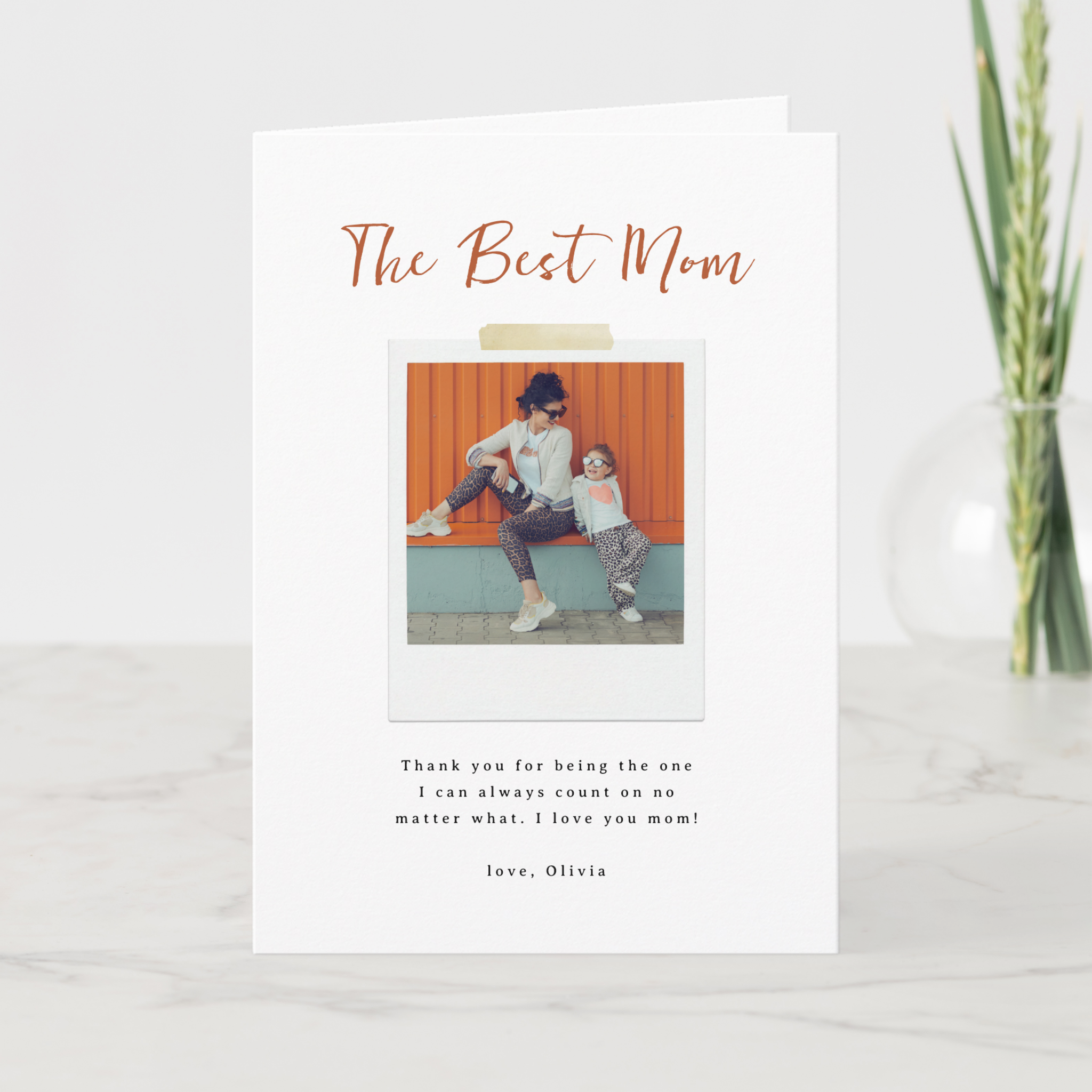
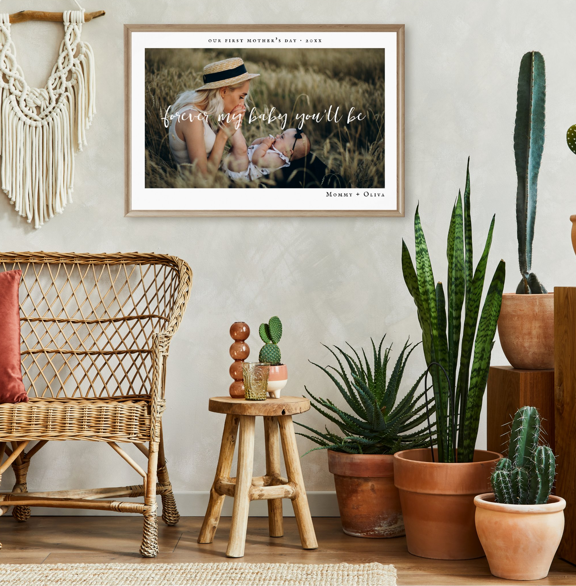
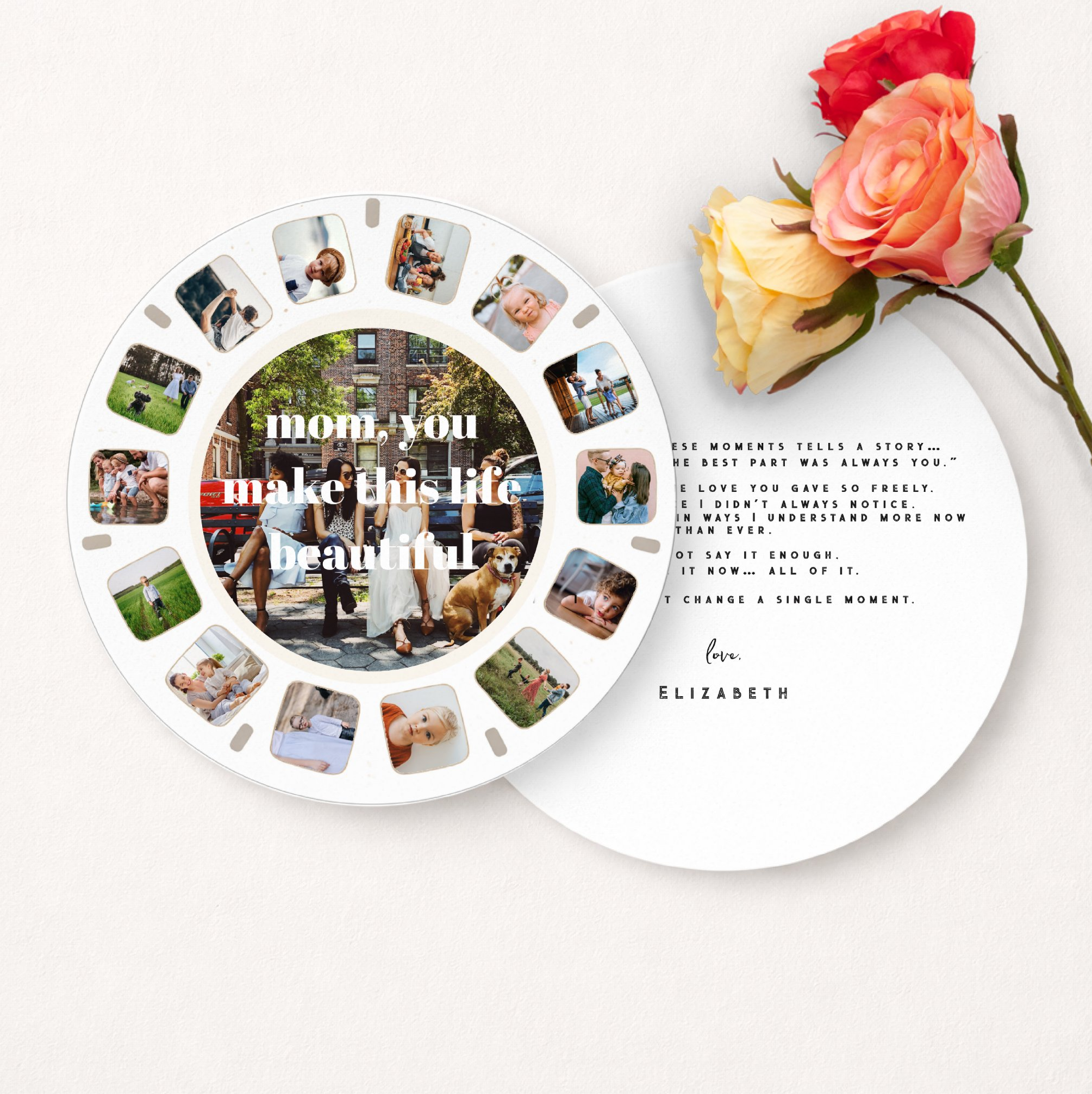
Final Thought
Mother’s Day doesn’t have to be perfect to be meaningful.
Even a last-minute gift can feel incredibly thoughtful when it reflects real memories, real moments, and the people who matter most.
If you’re still looking for something, this is a simple way to make it personal… without the stress 💛
Including Your Dog in Your Pregnancy Announcement
Sweet Ideas for Pet-Loving Families
For many couples, their dog is the very first member of the family.
Long before the baby arrives, it is the dog who sits beside you on the couch, follows you from room to room, and somehow senses when life is about to change. Dogs have a quiet way of becoming part of every chapter of a family's story.
So when the moment comes to share the exciting news that a baby is on the way, it often feels only natural to include them in the announcement too.
After all, they were here first.
And soon, they will have a very important new role: big brother or big sister.
Including your dog in a pregnancy announcement is a sweet way to celebrate the whole family and acknowledge the four-legged companion who has already been by your side through so many milestones.
Here are a few creative ways families are including their dogs in one of life’s most exciting announcements.
Let Your Dog Help Share the Big News
One of the most popular ways to include a pet in a pregnancy announcement is to let them be part of the reveal itself.
Some families have their dog pose beside tiny baby shoes, a letter board, or a small sign announcing the due date. Others dress their pup in a bandana that reads “Big Brother” or “Big Sister.”
But one of the sweetest ideas is letting the dog “hold” the ultrasound photo.
It is a simple visual moment that tells the entire story in a single image. The loyal family dog proudly holding the very first glimpse of the new baby joining the family.
It feels playful, personal, and meaningful all at once.
Turning Your Dog Into Part of the Artwork
Another beautiful option is to incorporate your pet directly into the design of the announcement itself.
Custom pet portraits are often created for weddings, save-the-dates, and stationery, but they can also celebrate moments that come after the wedding too.
The growing family.
The next chapter.
The tiny new roommate arriving soon.
A custom watercolor illustration allows your dog to become part of the story in a way that feels timeless and personal.
Instead of simply posing for a photo, your pet becomes a piece of artwork that celebrates the moment your family began to grow.
A Pregnancy Announcement for Dog Lovers
One of the newest designs in my shop was inspired by exactly this idea.
The announcement features a watercolor golden retriever sitting proudly with a sonogram photo in its mouth, paired with the phrase “Our Pack is Growing.”
It is designed especially for families who know their dog is not just a pet, but a true member of the family.
The front of the card celebrates the soon-to-be promoted “big brother,” while the back of the announcement allows families to include their ultrasound photo and share the exciting news of their baby’s expected arrival.
It is a sweet and simple way to include the dog who has already been part of so many moments leading up to this one.
And because many families now share their announcements online as well as by mail, the design also works beautifully as a digital pregnancy announcement for social media.
Celebrating Every Chapter of the Story
For years I have created custom pet illustrations for wedding stationery and keepsakes, but family stories do not stop at the wedding day.
Life keeps unfolding in new and beautiful ways.
A growing family.
A nursery being prepared.
A loyal dog quietly adjusting to the idea that their world is about to get a little bigger.
Pregnancy announcements that include pets celebrate that transition in a heartfelt way. They acknowledge the companion who was there first, and who will soon be watching over a brand new member of the family.
And for many families, that is a moment worth capturing.
A Sweet Way to Include Your Four-Legged Family Member
If your dog has been part of your story from the beginning, it only feels right that they should help share the news of your newest chapter too.
Whether through a photo, a playful sign, or a custom illustration, including your dog in a pregnancy announcement is a beautiful way to celebrate the whole family.
Because sometimes the very first one to know that something special is happening… is the dog.
Big Sister in Training 🐾
When your dog finds out the family is growing.
This watercolor pregnancy announcement photo prop lets your very first baby help share the news.
Perfect for announcement photos, framed photo props, or digital reveals.
From Snapshot to Heirloom: How I Create Custom Watercolor Family Portraits
Over the years, I’ve had the joy of creating custom watercolor portraits for couples, families, and growing households. Each piece is hand-illustrated and designed to become a keepsake that tells your story.
A family portrait is more than a picture.
It is a moment in time. A season of life. A memory you want to hold onto long after your kids have grown and routines have changed.
When I create custom watercolor family portraits, my goal is to turn everyday photos into meaningful keepsakes that feel timeless, personal, and full of heart. Because each portrait is completely custom, pricing varies based on the number of people, any pets included, and whether a special location or background is part of the design. I’m always happy to provide a personalized quote so you know exactly what to expect.
Here is a behind-the-scenes look at how I transform your favorite snapshots into hand-painted artwork you can treasure for years.
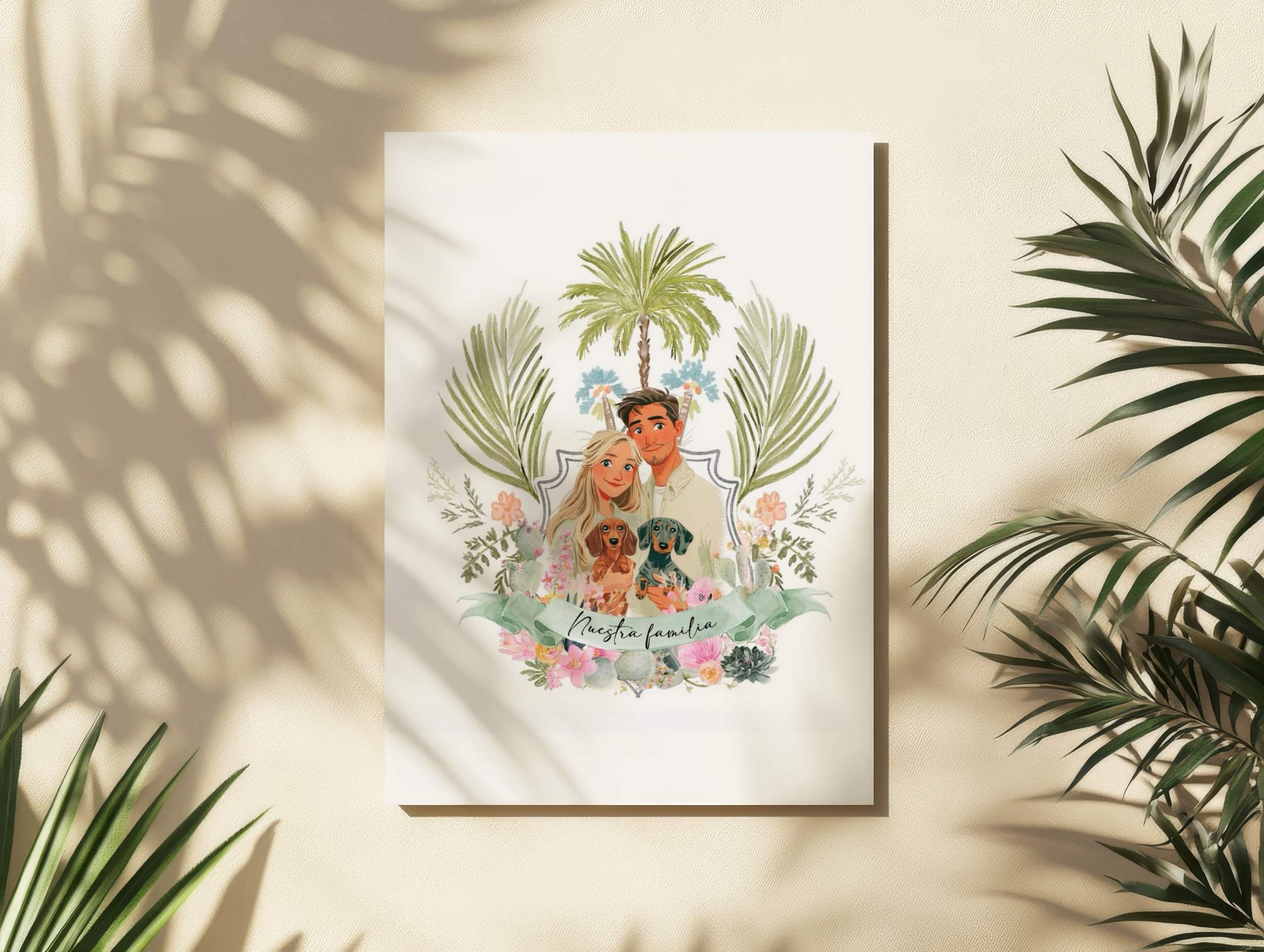
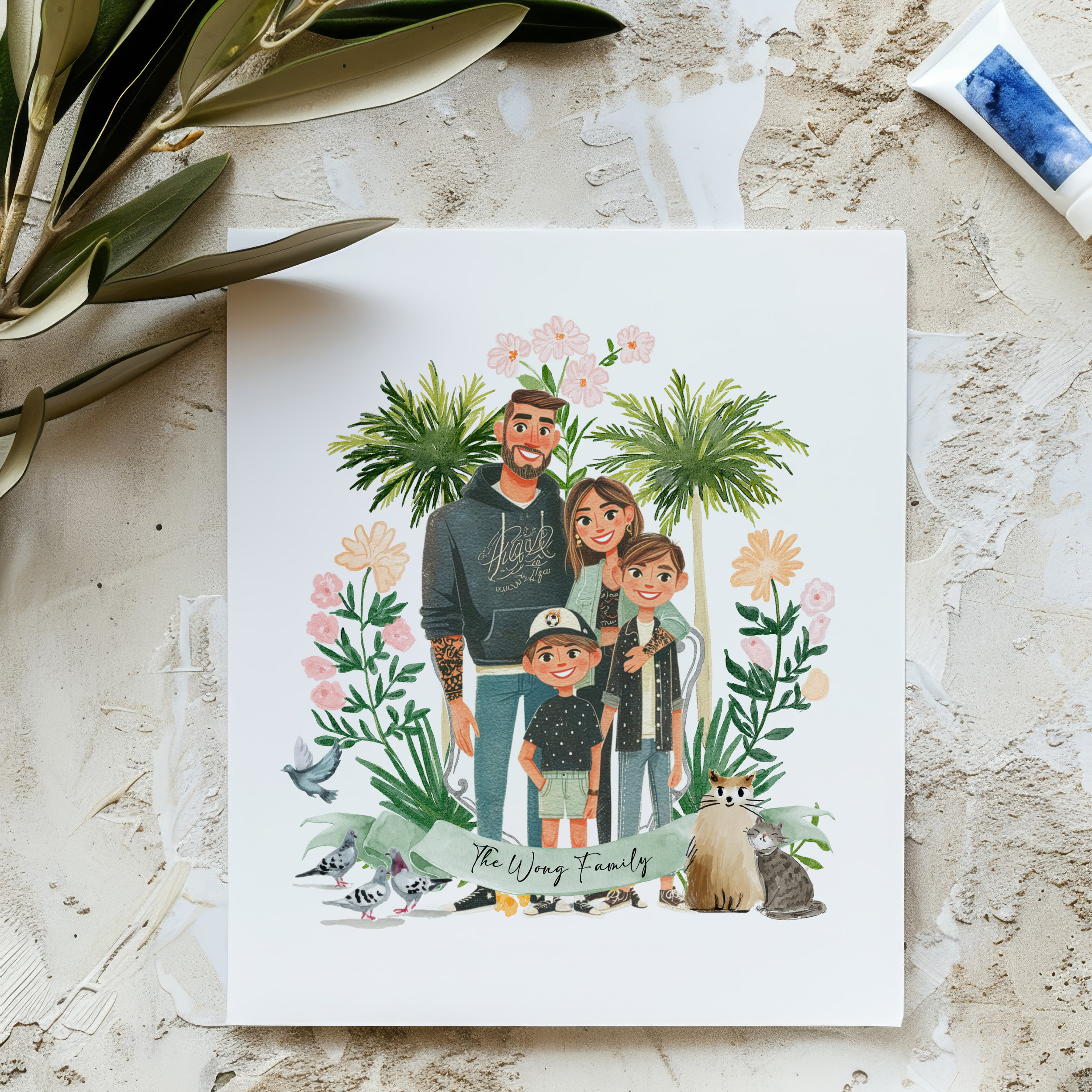

Step 2: Choosing the Right Reference Photos
Great portraits start with great reference images.
I guide you on selecting photos that have:
Clear lighting
Natural expressions
Good visibility of faces
Comfortable poses
You do not need a professional photoshoot. Some of my favorite portraits come from simple phone photos taken during real life moments.
I can also combine multiple photos into one cohesive composition when needed.
📏 About Proportions & Heights
Because these portraits are custom illustrated, I always aim to reflect each person’s real proportions as closely as possible.
For the most accurate results, I ask for:
Approximate heights
Ages of children
Any notable height differences
If someone prefers to appear slightly taller/shorter (yes, this happens!)
This helps me create a portrait that feels natural and true to your family.
If exact heights aren’t available, I’ll use photo references and visual cues to estimate proportions.
Step 3: Styling and Composition
Once I have your photos, I design the layout.
This includes:
Balancing each family member
Coordinating colors and clothing
Creating natural spacing
Choosing backgrounds
Planning focal points
This stage is where individual photos become one unified piece of art.
Step 4: Hand-Painted Watercolor Illustration
This is where the portrait comes to life.
Each piece is painted in my signature watercolor style, using layered washes, soft textures, and careful attention to detail.
I focus on:
Expressive faces
Natural skin tones
Gentle shading
Movement and warmth
My goal is not to create a stiff replica of a photo. It is to create an artwork that feels alive.
Step 5: Personalization Details
Every family is unique, and your portrait should be too.
Optional custom elements include:
Pets
Meaningful homes
Favorite locations
Seasonal settings
Hobbies or traditions
These small details often become clients’ favorite parts of their portrait.
Step 6: Collaboration and Revisions
Custom artwork is a partnership.
You will always have the chance to review your portrait and request thoughtful refinements, whether it is adjusting colors, or small details.
My goal is to make sure your final piece feels exactly right.
Step 7: Final Delivery and Display
When your portrait is complete, you’ll receive either a direct link to purchase a professionally printed version through Zazzle, or, if you’ve chosen the digital option, a high-resolution file ready for personal printing and sharing.
Many families choose to:
Frame their portrait
Display it in their home
Gift it to grandparents
Include it in albums
Use it for holiday cards
It becomes part of your family’s story.
Frequently Asked Questions
How long does a custom portrait take?
Most portraits are completed within several weeks, depending on complexity and schedule.
Can you combine multiple photos?
Yes. I regularly create cohesive portraits from separate images.
Do you include pets?
Absolutely. Pets are family.
Can clothing or backgrounds be adjusted?
Yes. I can refine colors, backgrounds, and details to create a harmonious final piece.
Is every portrait fully custom?
Yes. Each portrait is painted from scratch and designed specifically for your family.
Why Families Choose Custom Watercolor Portraits
A custom family portrait is more than decor.
It is:
A record of this season of life
A meaningful gift
A visual legacy
A reminder of everyday love
Long after trends change, these pieces remain.
Ready to Create Yours?
If you are dreaming of a meaningful watercolor portrait of your family, I would love to create something special for you.
Every portrait begins with a conversation.
And I cannot wait to tell your story through art.
Designed by IYHTVDesigns, specializing in custom watercolor portraits and illustrated keepsakes.
How I Create Custom Watercolor Wedding Maps (From First Idea to Final Keepsake)
Every custom watercolor wedding map I create starts with a story.
Not just a location. Not just a venue.
A story about how two people found each other, where they have been, what matters to them, and how they want their guests to experience their wedding weekend.
Over the years, I have designed illustrated wedding maps and destination invitations for couples all over the world. From Italy and Hawaii to Mexico, New Orleans, and small hometown celebrations, each piece is completely custom and built around the couple’s journey.
Here is a behind-the-scenes look at how I turn your love story into a hand-painted keepsake.
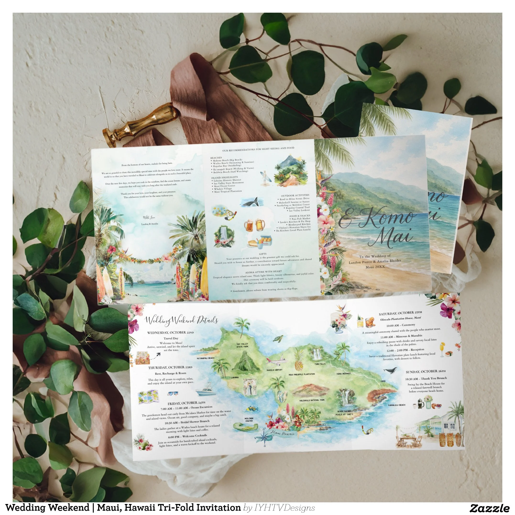
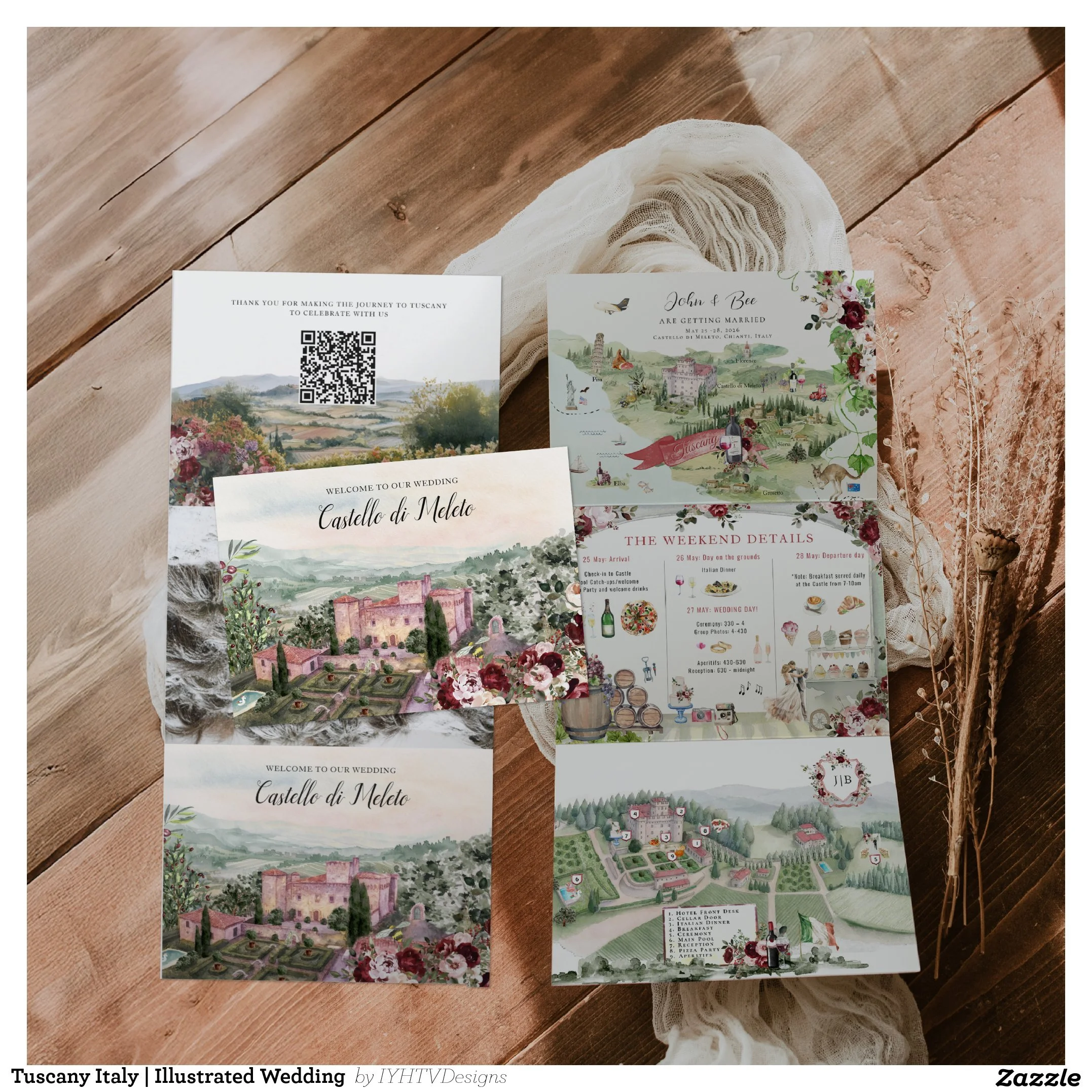
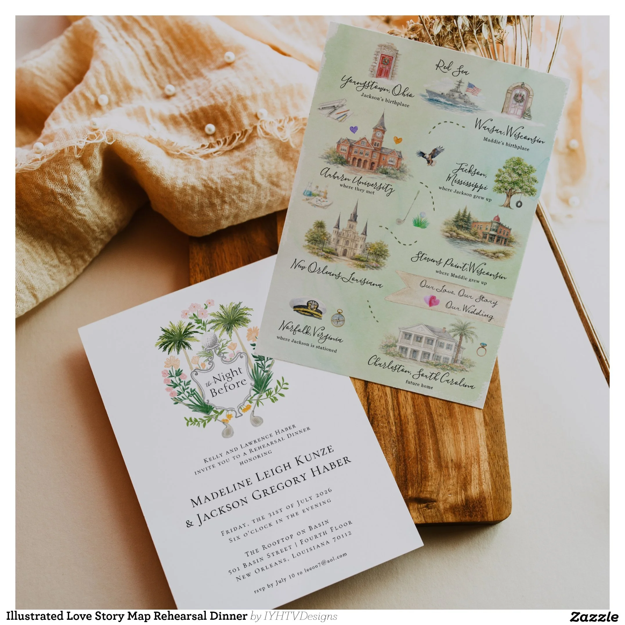
Step 1: Learning Your Story
Before I ever pick up a brush, I take time to understand you.
I learn about:
Where you met
Where you grew up
Where you fell in love
Why you chose your venue
How your wedding weekend will flow
Some couples want a map that highlights their relationship journey. Others want a detailed destination guide for guests. Many want both.
This first step is about listening. Every design begins with your story, not a template.
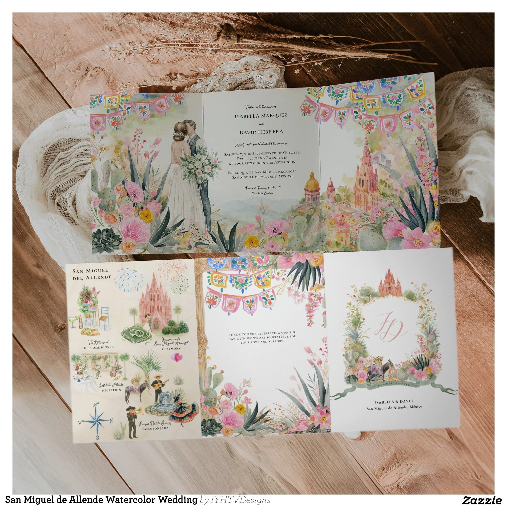
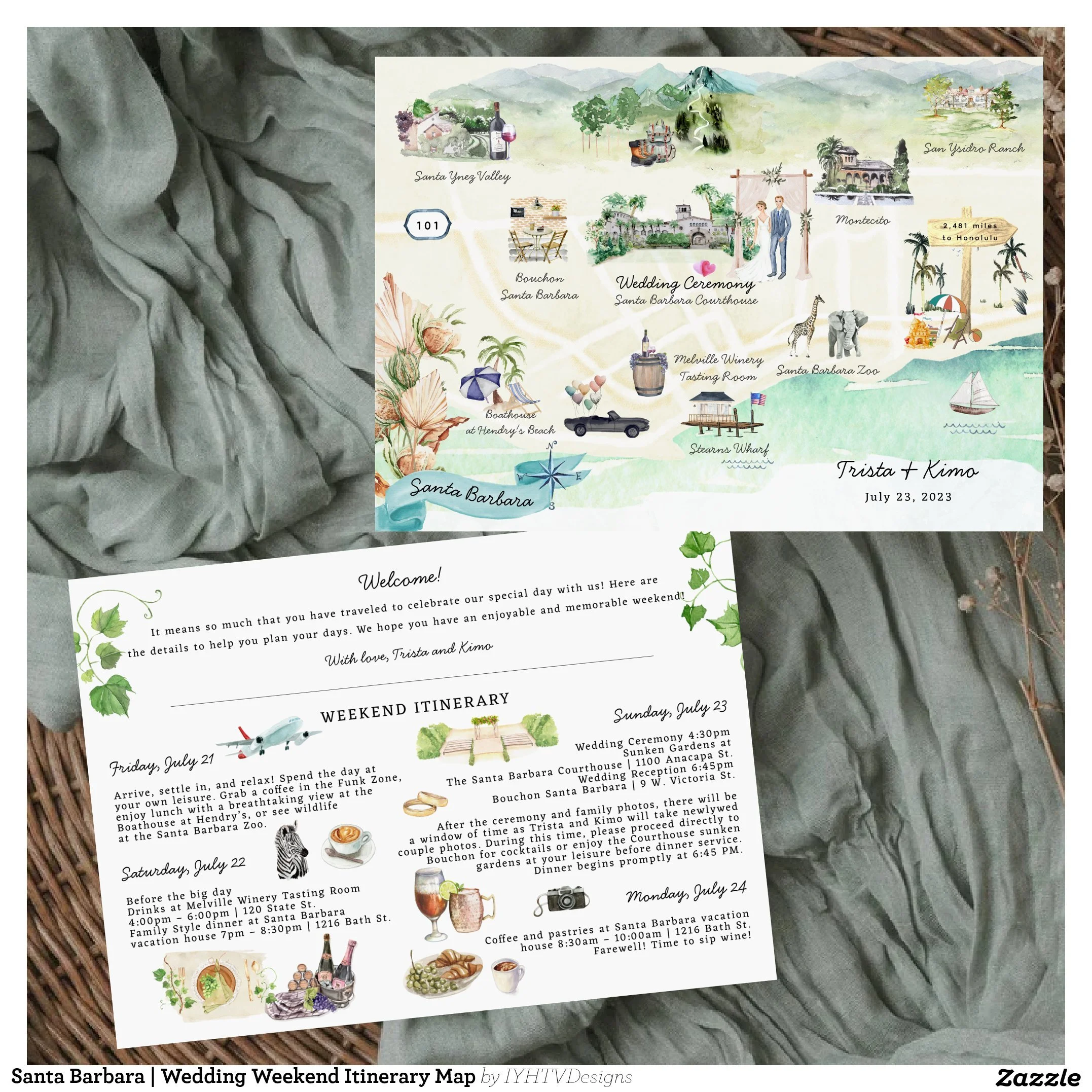
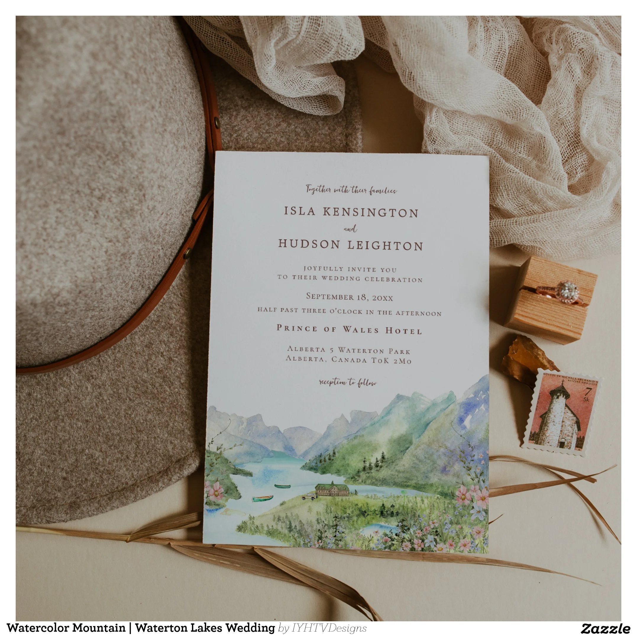
Step 2: Researching Your Location
Once I understand your vision, I dive into research.
I study:
Venue architecture
Surrounding landscapes
Street layouts
Landmarks
Natural features
Cultural details
Whether your wedding is in Tuscany, Maui, San Miguel de Allende, or a hometown you love, I make sure the illustration feels true to that place.
This is what gives each map its sense of authenticity.
Over the years, I’ve created hundreds of hand-painted watercolor maps featuring countries, regions, and destinations around the world. Many of these travel-inspired pieces inform my custom wedding designs. You can explore my full Watercolor Art Maps collection here, which showcases illustrated maps from Mexico and Central America to Europe and beyond.
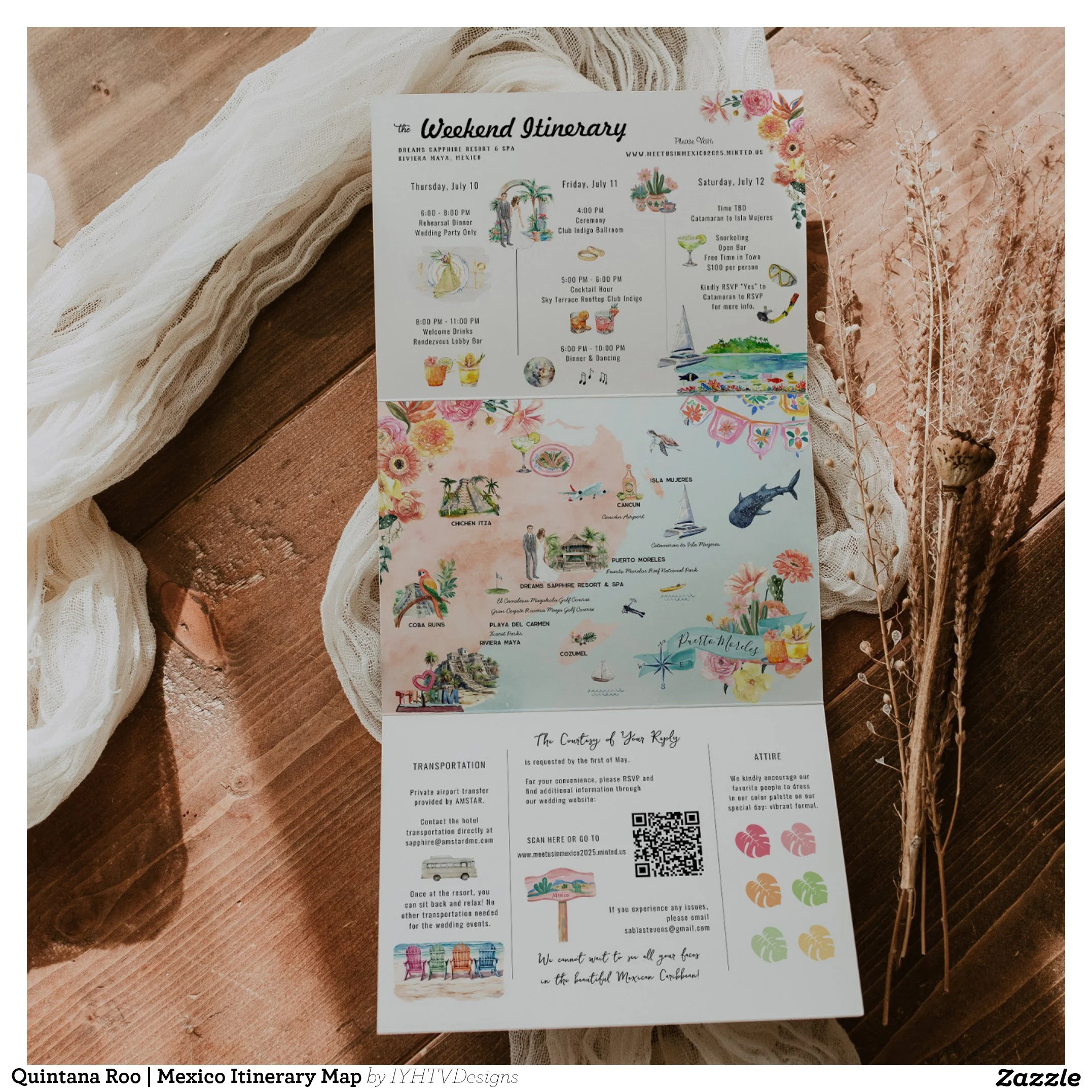
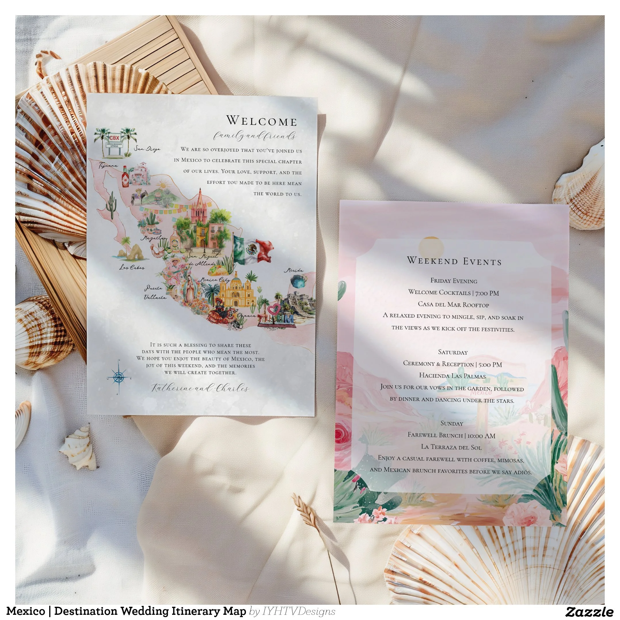
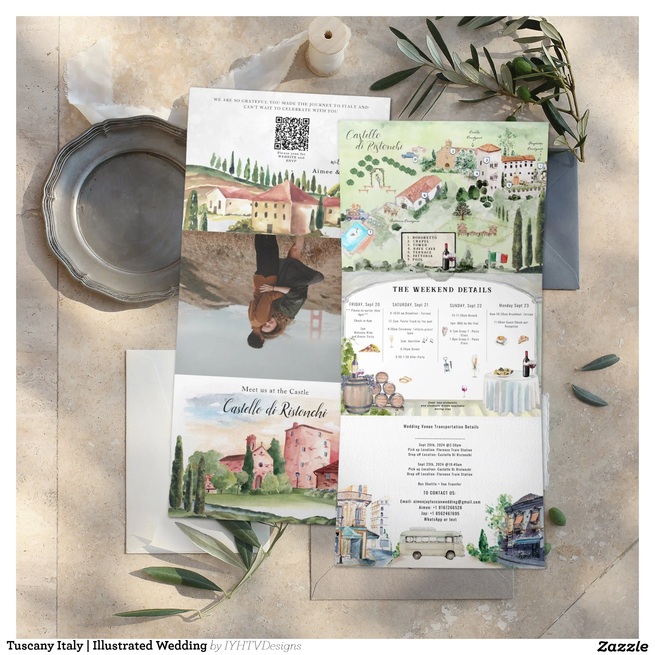
Step 3: Planning the Layout and Flow
Before painting in Procreate begins, we collaborate the desired the structure.
This includes:
Panel layout (for tri-folds or multi-page sets)
Reading order
Visual balance
Spacing for text
Guest-friendly navigation
A wedding map needs to be beautiful and functional.
Guests should be able to glance at it and immediately understand where they are going and what is happening.
This planning stage ensures the final piece works in real life, not just in photos.
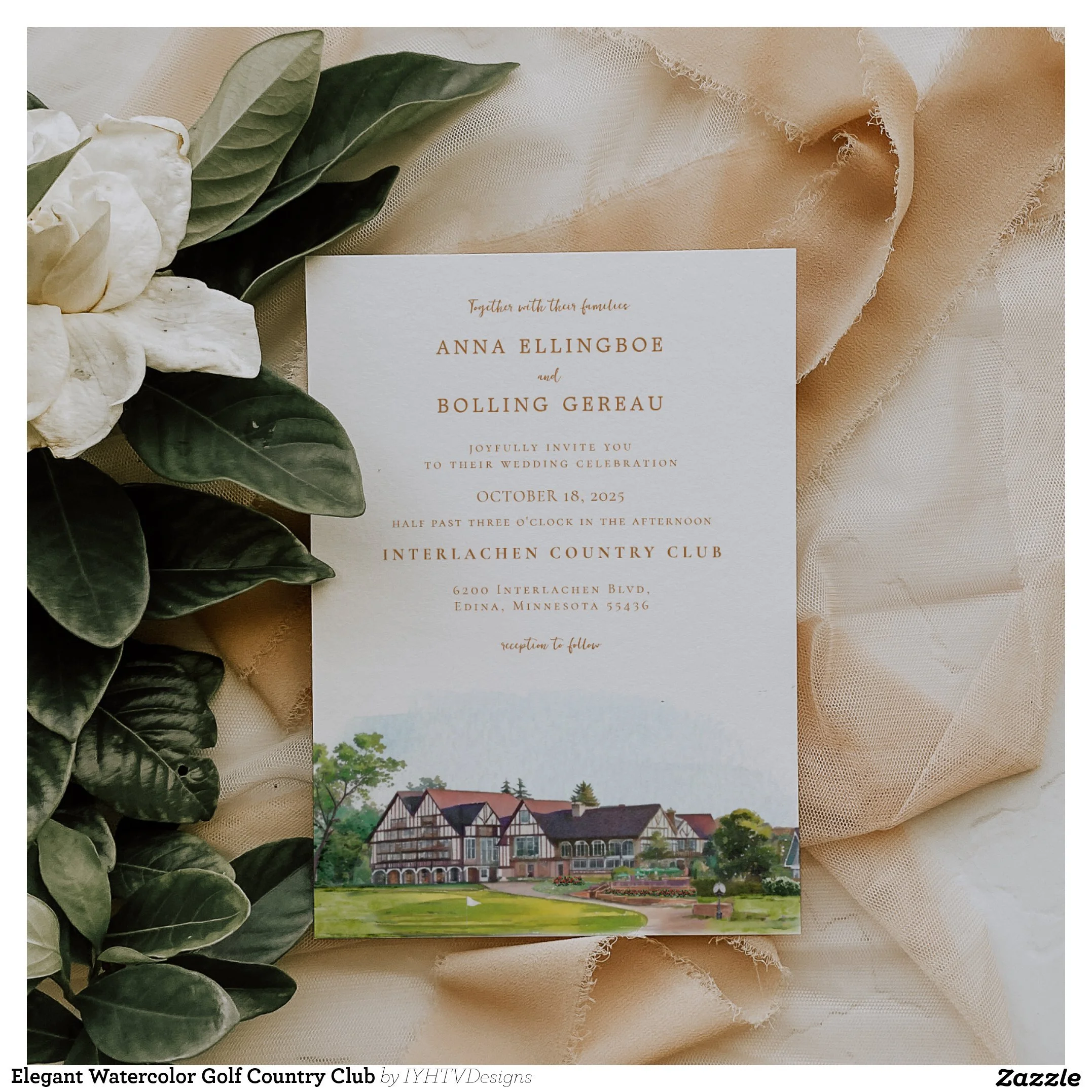
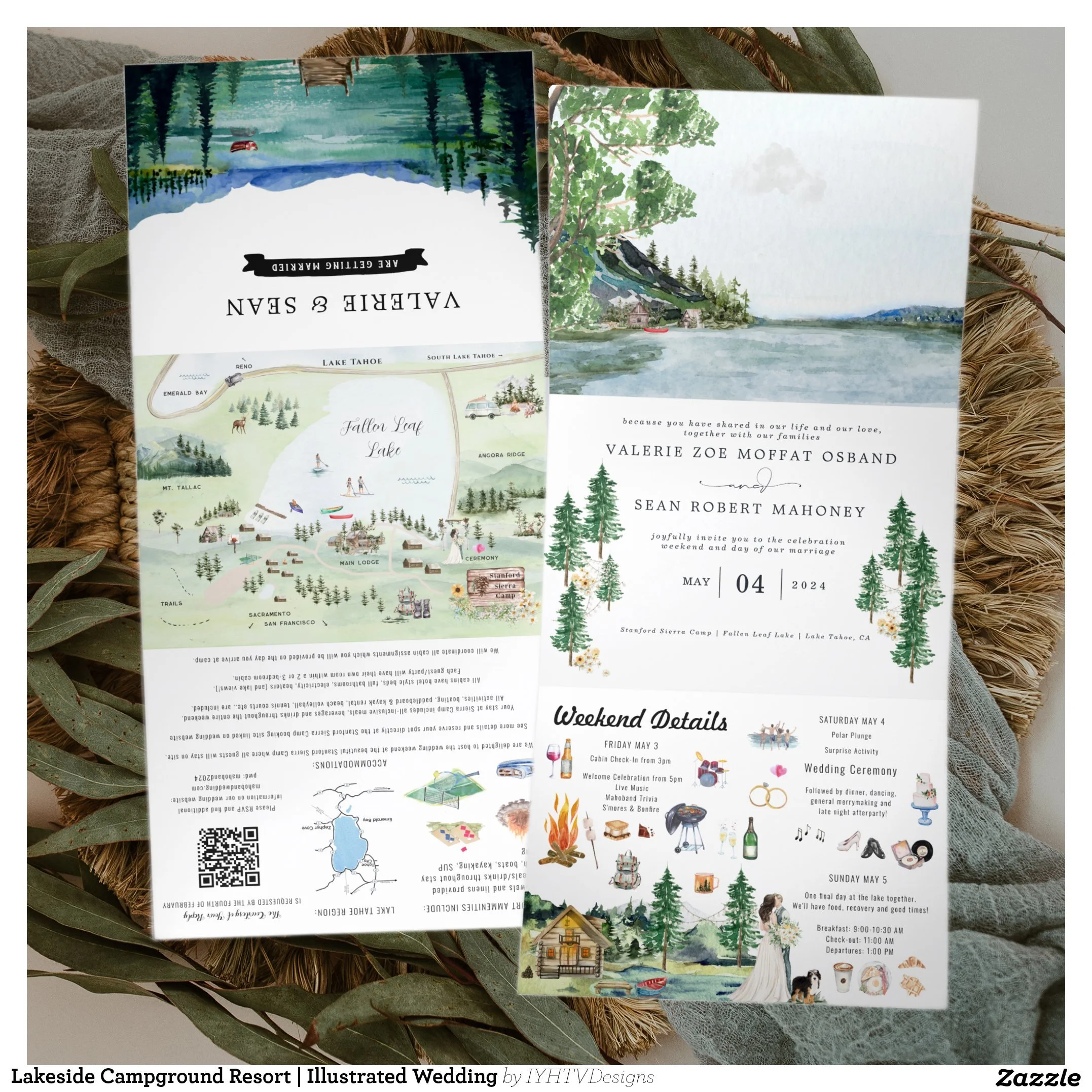
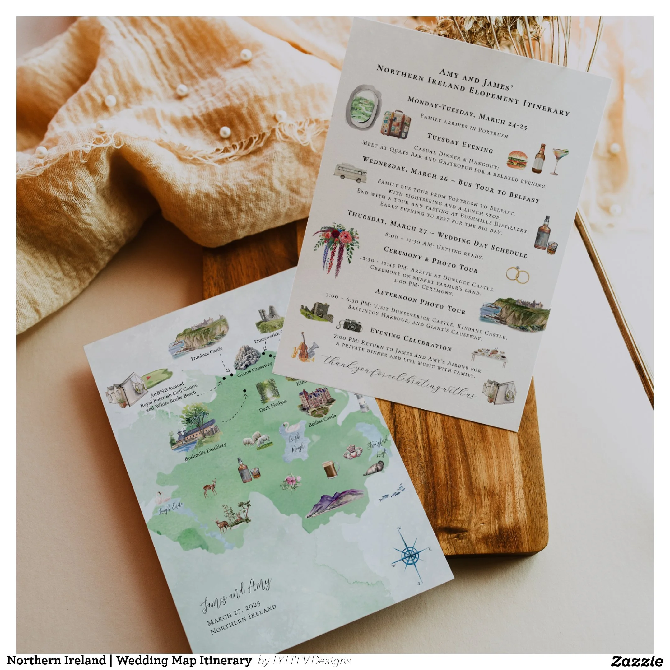
Step 4: Hand-Painted Watercolor Illustration
This is where the magic happens.
Each illustration is created in my signature watercolor style, using soft layering, detailed brushwork, and carefully balanced color palettes.
I focus on:
Light and depth
Natural textures
Architectural detail
Botanical elements
Atmosphere
My goal is always to make the piece feel timeless. Something you will still love when you look at it years from now.
Not trendy. Not generic. Truly yours.
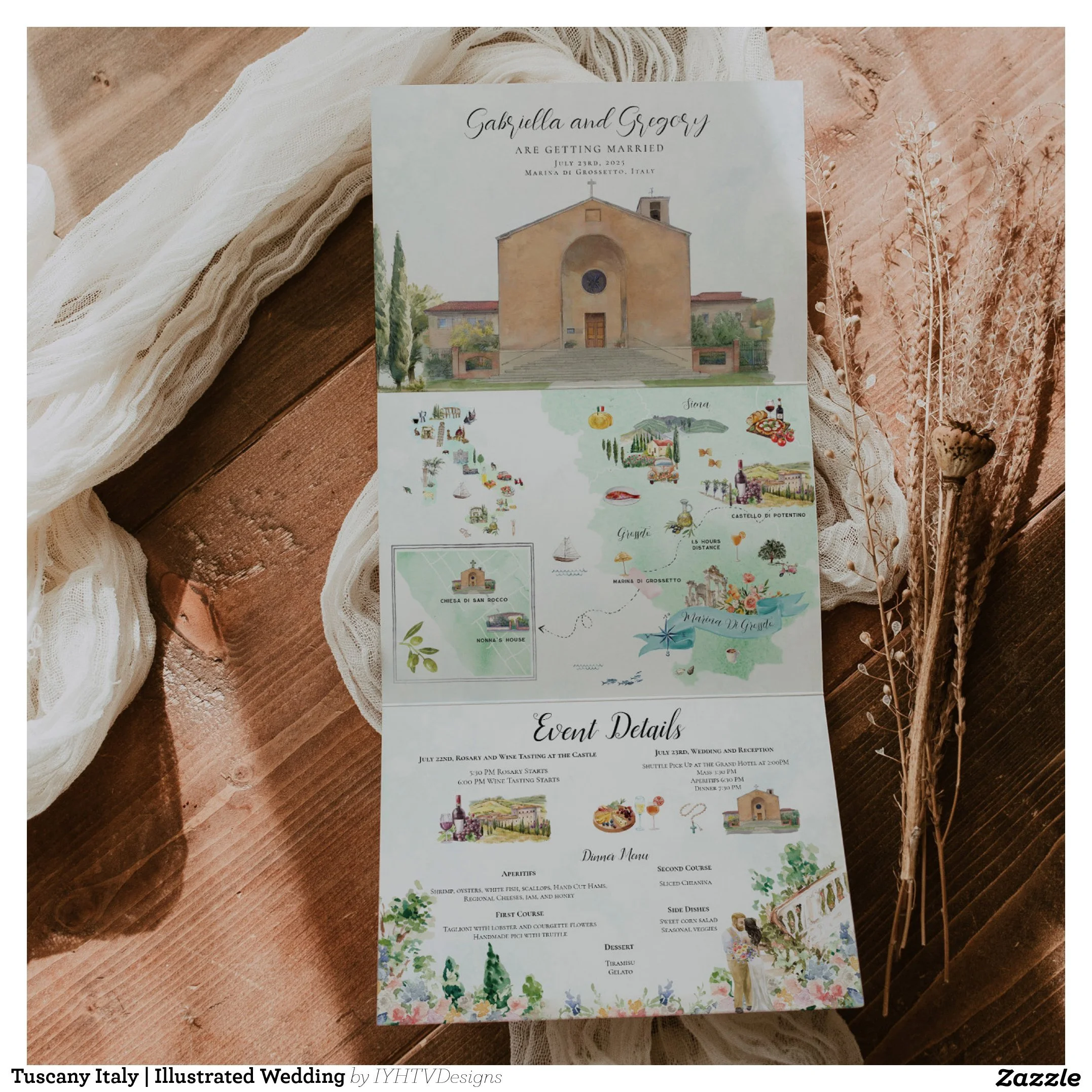
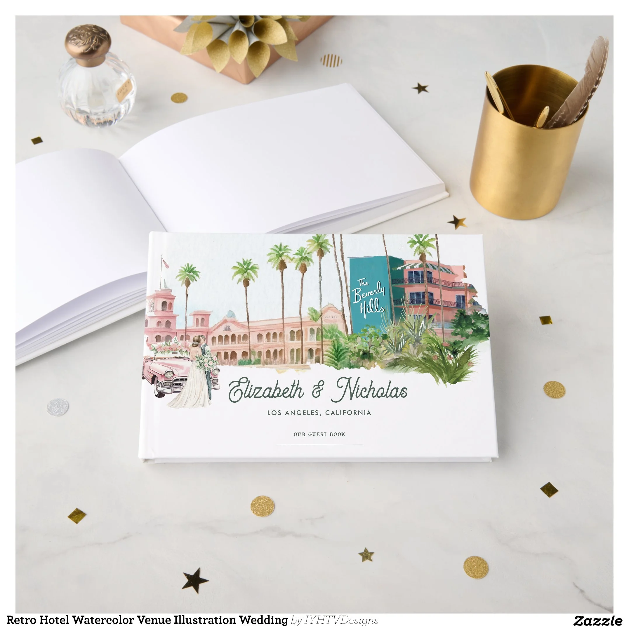
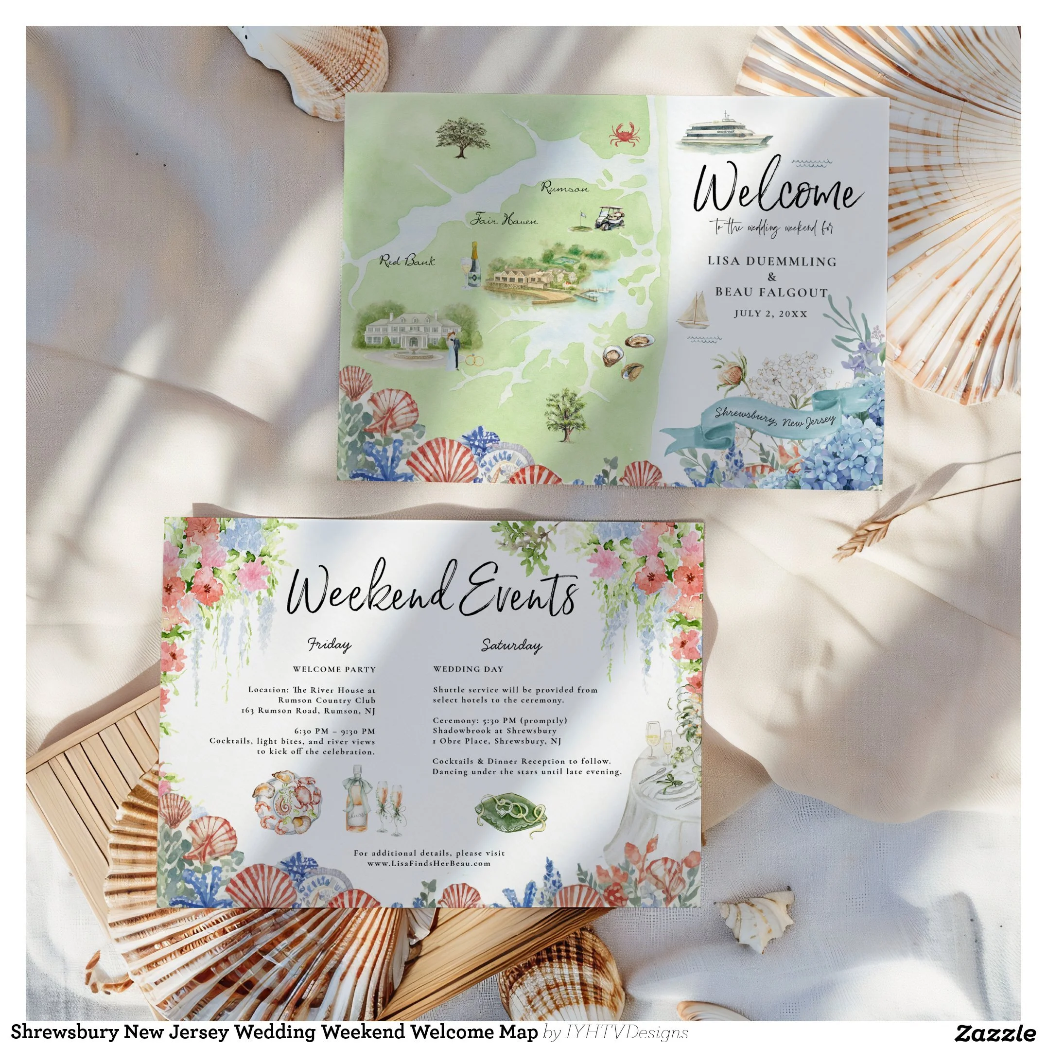
Step 5: Typography and Digital Refinement
Once the artwork is complete, I move into digital refinement.
This includes:
Professional typography
Spacing and alignment
Print optimization
Color correction
High-resolution export
This step ensures your invitations look just as beautiful when printed as they do on screen.
It is where artistry meets professional design.
Step 6: Collaboration and Revisions
Custom design is a collaboration.
You will always have the opportunity to review your design and request thoughtful adjustments.
This might include:
Wording changes
Timeline updates
Color tweaks
Detail refinements
Layout adjustments
I build flexibility into every project so your final piece feels exactly right.
My goal is never to rush you. It is to create something you feel proud to send to the people you love.
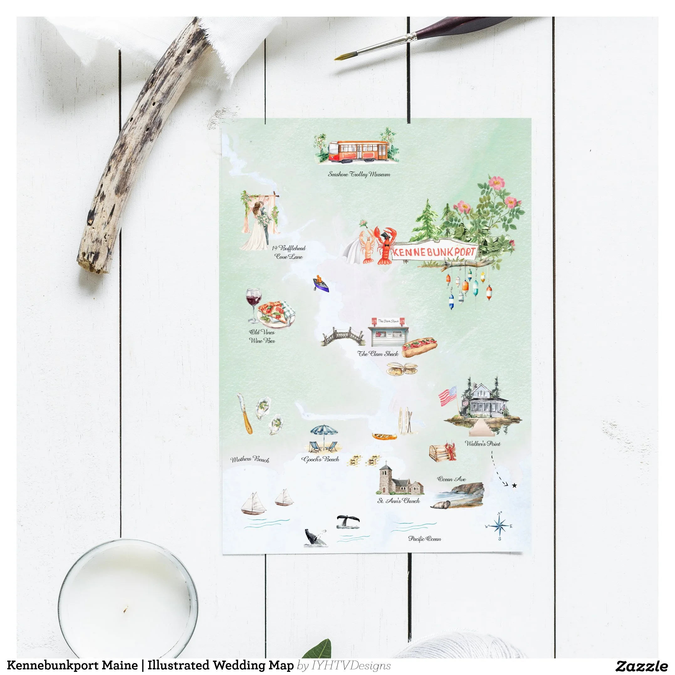
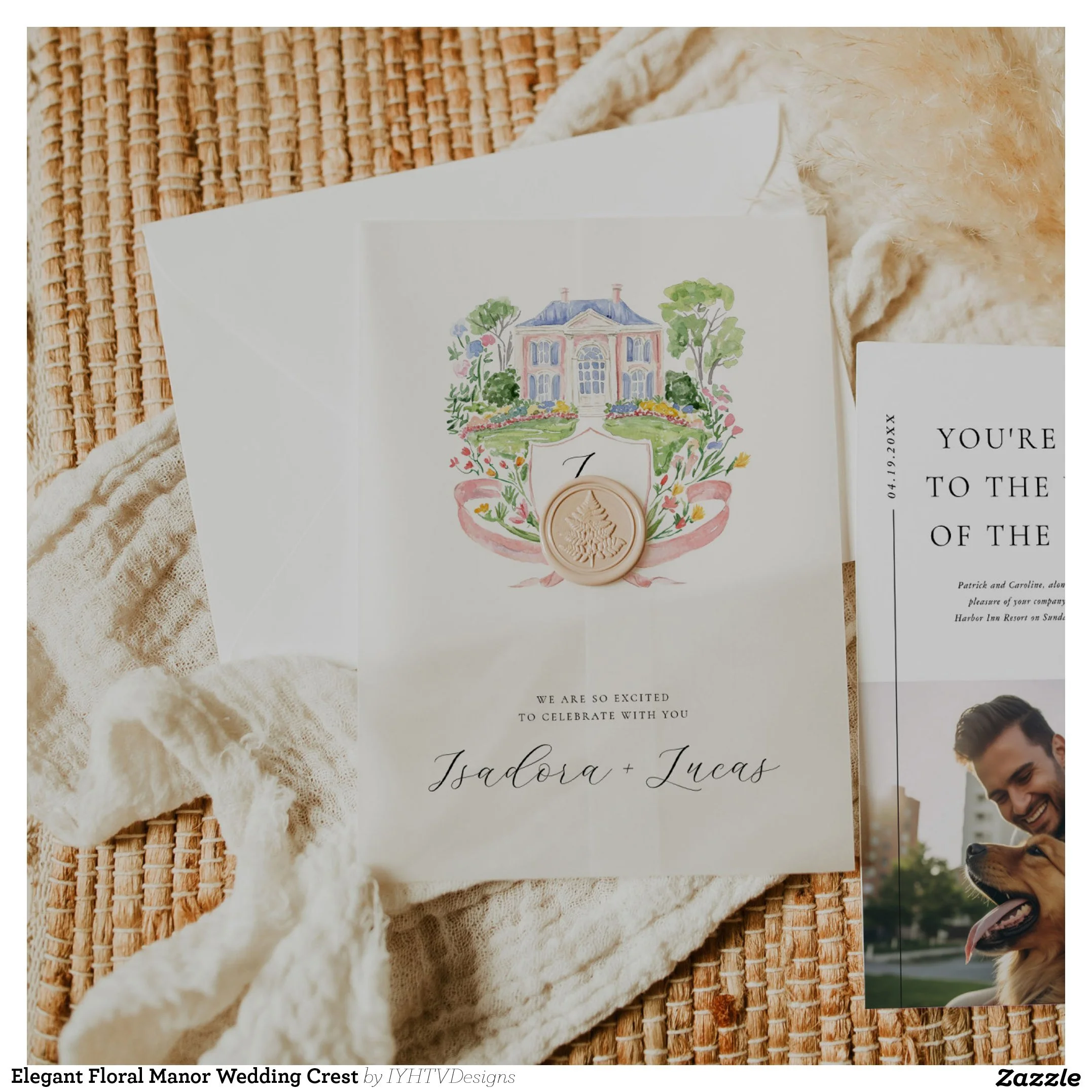
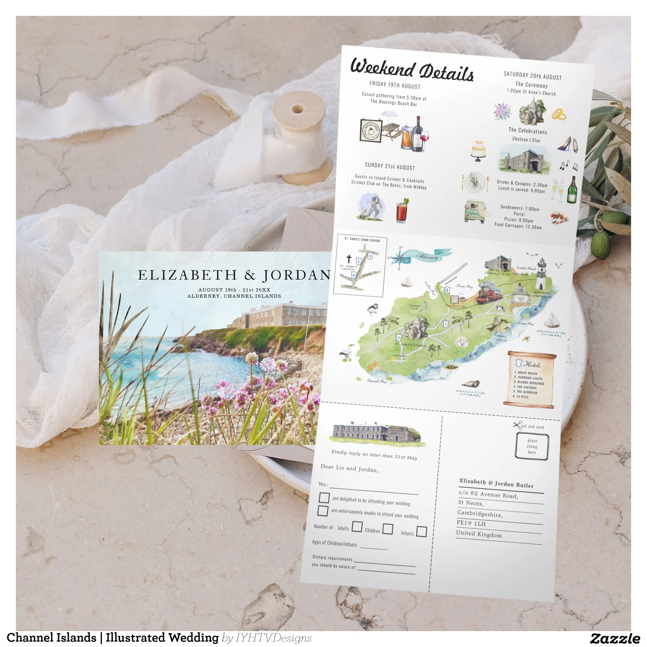
Step 7: Final Delivery and Keepsake Value
When your design is complete, you receive either high-resolution files ready for printing and sharing, or your custom link to print through Zazzle.
Many couples later:
Frame their maps
Include them in albums
Display them at home
Pass them down as keepsakes
What begins as an invitation becomes part of your family story.
Frequently Asked Questions
How long does a custom wedding map take?
Most projects take several weeks from start to finish, depending on complexity and timing. I always recommend reaching out early when possible.
Can you illustrate any location?
Yes. I regularly work with international and destination weddings, as well as hometown venues.
Is every design fully custom?
Yes. I do not use templates. Each map is built from scratch for your wedding.
Can wording be changed later?
Absolutely. Wording changes are part of the collaborative process.
Do you work with last-minute timelines?
Sometimes, depending on availability. It is always best to ask.
What if our plans change?
I understand that weddings evolve. I build flexibility into the design process whenever possible.
Why Couples Choose Custom Watercolor Maps
A custom wedding map is more than stationery.
It is:
A guide for your guests
A reflection of your journey
A piece of art
A lasting keepsake
It tells your story in a way nothing else can.
Ready to Create Yours?
If you are dreaming of a meaningful, custom watercolor map for your wedding weekend, I would love to hear your story.
You can explore my portfolio and reach out to begin your custom design journey.
Every map begins with a conversation.
And I cannot wait to start yours.
About the Artist
I’m Laura-Lise, founder of IYHTVDesigns, specializing in custom watercolor wedding maps and destination invitations for couples worldwide.
What Makes Wedding Details Feel Thoughtful (Not Generic)
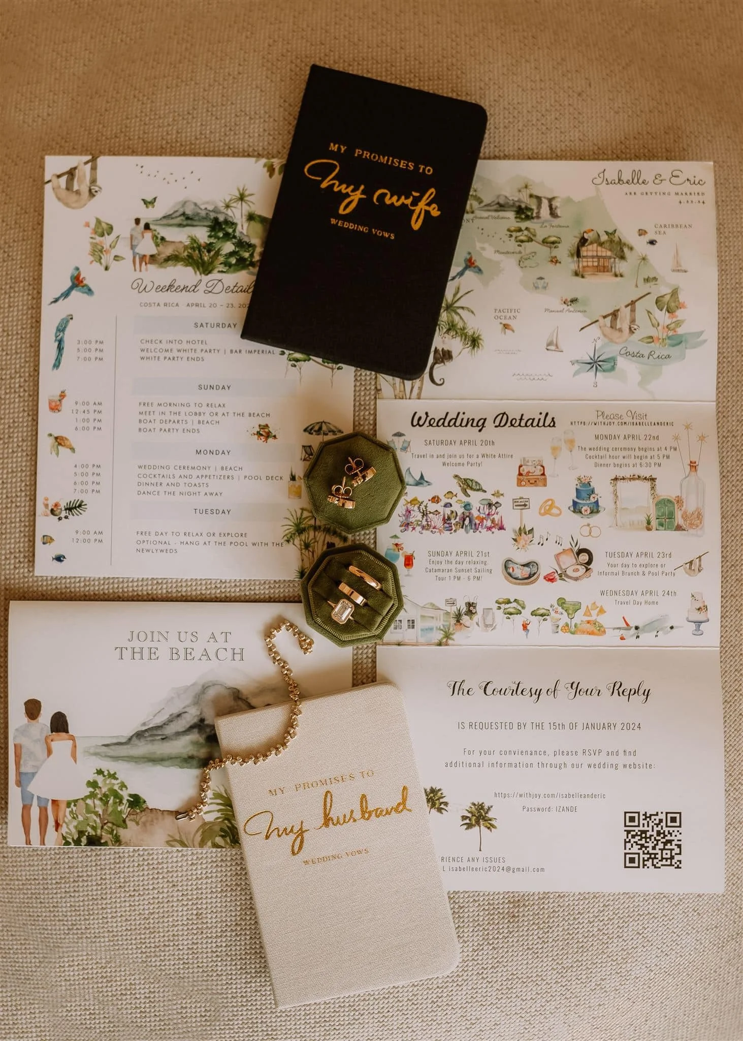
Thoughtful wedding details are not about having more. They are about choosing better. An example of thoughtful destination wedding details, where illustrated stationery, personal keepsakes, and cohesive design work together seamlessly.
There is a moment in wedding planning when everything starts to blur together.
You have saved dozens of ideas. You have pinned the invitations, the signage, the favors, the table numbers. And yet, somehow, it all starts to feel the same.
Not bad. Just generic.
This is usually the point where couples realize that personalization is not about adding more details. It is about choosing the right ones.
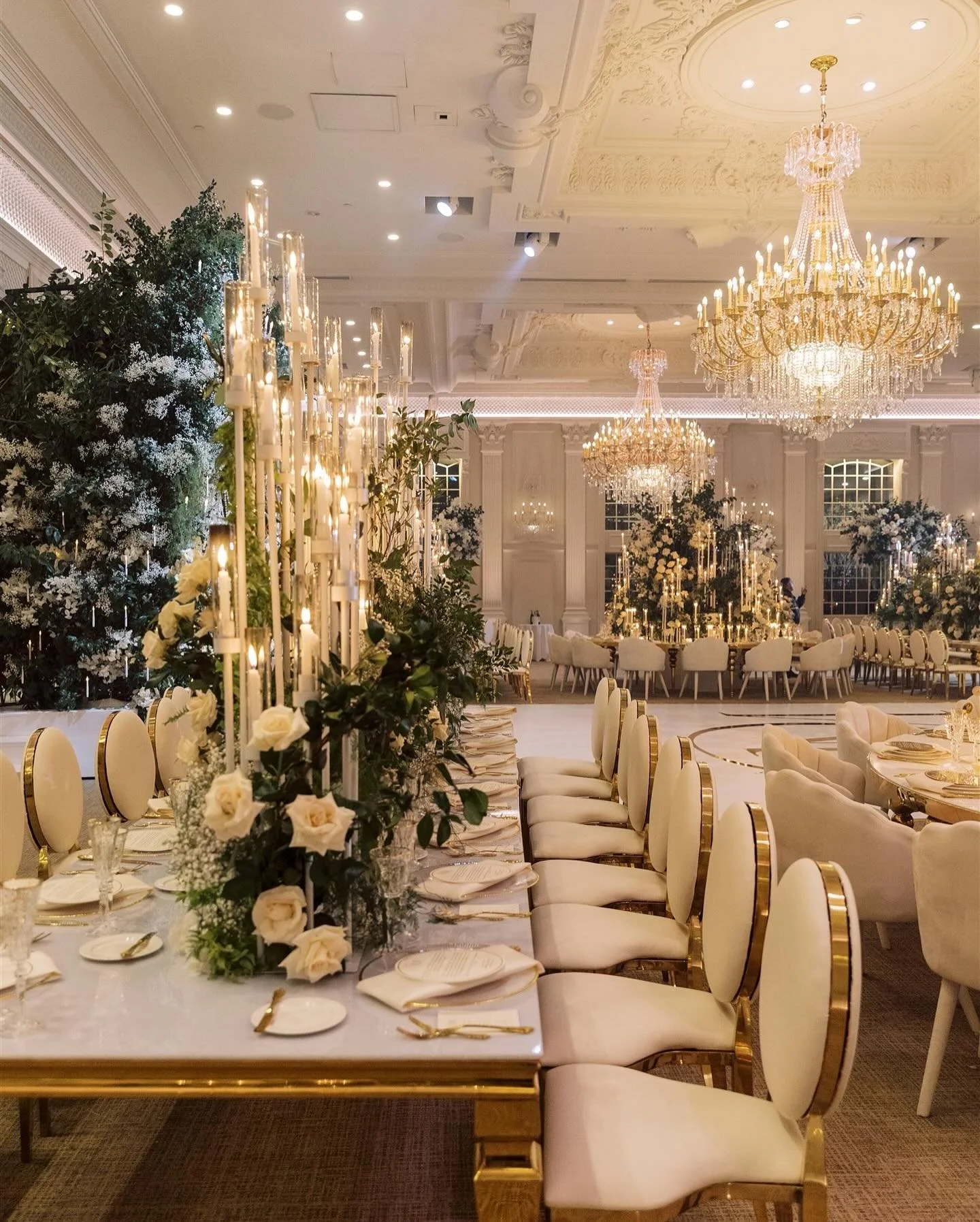
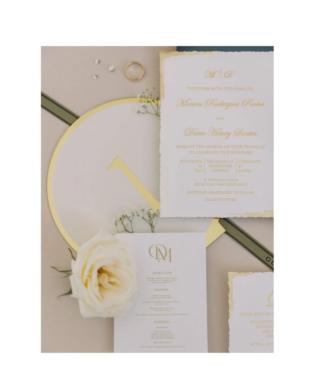
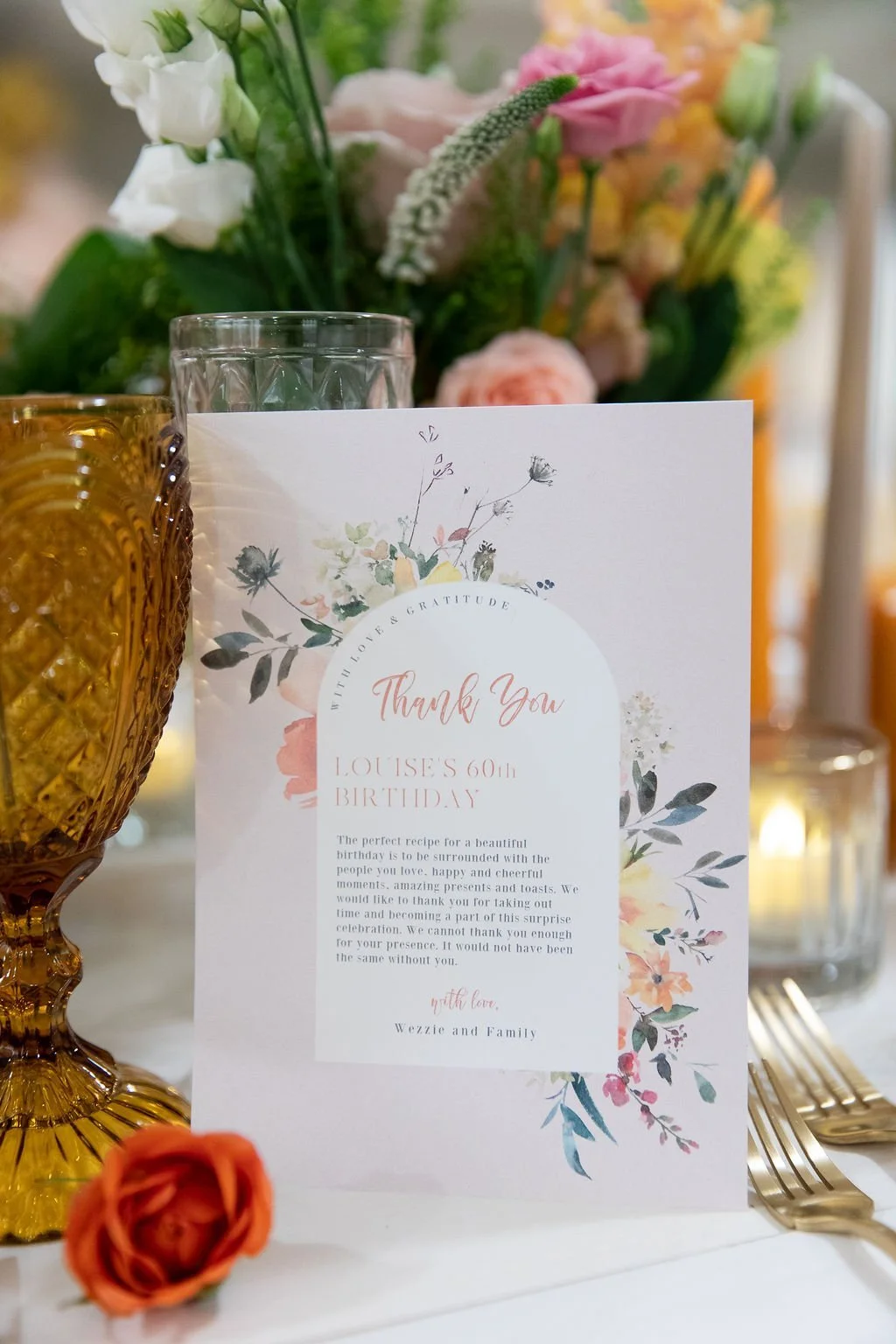
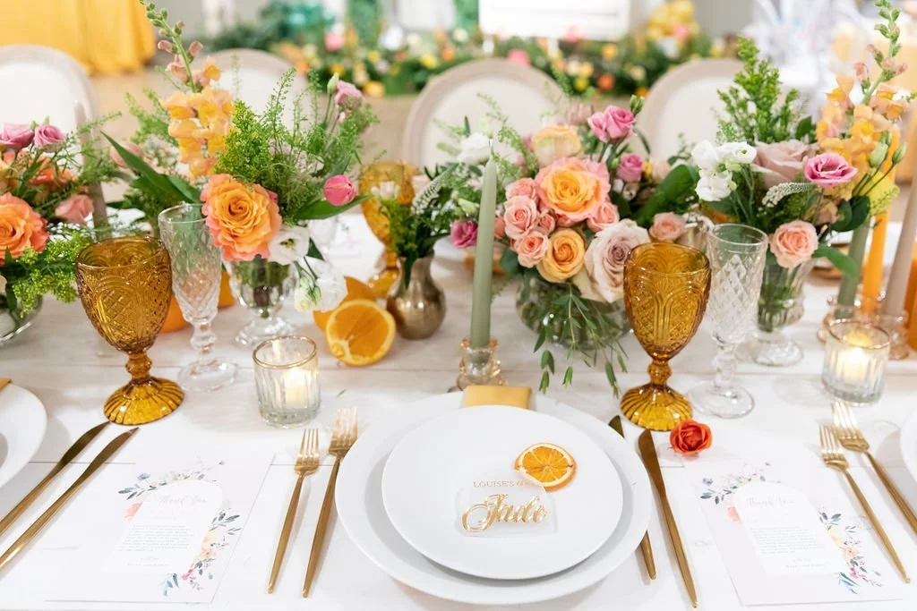
Thoughtful Always Beats Trendy
Trends move quickly in the wedding industry. What feels fresh this year often feels dated by the time albums are printed.
Thoughtful details, on the other hand, age beautifully.
Thoughtful looks like:
A consistent design language carried through multiple pieces
Personal touches that feel subtle, not performative
Materials and layouts that photograph well without trying too hard
When details are chosen with intention, they quietly elevate the entire experience.
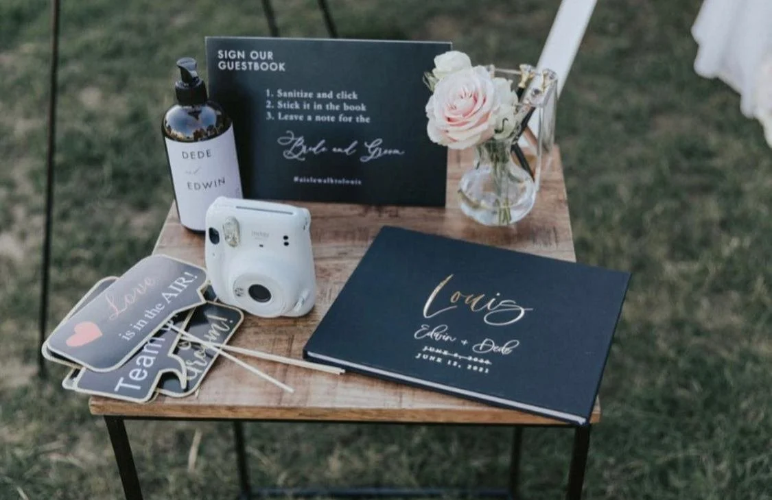
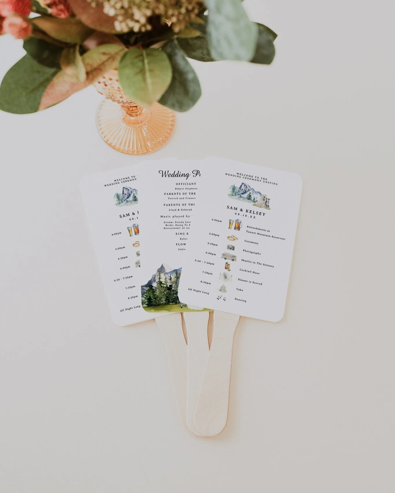
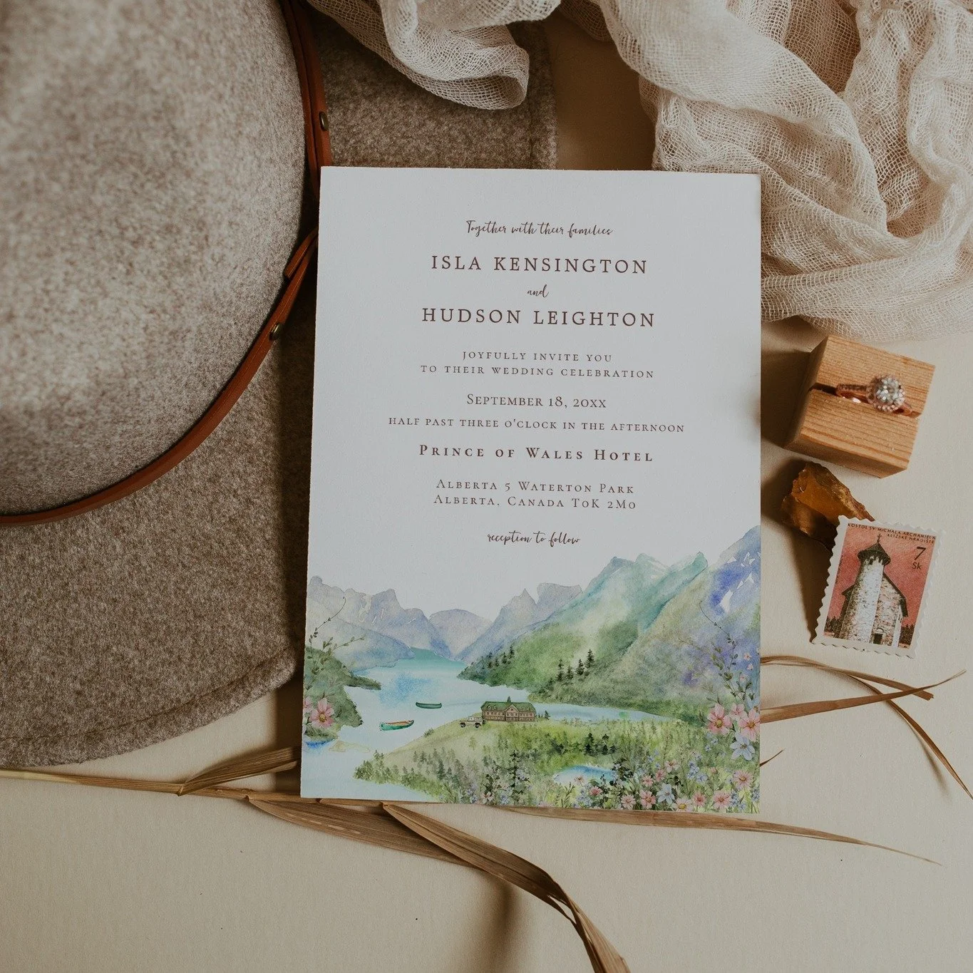
Consistency Is What Makes Things Feel “Designed”
One of the biggest differences between a wedding that feels cohesive and one that feels pieced together is consistency.
This does not mean everything has to match perfectly.
It means:
Similar typography across paper goods
A restrained color palette
Repeating motifs or illustration styles
When details speak the same visual language, guests may not consciously notice why it feels elevated, but they feel it.
Personalization Works Best When It Is Restrained
There is a misconception that personalization means putting names, dates, or monograms on everything.
In reality, the most effective personalization is often quieter.
A custom illustration, think venue illustration or a custom watercolor map.
A meaningful location reference.
A color choice that reflects the setting or season.
These details feel intentional because they are not shouting for attention.
Focus on the Details Guests Actually Interact With
Some wedding details exist mostly for photos. Others are touched, held, or used by guests.
The pieces that tend to make the strongest impression are the ones guests engage with:
Invitations and day-of paper
Tabletop details
Signage that guides the experience
Small keepsakes that feel considered
These are the places where thoughtful design has the most impact.
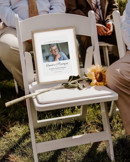
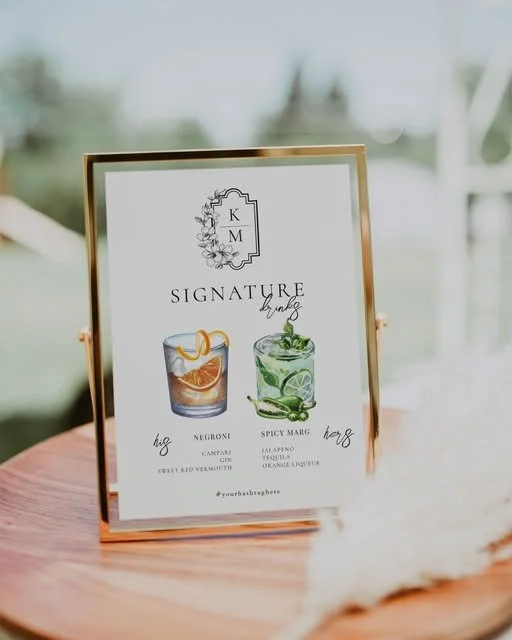
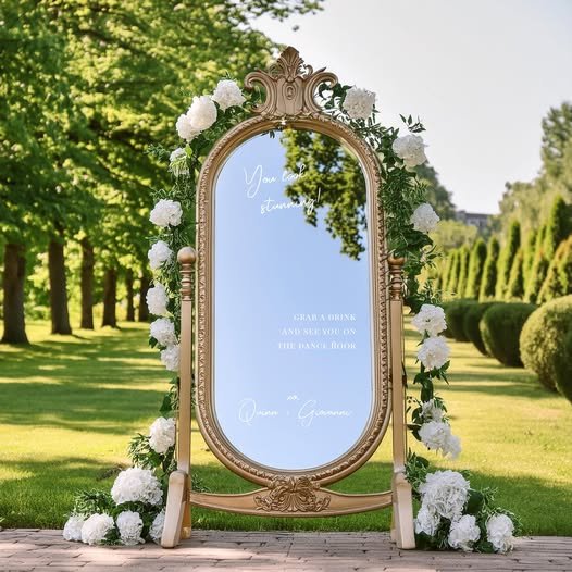
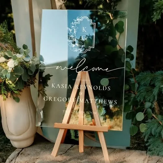
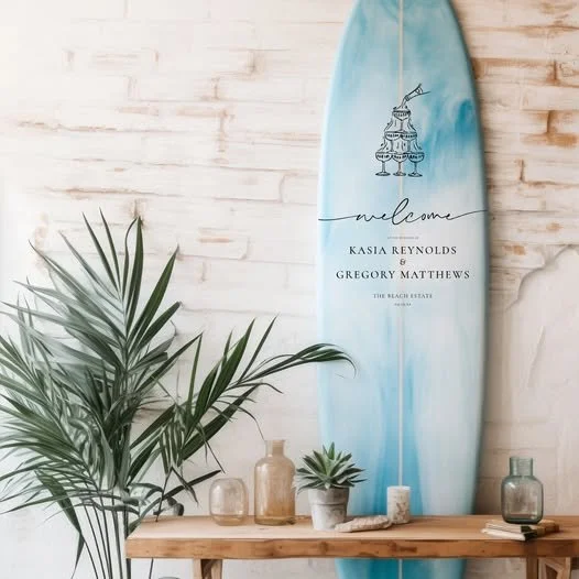
A Curated Approach Makes Decision-Making Easier
One of the most overwhelming parts of wedding planning is having too many options.
Instead of endlessly searching individual products, I always recommend working from a curated set of pieces that already work well together.
I have pulled together a collection of wedding details I consistently recommend. These are items that feel intentional, photograph beautifully, and work cohesively across a full celebration.
👉 View my curated wedding must-haves here:
Dreamy Wedding Invitations | Elegant Designs for Your Big Day
And here: Beautifully Curated Wedding Must-Haves
This approach removes a lot of guesswork and helps couples focus on creating something that feels like them, not just what is popular.
Thoughtful Details Create a Lasting Impression
At the end of the day, weddings are remembered for how they felt.
When details are chosen with care, everything feels calmer, more intentional, and more personal. Not because there was more, but because what was chosen mattered.
Thoughtful wedding design is not about perfection. It is about cohesion, restraint, and meaning.
If you focus on those elements, your wedding will never feel generic.
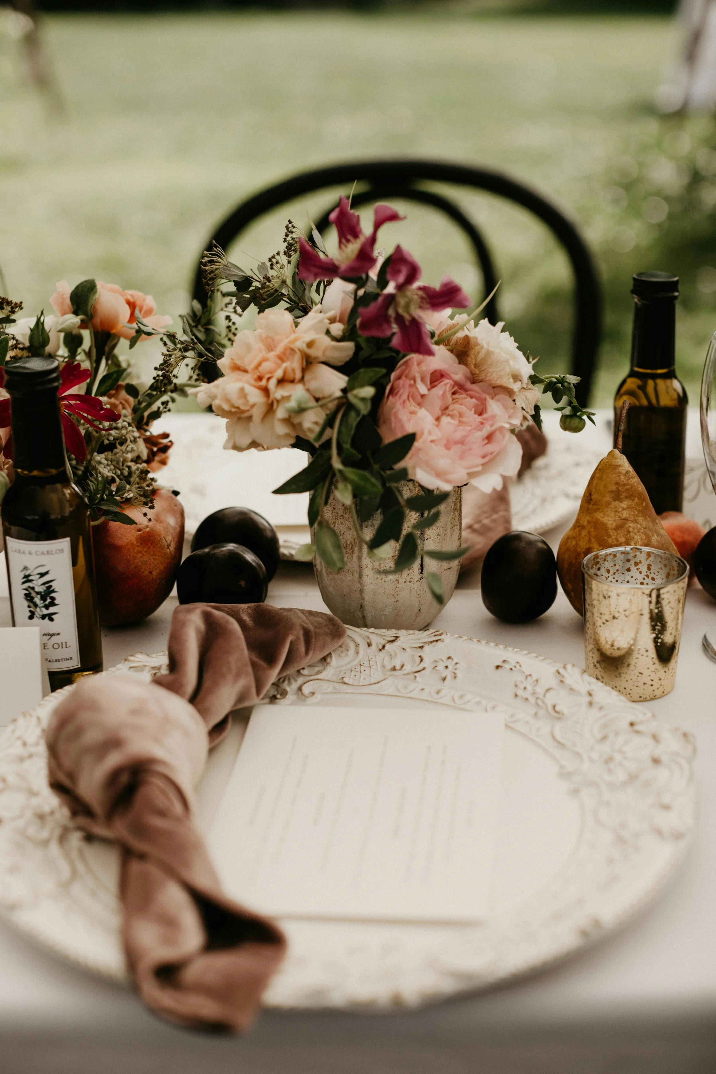
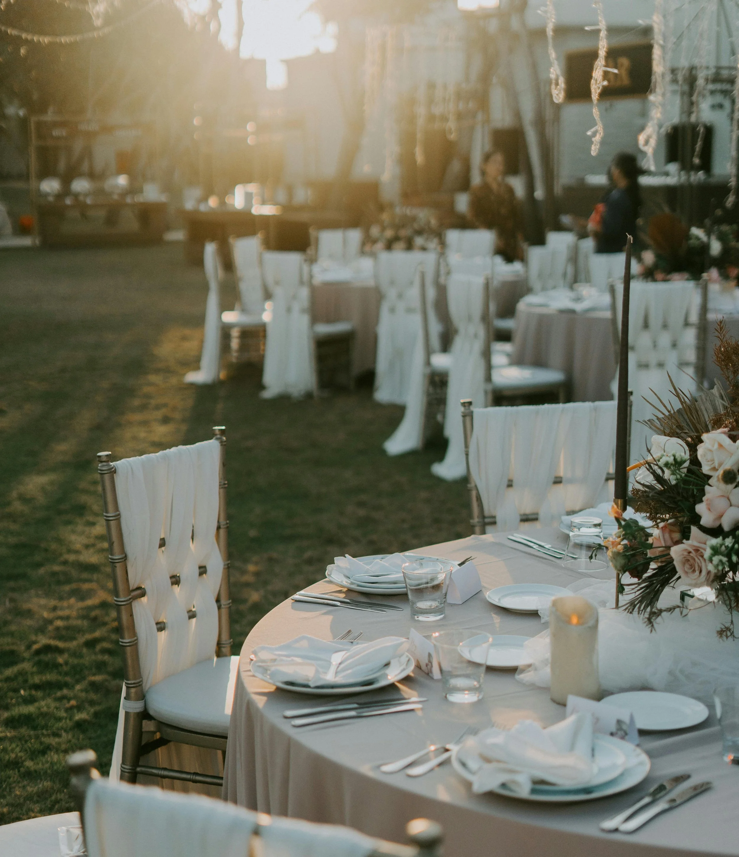
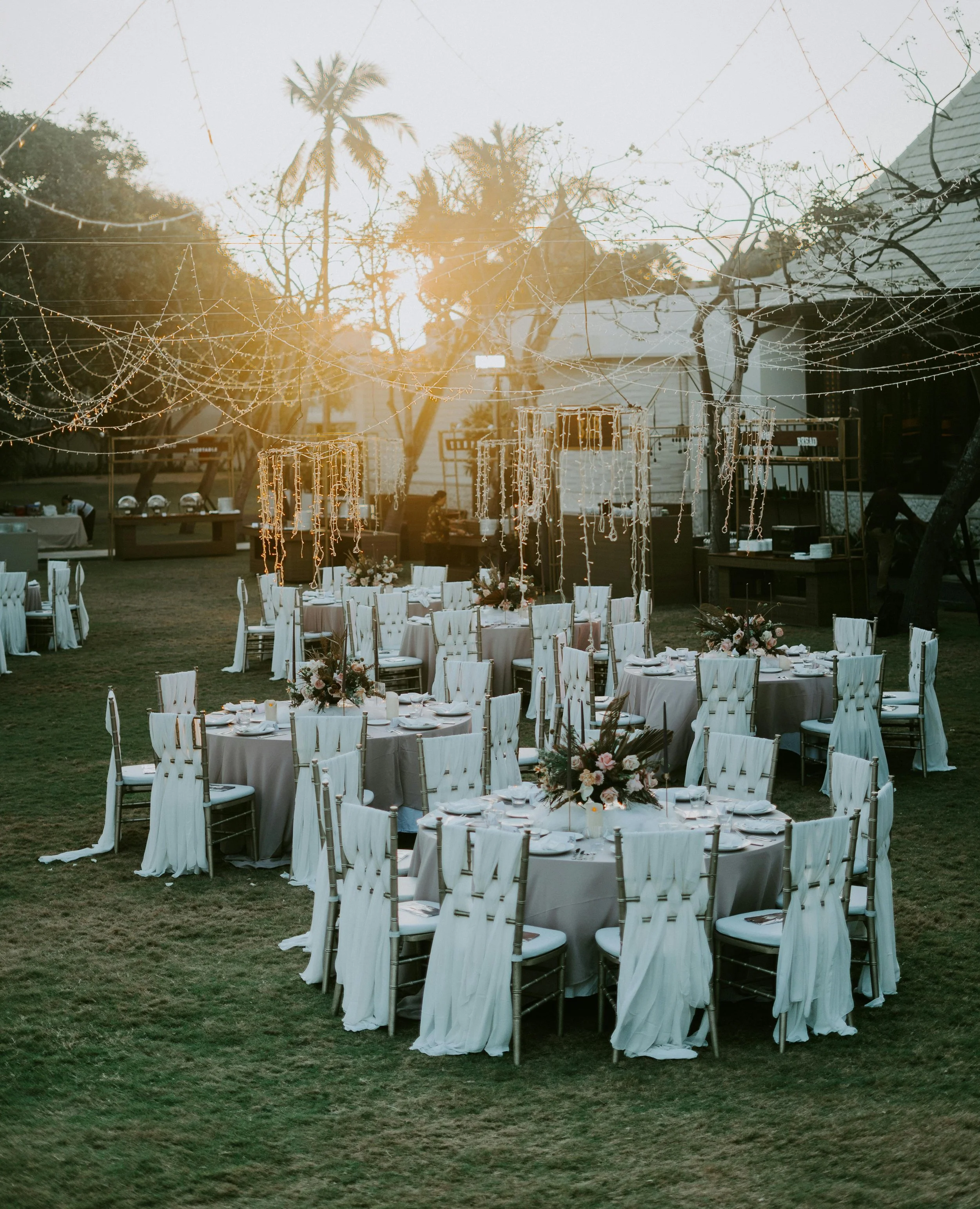
When Christmas Magic Changes: A Letter from Santa for Older Kids
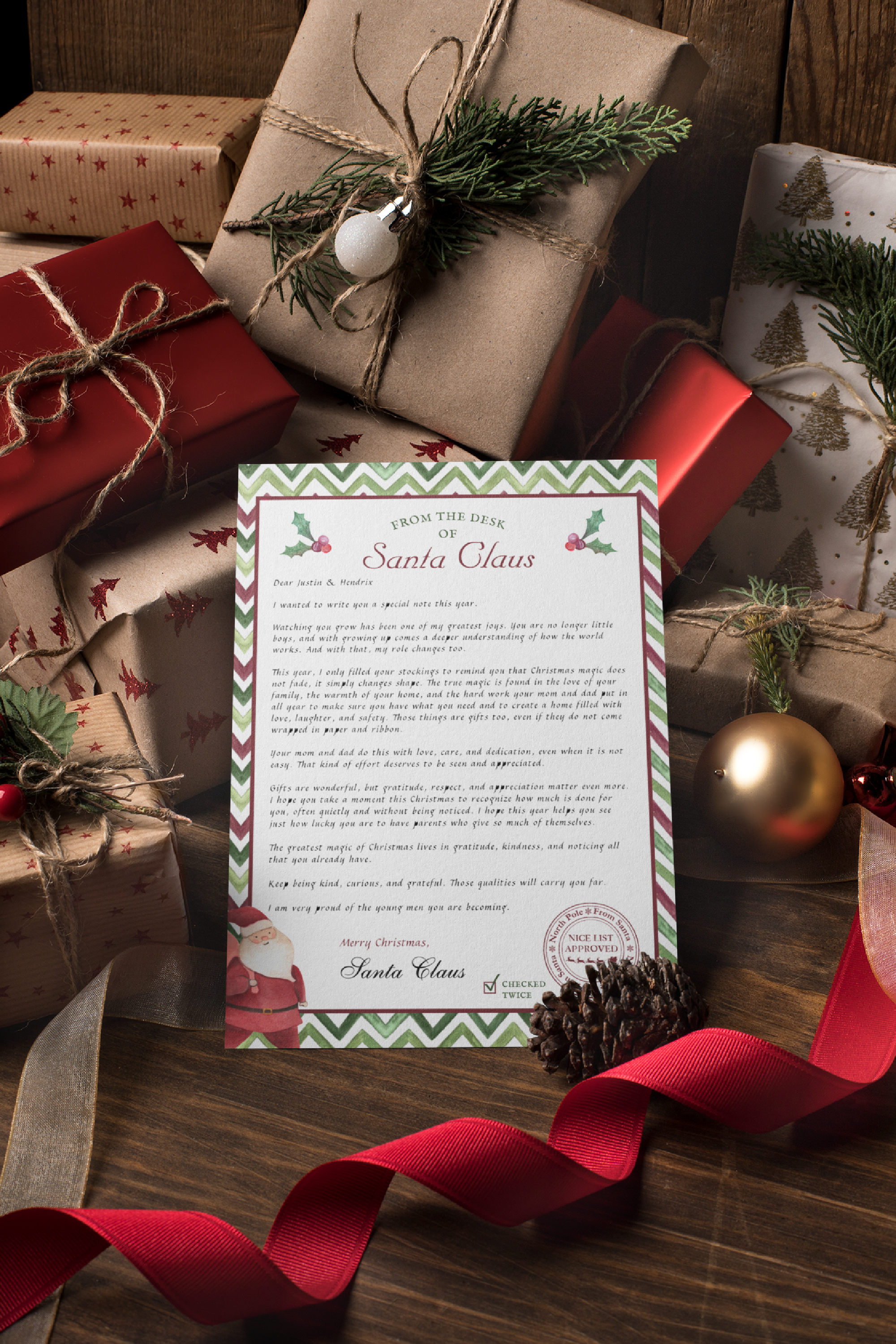
There is a quiet shift that happens in many homes as children grow.
Christmas mornings start a little later. Wish lists get shorter, or sometimes more complicated. Conversations become deeper. Kids notice more. They ask better questions. And as parents, we begin to feel that tug between holding onto the magic and helping our children understand the bigger picture.
It is not that the magic disappears. It is that it changes.
When “More” No Longer Feels Right
For many families, the pressure around Christmas gift giving grows heavier as kids get older. Bigger items. Higher expectations. More comparison. More consumption. And often, less connection.
At some point, many parents start asking themselves quiet questions like:
Is this still what Christmas is about?
How do we shift the focus without taking something away?
How do we honor the season while helping our kids grow into thoughtful, grounded humans?
There is no single right answer. But there are gentle ways to guide that transition.
Santa Does Not Have to Disappear
One thing I strongly believe is that Santa does not need to vanish suddenly or be “explained away” the moment kids start to mature.
Instead, Santa can grow with them.
The role Santa plays for a five year old is different than the role he plays for an eleven or fourteen year old. And that is okay. In fact, it can be incredibly meaningful.
Rather than Santa being the source of piles of gifts, he can become a symbol of reflection, gratitude, and the deeper magic of the season.
Why a Letter Matters
Words have weight, especially when they are written with intention.
A letter from Santa allows parents to gently reset expectations while still honoring tradition. It gives children language for what they are beginning to notice on their own. That mom and dad work hard. That love shows up in quiet ways. That not everything meaningful comes wrapped in paper and ribbon.
A letter also respects their maturity. It does not talk down to them. It invites them into understanding.
A Stocking Only Santa Letter
This year, I wrote a letter from Santa for my own boys explaining that he filled only their stockings. Not because they did anything wrong. Not because the magic was gone. But because the magic had changed shape.
The letter focuses on gratitude, kindness, and appreciation for the work parents do all year to provide stability, safety, and love. It reminds kids that gifts are wonderful, but they are not the heart of Christmas.
It was written with tweens and teens in mind. Thoughtful. Warm. Honest. Still magical, just in a quieter way.
Creating Meaningful Traditions That Grow With Your Kids
One of the most powerful things we can do as parents is allow traditions to evolve instead of forcing them to stay frozen in time.
Christmas does not have to look the same every year to be meaningful. In fact, some of the most beautiful moments come from letting go of what no longer fits and making space for something deeper.
A letter like this becomes more than a holiday note. It becomes a keepsake. A marker in time. A gentle reminder that growing up is not about losing magic, but about learning to recognize it in new ways.
For Families Navigating This Same Transition
If you are in this stage too, wondering how to balance magic with maturity, I created this Letter from Santa for Older Kids as a printable keepsake for families like ours.
It is fully editable, designed to be personalized, and can be printed at home or shared digitally. Most importantly, it was written from one parent to another, with care and intention.
Sometimes, the greatest gift we give our kids is perspective.
And sometimes, Christmas magic is quieter, deeper, and more meaningful than ever before.
Why Romantic Florals and Warm Garden Palettes Never Go Out of Style
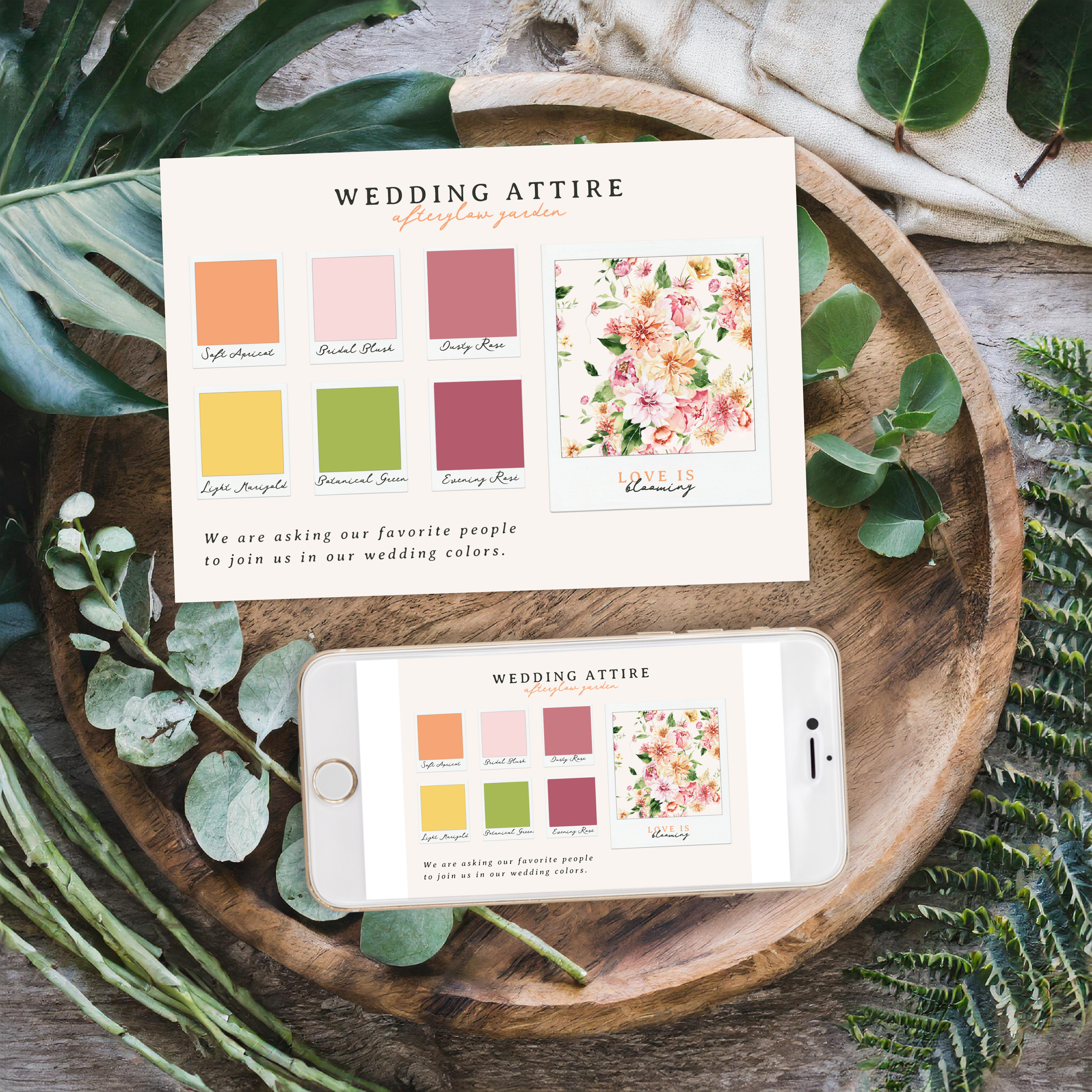
The Afterglow Garden | Romantic Wedding
Step into a world of soft florals, dreamy peaches, dusky pinks, and sunlit yellows with The Afterglow Garden, a romantic, ultra-girly wedding collection designed for brides who adore delicate watercolor blooms and feminine details.This suite brings together airy dahlias, blush roses, garden peonies, and lush green leaves, giving every piece a warm, glowing, just-before-sunset feel. Perfect for spring and summer weddings, the collection includes invitations, save the dates, RSVPs, menus, place cards, table numbers, wedding signage, and more. All fully customizable to match your celebration’s style.Whether you’re planning a garden wedding, a tented celebration, a vineyard soirée, or an outdoor destination ceremony, these soft watercolor florals add elegance, charm, and a gentle romantic glow to every moment. A beautiful choice for brides who love feminine touches, modern romance, and timeless details.
Wedding trends come and go. Fonts change. Colors cycle. Styles rise and fade. But one design choice continues to return year after year for a reason: romantic florals.
No matter the decade, brides are consistently drawn to soft flowers, gentle color palettes, and designs that feel feminine, warm, and timeless. While trends may shift toward minimalism or bold statements from time to time, florals always find their way back into wedding stationery, decor, and overall design. They simply never feel out of place.
The timeless appeal of floral wedding stationery
Florals have been part of weddings for centuries, and not by accident. Flowers symbolize love, growth, beauty, and celebration. When used thoughtfully, they create an emotional connection that feels natural and elegant rather than trendy or forced.
From garden weddings to ballroom celebrations, florals adapt effortlessly. They photograph beautifully, complement any venue, and feel just as meaningful years later when couples look back at their wedding keepsakes.
This is especially true for stationery. Invitations are often saved, framed, or tucked away as mementos. Soft floral designs age far better than overly trendy styles that can feel dated only a few years later.
Why warm garden color palettes resonate so deeply
Recently, many brides have gravitated toward warm, romantic color palettes featuring blush pinks, peach tones, soft yellows, and fresh greens. These hues feel inviting, joyful, and full of light.
Warm garden palettes are flattering across seasons, especially spring and summer, but they also transition beautifully into early fall celebrations. They evoke golden hour light, outdoor gatherings, and a sense of effortless romance.
Unlike harsh or highly saturated colors, softer tones feel calm and balanced. They do not overwhelm the design, and they pair seamlessly with florals, greenery, and watercolor textures.
Flirty florals feel modern when done right
One common hesitation brides have is worrying that florals might feel outdated or overly traditional. The truth is that florals only feel old-fashioned when they are heavy, dense, or overly structured.
Modern floral stationery leans into:
Airy compositions
Watercolor textures
Soft color transitions
Natural movement
Feminine details without excess
This approach keeps florals feeling fresh, romantic, and current while still maintaining their timeless charm. It allows brides to embrace a girly, floral aesthetic without sacrificing elegance or longevity.
Choosing stationery you will still love years from now
When couples look back at their wedding day, they often revisit their invitations, photos, and paper details. Choosing a design that still feels beautiful a decade later matters more than following a short-lived trend.
Romantic florals and warm garden palettes offer that sense of permanence. They feel classic without being boring, expressive without being overpowering, and personal without feeling tied to a specific moment in time.
Bringing the look together
If you are drawn to soft florals, blush and peach tones, and a warm garden-inspired aesthetic, choosing a cohesive stationery suite can help set the tone for your entire celebration. Invitations, save the dates, RSVP cards, and day-of stationery all work together to tell the story of your wedding from the very first impression.
I designed a full watercolor wedding suite inspired by this romantic garden style, featuring delicate florals, warm afterglow tones, and feminine details that feel both timeless and modern. Each piece is fully customizable and created to coordinate beautifully across your wedding paper goods.
If this look speaks to you, you can explore the full collection here and see how it might fit your celebration.
A style that always feels right
At the end of the day, the most important thing is choosing a wedding style that feels true to you. Romantic florals have endured because they continue to resonate emotionally, visually, and symbolically.
Trends may come and go, but soft florals, warm palettes, and feminine details remain a beautiful choice for couples who want their wedding to feel joyful, romantic, and timeless.
Are Watercolor Invitations Really Hand Painted? Understanding Digital vs Traditional Art in Wedding Stationery

Every once in a while, a review pops up online that makes every designer pause, blink twice, and ask: Wait… people think each invitation is hand painted? Individually? For a dollar fifty?
It turns out… yes.
A surprising number of customers assume “watercolor wedding invitation” means an actual human artist is sitting at a desk, brush in hand, painting each and every card one by one. And honestly? I get it. Watercolor feels personal, soft, romantic, handcrafted. But let’s clear up a really common misunderstanding so no one feels disappointed or misled later.
Because watercolor can be hand painted… but printed wedding invitations are not hand painted individually. Here’s what that really means.
What “Watercolor” Means in Print-on-Demand (Zazzle, Etsy, Minted, etc.)
When you see “watercolor” on an invitation listing, it means:
The artwork began as an original hand painted piece.
The designer (hi, that’s me!) paints the florals, venue, crest, or illustrations with traditional watercolor paint.
Then…
You receive a professionally printed reproduction of that artwork.
Just like buying a Monet print doesn’t mean Claude personally brushed pigments onto your canvas, a “watercolor invitation” means the design itself was created with watercolor, not that someone is hand painting your specific order.
Why No One Is Hand Painting Your $1.50 Invitation
Let’s talk logistics for a second.
Hand painting 50–100 wedding invitations would take:
days of painting
drying time
paper buckling issues
sealing, packaging, quality control
not to mention the actual cost of the artist’s labor
A truly hand painted wedding invitation suite usually costs $25–$60 per card, sometimes more depending on detail.
Print-on-demand invitations cost $1–$3 each because they’re printed using professional digital or offset machines. The same way art prints, greeting cards, and museum reproductions are made.
So when the product says “watercolor,” it’s describing the style of the artwork, not the production method.
So What Are You Actually Getting?
You’re getting:
Real hand-painted artwork created by an artist
Digitally reproduced in high-resolution
Professionally printed on your chosen paper
Customized with your names, dates, and details
Shipped quickly because it’s printed, not individually painted
Which is exactly how 99.9 percent of wedding stationery works… even luxury studios.
Why This Matters (and What to Look For Instead)
If you do want individually hand painted invitations, absolutely look for:
“Original hand-painted stationery”
“Hand-painted per piece”
“Hand-torn cotton paper originals”
“Made-to-order watercolor artwork”
Just know the cost will reflect the artistry and the time required.
If you simply love the look of watercolor, which is what most couples want, printed watercolor invitations are the perfect option: beautiful artwork without the astronomical price tag.
The Bottom Line
Watercolor wedding invitations are:
Hand-painted artwork.
Professionally printed invitations.
Not individually painted, not mass-handcrafted in real time, and not created per customer order with a tiny brush and an open palette on the artist’s desk.
And that’s what makes them so accessible, customizable, and affordable for couples who want something personal and beautiful without spending thousands.
If you ever have questions about the design process or what “watercolor” means on Zazzle or Etsy, feel free to ask. Artists are always happy to explain what goes into creating these pieces.
Cozy Up Your Table: Simple Pre-Holiday Home & Table Setting Ideas
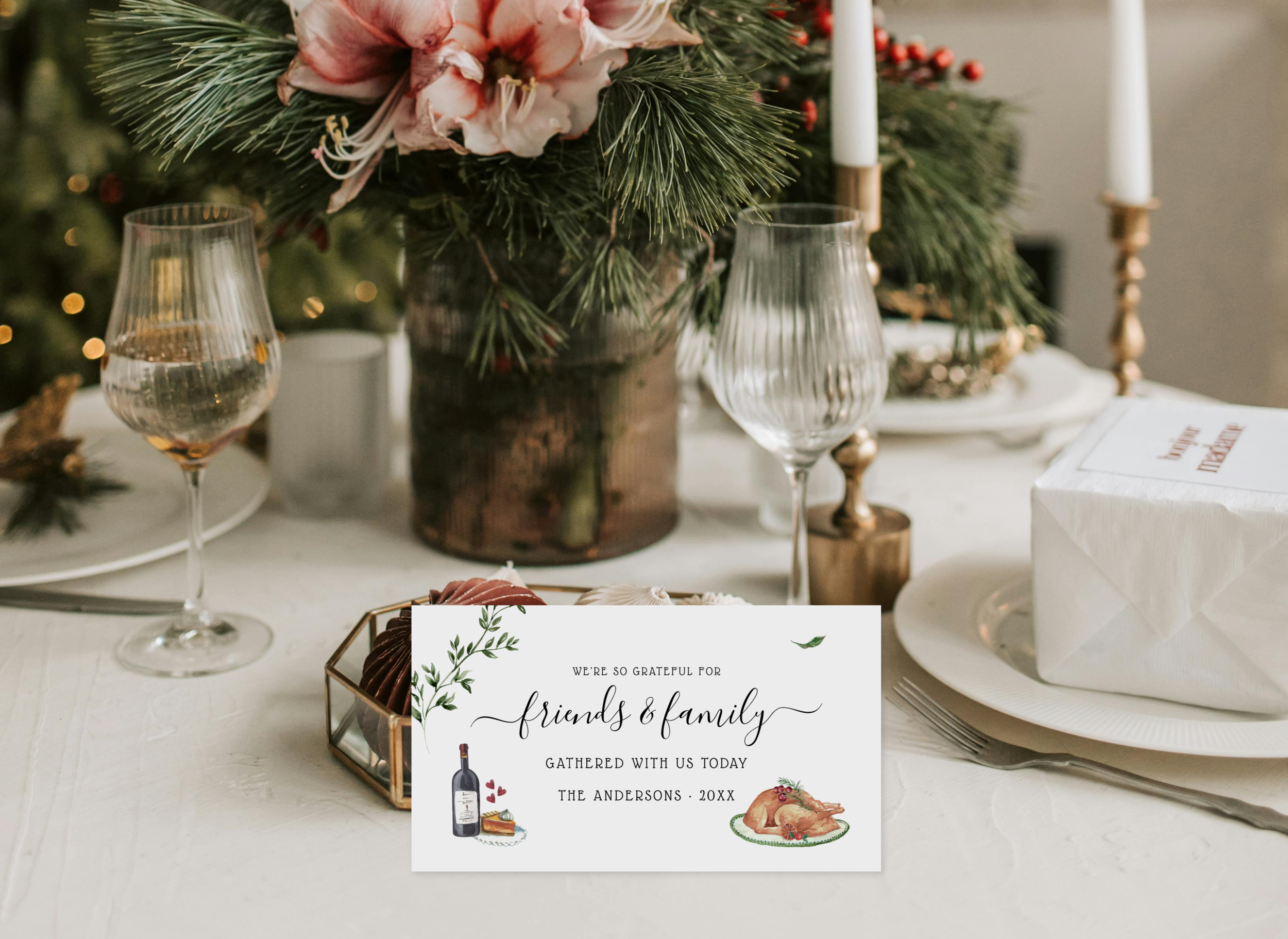
The Pre-Holiday Shift
Mid-November always feels like the calm before the holiday rush… that short stretch where evenings slow down, candles come out, and cozy dinners start to fill the calendar. I love this in-between season: a time to create warmth at home before everything turns festive. Whether it’s a small dinner with friends or a relaxed family meal, a few thoughtful details can make the table feel extra inviting.


1. Layer Textures for a Warm, Relaxed Feel
Cozy table settings are all about texture. Layer what you already have, a neutral tablecloth, woven placemats, or a natural runner, with a few handcrafted touches. Mix ceramic plates with wood accents and add soft napkins or small greenery sprigs to tie it together.
For color, I love leaning into muted greens, creamy whites, and gentle botanical patterns. They transition beautifully from late autumn to the holidays without feeling forced.
2. Add a Thoughtful, Personal Touch
Personalized place cards make guests feel seen, and they’re even better when they start a little tradition. One of my favorite ways to use them is to leave a spot for each guest to write what they’re grateful for during dinner. It’s such a simple, heartfelt moment that always sparks conversation (and laughter).
If you have kids at the table, this becomes even sweeter… little notes in their handwriting make the evening feel truly memorable.


3. Blend Cozy Comforts with Subtle Seasonal Hints
As the weather cools, I like adding small touches that feel seasonal without being overly themed, like switching out everyday mugs for winter ones or using coasters and menus with soft botanical or pine accents. Once the table is set, layer in a few soft details that give warmth to the space. A flickering candle, a framed art print on a nearby shelf, or a personalized ornament tied around a napkin all add character.
These little swaps create warmth without the pressure of decorating the whole house. If you design your own pieces, even better… custom mugs, menus, or printed place settings make a dinner feel personal and intentional.
4. Keep It Simple, Keep It Real
It’s easy to think a beautiful table has to be elaborate, but the magic usually lies in the simplest touches… soft light, good food, and a thoughtful setting. Matching coasters, drink stirrers, or even personalized trays can bring everything together. I love setting out a tray of hot cider or cocoa with coordinated coasters and mugs, especially for relaxed nights in. Whether it’s handwritten gratitude notes, a single flower at each place, or your favorite mug on the table, what matters most is creating an atmosphere that feels genuine.
These quiet, cozy moments are what people remember long after the meal is over.


This season is less about perfection and more about presence… slowing down, gathering, and making even the simplest dinners feel intentional. Every season tells its own story through color, texture, and detail. This one feels like warmth: simple meals, meaningful notes, and a table that invites people to linger. That’s always been the inspiration behind my designs: capturing those fleeting, cozy moments in a way that feels heartfelt and real.
Whether you’re setting the table for two or ten, let it reflect warmth, gratitude, and your own creative style. Sometimes all it takes is a few personal details to turn an ordinary night into something memorable.
What It’s Really Like to Move to Mexico with Kids | Our Honest Relocation Guide
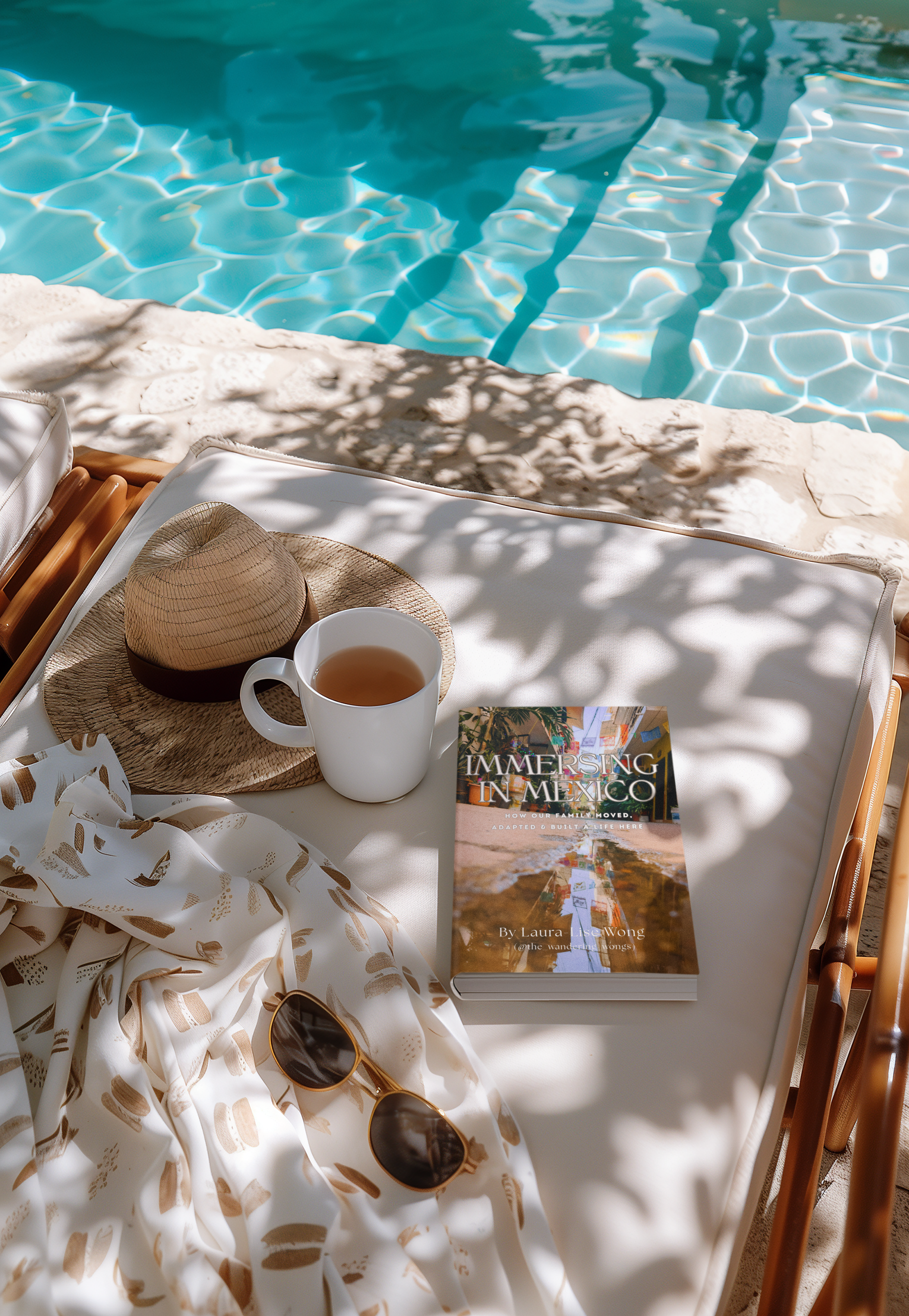
Real stories, practical tips, and hard-earned lessons from a family who moved to Puerto Vallarta. Discover our honest guide to moving to Mexico with kids, includes bonus resources and interactive maps.
When we made the decision to move our family to Puerto Vallarta, we didn’t have a blueprint. No guidebook, no Facebook post, no checklist could fully prepare us for what that leap would actually feel like.
And yet… here we are. Years later. Still here. Still learning. Still growing.
That’s why I wrote Immersing in Mexico, because I know how it feels to be searching for something real. This book isn’t scraped from the internet. It’s not a repackaged blog post. It’s our story. The real one. The messy, beautiful, layered reality of starting a new life in a new country with kids in tow.
🌿 What’s it really like to raise a family here?
🎒 How do you actually integrate outside of the "expat" scene?
🏡 Where do you live? What do you budget? How do the schools work?
🧾 What’s the deal with visas, banks, or finding community?
These were the questions I had before we moved, and I never quite found honest answers. So now, I’m offering the guide I wish I’d had.
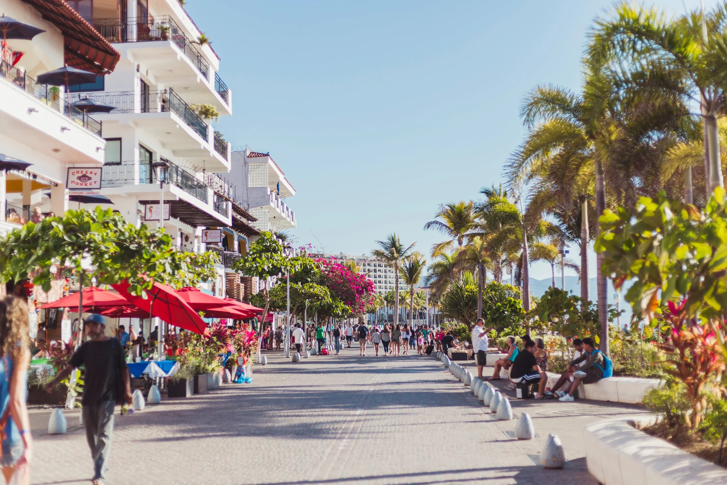
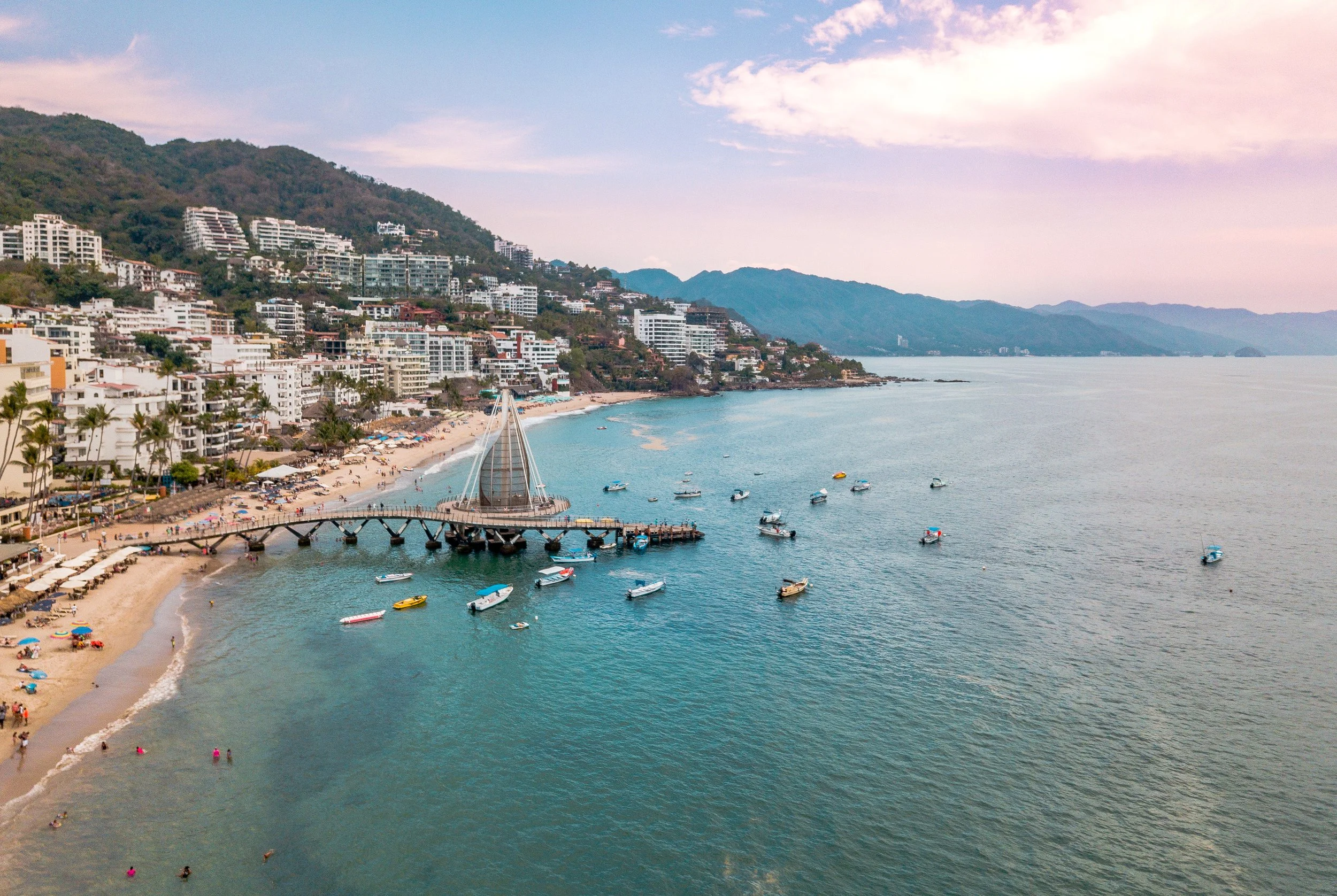
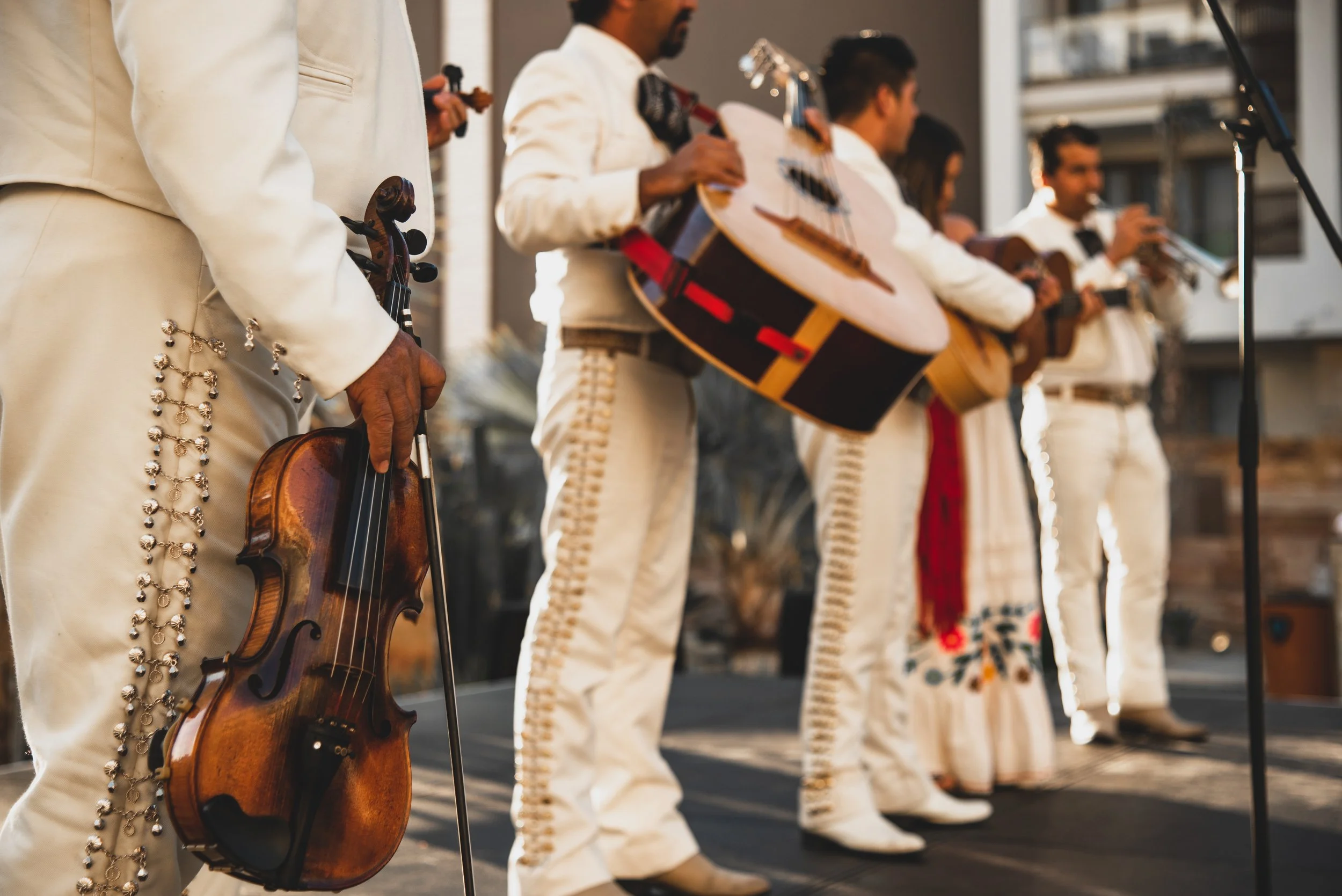
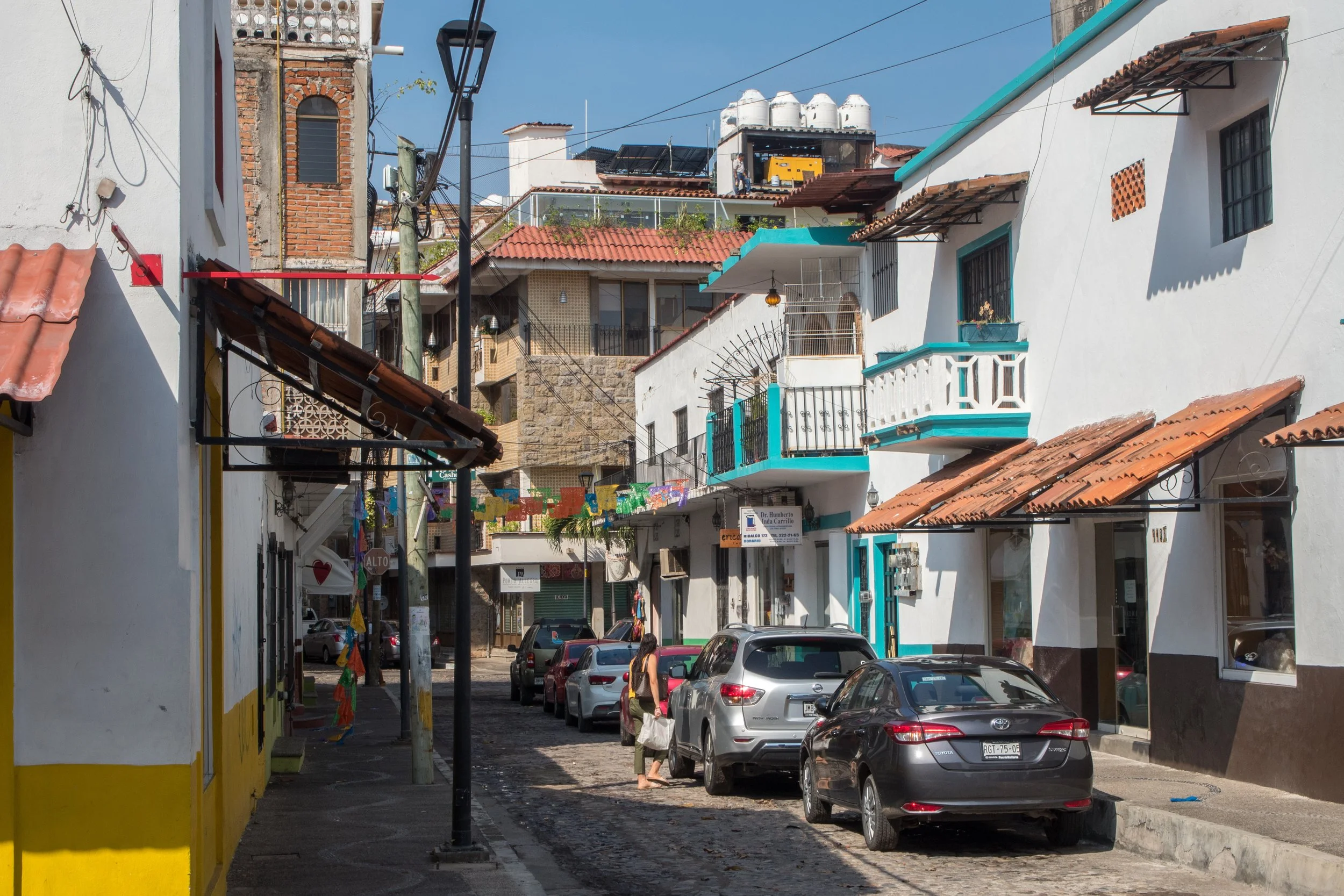
📘 Inside the Book:
Our real relocation journey (no sugarcoating)
Tips on housing, schools, and adapting with kids
Navigating language, culture, and local systems
Reflections on making friends, finding community, and rethinking “home”
Lessons we’ve learned the hard way… and what I’d do differently
Whether you’re just dreaming about Mexico, already packing, or trying to figure out if this is the right leap for your family, this book is for you.
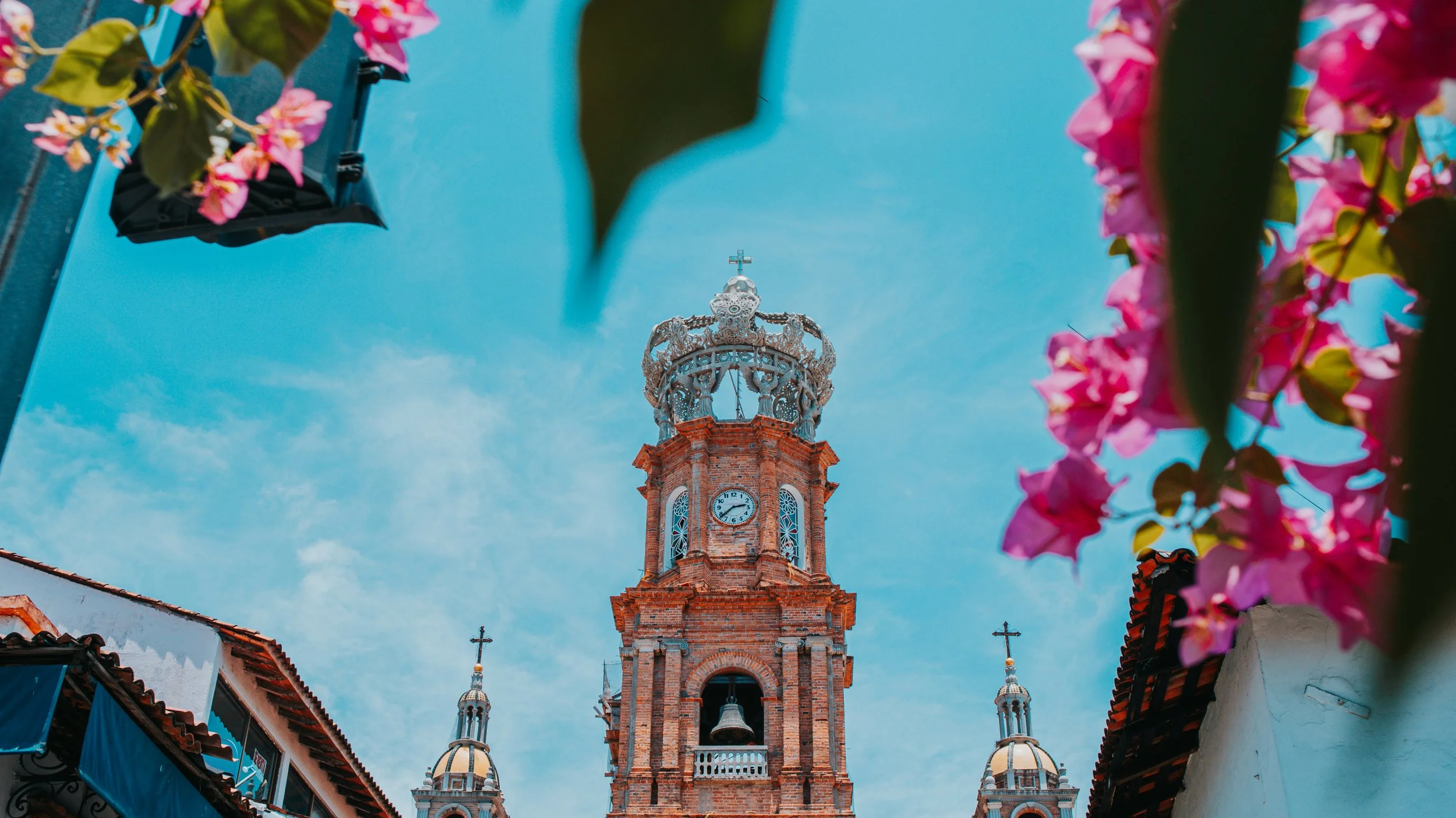


📎 Bonus Guides & Maps
If you want to go even deeper, I’ve also created:
22 bonus guides (44 extra pages!)
2 custom Google Maps to explore schools, day trips, markets, and more
A full bundle version for those seriously planning the move



💡 Print Note:
I’ve had a lot of kind messages asking about a printed version, thank you! The book was designed as an interactive digital experience with links, QR codes, and resources that wouldn’t translate well to print. I may create a simplified printed edition in the future, but for now, digital is the best way to offer the full value.
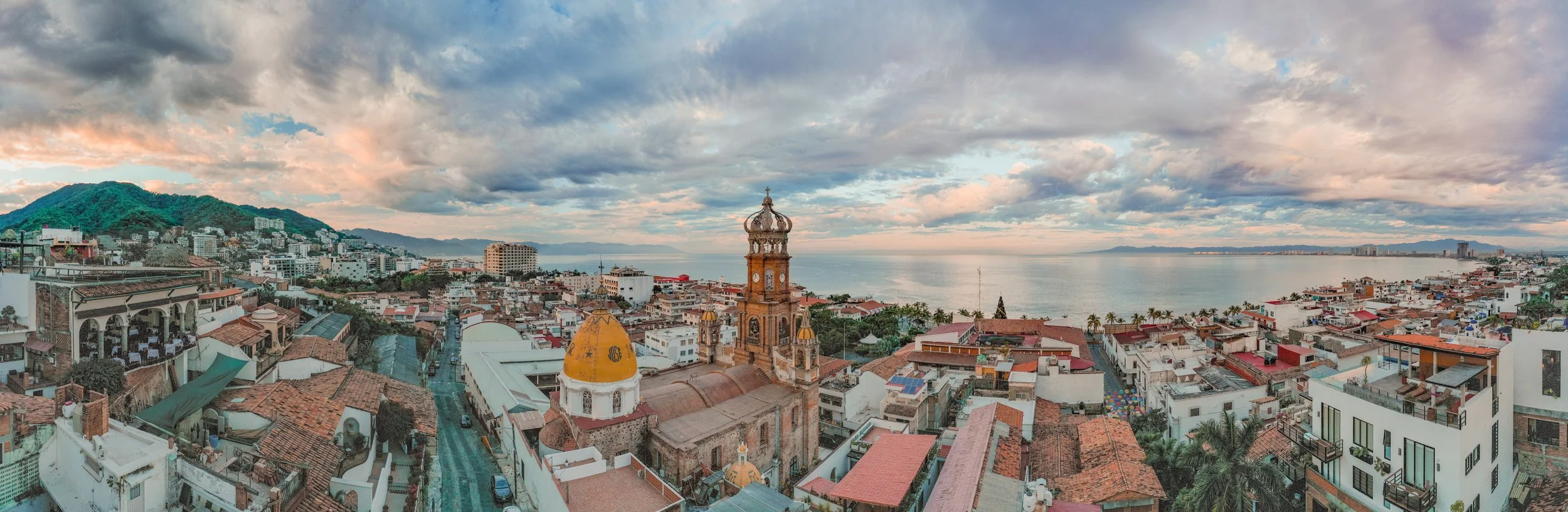
🛫 One Last Thing:
This isn’t just about moving to Puerto Vallarta. It’s about what it really takes to start over, with kids, in a new country. The lessons inside apply to anyone looking to create a deeper, more intentional life in Mexico.
From visa lines to birthday parties, community struggles to joyful breakthroughs, this is what it actually looks like.


How to Throw a Cottagecore Halloween Party


Halloween doesn’t have to mean neon orange, plastic spiders, and jump scares. If your style leans more cozy than creepy, a Cottagecore Halloween party is the perfect way to celebrate the season. Imagine soft dried florals, whimsical watercolor ghosts, vintage-style tableware, and a touch of woodland magic… the kind of gathering that feels more enchanted forest than haunted house.
Here’s how to create a celebration that’s both spooky and storybook-worthy.
1. Start with Whimsical Invitations
The invitation sets the tone for your soirée. Swap out cartoonish pumpkins for watercolor ghosts, bows, and botanical details. These designs instantly feel more curated and charming, while still carrying just enough spooky flair.
Include a note about your costume guidelines (family-friendly, contest prizes, or themed ideas) as well as teasers for food and drinks. Guests will love having a sense of the night’s vibe before they arrive.
👉 Shop Cottagecore Halloween Invitations here
2. Create a Dreamy Tablescape
Your table is the centerpiece of the night, so lean into vintage charm. Layer soft fabrics (linen or gauzy cotton) under paper plates and napkins with floral, ribbon, and spooky-cute designs. Add brass candlesticks, dried flower bundles, and scattered petals for that imperfectly perfect cottagecore look.
The result? A tablescape that feels straight out of a storybook, elegant enough for adults, but playful enough for kids.
👉 Shop matching Cottagecore Halloween Plates + Napkins
3. Add Whimsical Touches
Cottagecore is all about detail. Here are a few easy ways to sprinkle in that magic:
Scatter mini pumpkins or loose florals around serving trays.
Tie ribbons in black or muted orange onto candlesticks or jars.
Hang a simple banner with watercolor ghosts or spiderweb motifs for a subtle but festive backdrop.
These small touches create atmosphere without overwhelming the room.
4. Food & Drinks with a Twist
Skip the generic candy bowls and lean into seasonal treats with cozy flair. A few ideas:
A cheese board with fig jam, nuts, and dark chocolate squares.
Candied apples on rustic trays.
Pumpkin spice cupcakes topped with cinnamon sugar.
A signature drink, maybe a sparkling cider “witch’s brew” served in vintage glassware.
Guests will love the balance of spooky fun and rustic warmth.
5. Dress the Part
Encourage costumes that feel in tune with the setting. Think woodland witches, ghostly brides, enchanted forest creatures, or even cottage witches with lace shawls and flower crowns. It’s less about fright and more about fantasy and whimsy.
Bring It All Together
A Cottagecore Halloween party is about weaving coziness into the spooky season. With thoughtful invitations, enchanting tableware, whimsical touches, and comforting food, you’ll create a night that feels magical, memorable, and delightfully unique.
👉 Browse the full Cottagecore Halloween Collection on Zazzle