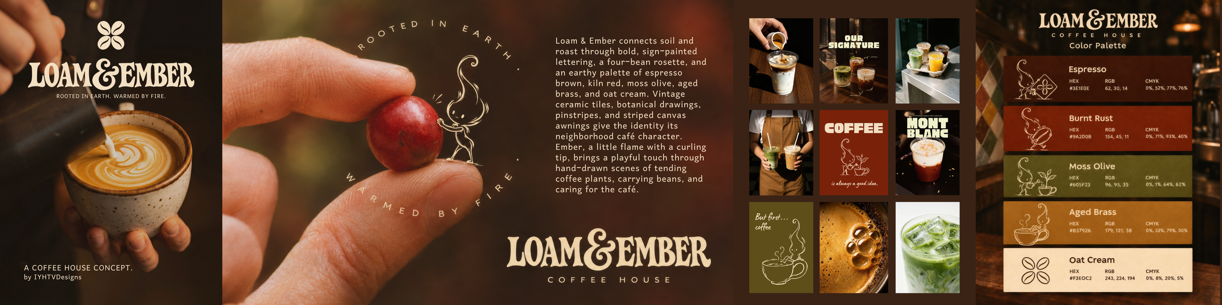
Loam & Ember: A Neighborhood Coffee House Concept
Conceptual brand identity by IYHTVDesigns
The coffee shop identity no one asked for, but I apparently needed to create.
Loam & Ember is a self-initiated branding project for a fictional neighborhood coffee house. I imagined somewhere with colorful old tiles, a striped canvas awning, warm wood, and a favorite seat by the window. The kind of place you stop into for a quick coffee and end up staying a little longer.
What started as a visual direction grew into a whole little world, complete with lettering, a coffee-bean rosette, illustrated details, packaging concepts, and a little flame named Ember.
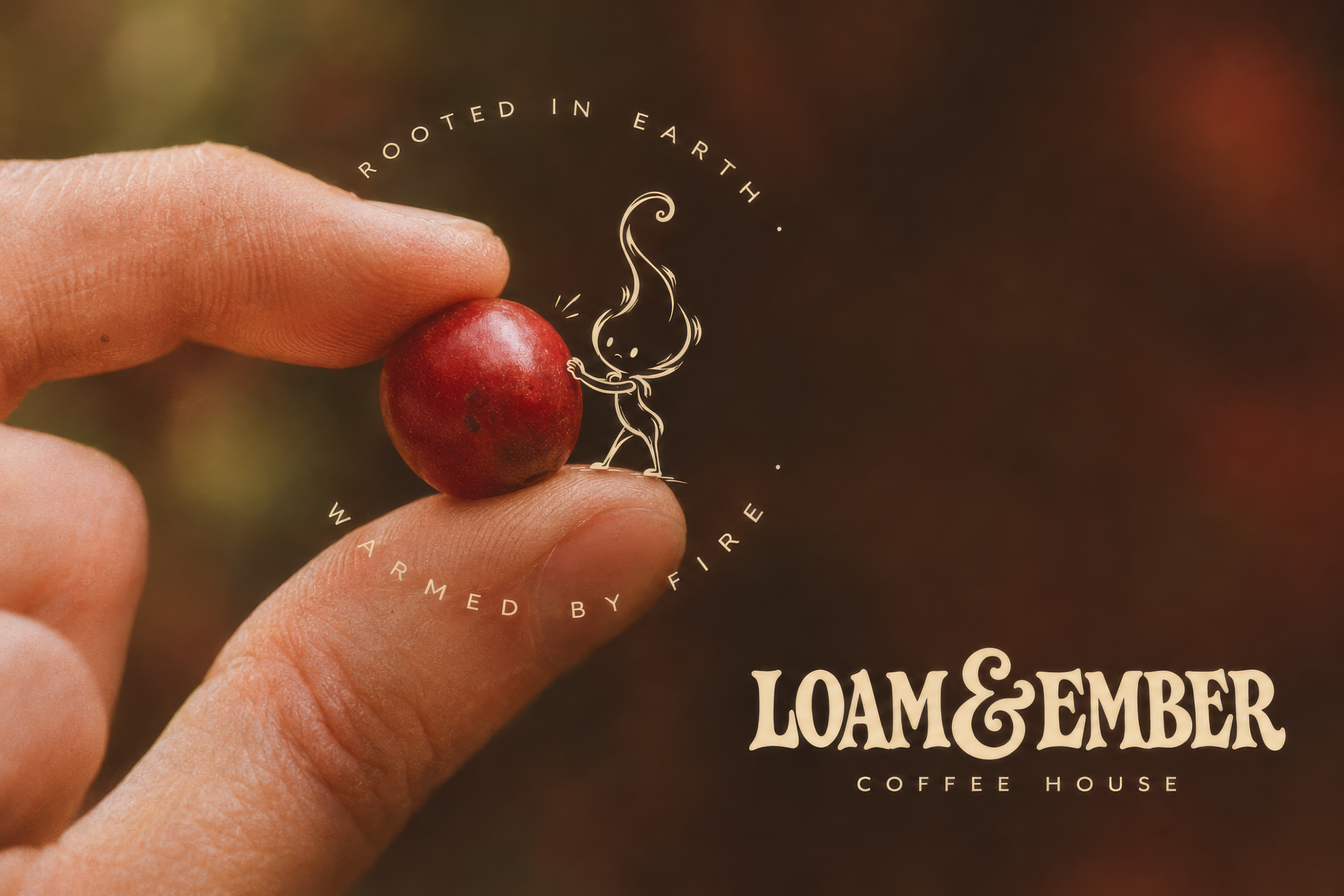
Rooted in earth. Warmed by fire.
The name came from the connection between soil and roast. Loam speaks to where coffee begins, while Ember brings in the warmth and transformation of roasting.
That connection became the thread running through the identity. Botanical imagery references the growing plant, earthy colors reflect soil and café materials, and Ember gives the warmth behind the name a personality.
The tagline brings those two ideas together: Rooted in earth. Warmed by fire.
Lettering, tiles, and a little nostalgia
I wanted the identity to feel at home on a neighborhood storefront.
The bold wordmark takes its cues from vintage sign painting, with expressive letterforms and a generous, curling ampersand. It has enough presence to carry a shop sign while still feeling comfortable on a takeaway cup or business card.
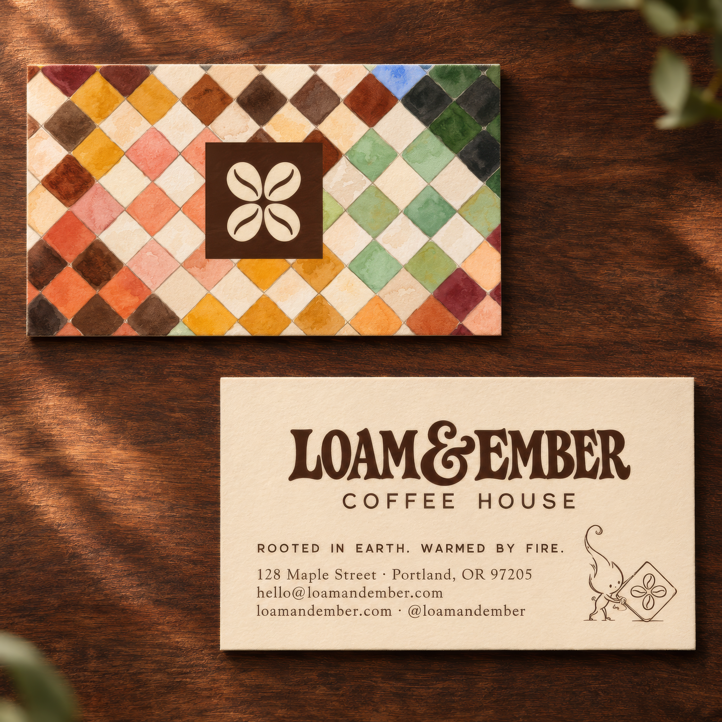
Alongside it sits a four-bean rosette inspired by decorative ceramic tiles. It connects the café’s coffee offering with its visual surroundings and gives the identity a recognizable mark to use on its own.
Diamond tiles, pinstripes, botanical drawings, and bentwood curves build on that foundation. Each detail contributes to the same imagined place.
An earthy palette
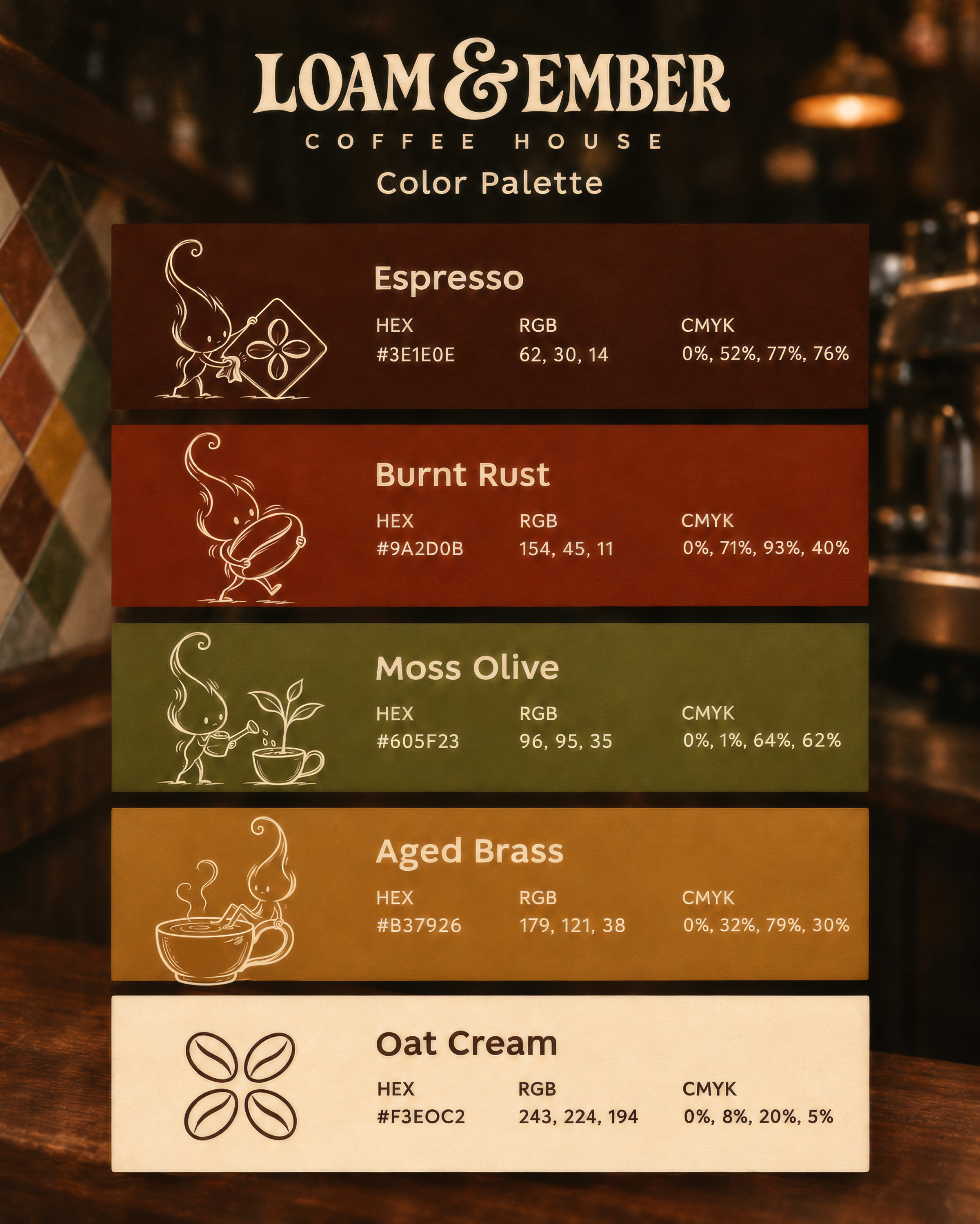
Espresso brown anchors the identity, with burnt rust, moss olive, aged brass, and oat cream bringing warmth and variety.
The colors draw from roasted coffee, glazed ceramics, foliage, brass fittings, and paper. Dark backgrounds give the cream lettering and illustrations room to stand out, while lighter applications let the finer details come through.
The tile pattern introduces additional shades in a loose, varied arrangement, much like a collection of old glazed tiles.
And then there’s Ember
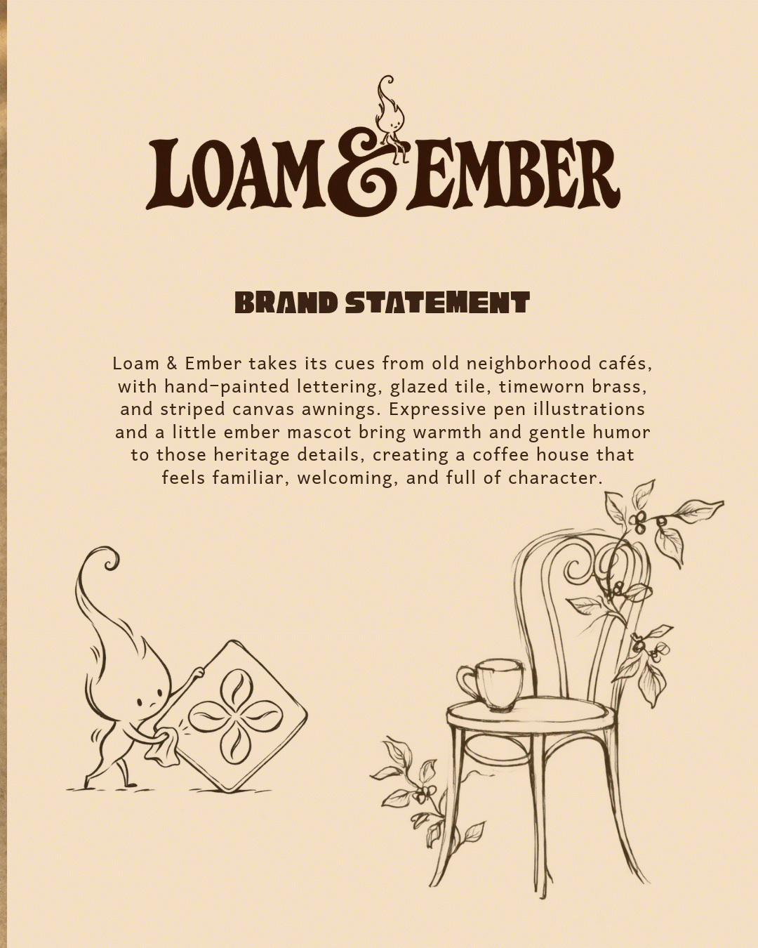
This little flame started as an illustration idea and pretty quickly became my favorite part of the whole project.
With his curling tip, delicate limbs, and quietly determined expression, Ember brings a playful touch to the café. You’ll find him tending coffee plants, carrying oversized beans, polishing tiles, and taking the occasional break on a cup’s handle.
His personality comes through in what he does. These small acts of care connect him to the café and give the illustrations a purpose beyond decoration.
The loose pen-style lines also sit comfortably alongside the botanical drawings, adding a softer, more spontaneous element to the bold lettering and geometric tiles.
Taking the identity into everyday moments
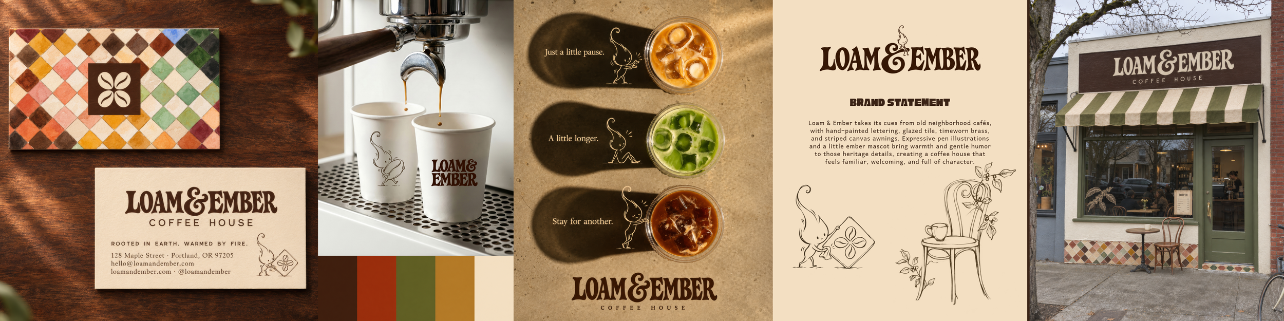
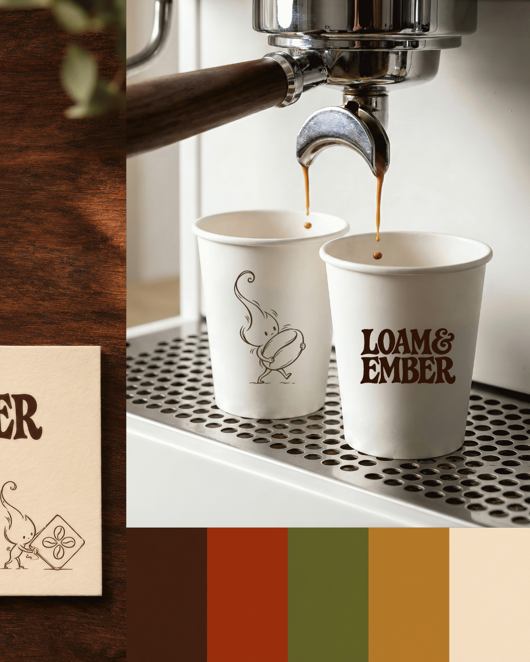
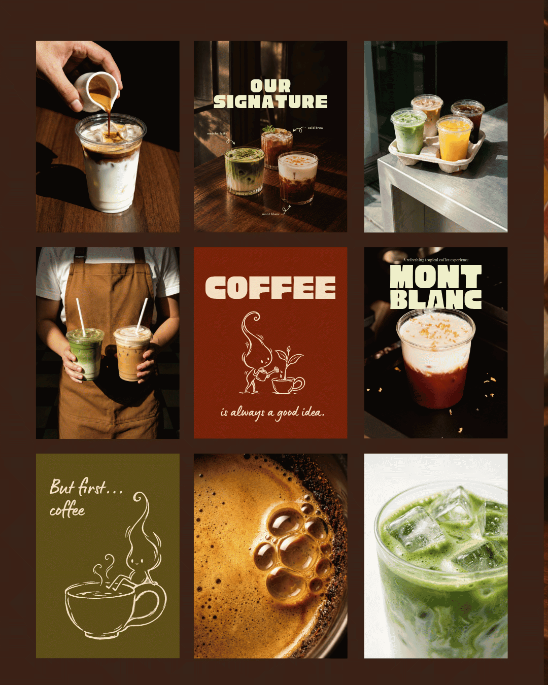
I explored how the branding could carry through the café’s everyday touchpoints, from paper cups and business cards to social content and a storefront concept.
The business card pairs a colorful tile front with a quieter cream reverse. The wordmark leads, while Ember appears in the corner, busy polishing a tile.
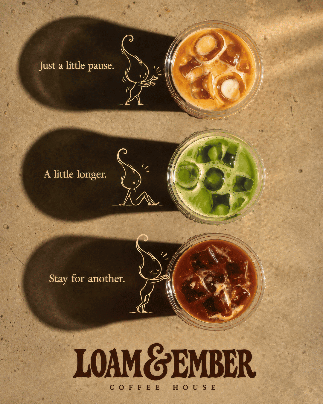
For the campaign imagery, I wanted him to interact with the scene. He steadies a coffee cherry, reaches toward an iced drink, and settles into its long afternoon shadow.
“Just a little pause. A little longer. Stay for another.”
That wording captures the pace I imagined for Loam & Ember: familiar, welcoming, and happy to have you linger.
A café I wish existed
The storefront concept brings the details together: an olive-and-cream striped awning, tiled frontage, botanical window artwork, and bold lettering above the door.
Developing Loam & Ember was a chance to follow one idea through the many places a brand can appear. The most enjoyable part was finding how those pieces could relate to one another, right down to a little flame caring for his café.
Now I’m just slightly disappointed I can’t actually go there for coffee.
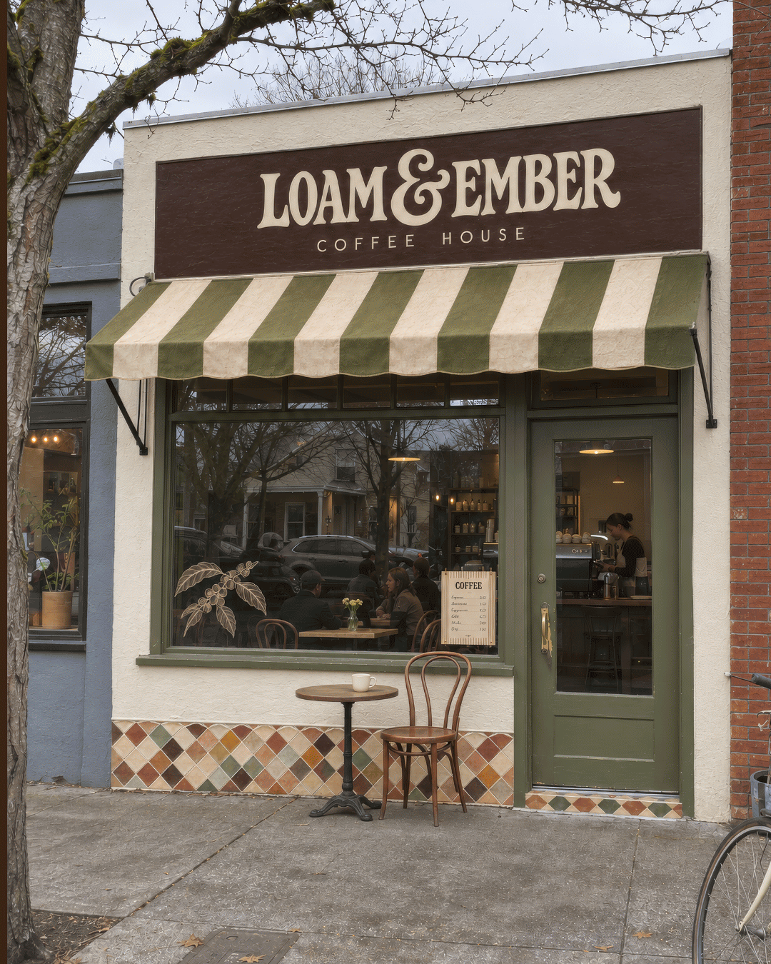
Loam & Ember is a fictional, self-initiated portfolio project. Mockups are used to visualize the brand concept; they do not depict an operating café or a commissioned client project.