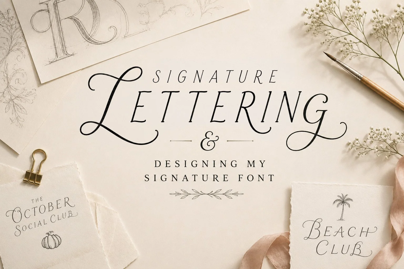
Designing My Signature Font
For years, custom lettering has quietly been part of my design process.
Whether creating wedding monograms, event logos, or bespoke title treatments, I've often drawn individual letterforms whenever a project called for something unique. Those custom characters were designed to solve a specific creative challenge and were never intended to become a complete typeface.
This project was different.
Rather than designing one or two decorative letters, I challenged myself to develop a cohesive lettering style that could be used across entire collections while remaining unmistakably my own.
What began as a creative experiment has gradually become one of the most recognizable elements of my work.
Like illustration, typography has personality.
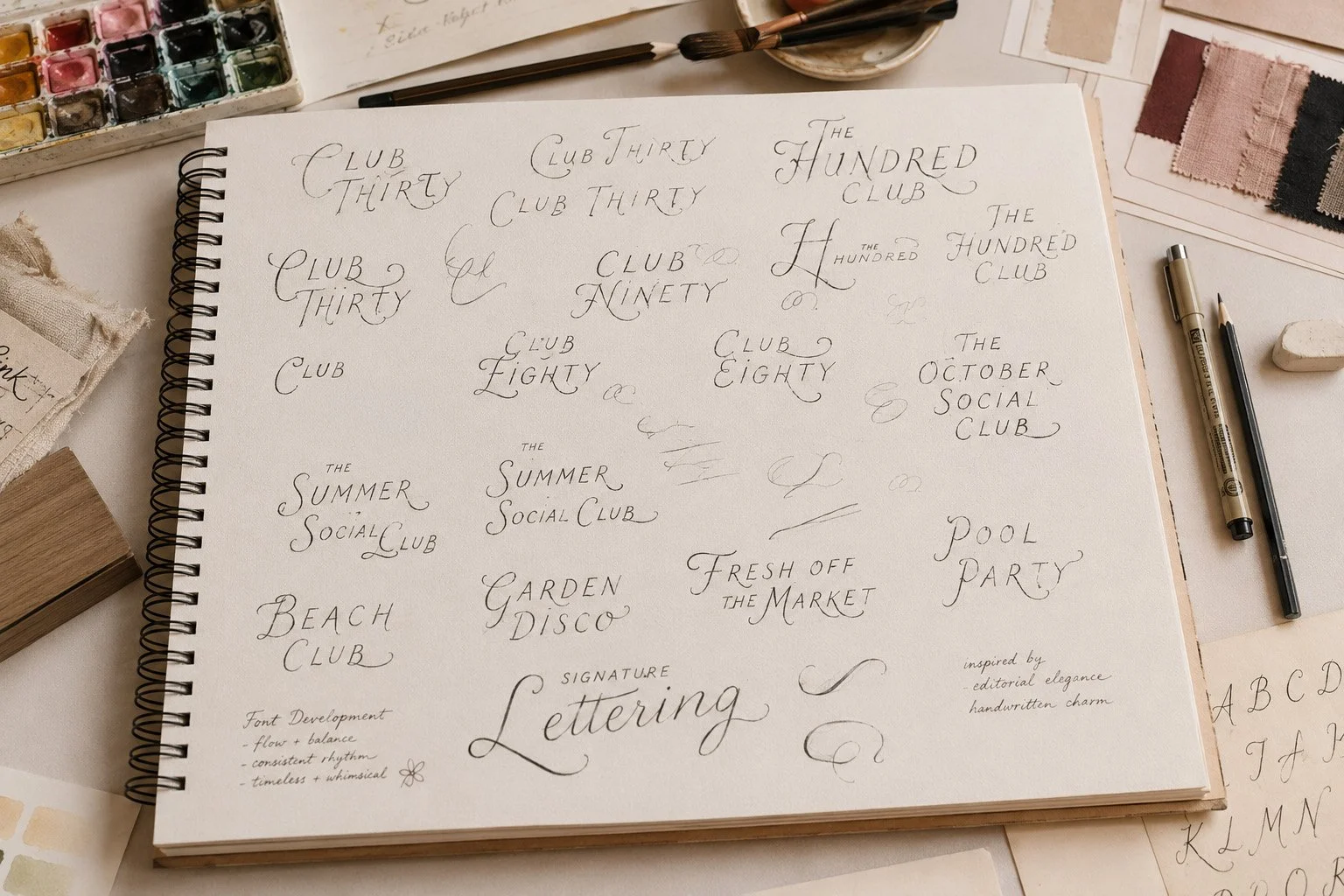
Some fonts feel formal and traditional. Others are playful, modern, nostalgic, or romantic. Rather than beginning with software, I started the same way I approach most creative projects: with pencil, paper, and countless rough sketches.
The goal wasn't simply to make pretty letters.
I wanted to create a lettering style that felt elegant without becoming overly formal. Something timeless, slightly whimsical, and flexible enough to work across weddings, hospitality, seasonal collections, and editorial design.
01. Finding the Voice
02. Sketching Individual Letterforms
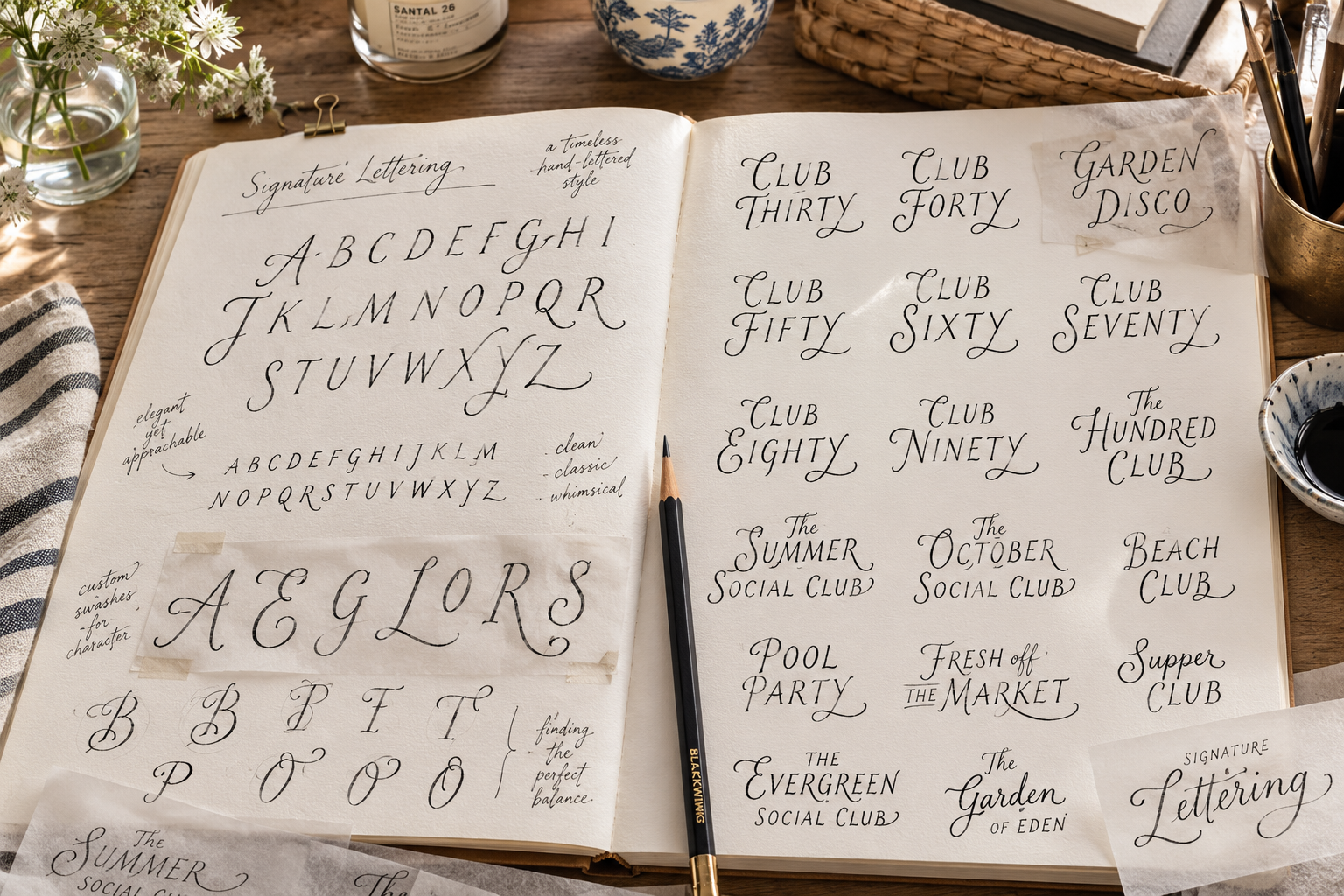
Every letter had to stand on its own before it could become part of a family.
I explored countless variations of ascenders, descenders, loops, flourishes, spacing, stroke weight, and proportions, refining each character until they felt consistent while still retaining their own personality.
Unlike a traditional font library built for body copy, this lettering was intentionally designed as a display style. Created for headlines, invitations, branding, signage, and moments where typography becomes part of the artwork itself.
03. Building a Complete Alphabet
Creating individual letters is only the beginning.
The real challenge comes when every character must work together.
As the alphabet grew, each new letter influenced the next. Small adjustments to proportions, curves, and spacing created a rhythm that allowed words to feel cohesive rather than appearing as isolated illustrations.
By the time the alphabet was complete, it had become far more than a collection of decorative letters. It had developed into a visual voice.
04. Putting It Into Practice
The best way to evaluate a typeface is to use it.
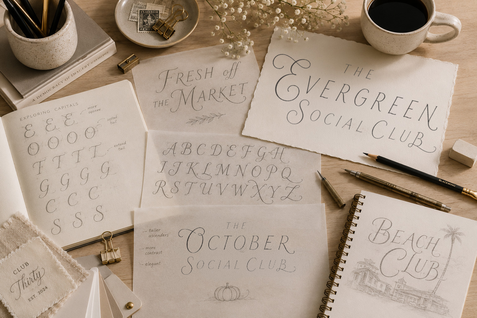
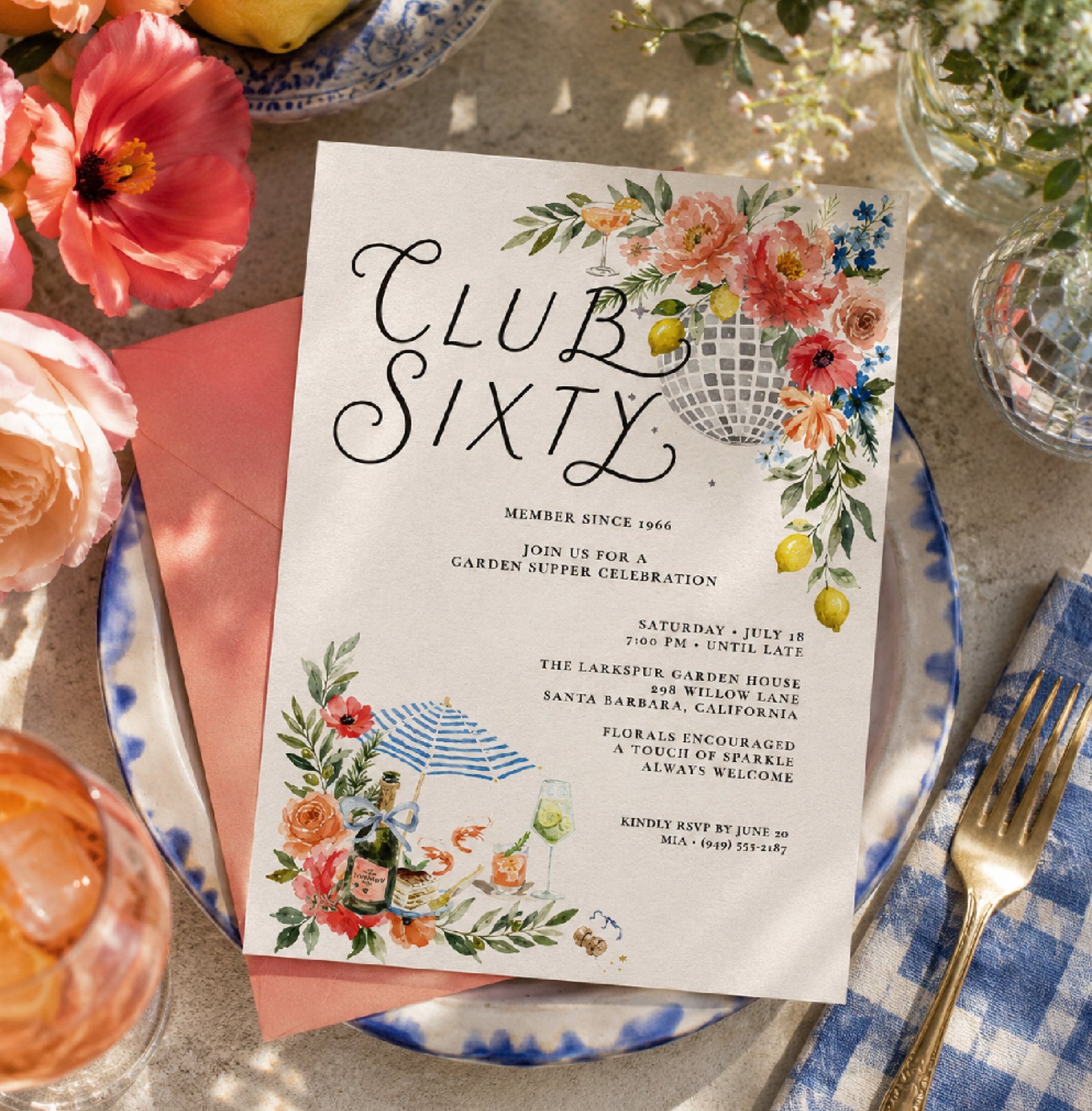
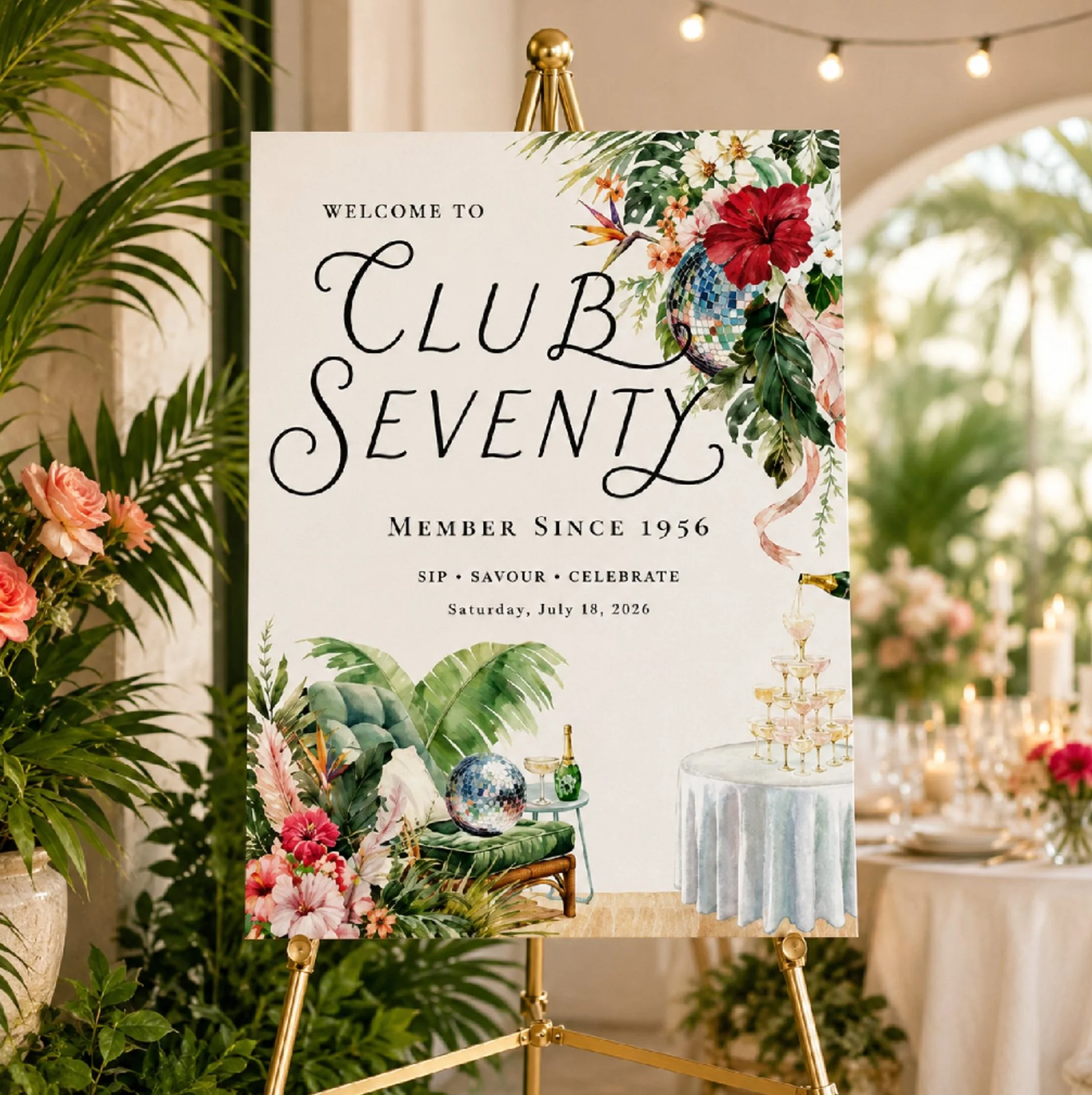
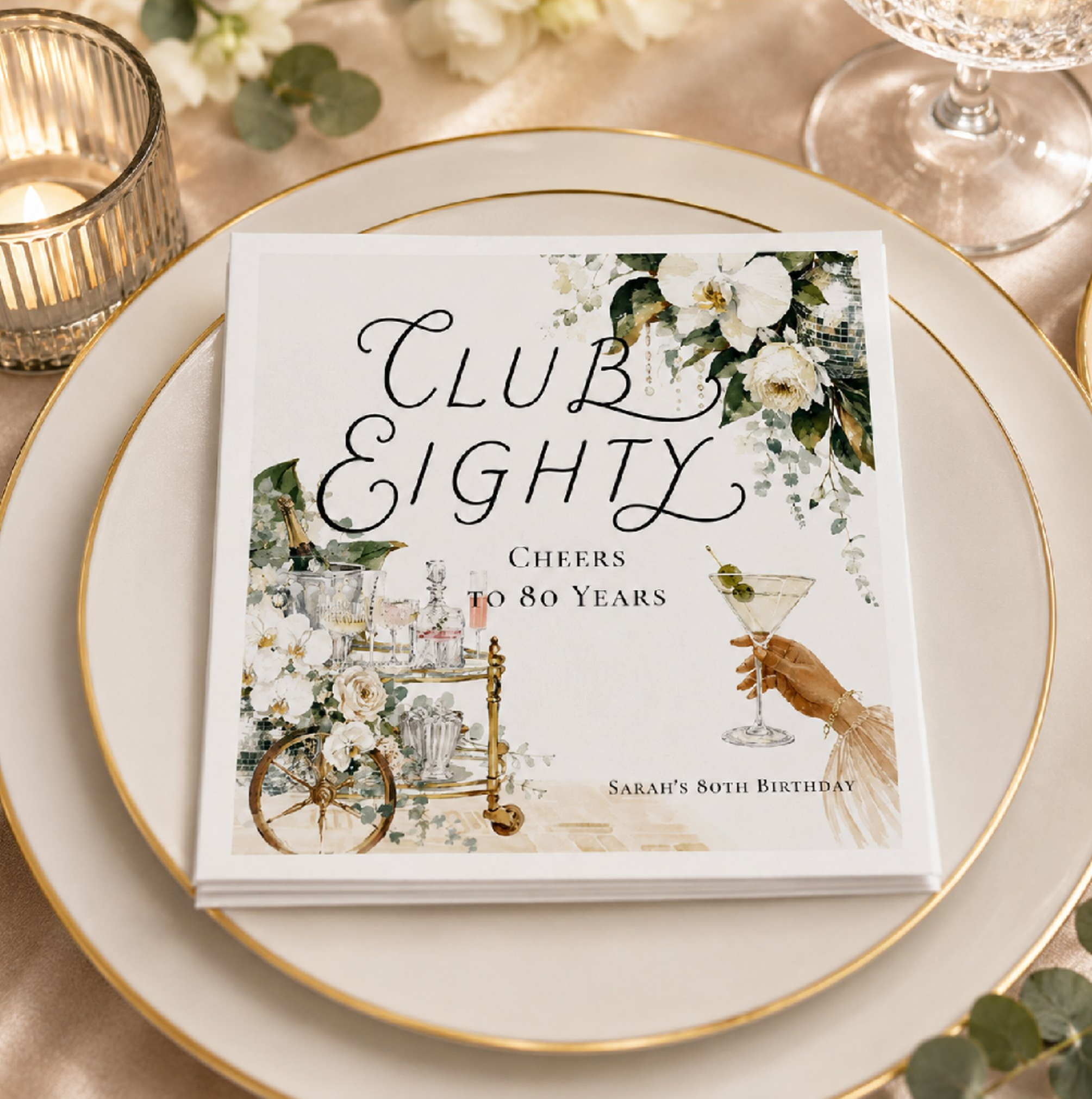
Rather than leaving the lettering as an unfinished personal project, I immediately began incorporating it into product collections, invitations, editorial pieces, and branding concepts.
Each collection revealed opportunities to refine spacing, balance, flourishes, and proportions. The lettering continued to evolve naturally through real-world use rather than remaining static.
05. One Typeface, Many Personalities
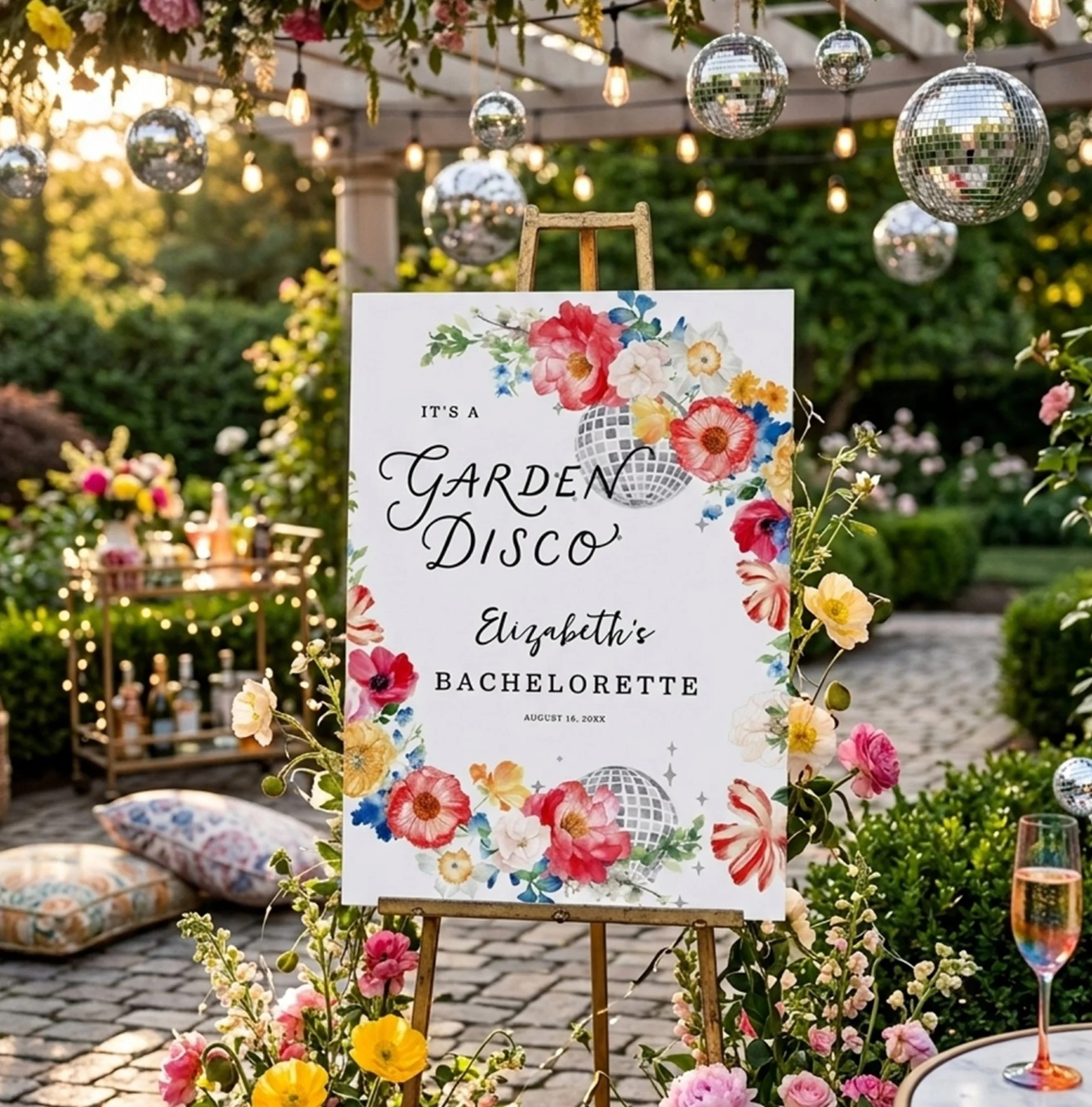
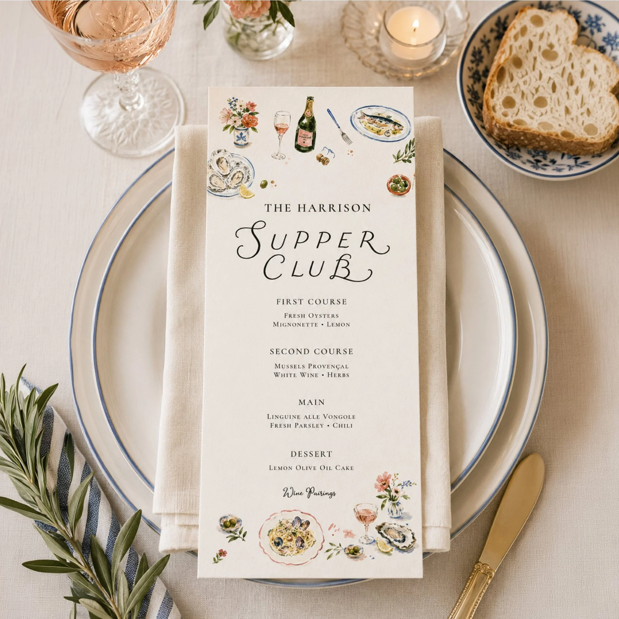
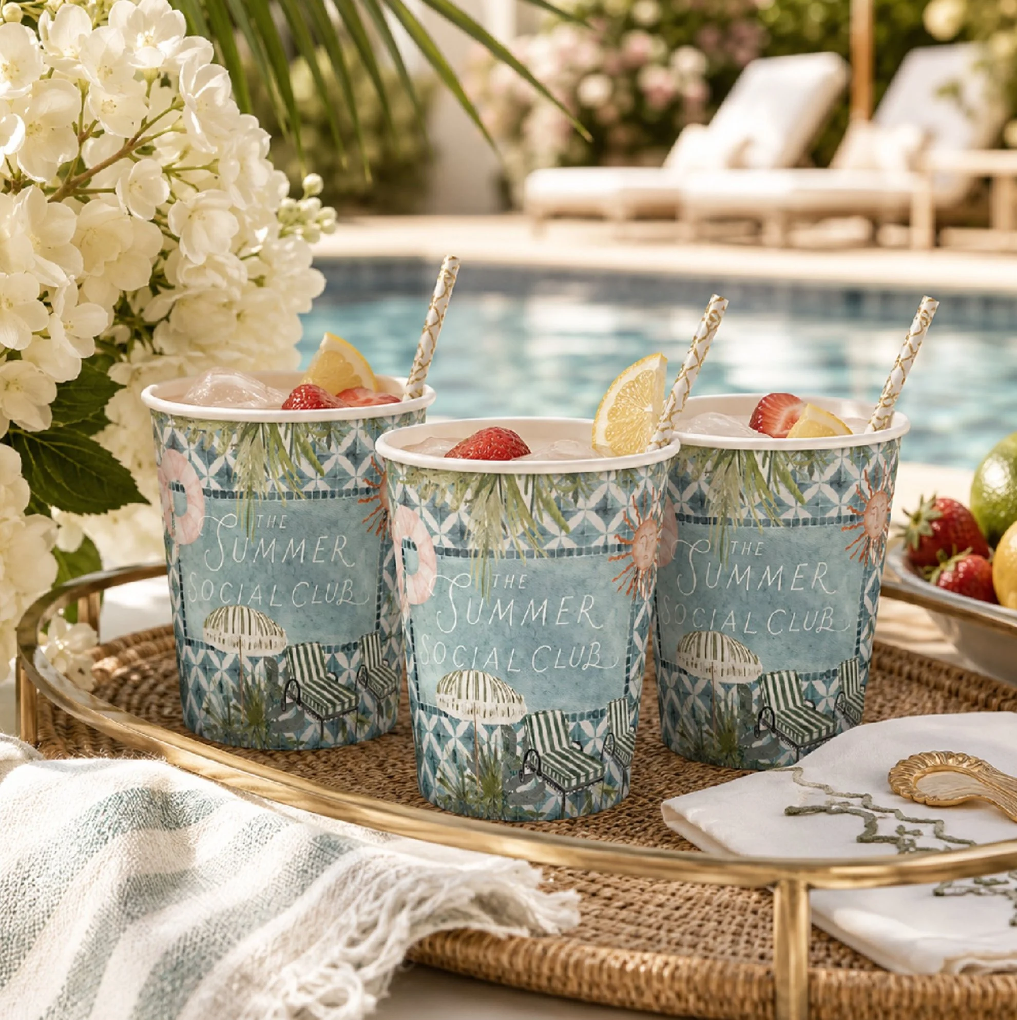
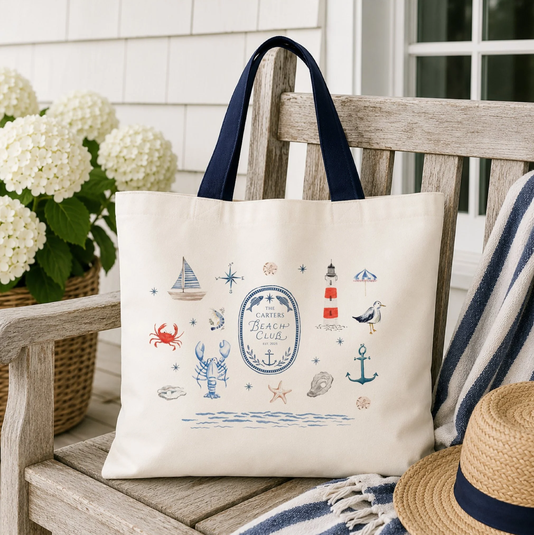
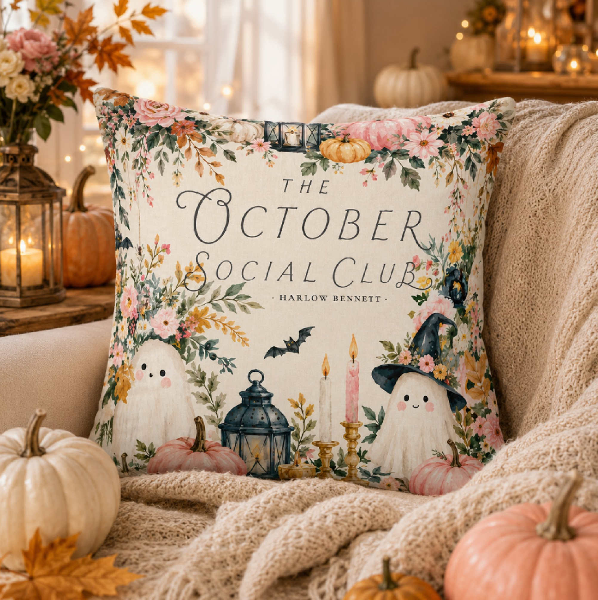
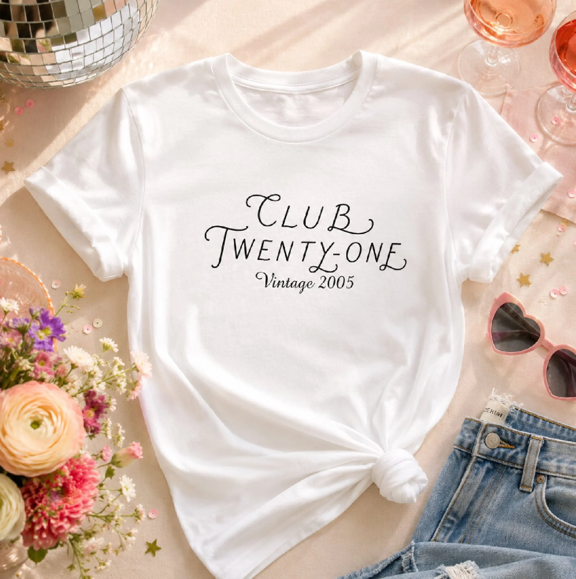
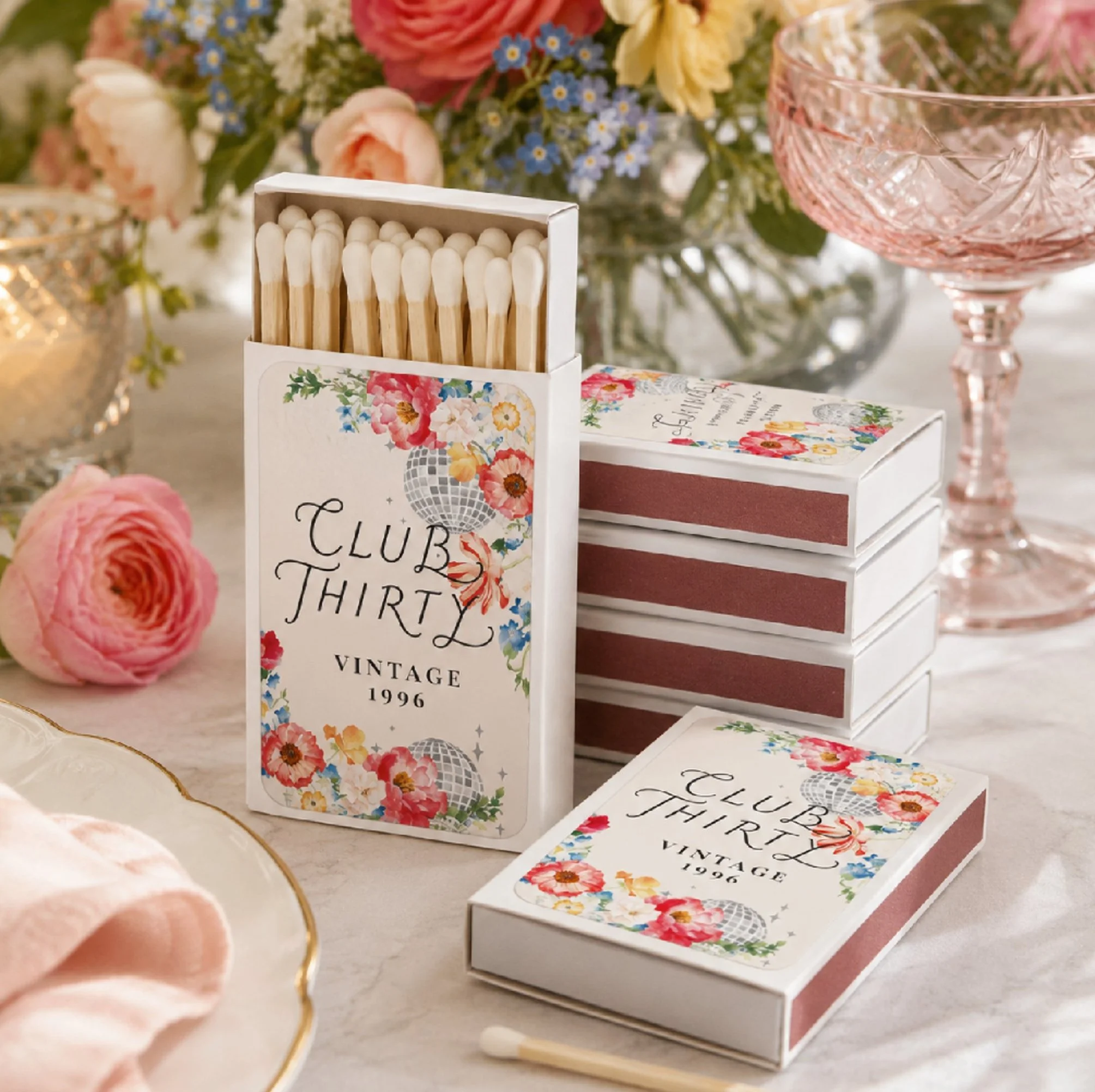
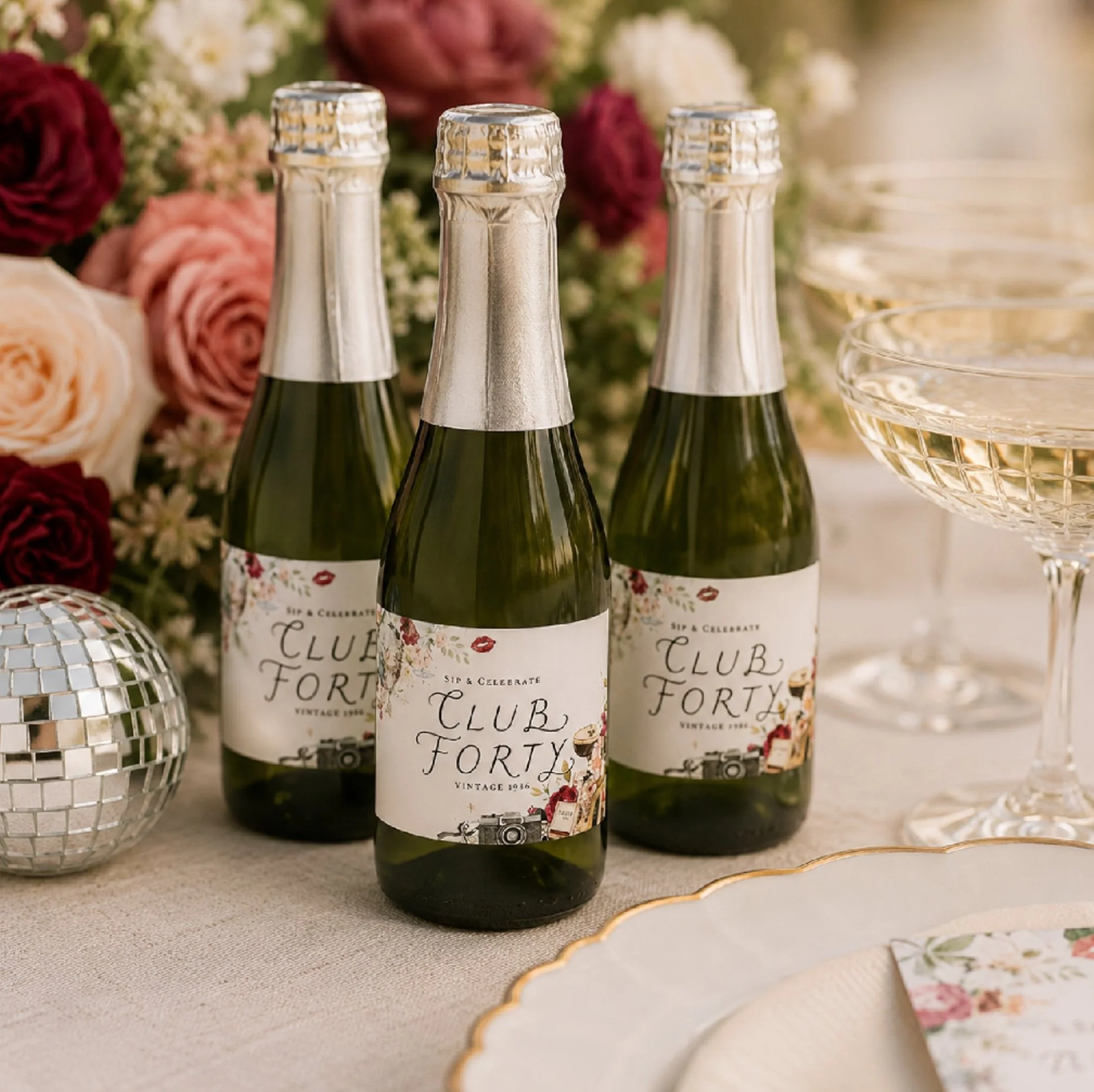
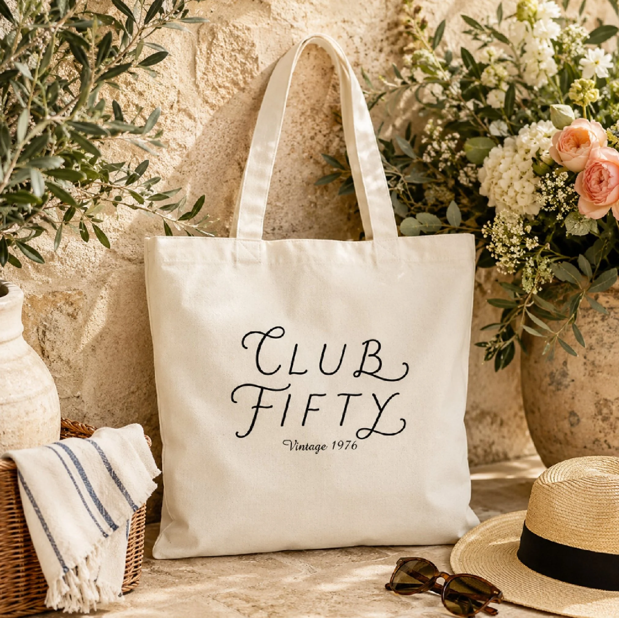
Although every collection shares the same underlying lettering style, each one takes on its own personality through illustration, colour palette, composition, and supporting typography.
Whether celebrating coastal summers, cozy autumn gatherings, winter holidays, or elegant entertaining, the same lettering adapts while remaining instantly recognizable.



More Than a Font
Typography has always fascinated me because it does more than communicate words.
It establishes atmosphere.
It creates recognition.
It becomes part of a brand's identity long before someone notices the individual letters themselves.
Developing this signature lettering style has given me a creative foundation that continues to grow with each new collection, allowing future projects to feel connected while still remaining unique.
Like every illustration I create, it wasn't designed to follow trends.
It was designed to become part of a visual language that clients immediately recognize as IYHTVDesigns.