2026 Wedding Colour Trends: Warm Minimalism Takes Centre Stage
Wedding trends come and go, but every so often a colour palette emerges that feels less like a passing fashion and more like a timeless design philosophy.
For 2026, one of the most elegant trends embraces exactly that approach: soft ivory, warm neutrals, and rich copper-inspired earth tones. Rather than dramatic contrasts or bold statement colours, couples are gravitating toward palettes that feel calm, refined, and effortlessly sophisticated.
The result is a wedding aesthetic that photographs beautifully, complements nearly every venue, and feels just as appropriate for an intimate garden ceremony as it does for a grand ballroom celebration.
The Colours Defining 2026
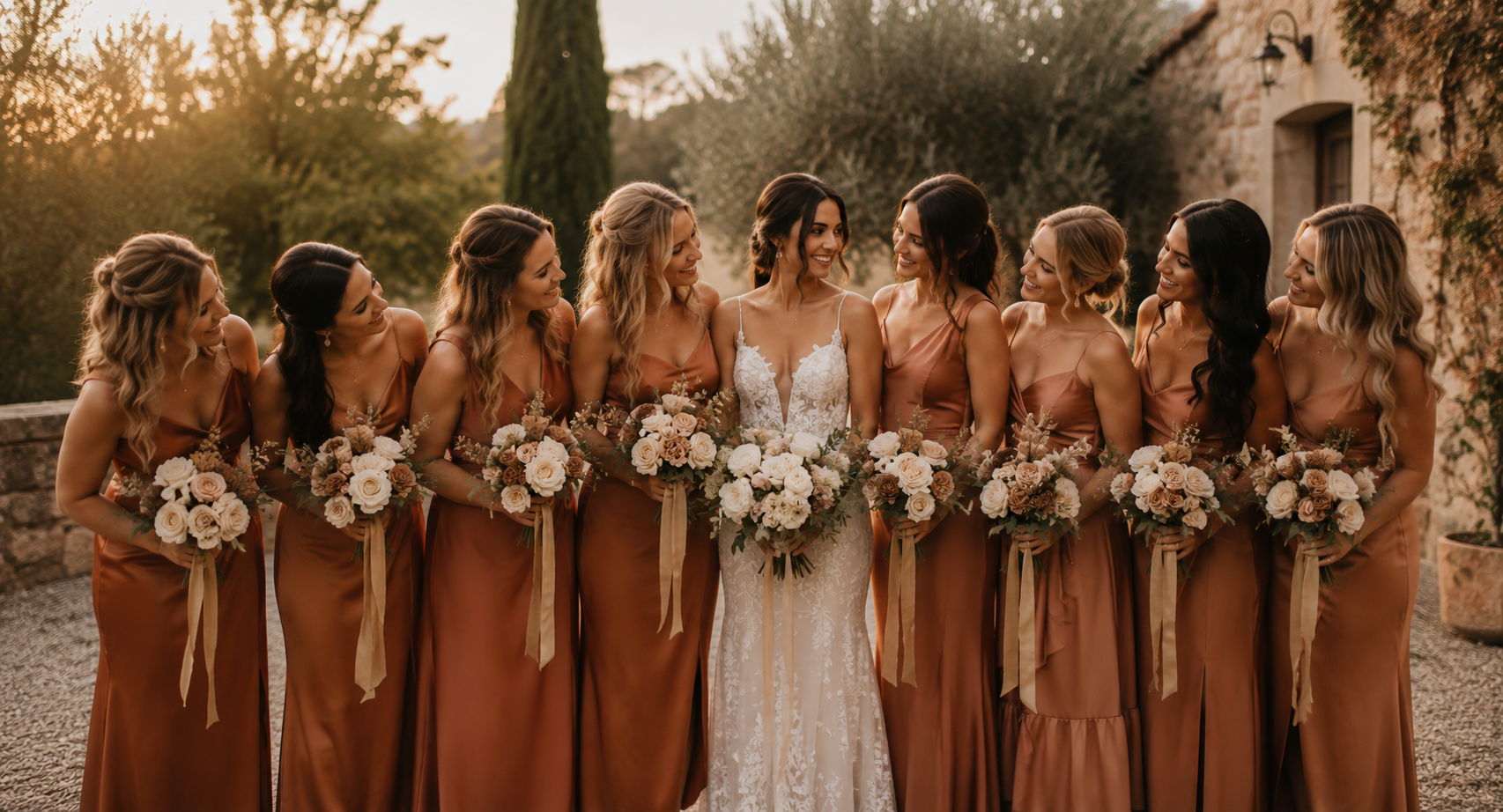
One of the standout palettes for Fall 2026 combines three beautifully balanced shades:
Cloud Dancer
A soft, creamy ivory that replaces stark white with something gentler and more inviting.
Hazelnut
A warm neutral beige that brings depth and softness while remaining wonderfully versatile.
Matte Copper
A rich earthy copper that introduces warmth, elegance, and a subtle hint of autumn without feeling overly seasonal.
Together, these colours create an aesthetic that feels fresh, modern, organic, and luxurious all at once.
Warm. Minimal. Earthy.
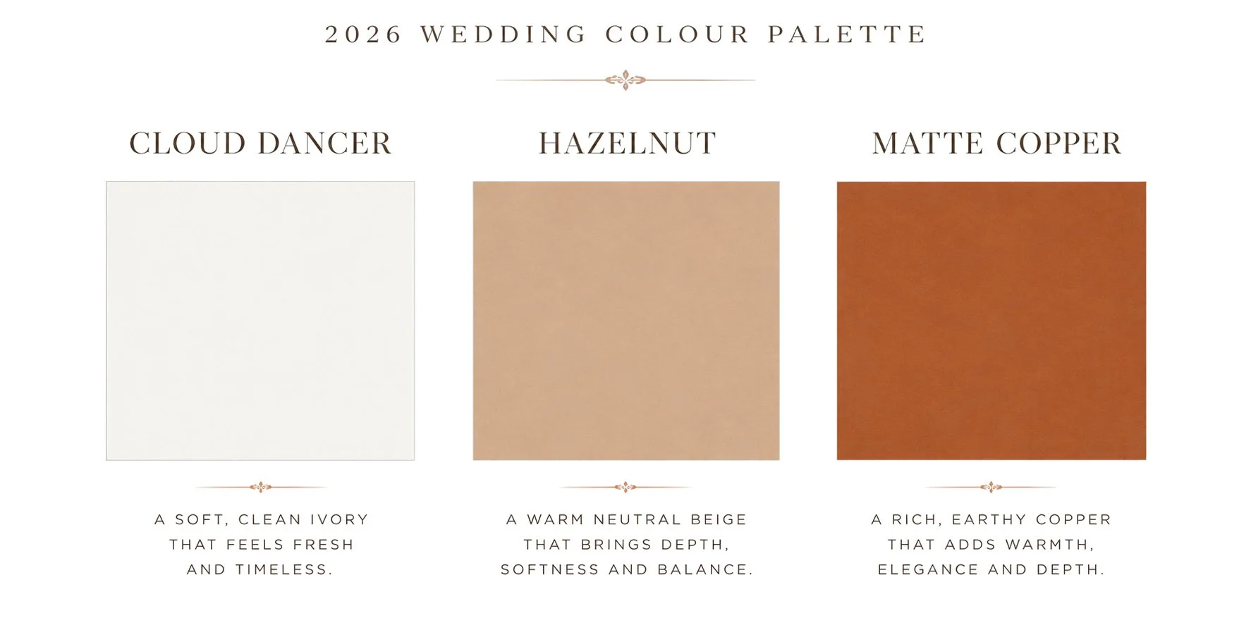
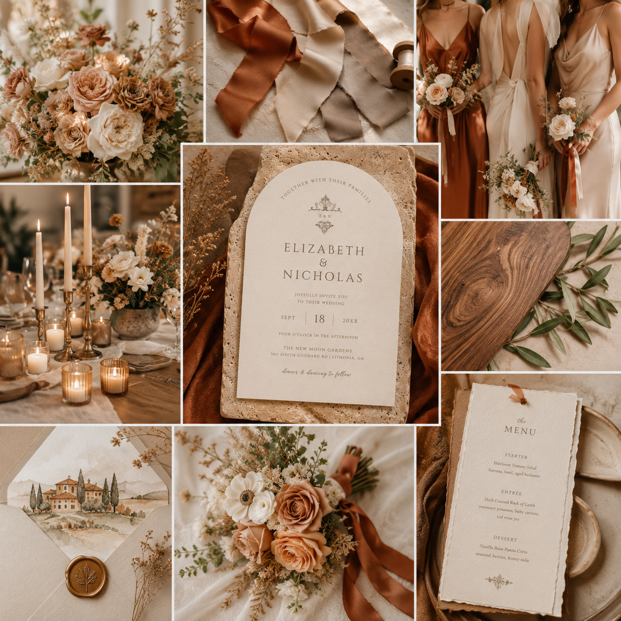
Soft ivory establishes a clean, luminous foundation, while warm hazelnut neutrals and rich matte copper introduce depth, warmth, and understated sophistication. Inspired by natural textures and timeless materials, this palette balances modern simplicity with effortless elegance, creating a refined aesthetic that feels both contemporary and enduring.
Why Warm Neutral Weddings Feel So Timeless
One of the reasons this palette is becoming so popular is because it isn't built around chasing trends.
Instead, it draws inspiration from natural materials and colours that have always existed around us.
Think linen tablecloths.
Natural stone.
Handmade ceramics.
Champagne silk ribbon.
Warm candlelight.
Aged brass.
Soft white florals.
Wood grain.
These elements create an atmosphere that feels welcoming rather than overly styled.
Years from now, wedding photographs featuring these tones are likely to feel every bit as elegant as they do today.
Why This Colour Palette Photographs So Beautifully
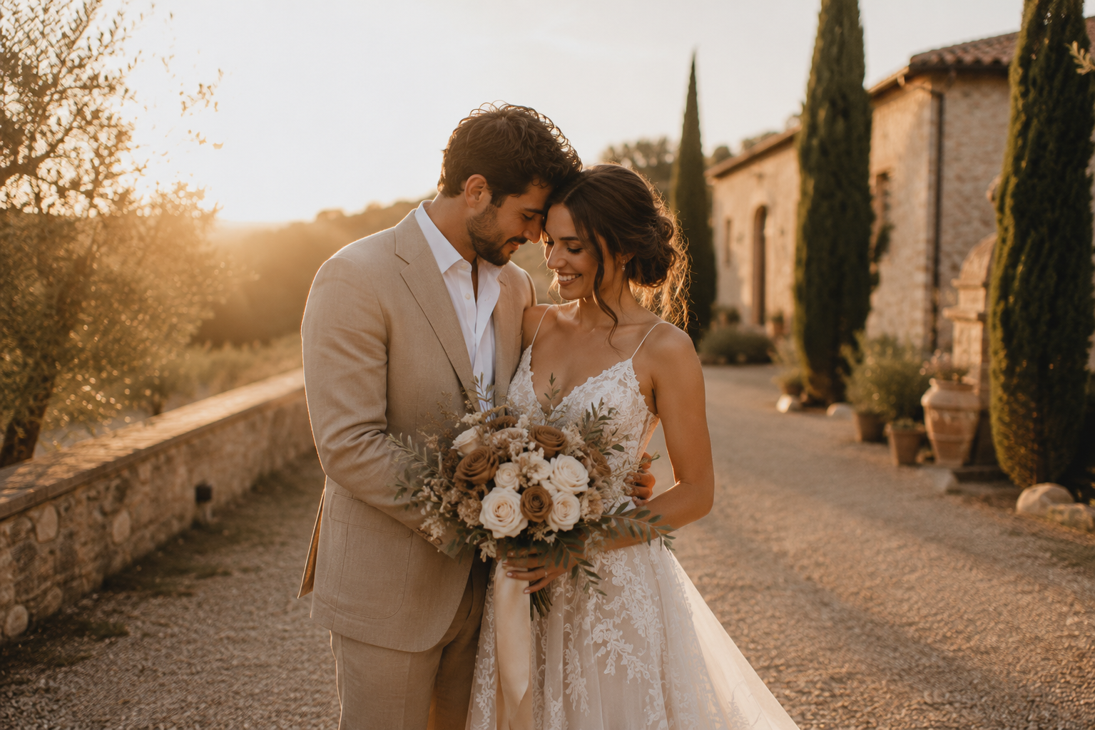
As both a designer and photographer, one of my favourite things about this palette is how incredibly well it photographs.
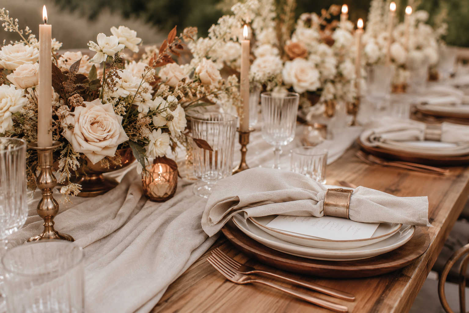
Warm neutrals reflect natural light more softly than bright whites while avoiding the harsh contrast that darker palettes can sometimes create.
They also complement virtually every skin tone and work beautifully during golden hour, where warm sunlight enhances the copper and beige tones instead of competing with them.
Whether your wedding is held in a vineyard, a mountain lodge, a coastal venue, or an elegant ballroom, these colours adapt effortlessly to the surrounding environment.
That versatility is one of the reasons warm minimalism continues to gain popularity with modern couples.
Bringing the Trend Into Your Wedding Stationery
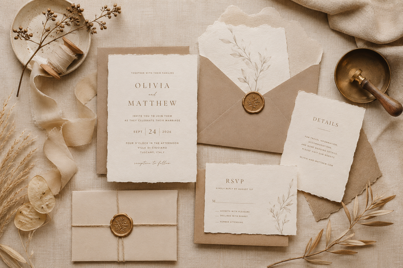
While flowers and bridesmaid dresses often receive the most attention, your wedding stationery is one of the very first opportunities to establish your wedding's overall aesthetic.
Invitations introduce guests to the style of your celebration long before they arrive.
Choosing a palette built around warm ivory, natural neutrals, and copper-inspired accents immediately communicates elegance without feeling overly formal.
Minimal typography, generous white space, and thoughtful details allow these colours to shine without overwhelming the design.
The result is stationery that feels elevated, luxurious, and wonderfully timeless.
A Design That Naturally Fits the 2026 Trend
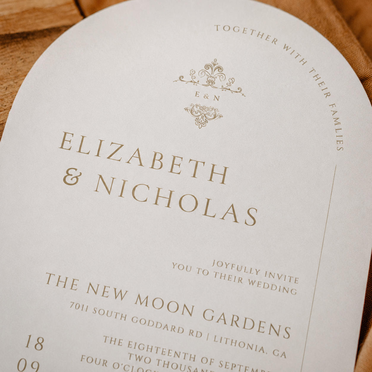
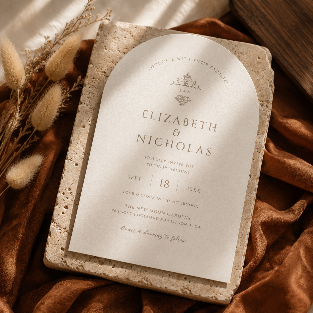
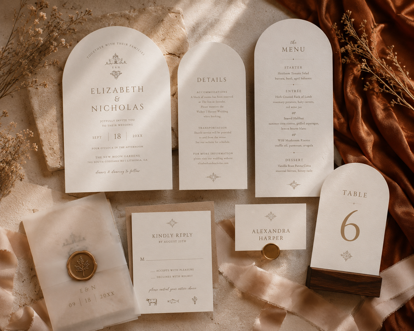
One of my favourite examples of this aesthetic is my Vintage Monogram Wedding Invitation Collection.
Although this design wasn't originally created specifically for the 2026 colour forecasts, it naturally embodies many of the same characteristics that are now defining this year's most elegant weddings.
The soft ivory background echoes the gentle warmth of Cloud Dancer.
The understated typography and neutral detailing reflect the softness of Hazelnut.
When styled with warm linens, natural wood, and copper-toned fabrics, the invitation effortlessly embraces the richness of Matte Copper while maintaining a clean, editorial appearance.
It's a wonderful reminder that truly timeless design often aligns with future trends because it is built upon enduring principles rather than temporary fashions.

Pairing Ideas for a Warm Minimalist Wedding
One of the greatest strengths of this palette is how easily it coordinates with other wedding details.
Some beautiful pairings include:
White garden roses
Toffee roses
Champagne orchids
Natural greenery
Travertine place settings
Walnut wood chargers
Ivory taper candles
Champagne silk ribbon
Handmade paper
Warm brass candle holders
Copper-toned table accents
Bridesmaid dresses in cinnamon, caramel, mocha, or terracotta
Each layer adds warmth without competing for attention, creating a celebration that feels cohesive from beginning to end.
Beyond Autumn
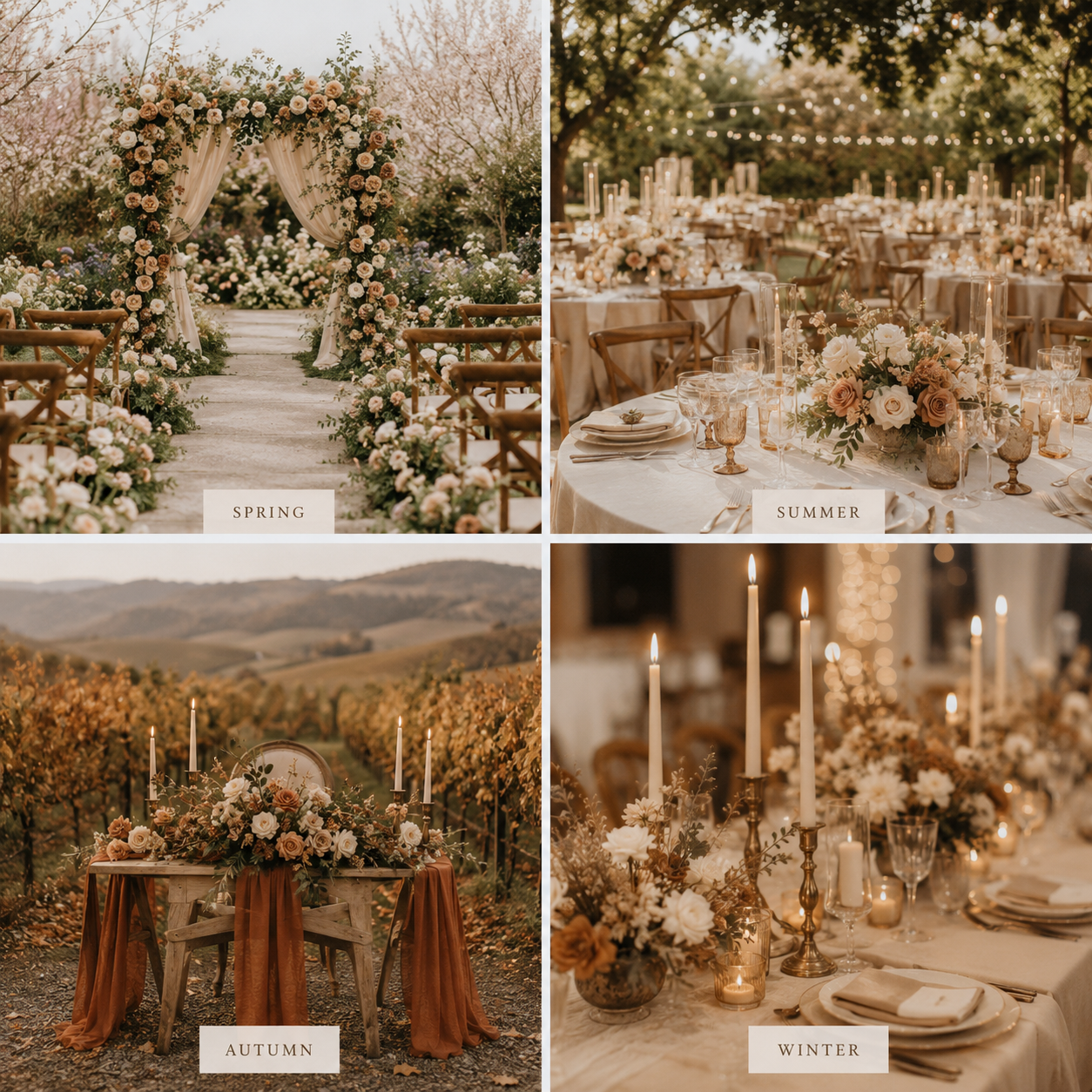
Although these colours are often associated with autumn weddings, their versatility extends far beyond a single season.
During spring, they pair beautifully with fresh white florals and soft greenery.
In summer, they feel airy and elegant against outdoor garden venues.
For autumn, they naturally complement changing leaves and candlelit receptions.
Even winter celebrations benefit from the warmth these earthy neutrals bring to cooler surroundings.
Rather than feeling tied to a specific month, this palette adapts effortlessly throughout the year.
Designing for Trends Without Chasing Them
Wedding trends can provide wonderful inspiration, but the most meaningful designs are those that still feel authentic years after the celebration has ended.
Rather than following every passing colour forecast, I always strive to create stationery that balances current inspiration with timeless design principles.
When those two worlds overlap, as they do with this beautiful warm minimalist palette, the result is something that feels both current and enduring.
That's exactly the kind of wedding design I love creating.
Planning a Warm Minimalist Wedding?
If you're dreaming of a wedding filled with soft neutrals, natural textures, and understated elegance, this colour palette offers the perfect starting point.
Whether you're planning a vineyard celebration, an intimate garden ceremony, or a sophisticated destination wedding, warm minimalist stationery creates a timeless first impression that guests will remember long after the day has ended.
Browse the Vintage Monogram Wedding Collection to see how this elegant palette can carry through your invitations, save the dates, menus, signage, and day-of stationery for a beautifully cohesive celebration.