Every year, wedding trends arrive with a familiar set of declarations.
This color is in. That flower is out. Minimalism is over. Bows are staying. Something we loved ten years ago has returned with a new name.
But design rarely changes that neatly.
The shifts that eventually reach wedding stationery often begin somewhere else entirely. On fashion runways. Inside restaurants and hotels. In interiors, packaging, editorial design and the objects people choose to surround themselves with.
And right now, across many of those worlds, I keep noticing the same thing.
Perfect is becoming less interesting.
After years of polished minimalism, carefully coordinated palettes and design that could sometimes feel almost interchangeable, things are getting more personal again. More tactile. More layered. More expressive. Sometimes a little stranger.
We're seeing lace, draping and asymmetry return to fashion. Vintage references are being reworked rather than simply reproduced. Interiors are becoming layered with objects, craftsmanship and personal history. Color combinations don't always behave. Handmade details are being celebrated precisely because they aren't perfect.
And I believe those ideas are going to have a very interesting effect on weddings.
So this isn't a list of things every couple should include in 2027.
It's a designer's forecast of the creative movements I believe will influence the most interesting wedding stationery and event design in the year ahead.
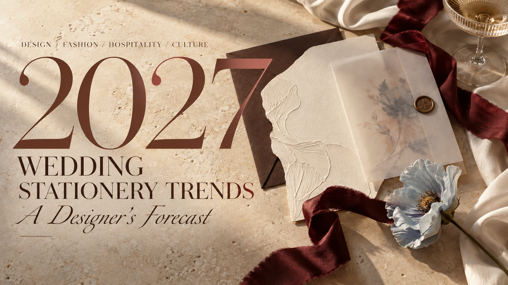
01 / Fashion Moves Onto the Paper
Fashion has always influenced weddings, but in 2027 I think stationery will begin borrowing more than its color palette.
It will borrow its construction.
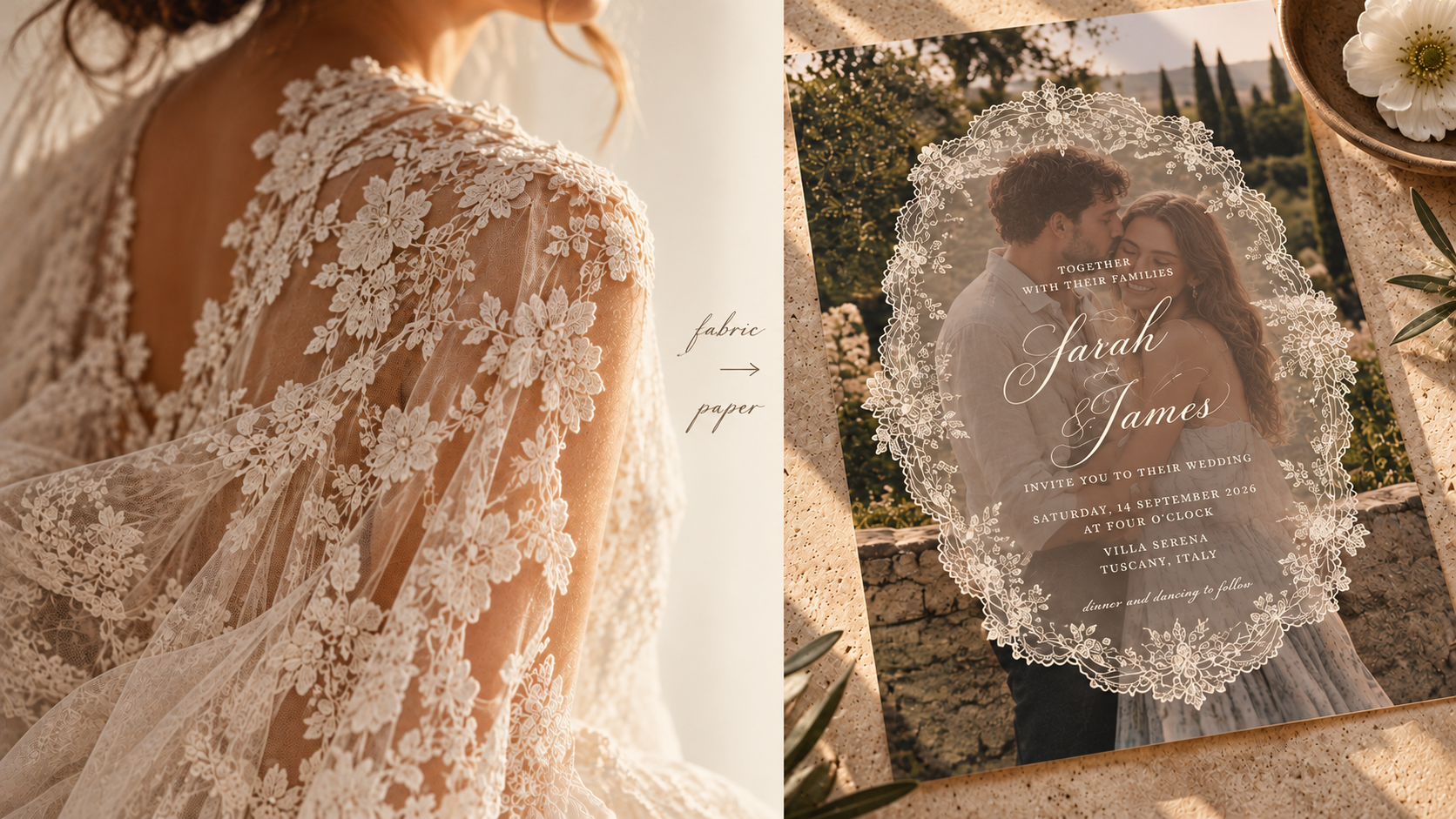
Spring 2027 bridal collections are filled with lace, dramatic draping, asymmetry, sheer layers, sculptural shapes and vintage references interpreted through a modern lens. Even outside traditional bridal, designers are playing with romantic ruffles, slips, unusual tailoring and fabric manipulation.
There is an obvious visual connection between fashion and paper, but the more interesting translation isn't printing a picture of lace onto an invitation.
It's asking what lace does.
It reveals and conceals. It creates an edge. It adds texture. It changes depending on what sits beneath it.
The same can be said of draping, pleating, corsetry and sheer fabric.
Imagine translucent layers revealing typography underneath. An invitation constructed asymmetrically rather than perfectly centered. Embossing inspired by embroidery. A folded menu taking cues from pleating. A scalloped edge referencing lace without literally reproducing it.
Even something as simple as a ribbon becomes more interesting when it feels like part of the construction rather than something tied around the finished piece afterward.
The wedding dress and the invitation don't need to match.
But increasingly, I think they'll feel as though they belong to the same world.
02 / Color Gets More Interesting
I don't think 2027 will belong to one wedding color.
And I'm glad.
What feels more interesting right now is the willingness to put colors beside each other that aren't obvious companions.
Spring 2027 fashion is moving freely between soft pastels and much stronger color, while bridal itself is expanding beyond white into muted pink, blue, cream and gray. Recent collections are even pairing pastels with flashes of cobalt and acid green.
I think weddings will take that permission and run with it.
Not necessarily toward louder palettes, but toward more specific ones.
Powder blue becomes much more interesting beside oxblood than another pale neutral. Butter yellow gains weight beside chocolate brown. Dusty lilac suddenly feels less sweet with an acidic green. Tomato red can make blush feel almost modern.
It's the slightly uncomfortable color that often makes the rest of the palette work.
That doesn't mean neutrals are disappearing. A restrained palette can still be incredibly beautiful.
But I think we'll see fewer palettes designed around the question, Does everything match?
And more designed around:
Does this combination have a point of view?

03 / The Wedding Becomes a Restaurant
One of the biggest influences I see moving into weddings isn't coming from weddings at all.
It's coming from hospitality.
Think about the places people remember.
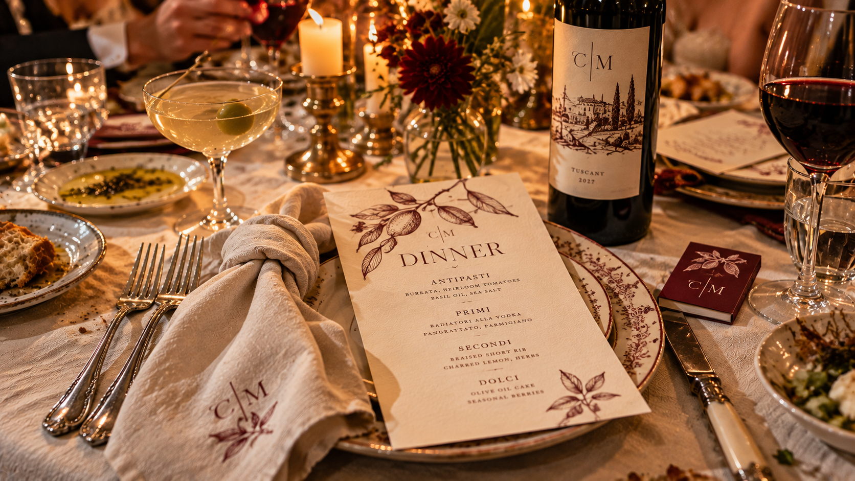
A tiny restaurant with incredible typography on the menu. A hotel bar with its own matchbooks. A café whose napkins, cups and signage somehow make the entire place feel more considered. A wine label you photograph before the bottle is empty because the design is too good to forget.
Hospitality understands something that translates beautifully to weddings:
identity doesn't need to shout to be everywhere.
A wedding reception is already, in many ways, a restaurant that exists for one night.
There is a menu. A bar. A wine selection. Tables. Servers. Food. Music. Lighting. Guests sitting together for hours.
So rather than simply styling the dinner, I think more couples will begin branding the experience of it.
Custom matchbooks. Cocktail napkins. Wine labels. Menus that look as though they came from a favorite neighborhood restaurant. Illustrated food. Tiny bar identities. Coasters. Table numbers inspired by café graphics. Even cheeky little receipts or late-night takeaway packaging.
These details don't have to scream wedding.
In fact, they're often better when they don't.
04 / Illustration Becomes Identity
Custom illustration has become a familiar part of wedding stationery.
But I think we're going to ask more of it.
For years, the default has often been the venue watercolor: beautiful architecture painted above the couple's names.
There will always be a place for that.
But a wedding isn't only a venue.
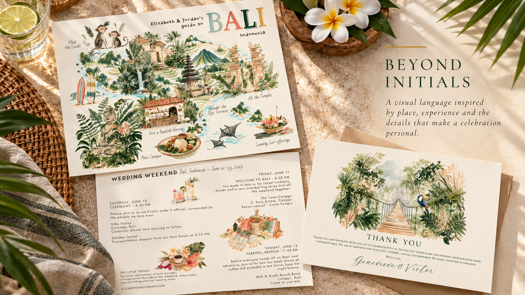
It's people, places, pets, food, memories, family, travel, inside jokes and tiny details that might mean absolutely nothing to anyone except the two people getting married.
That's where illustration becomes far more interesting.
The restaurant from the first date. The dog who owns the house. A grandmother's garden. The skyline where they met. A particular flower. Their favorite cocktail. A terrible rental car from an unforgettable road trip.
One illustration is decoration.
A collection of them becomes a visual language.
Once that library exists, it can travel from invitations to maps, menus, cocktail napkins, websites, welcome gifts, signage and the event itself.
Instead of decorating the wedding with pretty pictures, couples can build an illustrated world that belongs specifically to them.

05 / Meaning Becomes the New Luxury
I don't think the monogram is going anywhere.
But I do think the automatic monogram is becoming less interesting.
Initials are useful. They're personal by definition.
But sometimes there is something far more specific that could represent a couple.
A flower from a family garden. A shell collected from a meaningful beach. A house. A mountain. A bird. A cherry. A martini. A dog in an absurd little bow tie.
Perhaps it's worked into a crest.
Perhaps it replaces the crest entirely.
What interests me is the idea of wedding identities containing symbols that aren't immediately understandable to everyone who sees them.
They don't need to be.
A guest might simply see a beautiful illustration.
The couple sees a story.
As our visual world becomes increasingly easy to replicate, I think that distinction will matter more. A beautiful aesthetic can be copied.
Meaning is harder to copy.
And that may become one of the most valuable forms of luxury in wedding design.
06 / Paper Becomes an Object
We spend an extraordinary amount of our lives touching glass.
Maybe that's part of why tactile design suddenly feels so satisfying.
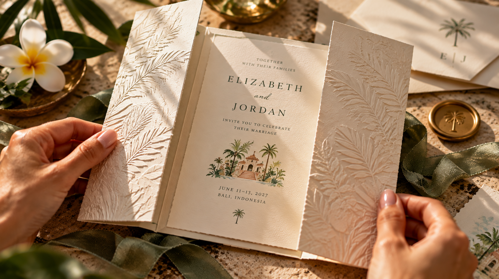
Wedding stationery is becoming something you don't simply look at.
You open it.
Unfold it.
Untie it.
Turn it over.
Run your fingers across it.
Spring 2027 fashion is similarly fascinated with materiality, from layers of lace and embellishment to sculptural construction and fabric manipulated into unexpected shapes. Interiors are embracing dimensional wall treatments, embroidery, appliqué, passementerie and other tactile craft.
It makes sense that paper would participate in the same movement.
Die-cut shapes. Scallops. Folds. Layers. Translucency. Embossing. Fabric. Ribbon. Charms. Unexpected stocks. Pieces that function almost like tiny objects.
But I don't think more automatically means better.
A twelve-piece invitation suite isn't inherently more luxurious than one beautifully considered card.
Sometimes a single unexpected shape or incredible stock does all the work.
The shift isn't toward complexity.
It's toward physicality.
07 / The Human Hand Shows
There is something almost funny about spending years making digital design more and more perfect, only to arrive at a moment when imperfection suddenly feels luxurious.
But here we are.
Even the Spring 2027 fashion conversation is showing renewed interest in DIY techniques and visible handcraft as a counterpoint to digital precision. Across fashion more broadly, this season is leaning toward human creativity and emotional expression rather than frictionless perfection.
I think wedding stationery will reflect that.
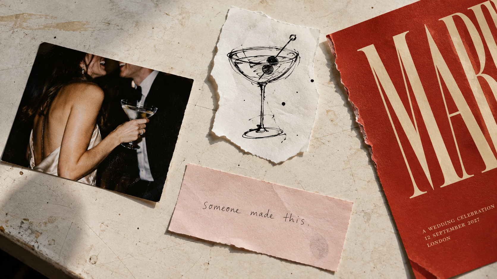
Handwriting that actually looks handwritten.
Loose sketches.
Ink that isn't perfectly consistent.
Vintage typography.
Torn edges.
Naïve illustration.
Scanned flowers.
Collage.
Analogue photography.
Things with evidence of a hand still attached to them.
That doesn't mean design suddenly becomes sloppy.
There is a huge difference between intentional imperfection and simply not finishing something properly.
The work can still be beautifully art-directed and meticulously considered.
It just doesn't need every line straightened and every irregularity removed.
Because increasingly, those irregularities are what tell us: someone made this.
08 / Stationery Escapes the Page
Perhaps the biggest change in wedding stationery is that we're increasingly using the word stationery to describe something that doesn't stay on paper at all.
The invitation establishes a language.
Then that language starts moving.
Onto the menu.
Across the bar.
Around the dance floor.
Onto a stage.
Along a wall.
Through the wayfinding.
Into packaging, textiles, installations and the tiny objects guests interact with throughout the night.
Eventually, the identity becomes part of the environment.
And that shift mirrors what we're seeing elsewhere in design. Interiors are becoming more personal, layered and story-driven rather than uniformly minimal. People aren't simply decorating spaces. They're creating environments that communicate something about who inhabits them.
A wedding can do the same.
This doesn't mean putting the couple's initials on every available surface.
Good event branding can actually be remarkably quiet.
A shape introduced on the invitation might reappear in the architecture of a bar. An illustration becomes a pattern. A color appears unexpectedly in the lighting. Typography from the save-the-date guides guests toward dinner.
Guests may never consciously connect those decisions.
They simply experience a celebration where everything somehow feels as though it belongs together.
I've written much more about this idea in From Invitation to Environment: What Event Branding Actually Means, because I think this is where stationery stops being an accessory to the event and begins helping to shape the event itself.

So, What Will Weddings Look Like in 2027?
Hopefully, not all the same.
That's the part of this forecast I'm most confident about.
The broader design world is moving away from the idea that good taste requires everything to be quiet, neutral and perfectly controlled. Fashion is mixing romance with asymmetry, vintage references with modern construction and softness with much stronger gestures. Interiors are becoming layered, tactile and personal. Craft is increasingly valuable precisely because we can see the hand behind it.
Wedding stationery is uniquely positioned to bring all of those ideas together.
Borrow the lace from the dress, but translate it rather than copy it.
Choose the strange color.
Turn dinner into a tiny restaurant that exists for one night.
Illustrate something nobody else would think to illustrate.
Use a symbol that requires a story.
Make something guests want to touch.
Leave a line imperfect.
Let the invitation escape the envelope and become part of the room.
Or ignore all eight predictions.
Because ultimately, I don't think the most interesting weddings of 2027 will be the ones that followed the most trends.
I think they'll be the ones where you can look around the room and know exactly whose wedding you're at.

The future of wedding design isn't about making everything perfect.
It's about making it personal.