From Invitation to Environment: What Event Branding Actually Means
You choose a color palette.
You design an invitation.
Maybe there's a logo or monogram. A custom illustration. A pattern you love.
Then the event gets closer.
Suddenly you need a welcome sign. A bar menu. A seating display. Table numbers. Maybe graphics for a stage, a dance floor, a photo moment or an entire wall.
And this is usually the point where something interesting happens.
Those pieces can either become a collection of things that happen to be at the same event.
Or they can become an environment.
That second idea is what I mean when I talk about event branding.
First, What Is Event Branding?
The word branding can make this sound much more corporate than it actually is.
Event branding doesn't necessarily mean putting a logo on everything.
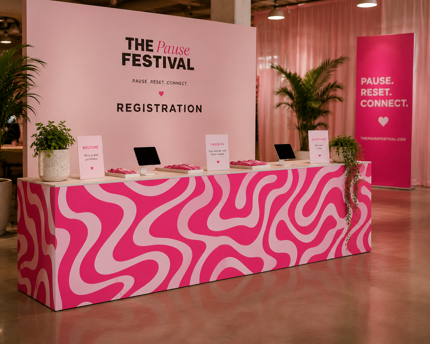
At its simplest, it's the visual language that connects the different parts of an event.
Color is part of it.
Typography is part of it.
Illustration, pattern, photography, materials, shapes and signage can all be part of it too.
But the real goal isn't matching.
It's recognition.
A guest should be able to move from the invitation to the entrance, from the entrance to the bar, and from the bar to the table without every element looking identical, while still feeling as though all of it belongs to the same experience.
It Usually Starts With Something Small
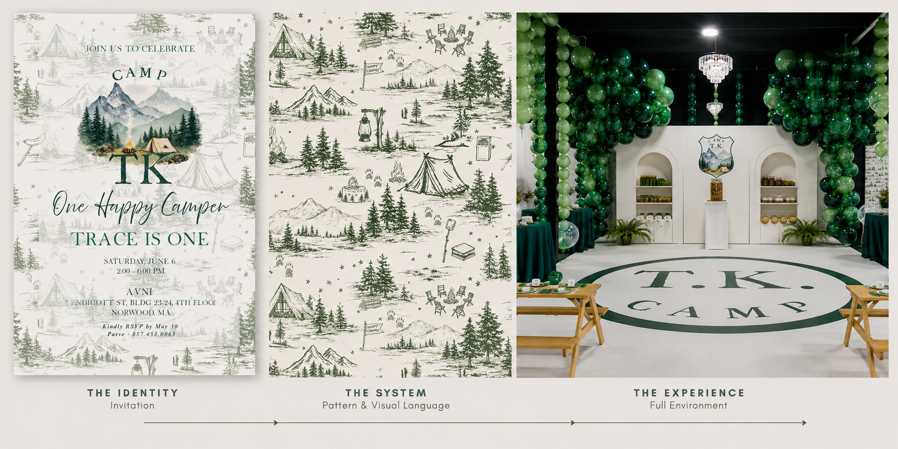
Interestingly, an event identity often begins on one of the smallest pieces we'll create.
An invitation.
A logo.
A monogram.
An illustration.
Maybe even a single unusual color.
At that stage, I'm not necessarily thinking about how many times that element can be repeated.
I'm thinking about what kind of visual world could grow from it.
A venue illustration might eventually become an oversized graphic.
A tiny pattern inside an envelope might become a bar wrap.
A monogram could become a subtle detail on menus, cocktail napkins or signage.
A shape from the invitation might influence the shape of a seating display.
The original design becomes a vocabulary.
And once that vocabulary exists, we can start speaking with it in different ways.
Then the Scale Changes
This is where event branding becomes especially fun.
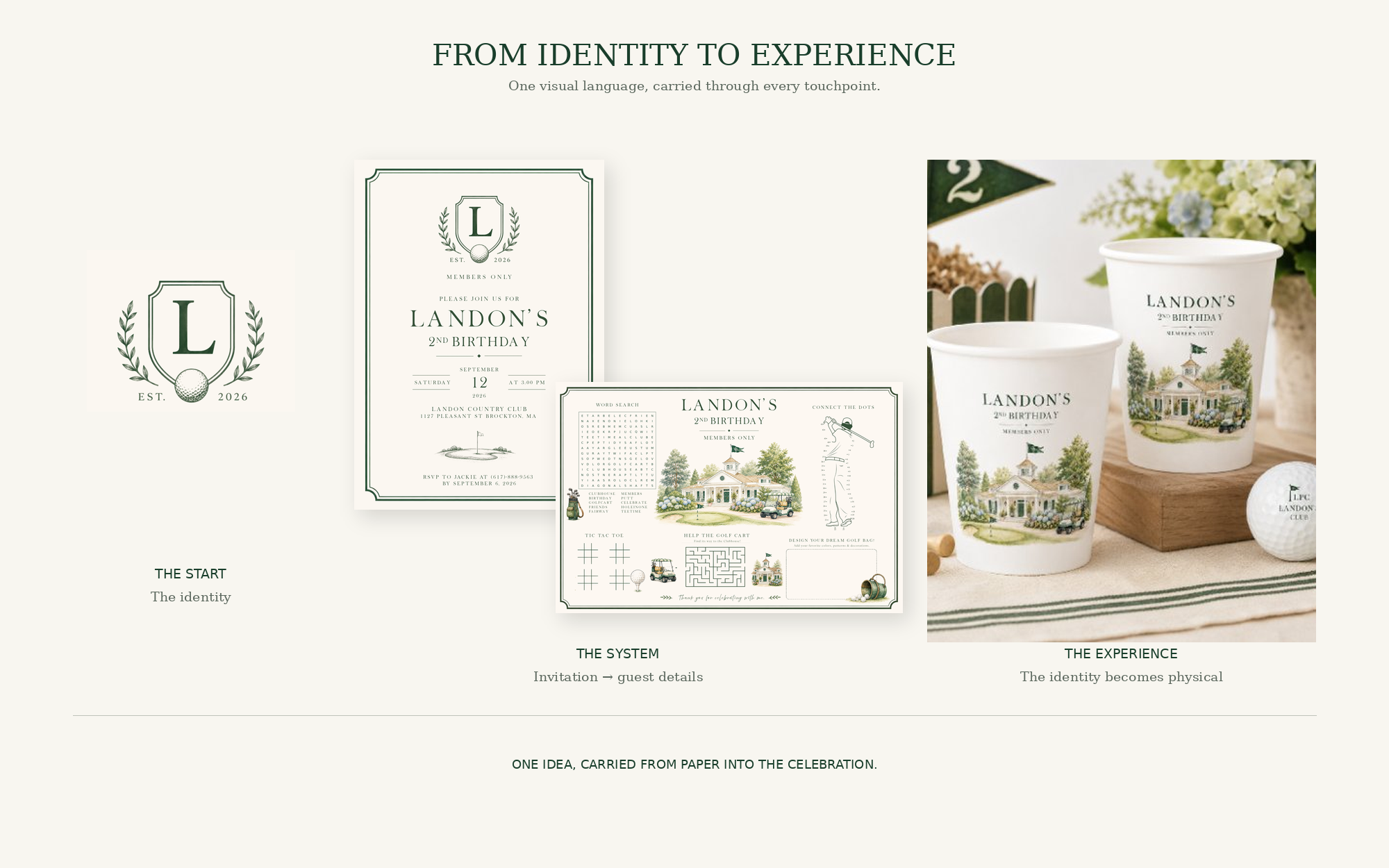
Something designed at five inches suddenly needs to work at five feet.
And simply enlarging it isn't always the answer.
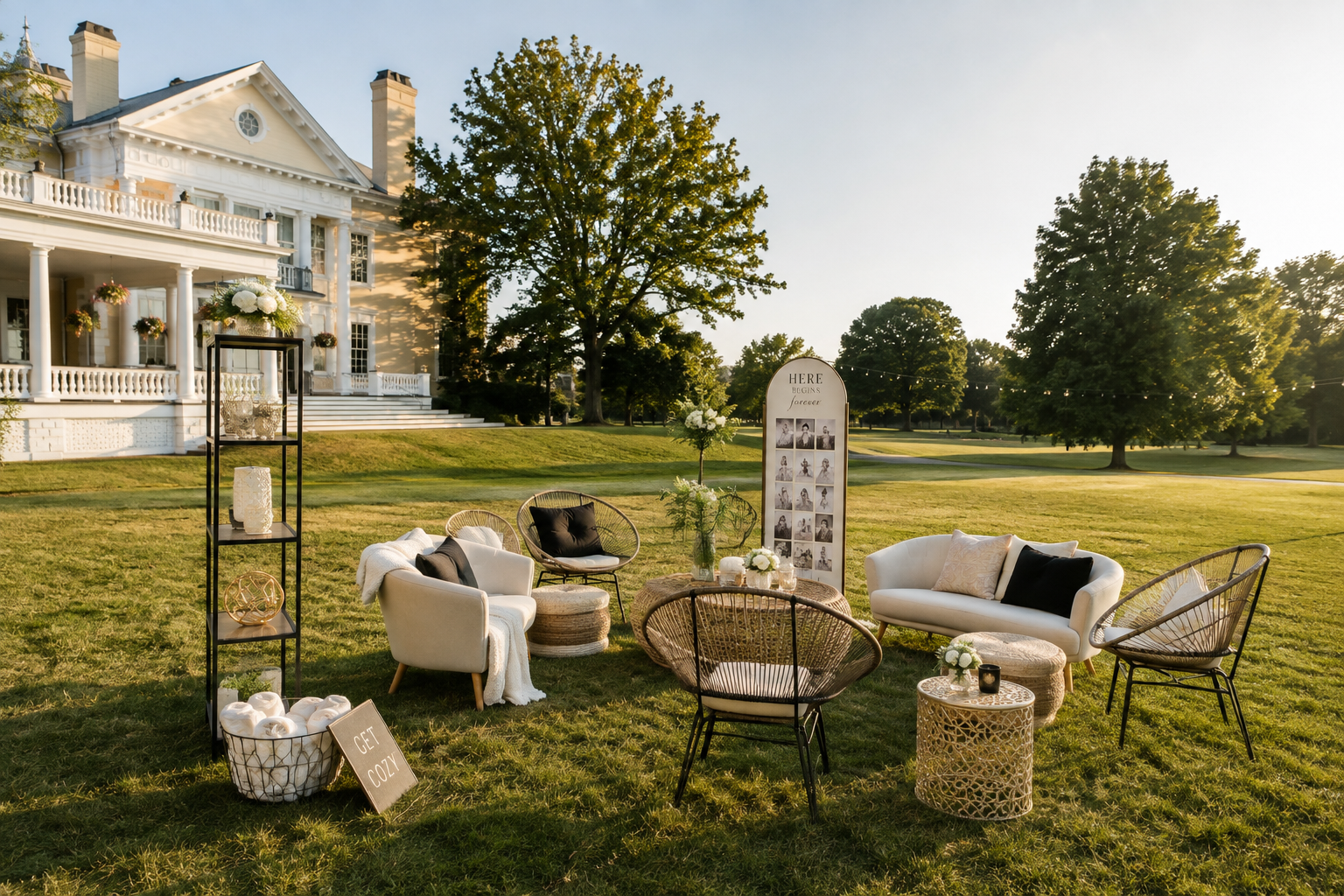
Designing for an environment means thinking differently.
What will someone see from across the room?
What needs to be understood immediately?
What will they experience up close?
What competes with the architecture, florals, lighting and furniture already in the space?
A delicate illustration that works beautifully on an invitation might disappear completely on a twenty-foot wall.
A tiny pattern might become incredible when it's enlarged.
Typography that feels dramatic on paper might need to become much quieter once it's surrounded by flowers, lighting and people.
Scale changes the design.
And good event branding allows it to change.
The Venue Is Part of the Design
One of the biggest differences between designing stationery and designing an environment is that the environment already exists.
There is architecture.
There are walls, windows, flooring, lighting and furniture.
There may be a spectacular view.
There may also be something we'd rather not draw attention to.
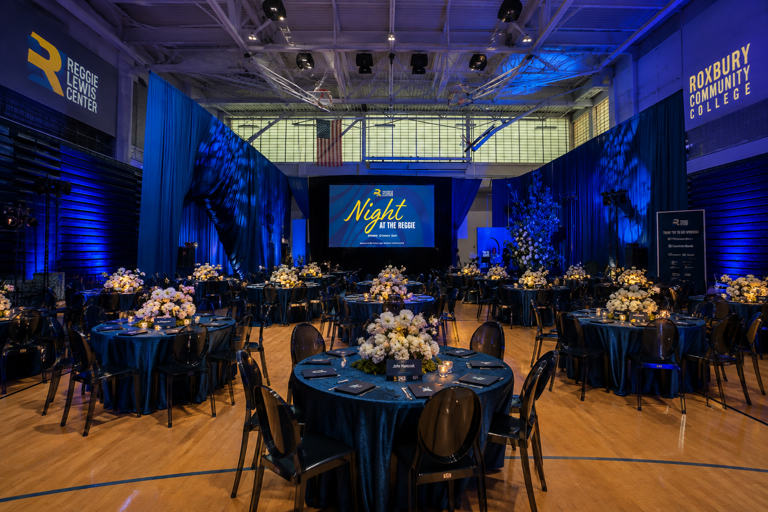
The strongest event graphics don't feel as though they've simply been dropped into a room.
They respond to it.
A historic venue might inspire illustration or typography.
A modern space may call for oversized graphics and cleaner forms.
A destination can introduce local architecture, landscapes, plants, food or cultural details.
Sometimes the environment gives us the identity before we've designed anything at all.
Not Everything Needs the Logo
This might be one of the biggest misconceptions about event branding.
Branding does not mean branding everything.
If the logo appears on the invitation, welcome sign, seating chart, menu, bar, cocktail napkin, dance floor, photo backdrop and favor, eventually it stops feeling intentional.
It starts feeling sponsored.
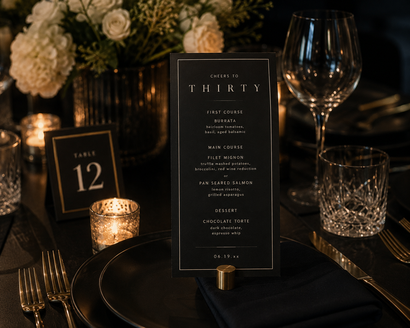
A strong identity gives us more tools than a logo.
We can use a color.
A typeface.
A crop of an illustration.
One tiny icon.
A pattern.
A particular shape.
Sometimes the most sophisticated application of an event identity doesn't contain the event logo at all.
You simply recognize it.
Every Surface Is a Possibility. Not a Requirement.
Once you start thinking environmentally, almost anything can become part of the visual experience.
Bars can be wrapped.
Dance floors can carry graphics.
Walls can become installations.
Menus can become objects.
Seating charts can become interactive displays.
Stages can become enormous pieces of graphic design.
Even functional elements like directional signage can contribute to the visual story.
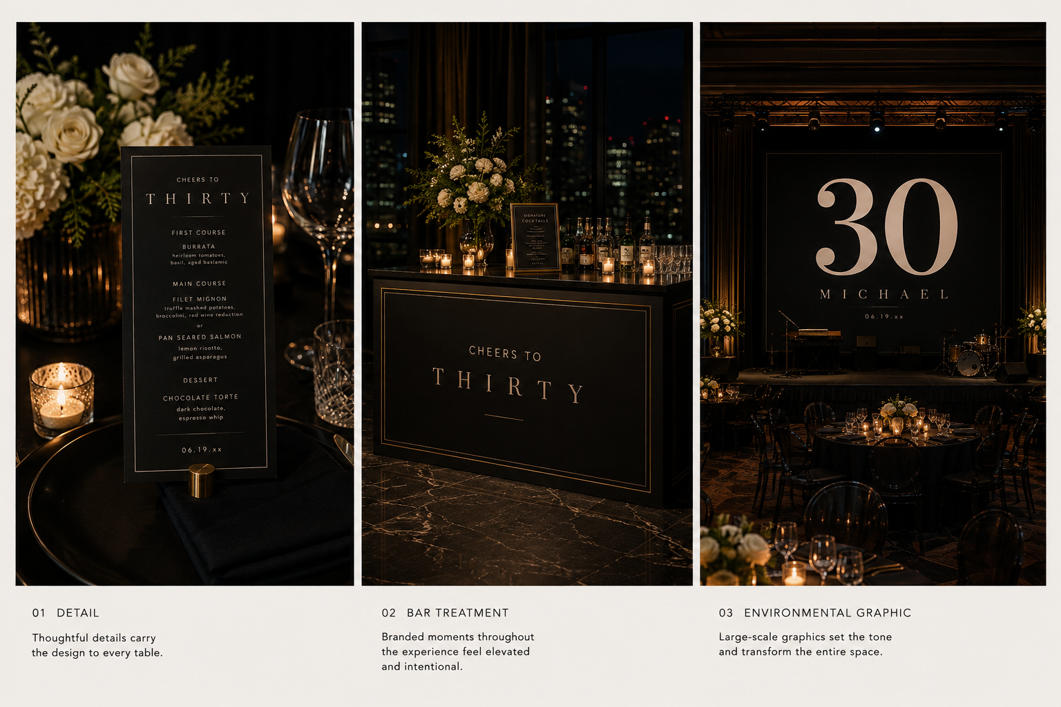
But possibility shouldn't become obligation.
The question isn't, Where else can we put the design?
It's, Where would design actually make this experience better?
Sometimes the answer is an enormous installation.
Sometimes it's a beautifully designed little sign telling someone where to go.
Both matter.
Event Branding Isn't Just Decoration
This is where the word experience becomes important.
Some event graphics are decorative.
Others actually help guests understand the event.
A welcome sign confirms they've arrived.
Directional signage tells them where to go.
A seating display helps them find their place.
A menu tells them what they're about to eat.
A schedule explains what's happening next.
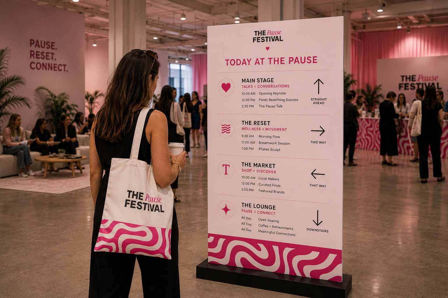
When those functional pieces are thoughtfully designed, they can do two jobs at once.
They make the event easier to navigate.
And they make the environment feel more considered.
That's why I don't really separate function from aesthetics when I'm designing an event.
The best pieces usually do both.
Weddings Aren't the Only Events With Identities
Weddings make event branding easy to understand because there are so many visual touchpoints.
But the same thinking applies far beyond weddings.
A milestone birthday can have its own visual world.
A baby shower can begin with a custom illustration and expand into signage and environmental graphics.
A corporate gathering can feel warm, experiential and human rather than covered in logos.
A hospitality event might borrow from the visual identity of the space itself.
A festival can use graphics to move people through an entire venue while creating moments they want to photograph along the way.

The scale changes.
The audience changes.
The tone changes.
The principle doesn't.
We're creating a visual system flexible enough to move through an experience.
The Details Guests Remember Aren't Always the Biggest Ones
Interestingly, the biggest graphic at an event isn't necessarily the one guests remember.
Sometimes it's the menu they took home.
The funny line they saw at the bar.
Their name beautifully printed on something.
An illustration they recognized from the invitation.
The unexpected little sign that made them laugh.
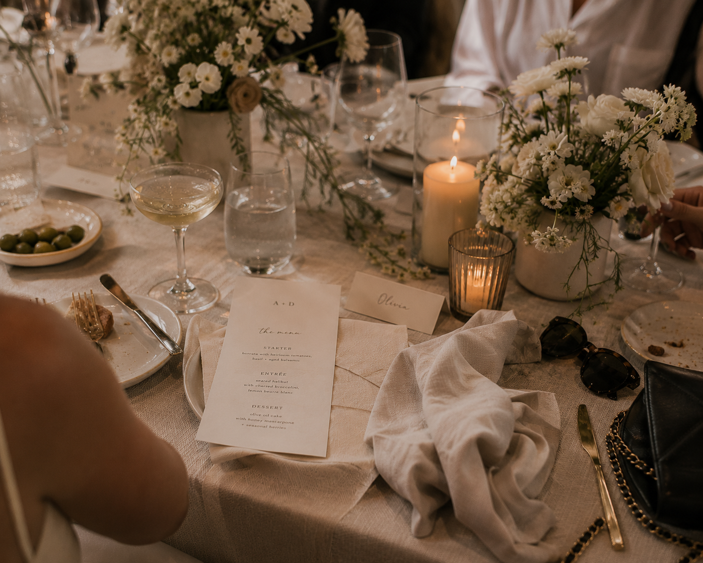
These moments are why I think personality matters so much in event branding.
Perfectly coordinated isn't enough.
The design should belong specifically to this event.
From Invitation to Environment
I think that's ultimately the easiest way to understand event branding.
It isn't about designing more stuff.
It's about taking an idea and allowing it to grow.
An invitation becomes an introduction.
A color becomes an atmosphere.
An illustration becomes part of a room.
Typography becomes wayfinding.
A pattern becomes architecture.
And individual pieces that might otherwise have felt unrelated begin to tell one visual story.
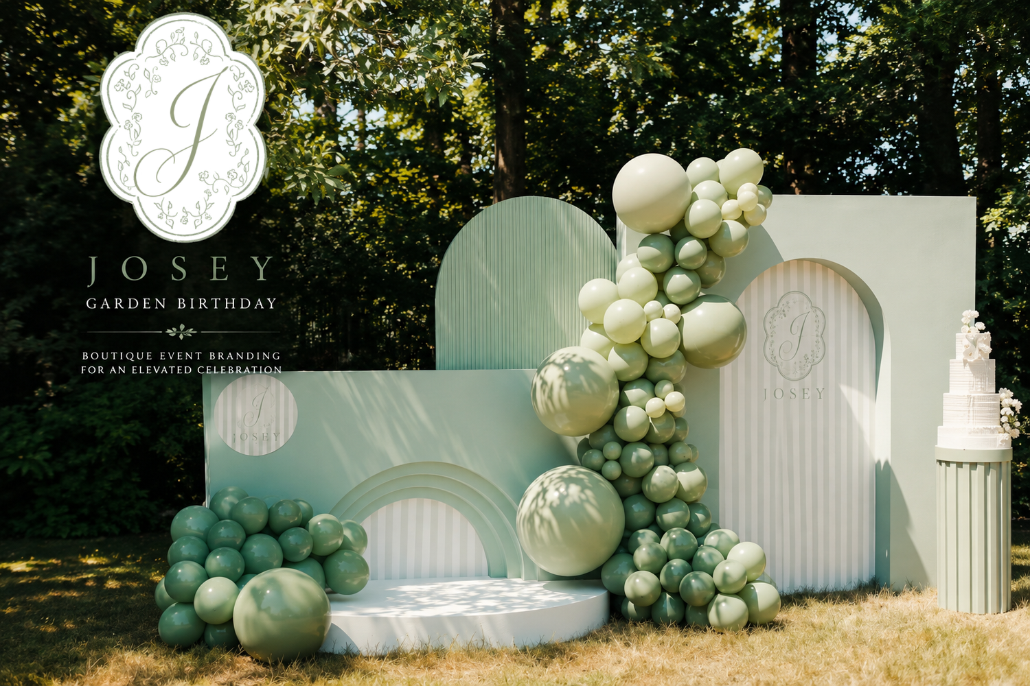
That's when design moves beyond something guests simply look at.
It becomes part of where they are.
And that is where an event identity becomes an environment.
IYHTVDesigns creates custom event branding, illustration, stationery and environmental graphics for weddings, celebrations and experiences, developing visual identities that can move from the smallest printed detail to the spaces guests experience.